 |
VOOZH | about |
|
VOOZH | about |
Editor’s note: This guide to building React Native forms with UI components was last reviewed and updated on 24 October 2024.
👁 Building React Native Forms With UI ComponentsThere are several ways you can build and style React Native forms:
TextInput, Switch, Picker, and SliderModal component for enhanced form interactions and modal-based formsForms are interactive parts of websites and product UI. Feedback, surveys, data collection, etc., are critical aspects of your product that require the extensive use of forms. If you don’t get your forms right, you may unknowingly create a bad UX, drastically reducing your product’s use. In this article, we will explore how to build performant React Native forms using React Native UI components. To learn more about React forms, check out our guide to building powerful React forms with Informed.
Before getting started, you will need to have Xcode or Android Studio installed, as well as Node.js v14+. Although it is not mandatory, some knowledge of React Native will be helpful. Note that we’ll be focusing on form functionality, with the styles for each example available in the project repository.
The Replay is a weekly newsletter for dev and engineering leaders.
Delivered once a week, it's your curated guide to the most important conversations around frontend dev, emerging AI tools, and the state of modern software.
React Native forms offer intuitive ways of gathering user input, submitting it to a backend server, or storing it locally. Forms can include a variety of input fields:
Check out our guides to radio buttons and dropdown menus in React Native to learn more.
React Native comes with inbuilt components to create forms, such as TextInput, Switch, Picker, and Slider. Likewise, you can create custom components to suit your exact needs. React Native handles user input and form submission with the state object. The state object can be defined in a component to hold input values and update them with values as the user interacts.
Some third-party libraries are also available to facilitate form handling in React Native. Libraries like Formik and Redux Form provide extra components like form validation and refined form submission options.
We will start with a few installations for those using React Native for the first time. If this is your first time with React Native, install the required packages and follow the steps accordingly. First, install the React Native CLI tool with the following command:
npm install -g react-native-cli
Afterward, create a new React Native project named pickerSample and start the server by running this command:
react-native init pickerSample
Then, change the directory into the newly created project and start the server with this command:
cd pickerSample && npx react-native run-ios // Start the iOS simulator
// OR
cd pickerSample && npx react-native run-android // Android the android emulator
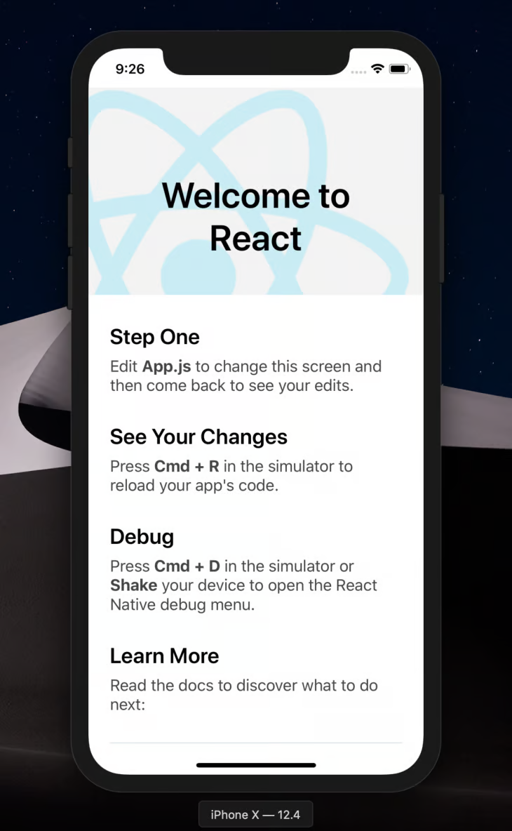
If you have Xcode or Android Studio installed, the commands above will run the project, and you should have the simulator show up on the screen like this:
👁 React Native On IOS And Android
In my case, I’m using Xcode.
Picker componentThe React Native Picker component is the equivalent of a dropdown in regular JavaScript. It is used to render a list of multiple choices for users to select only one option. The functionality is useful when asking a question with a variety of options but only one correct answer.
For example, when handling payments, you might ask users to select their currency. To accommodate a diverse customer base, it’s best to display a wide range of currency options. This approach provides a variety of options and allows for only one answer. Let’s see how we can achieve that using the React Native Picker component!
First, install the React Native Picker by running the following:
npm install @react-native-picker/picker --save
#OR
yarn add @react-native-picker/picker.
In the root directory of the sample project, create a new src/components/Picker.js file and define some form fields for demonstration purposes, as shown below:
import React, {useState} from 'react';
import {Text, StyleSheet, View, TextInput, Button} from 'react-native';
import { Picker } from '@react-native-picker/picker';

const App = () => {
 const [currency, setCurrency] = useState('US Dollar');
 return (
 <View >
 <Text > Demo Form </Text>
 <View>
 <TextInput
 placeholder="Email" />
 <TextInput
 secureTextEntry={true}
 placeholder="Password"
 />
 <Picker
 selectedValue={currency}
 onValueChange={currentCurrency => setCurrency(currentCurrency)}>
 <Picker.Item label="USD" value="US Dollars" />
 <Picker.Item label="EUR" value="Euro" />
 <Picker.Item label="NGN" value="Naira" />
 </Picker>
 <Text>
 Selected: {currency}
 </Text>
 </View>
 </View>
 );
};
const styles = StyleSheet.create({
 //Check project repo for styles
});

export default App;
We’ve just rendered the Picker component we created in the src/components/Picker.js file here. As a result, when the app loads, the picker file will be rendered. If we run the app at this point, we should get the following output on the simulator:
Slider componentThe React Native Slider component is mostly used to select a single value from a range of values. This feature is especially useful in forms where you need to present users with a range of values from a defined minimumValue to a maximumValue scale.
Practical examples of this component include product and performance rating scales. To demonstrate this, we’ll create a new component, build out our form, and implement the slider. Install the component by running the following:
yarn add @react-native-community/slider
#OR
npm install @react-native-community/slider --save.
In the src/components file we created earlier, create a new Slider.js file and update it with the code below:
import React, {useState} from 'react';
import {Text, StyleSheet, View, TextInput} from 'react-native';
import Slider from '@react-native-community/slider';

const App = () => {
 const [value, setValue] = useState(0);
 return (
 <View>
 <Text> Demo Form </Text>
 <View>
 <TextInput placeholder="Email" />
 <TextInput
 secureTextEntry={true}
 placeholder="Password"
 />
 <Text>
 Rate your teams performance this quarter
 </Text>
 <Slider
 step={1}
 minimumValue={0}
 maximumValue={100}
 value={value}
 onValueChange={slideValue => setValue(slideValue)}
 minimumTrackTintColor="#1fb28a"
 maximumTrackTintColor="#d3d3d3"
 thumbTintColor="#b9e4c9"
 />
 <Text>
 Slide value: {value}%
 </Text>
 </View>
 </View>
 );
};
export default App;
To render this component when the app runs and see what it looks like, we’ll update the App.js file again like so:
import React from 'react';
import Picker from './src/components/Picker'
import Slider from './src/components/Slider'
const App = () => {
 return (
 <Slider />
 );
};
export default App;
Run the app again, and we should get the following output:
Modal componentThe Modal UI component lets you display content directly on top of a parent (enclosing) view. This is useful when performing several activities without needing to navigate to different pages. Just like the Slider component, the React Native Modal component has also been extracted from the React Native core into the community package that can be installed via npm.
The major difference is the added features that came with the react-native-modal package. This includes animations, inline style props, more customization options, etc.
To further exemplify this component, we’ll build a demo app to show how you can implement the Modal component independently. In my case, I want to show a login form in a modal when a user clicks it. But first, let’s install the package from npm:
npm i react-native-modal
#OR
yarn add react-native-modal
Then, create a Login.js file in the /components directory. In this file, we’ll define the form we want to render on the modal with the following code:
import React, {useState} from 'react';
import { Text, View, TextInput} from 'react-native';

const LoginForm = () => {
 const [value, setValue] = useState(0);
 return (
 <View>
 <Text> Login Form </Text>
 <View>
 <TextInput placeholder="Enter Email" />
 <TextInput
 secureTextEntry={true}
 placeholder="Enter Password"
 />
 </View>
 </View>
 );
};

export default LoginForm;
This is a login form that doesn’t do much. I’m only defining the email and password fields to give you a visual understanding of the supposed use case. Next, we’ll create the Modal component src/components/Modal.js and update it like so:
import React, { useState} from 'react';
import {Button, View, StyleSheet} from 'react-native';
import Modal from 'react-native-modal';
import LoginForm from './Login';
const ModalDemo = () => {
const [isModalVisible, setIsModalVisible] = useState(false);
const toggleModal = () => {
setIsModalVisible(!isModalVisible);
};
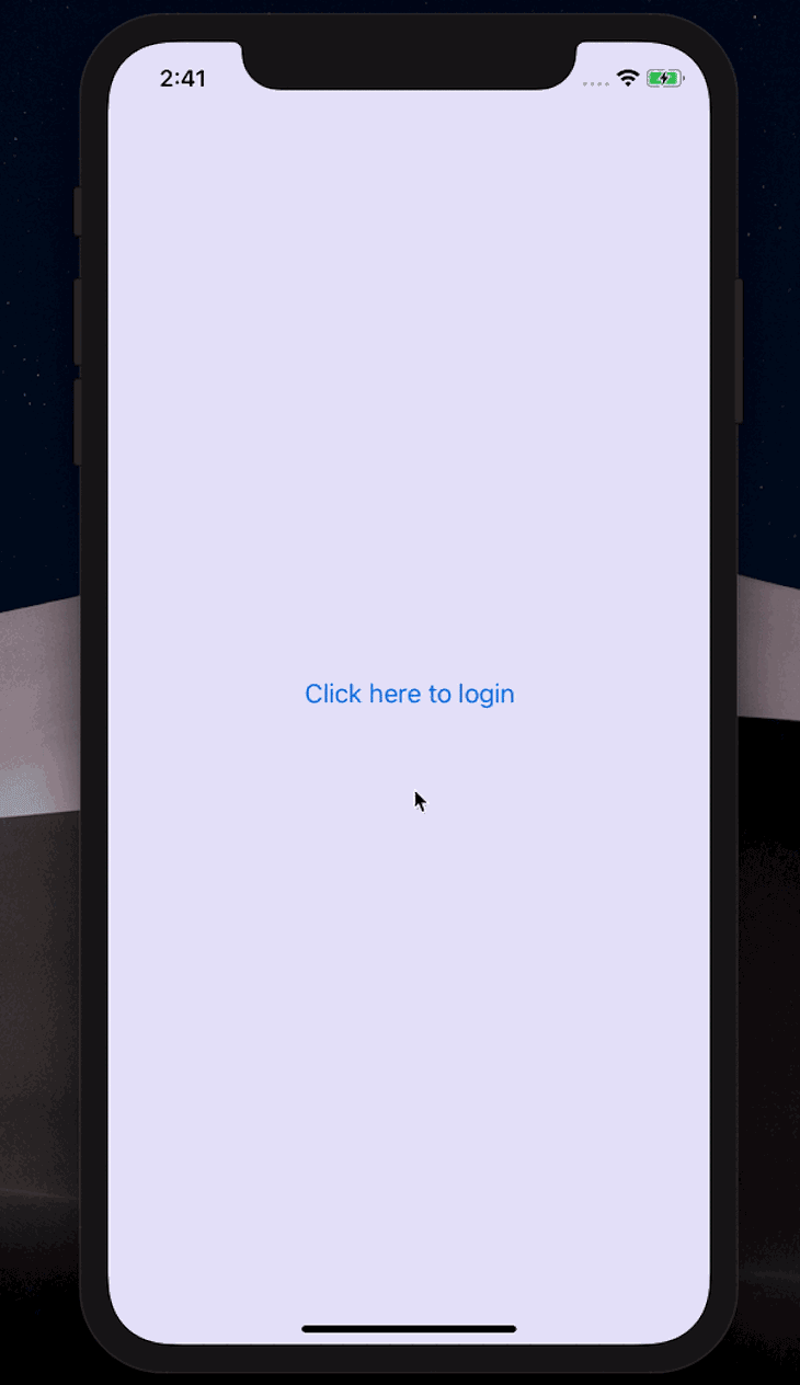
return (
<View style={styles.container}>
<Button title="Click here to login" onPress={toggleModal} />
<Modal
isVisible={isModalVisible}>
<View>
<LoginForm />
<View>
<Button title="Hide modal" onPress={toggleModal} />
</View>
</View>
</Modal>
</View>
);
};
const styles = StyleSheet.create({
container: {
flex: 1,
backgroundColor: '#E6E6FA',
alignItems: 'center',
justifyContent: 'center',
},
});
export default ModalDemo;
Here, we import the React Native Modal component we installed earlier. We also did the same for the login form we created to render on the modal.
Next, we render the modal with buttons to show and hide the modal. Initially, the modal will be hidden. We’ll do this by setting the isVisible prop of the Modal component to false.
When the login button is clicked, we call the toggleModal() function that changes the value of the isVisible prop from false to true. When that happens, the modal will be visible. In the Modal component, we rendered the login form and a button to hide the modal by toggling the value of the isVisible prop, as shown below:
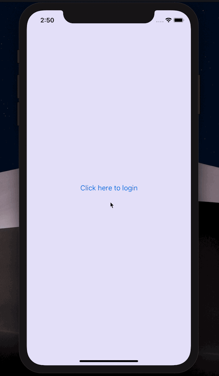
Some other props are available to the modal component for other customizations, like styling and animations. For example, we can decide to alter the default behavior of the modal by modifying the animation styles. So, let’s slow down the modal exit speed when we click the Hide modal button.
We can do this with the animationOutTiming prop by setting a higher value. The same applies to animating the modal from the top of the screen rather than below, as seen in the GIF above. We can also work with more animation props in React Native. For example, enter the following code:
return (
 <View style={styles.container}>
 <Button title="Click here to login" onPress={toggleModal} />
 <Modal
 animationOutTiming={1000}
 animationOut={'slideOutUp'}
 isVisible={isModalVisible}>
 <View>
 <LoginForm />
 <View style={{marginTop: 150}}>
 <Button title="Hide modal" onPress={toggleModal} />
 </View>
 </View>
 </Modal>
 </View>
);
This update will yield a different modal behavior than you’d expect. Check it out below:
You can find more available props for the Modal component here.
React form libraries simplify building forms by providing pre-built components and functionalities for handling form inputs, validation, and submission. Many form libraries, such as React Hook Form and Formik, are compatible with both React and React Native, allowing developers to apply similar concepts across platforms.
Let’s demonstrate how to build a simple sign-up form using the Formik library. Install the library with the following command:
npm install yup formik --save
OR
yarn add formik yup
Next, let’s create a Formik.js file in the /components directory with the following snippets:
// components/Formik.js
import { Formik, Form, Field, ErrorMessage } from 'formik';
import * as Yup from 'yup';

// Handling form validation
const userSchema = Yup.object({
 name: Yup.string().required('Name is required'),
 email: Yup.string().email('Email is not valid').required('Email is required'),
 password: Yup.string().min(7, 'Password is too short').required('Password is required'),
});

const userSignup = () => {
 const initialValues = { name: '', email: '', password: '' };
 const handleSubmit = (values, { setSubmitting }) => {
 // Handle form submission here
 };
return (
 <Formik initialValues={initialValues} validationSchema={userSchema} onSubmit={handleSubmit}>
 {({ isSubmitting }) => (
 <Form>
 <label htmlFor="name">Name</label>
 <Field type="text" name="name" />
 <ErrorMessage name="name" />

 <label htmlFor="email">Email</label>
 <Field type="email" name="email" />
 <ErrorMessage name="email" />

 <label htmlFor="password">Password</label>
 <Field type="password" name="password" />
 <ErrorMessage name="password" />

 <button type="submit" disabled={isSubmitting}>Submit</button>
 </Form>
 )}
 </Formik>
 );
}
export default userSignup;
In the snippets above, we define a SignupForm component that uses the Formik library to handle form inputs, validations, and submissions. We define a validation schema using the Yup library, set up an initial formState object, and define a function to submit the form details.
We render the form using the Formik components, including the Field component for each input, the ErrorMessage component for validation errors, and the Form component to wrap the form fields and submission button.
React Hook Form is a form library that uses React Hooks to handle form inputs, validation, and submission. To learn more about React Hook Form, check out our complete guide here. Now, let’s build a sign-up form with the React Hook Form. Start by installing the library with the following command:
npm install react-hook-form
OR
yarn add react-hook-form
Next, create a ReactHook.js file in the /components directory with the following snippets:
import { useForm } from 'react-hook-form';

const SignupForm = () => {
 const { register, handleSubmit, formState: { errors } } = useForm();

 const Submit = (data) => {
 // Handle submit codes here
 };

 return (
 <form onSubmit={handleSubmit(Submit)}>
 /* "handleSubmit" will validate your inputs before invoking "Submit" function */
 <label htmlFor="name">Name</label>
 {/* register your input into the hook by invoking the "register" function */}
 <input type="text" {...register('name')} />

 <label htmlFor="email">Email</label>
 {/* include validation with required or other standard HTML validation rules */}
 <input type="email" {...register('email', { required: true, pattern: /^\S+@\S+$/i })} />
 {/* errors will return when field validation fails */}
 {errors.email && <span>Please enter a valid email address</span>}

 <label htmlFor="password">Password</label>
 <input type="password" {...register('password', { required: true, minLength: 6 })} />
 {errors.password && <span>Password must be at least 6 characters</span>}

 <button type="submit">Submit</button>
 </form>
 );
}
In the above snippets, we define a SignupForm component that uses the useForm Hook provided by React Hook Form to handle form inputs, validation, and submission. We also define a Submit function to handle the form submission using the handleSubmit() React Hook Form inbuilt function to submit the form data.
We registered each input field using the register function provided by React Hook Form and specified validation rules using the options object. Finally, we render the form using standard HTML input and label elements and conditionally render error messages using the errors object returned by React Hook Form.
In this article, we’ve explored the essentials of creating and managing forms in React Native. We began by discussing the fundamental components of React Native forms, such as TextInput, Picker, and Slider, and how they manage user input.
We then explored form validation techniques, emphasizing the importance of ensuring data integrity and enhancing user experience. We also examined the integration of third-party libraries like React Hook Form and Formik, which can streamline form handling and validation in React Native applications. By implementing these strategies, developers can build user-friendly forms in React Native, leading to more efficient and maintainable codebases.
You can find the source code for this project here.
LogRocket's Galileo AI watches sessions for you and and surfaces the technical and usability issues holding back your React Native apps.
LogRocket also helps you increase conversion rates and product usage by showing you exactly how users are interacting with your app. LogRocket's product analytics features surface the reasons why users don't complete a particular flow or don't adopt a new feature.
Start proactively monitoring your React Native apps — try LogRocket for free.
TSRX adds first-class control flow, conditional hooks, and scoped styles to React via a TypeScript compiler extension — no new framework required.
Learn how to build a full React Native auth system using Better Auth and Expo — with email/password login, Google OAuth, session persistence, and protected routes.
Compare the top AI development tools and models of June 2026. View updated rankings, feature breakdowns, and find the best fit for you.
Learn how Bloom filters reduce database lookups for username availability checks while preserving correctness at scale.
Hey there, want to help make our blog better?
Join LogRocket’s Content Advisory Board. You’ll help inform the type of content we create and get access to exclusive meetups, social accreditation, and swag.
Sign up now