 |
VOOZH | about |
|
VOOZH | about |
Almost every website and mobile application now includes a dark mode or an alternative color scheme to the default one. Color schemes provide users with the option to choose how they want their app design to look. When such an option isn’t available, it can be disappointing for users.
👁 Building A React Native Theme Switcher App With The Usecolorscheme HookColor schemes also help us, as developers, design for each user’s preference — that is, design for users who prefer light mode and those who prefer dark mode.
In this article, we’re not going to delve into designs and color picking. Instead, we will only focus on how to implement a theme switcher in a React Native application. This means switching or toggling between light, dark, and system modes — i.e., the color scheme of the mobile device.
So, our emphasis will be more on code snippets and explanations along with their outputs. We will cover:
useColorScheme HookYou can check out the full code for our demo application on GitLab.
The Replay is a weekly newsletter for dev and engineering leaders.
Delivered once a week, it's your curated guide to the most important conversations around frontend dev, emerging AI tools, and the state of modern software.
If you prefer developing React Native apps with Expo and will be following this tutorial using that setup, you have to make a little change in your app.json file.
In your app.json file, add the lines below;
{
 "expo": {
 "userInterfaceStyle": "automatic",
 "ios": {
 "userInterfaceStyle": "automatic"
 },
 "android": {
 "userInterfaceStyle": "automatic"
 }
 }
}
The default style is light, so our color scheme will always return a light theme. You can change this to automatic as seen above to accommodate for both dark and light themes. This allows us to dynamically retrieve the color scheme of our device.
useColorScheme HookBefore we start building our theme switcher, it’s important to familiarize ourselves with a Hook that we’ll encounter and use frequently throughout our implementation: useColorScheme.
useColorScheme is a React Native Hook that enables us to subscribe to updates on different color schemes. Essentially, it provides access to the device’s color scheme, which could be a light or dark color scheme. It returns a value that shows the current color scheme preferred by the user.
Consider the code below:
/* App.js */

import React from 'react';
import {Text, StyleSheet, useColorScheme, View} from 'react-native';

const App = () => {
 const colorScheme = useColorScheme();
 return (
 <View style={styles.container}>
 <Text>Current Color Scheme: {colorScheme}</Text>
 </View>
 );
};
const styles = StyleSheet.create({
 container: {
 flex: 1,
 alignItems: 'center',
 justifyContent: 'center',
 },
});
export default App;
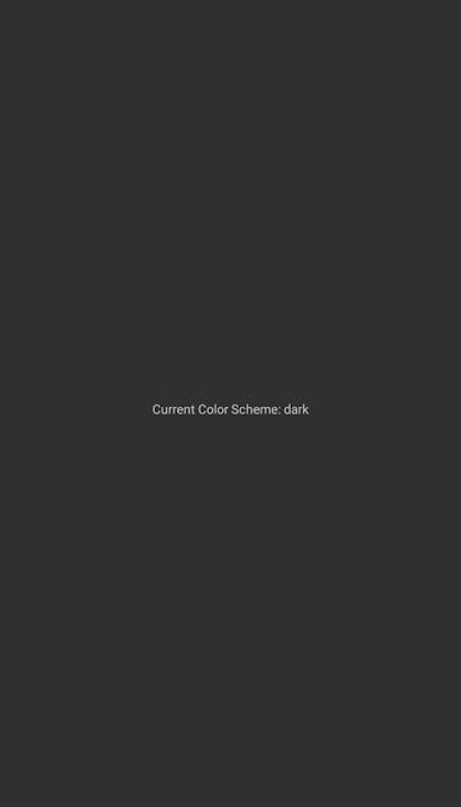
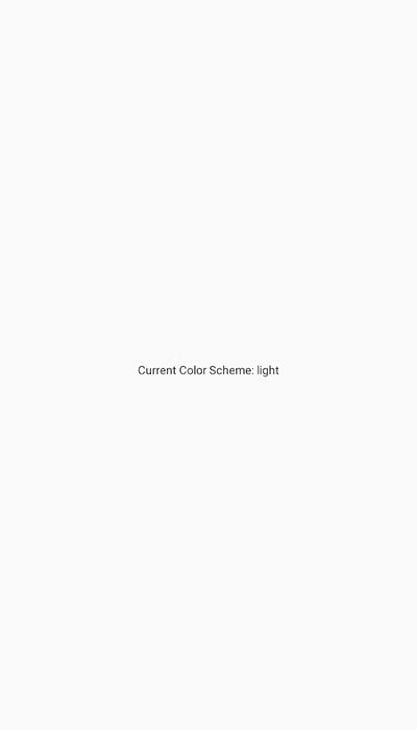
The output will display the current color scheme. For example, my output shows a dark color scheme because that’s my preferred system theme:
If your device is in light mode, then your output will show the light color scheme.
With the value returned by useColorScheme, we can then design for when users choose either dark or light mode. Let’s examine the code snippet below:
/* App.js */

import React from 'react';
import {Text, StyleSheet, useColorScheme, View} from 'react-native';

const App = () => {
 const colorScheme = useColorScheme();

 return (
 <View style={styles.container}>
 <Text
 style={{
 color: colorScheme === 'light' ? '#000' : '#fff',
 }}>
 Current Color Scheme: {colorScheme}
 </Text>
 </View>
 );
};
const styles = StyleSheet.create({
 container: {
 flex: 1,
 alignItems: 'center',
 justifyContent: 'center',
 },
});
export default App;
In the code above, we are styling our text according to the color scheme. When users select dark mode, we style the text with white color to make it visible in dark mode. Conversely, we style the text with black color when users are in light mode.
We can also use the Color object provided by react-native/Libraries/NewAppScreen to style our text. The NewAppScreen is a default component that React Native provides us as a starting point for creating our screens. It functions like a template and can be used as shown below:
/* App.js */

import React from 'react';
import {Text, StyleSheet, useColorScheme, View} from 'react-native';
import {Colors} from 'react-native/Libraries/NewAppScreen';

const App = () => {
 const colorScheme = useColorScheme();
 const color = colorScheme === 'light' ? Colors.darker : Colors.lighter;

 return (
 <View style={styles.container}>
 <Text style={{color: color}}>Current Color Scheme: {colorScheme}</Text>
 </View>
 );
};
const styles = StyleSheet.create({
 container: {
 flex: 1,
 alignItems: 'center',
 justifyContent: 'center',
 },
});
export default App;
In the code above, we imported our NewAppScreen module. Using the Color object, which has a set of predefined values or Colors, we assign the lighter color to be our text color when the user is in dark mode and the darker color when the user chooses light mode:
If we change our device theme to light mode, our output will look like this:
So far, we’ve explored how to check the current mode or color scheme of our device. We have also briefly seen how to use the returned value of the useColorScheme Hook to style our application accordingly.
In this section, we will be looking at how to switch between themes dynamically and how to persist in the current state of our theme.
First, let’s install the async-storage package. This package allows us to save JSON strings in our device’s local storage. It works similarly to local storage, session storage, and cookies on the web:
/* npm */
npm install @react-native-async-storage/async-storage

/* yarn */
yarn add @react-native-async-storage/async-storage

/* expo */
npx expo install @react-native-async-storage/async-storage
In your App.js file, copy and paste the code below:
/* App.js */

import React from 'react';
import Home from './src/Home';
import {ThemeProvider} from './context/ThemeContext';

const App = () => {
 return (
 <ThemeProvider>
 <Home />
 </ThemeProvider>
 );
};
export default App;
We imported two components in the code above — ThemeContext and Home. Our ThemeContext component will house our theme’s context and current state, while Home will be our home page.
We’re wrapping the Home page with ThemeContext because we want the themes to be accessible to the rest of the application.
context for theme managementNext, create a folder called context. Inside that folder, create a file named ThemeContext.js with the following code:
/* context/ThemeContext.js */

import React, {createContext, useState, useEffect} from 'react';
import AsyncStorage from '@react-native-async-storage/async-storage';

const ThemeContext = createContext();

export const ThemeProvider = ({children}) => {
 const [theme, setTheme] = useState('light');

 useEffect(() => {
 // Load saved theme from storage
 const getTheme = async () => {
 try {
 const savedTheme = await AsyncStorage.getItem('theme');
 if (savedTheme) {
 setTheme(savedTheme);
 }
 } catch (error) {
 console.log('Error loading theme:', error);
 }
 };
 getTheme();
 }, []);

 const toggleTheme = newTheme => {
 setTheme(newTheme);
 AsyncStorage.setItem('theme', newTheme)
 };

 return (
 <ThemeContext.Provider value={{theme, toggleTheme}}>
 {children}
 </ThemeContext.Provider>
 );
};
export default ThemeContext;
We manage our state and persist our current state value in the ThemeContext.js file with async-storage. Since strings passed to local storage remain unchanged unless modified or deleted, we can always retrieve the last saved value and set it as our current theme state, as demonstrated in the code above.
Finally, we pass our theme state and toggleTheme function to our ThemeContext.Provider. This makes it accessible to the rest of the app so that we can call the toggleTheme function to perform our switches.
button componentNext, let’s create a Home.js file and copy in the following code:
/* Home */

import React, {useContext} from 'react';
import {View, Text, StyleSheet, TouchableOpacity} from 'react-native';
import ThemeContext from '../context/ThemeContext';

const Home = () => {
 const {theme, toggleTheme} = useContext(ThemeContext);

 const handleToggleTheme = () => {
 const newTheme = theme === 'light' ? 'dark' : 'light';
 toggleTheme(newTheme);
 };

 const styles = StyleSheet.create({
 container: {
 flex: 1,
 alignItems: 'center',
 justifyContent: 'center',
 backgroundColor: theme === 'dark' ? 'black' : 'white',
 },
 text: {
 color: theme === 'dark' ? 'white' : 'black',
 },
 button: {
 color: theme === 'dark' ? 'black' : 'white',
 },
 });

 return (
 <View style={styles.container}>
 <Text style={styles.text}>Home page</Text>
 <TouchableOpacity
 onPress={handleToggleTheme}
 style={{
 marginTop: 10,
 paddingVertical: 5,
 paddingHorizontal: 10,
 backgroundColor: theme === 'dark' ? '#fff' : '#000',
 }}>
 <Text style={styles.button}>
 Switch to {theme === 'light' ? 'Dark' : 'Light'} Theme
 </Text>
 </TouchableOpacity>
 </View>
 );
};
export default Home;
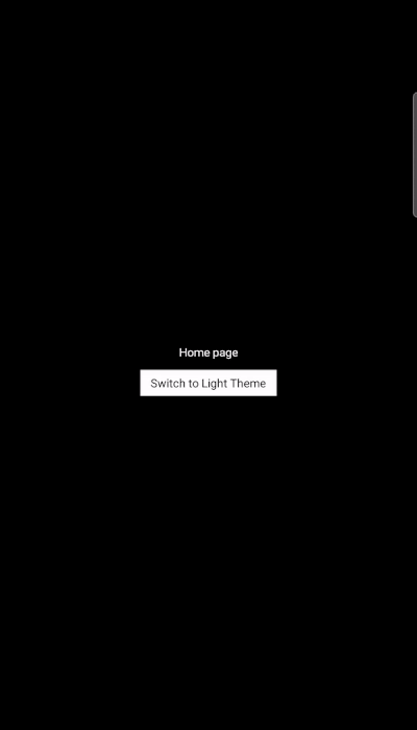
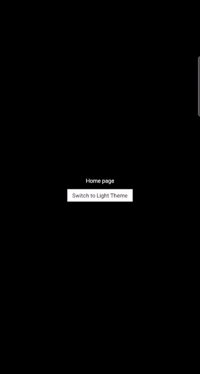
In the code above, we’re retrieving the theme value and toggleTheme function that we passed to our Context API. Using the returned value, we can style our page designs depending on the theme value. We also pass our toggleTheme function to our button component.
The output will look like this:
We‘ve now seen how to switch between themes, specifically light and dark modes. The final step is to detect the system color scheme and accurately switch the theme of the application accordingly.
That means if your mobile device is in light mode, the application’s theme will also be in light mode. Then, if you switch your system or mobile device to a dark mode, the application automatically adjusts its theme state to a dark theme. We’ll also discuss persisting the state.
To accomplish this, we’ll modify the code we already have above. In your ThemeContext.js file, copy and paste the following code:
/* ThemeContext */

import React, {createContext, useState, useEffect} from 'react';
import {useColorScheme} from 'react-native';
import AsyncStorage from '@react-native-async-storage/async-storage';

const ThemeContext = createContext();

export const ThemeProvider = ({children}) => {
 const colorScheme = useColorScheme();
 const [theme, setTheme] = useState(colorScheme || 'light');

 useEffect(() => {
 // Load saved theme from storage
 const getTheme = async () => {
 try {
 const savedTheme = await AsyncStorage.getItem('theme');
 if (savedTheme) {
 setTheme(savedTheme);
 }
 } catch (error) {
 console.log('Error loading theme:', error);
 }
 };
 getTheme();
 }, []);

 useEffect(() => {
 // set theme to system selected theme
 if (colorScheme) {
 setTheme(colorScheme);
 }
 }, [colorScheme]);

 const toggleTheme = newTheme => {
 setTheme(newTheme);
 // Save selected theme to storage
 AsyncStorage.setItem('theme', newTheme);
 };

 return (
 <ThemeContext.Provider value={{theme, toggleTheme}}>
 {children}
 </ThemeContext.Provider>
 );
};
export default ThemeContext;
In the code above, when we select a theme, we also save it to our local storage. This means when our application loads, we can check if there’s an existing theme in our local storage. If there is, then we set that theme to be our preferred theme. Otherwise, we will not set any theme.
The resulting React Native theme switcher app will look like this:
In certain scenarios, we may want to give users multiple theme options, such as:
For example, some users might be using the light theme for their mobile devices, but they may prefer and want to use the dark theme of a certain application. In this instance, we don’t want to use the system’s light theme for the application. Instead, we want to specify a dark theme.
To do this, copy the code below into your ThemeContext.js file:
/* ThemeContext.js */

 ....

 const toggleTheme = (newTheme) => {
 setTheme(newTheme);
 AsyncStorage.setItem('theme', newTheme); // Save selected theme to storage
 };

 const useSystemTheme = () => {
 setTheme(colorScheme);
 AsyncStorage.setItem('theme', colorScheme);
 };

 return (
 <ThemeContext.Provider value={{ theme, toggleTheme, useSystemTheme }}>
 {children}
 </ThemeContext.Provider>
 );
};
export default ThemeContext;
The first function allows us to change themes between dark and light themes, as we have seen in the other examples. The second function allows us to use the system’s or device’s default theme — we set our theme to be whatever our device theme is at the point.
Then, in your Home.js file, we will create three buttons to specify each theme. See the code below:
/*Home.js*/

....imports....

const Home = () => {
 const systemTheme = useColorScheme();
 const { theme, toggleTheme, useSystemTheme } = useContext(ThemeContext);

const styles = StyleSheet.create({
 ......
 });

 return (
 <View style={styles.container}>
 <Text style={styles.text}>Current Theme: {theme}</Text>
 <Text style={styles.text}>System Theme: {systemTheme}</Text>
 <TouchableOpacity
 onPress={() => toggleTheme('light')}
 style={{
 marginTop: 10,
 paddingVertical: 5,
 paddingHorizontal: 10,
 backgroundColor: theme === 'dark' ? '#fff' : '#000',
 }}
 >
 <Text style={styles.button}>Light Theme</Text>
 </TouchableOpacity>
 <TouchableOpacity
 onPress={() => toggleTheme('dark')}
 style={{
 marginTop: 20,
 paddingVertical: 5,
 paddingHorizontal: 10,
 backgroundColor: theme === 'dark' ? '#fff' : '#000',
 }}
 >
 <Text style={styles.button}>Dark Theme</Text>
 </TouchableOpacity>
 <TouchableOpacity
 onPress={() => useSystemTheme()}
 style={{
 marginTop: 20,
 paddingVertical: 5,
 paddingHorizontal: 10,
 backgroundColor: theme === 'dark' ? '#fff' : '#000',
 }}
 >
 <Text style={styles.button}>System Theme</Text>
 </TouchableOpacity>
 </View>
 );
};
export default Home;
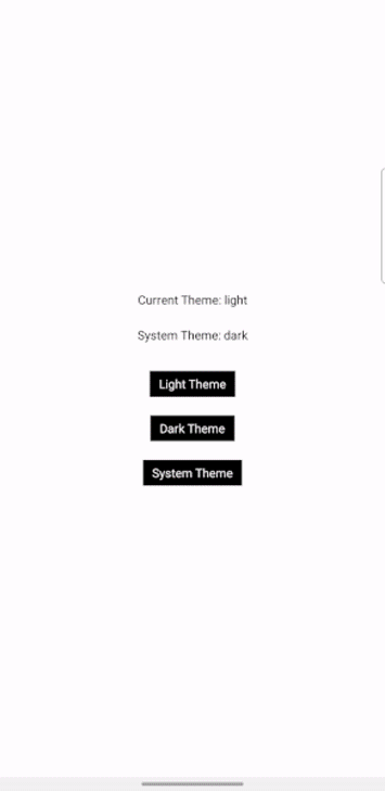
With these three buttons, we can choose whatever theme we want. The code above also allows us to see the current theme of our application — in other words, whatever theme we have currently selected — as well as our system’s theme, which may be different from our current theme.
With this, we can either choose to use our system’s theme automatically or choose a different theme for our application:
As you can see, our chosen theme will persist even after closing and reopening the application.
In this article, we’ve seen how to implement a toggling function, persist the state of each selection, and toggle between themes based on the user’s system choice.
Toggling between themes is a common feature in app development today. Giving users the choice of their preferred theme and persisting it even after the user closes the app enhances UX and makes your application more appealing.
The full project code is available on GitLab. If you have any remaining questions, feel free to comment them below. Otherwise, until the next article, ciao!
LogRocket's Galileo AI watches sessions for you and and surfaces the technical and usability issues holding back your React Native apps.
LogRocket also helps you increase conversion rates and product usage by showing you exactly how users are interacting with your app. LogRocket's product analytics features surface the reasons why users don't complete a particular flow or don't adopt a new feature.
Start proactively monitoring your React Native apps — try LogRocket for free.
Build dynamic LLM routing in Next.js with OpenRouter, TanStack AI, task classification, model fallbacks, and cost-aware routing.
TSRX adds first-class control flow, conditional hooks, and scoped styles to React via a TypeScript compiler extension — no new framework required.
Learn how to build a full React Native auth system using Better Auth and Expo — with email/password login, Google OAuth, session persistence, and protected routes.
Compare the top AI development tools and models of June 2026. View updated rankings, feature breakdowns, and find the best fit for you.
Would you be interested in joining LogRocket's developer community?
Join LogRocket’s Content Advisory Board. You’ll help inform the type of content we create and get access to exclusive meetups, social accreditation, and swag.
Sign up now