 |
VOOZH | about |
|
VOOZH | about |
Bulma CSS is a popular, open source CSS framework with a sleek, modern design and user-friendly components. It simplifies frontend development by providing a set of pre-designed, responsive, and customizable UI elements that can be easily integrated into any web project.
👁 Bulma Css Adoption Guide: Overview, Examples, And AlternativesWith its growing popularity and active community support, Bulma CSS has become a relevant player in the frontend landscape today. It offers developers a powerful tool to streamline workflows and create beautiful, functional web applications.
The Replay is a weekly newsletter for dev and engineering leaders.
Delivered once a week, it's your curated guide to the most important conversations around frontend dev, emerging AI tools, and the state of modern software.
Bulma CSS was created in 2016 by Jeremy Thomas. With over 48,000 stars on GitHub and over 250,000 estimated weekly downloads, it has gained immense popularity among developers.
The framework was developed to tackle the typical problems that developers encounter when building frontend applications. For example, building responsive designs from scratch can be tedious and time-consuming. With Bulma, developers can easily create designs that work seamlessly across different devices.
Another problem Bulma addresses is the need for a modern and clean design. The framework provides an extensive library of components that websites commonly use, such as buttons, forms, cards, menus, and more. These components are designed to be simple, readable, and customizable.
Since its release, Bulma has undergone significant changes and improvements. It is a CSS-only framework, which makes it lightweight and fast to load. The framework is based on Flexbox, a CSS layout module that enables developers to create flexible and responsive layouts.
It is also built with web standards and best practices, making it a reliable and robust choice for building frontend applications. Its modular architecture allows components to be added easily without relying on complex dependencies or extra code.
Bulma is a powerful and versatile CSS framework that can help you easily create beautiful, responsive, and modern websites. Here are some reasons why you might want to use Bulma for your next project:
While Bulma is an excellent choice for many projects, there are some cases when you might want to avoid using it. Here are some cons to consider:
However, if these downsides don’t apply to your project and you’re interested in taking advantage of this framework’s many benefits, let’s next take a look at how to get started with Bulma.
Getting started with Bulma is a simple process. You have two options: use the pre-compiled .css file or install the .sass file and customize it according to your requirements.
If you want to go with the first option, you can utilize the CDN link in your HTML or CSS file, or download the zip file from GitHub:
//html file
<link
 rel="stylesheet"
 href="https://cdn.jsdelivr.net/npm/[email protected]/css/bulma.min.css"
>

//css file
@import "https://cdn.jsdelivr.net/npm/[email protected]/css/bulma.min.css";
Otherwise, you can install the .sass files via npm to use them:
npm install bulma
// or
yarn add bulma
Bulma also provides a right-to-left (RTL) version for developers who want to create websites and applications in languages read from right to left, such as Arabic and Hebrew. You can access it using the CDN link in your HTML or CSS file:
//html file
<link
 rel="stylesheet"
 href="https://cdn.jsdelivr.net/npm/[email protected]/css/bulma-rtl.min.css"
>
//css file
@import "https://cdn.jsdelivr.net/npm/[email protected]/css/bulma-rtl.min.css";
The .css file is a single CSS file, while the .scss files break the CSS down into multiple files, allowing you to import only the ones you need. Here is a basic example of how to use it:
//html file
<section class="section">
 <div class="container">
 <h1 class="title">
 Hello World
 </h1>
 <p class="subtitle">
 My first website with <strong>Bulma</strong>!
 </p>
 </div>
</section>
//css file
@import "https://cdn.jsdelivr.net/npm/[email protected]/css/bulma.min.css";
You can see the CodePen preview below as well:
See the Pen How to use Bulma CSS by Timonwa Akintokun (@timonwa)
on CodePen.
Below are some key features of Bulma that you should know.
Bulma prioritizes mobile devices and has been designed to be fully responsive. This makes it ideal for building mobile-friendly websites and web applications. It provides four breakpoints, which you can use to define five different screen sizes:
Bulma follows a consistent naming convention for class names, such as button, box, content, input, and so on. This makes it easier for developers to identify and use these elements in their code.
It’s also easy to create variants of Bulma elements using modifiers. For example, suppose you wanted to make a primary or outlined button. In that case, you could add the is-primary or is-outlined modifier. If you’re going to make an input rounded, you can add the is-rounded modifier:
<button class="button is-primary is-outlined">Primary Button</button>
<input class="input is-rounded" type="text" placeholder="Rounded Input">
The code above would yield the following:
👁 Demo Usage Of Bulma Modifiers To Create A Primary Button Variant And Rounded Input Variant
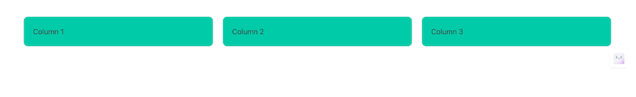
Bulma provides a powerful grid system that makes it easy to create complex layouts. The grid system consists of 12 columns that can be combined in different ways to create different layouts. Each column will also have equal width by default. Here’s an example usage of Bulma’s grid system:
<div class="columns">
 <div class="column">Column 1</div>
 <div class="column">Column 2</div>
 <div class="column">Column 3</div>
</div>
And here’s how it would look:
👁 Demo Of Bulma Css Grid System With Example Of Three Columns In One Row
Bulma comes with a wide range of CSS components that you can use to style your website or web application. These components include buttons, forms, menus, modals, tabs, skeleton loaders, and more:
<head>
 <link rel="stylesheet" href="https://cdn.jsdelivr.net/npm/[email protected]/css/bulma.min.css">
</head>
<body>
 <section class="section">
 <div class="container is-max-desktop">
 <h1 class="title">Contact Form</h1>
 <form>
 <div class="field">
 <label class="label">Name</label>
 <div class="control">
 <input class="input" type="text" placeholder="Enter your name">
 </div>
 </div>
 <div class="field">
 <label class="label">Email</label>
 <div class="control">
 <input class="input" type="email" placeholder="Enter your email">
 </div>
 </div>
 <div class="field">
 <label class="label">Message</label>
 <div class="control">
 <textarea class="textarea" placeholder="Enter your message"></textarea>
 </div>
 </div>
 <div class="field">
 <div class="control">
 <button class="button is-primary">Submit</button>
 </div>
 </div>
 </form>
 </div>
 </section>
</body>
You can view the CodePen preview here:
See the Pen Creating a form with Bulma CSS by Timonwa Akintokun (@timonwa)
on CodePen.
Bulma is highly customizable, so you can easily modify its styles to match your brand or design requirements. All of its components are styled using Sass variables and CSS variables, which you can easily override.
Bulma provides two default themes: light and dark. However, if you’re looking for something more personalized, you have the option to create your own custom themes by adding CSS variables to the CSS or Sass files.
Bulma offers support for dark mode, a popular theme choice for many websites. This feature allows users to switch to a darker color scheme that is easier on the eyes, particularly when viewing websites in low-light environments. Additionally, users can customize their website’s theme by selecting from various color options or manually setting their preferences.
Here are some practical cases where web developers can use Bulma CSS:
There are many CSS frameworks other than Bulma with their own strengths and ideal use cases. Let’s dive into various points of comparison to help you better understand and assess the similarities and differences between Bulma and alternatives like Tailwind, Bootstrap, and Chakra UI.
| Feature | Bulma CSS | Tailwind CSS | Bootstrap | Chakra UI |
|---|---|---|---|---|
| Learning curve | Relatively simple learning curve with intuitive class names | Steeper learning curve due to extensive utility classes | Moderate learning curve with extensive documentation | Moderate learning curve with focus on accessibility and theming |
| Documentation and resources | Comprehensive documentation with examples and tutorials | Extensive documentation, including video tutorials, official plugins, and UI kits | Extensive documentation with numerous resources, tutorials, and themes | Well-documented with focus on accessibility and theming support |
| Performance | Lightweight and efficient, but not as optimized for utility as Tailwind | Highly optimized for utility classes, but can result in larger CSS file size | Moderate file size, optimized for performance with built-in utilities | Optimized for performance with built-in theming and component library |
| Customization | Highly customizable with variables with theming support | Highly customizable with utility classes | Customizable through variables and Sass mixins | Highly customizable with theming support and prop-based API |
| Features | Modular components and responsive design | Extensive utility classes for rapid prototyping | Comprehensive set of components and built-in utilities | Accessible component library with focus on design systems |
| Accessibility | Accessibility features may require additional customization | Accessibility features built into utility classes | Accessibility features built into components | Strong focus on accessibility with inbuilt features and guidelines |
| Community | Active community with a decent-sized user base and contributions | Large and rapidly growing community with extensive resources and plugins | Massive community with extensive documentation, support, and resources | Growing community with focus on accessibility and design systems |
Overall, each CSS framework offers its own strengths and caters to different preferences and project requirements. Developers should evaluate their specific needs and priorities when choosing a framework for their projects.
Bulma CSS is a lightweight and modern CSS framework that simplifies frontend development by providing customizable, responsive, and pre-designed UI elements. It’s easy to use and has a shallow learning curve, making it an excellent choice for beginners.
Bulma’s strengths lie in its performance, ease of use, and community support. However, it might not be the best choice for highly customized designs or projects that require a lot of JavaScript functionality.
Overall, Bulma is a powerful and versatile framework that can help you create beautiful, responsive, and modern websites.
As web frontends get increasingly complex, resource-greedy features demand more and more from the browser. If you’re interested in monitoring and tracking client-side CPU usage, memory usage, and more for all of your users in production, try LogRocket.
👁 LogRocket Dashboard Free Trial BannerLogRocket lets you replay user sessions, eliminating guesswork around why bugs happen by showing exactly what users experienced. It captures console logs, errors, network requests, and pixel-perfect DOM recordings — compatible with all frameworks.
LogRocket's Galileo AI watches sessions for you, instantly identifying and explaining user struggles with automated monitoring of your entire product experience.
Modernize how you debug web and mobile apps — start monitoring for free.
TSRX adds first-class control flow, conditional hooks, and scoped styles to React via a TypeScript compiler extension — no new framework required.
Learn how to build a full React Native auth system using Better Auth and Expo — with email/password login, Google OAuth, session persistence, and protected routes.
Compare the top AI development tools and models of June 2026. View updated rankings, feature breakdowns, and find the best fit for you.
Learn how Bloom filters reduce database lookups for username availability checks while preserving correctness at scale.
Hey there, want to help make our blog better?
Join LogRocket’s Content Advisory Board. You’ll help inform the type of content we create and get access to exclusive meetups, social accreditation, and swag.
Sign up now