 |
VOOZH | about |
|
VOOZH | about |
Editor’s note: This Tailwind CSS and React tutorial was last updated on 19 February 2021 to reflect changes introduced with the latest Tailwind CSS release, Tailwind CSS v2.0. The instructions and configurations described herein have been updated accordingly.
👁 tailwind css and craRecently, I tried using Tailwind CSS in a React project bootstrapped by the Create React App (CRA) boilerplate and ran into difficulties setting up Tailwind CSS as CRA abstracts configuration.
To make custom configurations, you would have to eject Create React App to have full access to tinker with the configurations, which also means a much more tedious setup — and should anything break, you’re on your own. I tinkered a bit, and after several Google searches, I found a better way to get it done.
In this tutorial, we’ll demonstrate how to to make Tailwind CSS work inside your React project without having to eject Create React App.
To follow along with this tutorial, you should have
The Replay is a weekly newsletter for dev and engineering leaders.
Delivered once a week, it's your curated guide to the most important conversations around frontend dev, emerging AI tools, and the state of modern software.
First, open your terminal and type the following commands to create a new project.
#using NPX
npx create-react-app tailwindreact-app

#using NPM
npm init react-app tailwindreact-app

#using yarn
yarn create react-app tailwindreact-app
create-react-app is the official React build tool for scaffolding new React projects. It leverages webpack and babel and reduces the hassle of configuring and setting up the build processes for projects, allowing you to focus on writing the code that powers your app.
Add cd to your app directory:
cd tailwindreact-app
Next, install Tailwind and its dependencies:
#using npm
npm install -D tailwindcss@npm:@tailwindcss/postcss7-compat @tailwindcss/postcss7-compat postcss@^7 autoprefixer@^9

#using Yarn
yarn add tailwindcss@npm:@tailwindcss/postcss7-compat @tailwindcss/postcss7-compat postcss@^7 autoprefixer@^9 -D
Create React App does not support PostCSS 8 yet, so we’ll install the version of PostCSS 7 that is compatible with Tailwind CSS v2.
As stated in the PostCSS documentation:
PostCSS is a tool for transforming styles with JS plugins. These plugins can lint your CSS, support variables and mixins, transpile future CSS syntax, inline images, and more.
Autoprefixer is a PostCSS plugin that parses your CSS and adds/removes unnecessary vendor prefixes in your compiled CSS rules. It can help you add prefixes for animations, transition, transform, grid, flex, flexbox, etc.
Since Create React App doesn’t let you override the PostCSS configuration by default, we’ll need to install CRACO to configure Tailwind.
#using npm
npm install @craco/craco

#using Yarn
yarn add @craco/craco
CRACO, short for Create React App configuration override, is an easy and comprehensible configuration layer for Create React App. It provides all the benefits of create-react-app and customization and eliminates the need to “eject” your app by adding a craco.config.js file at the root of your application to customize with your eslint, babel and PostCSS configurations.
First, create a CRACO configuration file in your base directory, either manually or using the following command:
touch craco.config.js
Next, add tailwindcss and autoprefixer as PostCSS plugins to your CRACO config file:
// craco.config.js
module.exports = {
 style: {
 postcss: {
 plugins: [
 require('tailwindcss'),
 require('autoprefixer'),
 ],
 },
 },
}
Configure your app to use craco to run development and build scripts.
Open your package.json file and replace the content of "scripts" with:
 "start": "craco start",
 "build": "craco build",
 "test": "craco test",
 "eject": "react-scripts eject"
Your scripts file should look like this:
 "scripts": {
 "start": "craco start",
 "build": "craco build",
 "test": "craco test",
 "eject": "react-scripts eject"
}
Create the default configurations scaffold:
npx tailwindcss init
This command creates a tailwind.config.js in your project’s base directory. The file houses all of Tailwind’s default configuration. We can also add an optional --full flag to generate a configuration file with all the defaults Tailwind comes with.
You’ll get a file that matches the default configuration file Tailwind uses internally.
Inside your src folder create a folder named styles. This is where all your styles will be stored.
Inside that folder, create a tailwind.css and an index.css file.
The index.css file is where we’ll import tailwind’s base styles and configurations. tailwind.css will contain the compiled output of the index.css.
add the following to your index.css file.
//index.css
@tailwind base;

@tailwind components;

@tailwind utilities;
@tailwind is a tailwind directive that is used to inject default base styles, components, utilities and custom configurations.
@tailwind base **injects Tailwind’s base styles, which is a combination of Normalize.css and some additional base styles.
@tailwind components injects any component (small reusable styles such as buttons, form elements, etc.) classes registered by plugins defined in your tailwind config file.
Below the component import is where you would add any of your custom component classes — things that you’d want to be loaded before the default utilities so the utilities could still override them.
Here’s an example:
.btn { ... }
.form-input { ... }
@tailwind utilities injects all of Tailwind’s utility classes (including the default and your utilities), which are generated based on your config file.
Below the utilities import is where you would add any custom utilities you need that don’t come out of the box with Tailwind.
Example:
.bg-pattern-graph-paper { ... }

.skew-45 { ... }
Tailwind swaps all these directives out at build time and replaces them with the CSS generated.
To configure your app to use CRACO to build your styles every time you run the npm start or yarn start command, open your package.json file and replace the content of "scripts" with:
 "scripts": {
 "build:style": "tailwind build src/styles/index.css -o src/styles/tailwind.css",
 "start": "craco start",
 "build": "craco build",
 "test": "craco test",
 "eject": "react-scripts eject"
 },
To import your CSS to the app, open your index.js file and import your Tailwind styles:
import './styles/tailwind.css';
Delete the index.css and app.css files in your projects root directory and remove their corresponding import statements in the Index.js and App.js files, respectively.
Your index.js file should look similar to this:
// index.js
import React from 'react';
import ReactDOM from 'react-dom';
import App from './App';
import reportWebVitals from './reportWebVitals';
After deletion, it should become:
//index.js
import React from 'react';
import ReactDOM from 'react-dom';
import './styles/tailwind.css';
import App from './App';
import reportWebVitals from './reportWebVitals';
Your App.js file should look like this before deletion:
//App.js
import logo from './logo.svg';
import './App.css';
After deletion, it should become:
//App.js
import logo from './logo.svg';
These changes would cause an output similar to this:
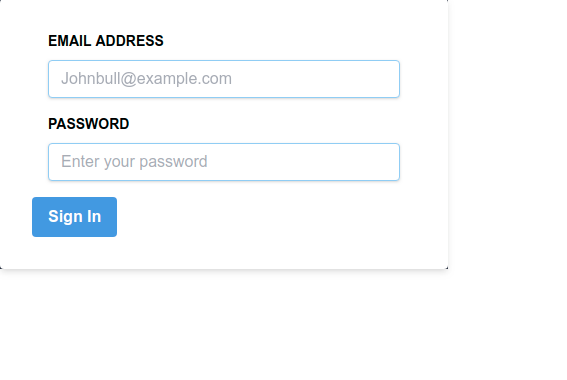
To test that our configurations work correctly, let’s create a simple sign-in form.
Open your App.js file and replace the content between the return function with the following:
 <section className="App h-screen w-full flex justify-center items-center bg-green-500">
 <div className="w-full max-w-md bg-gray-800" >
 <form action="" className=" bg-white shadow-md rounded px-8 py-8 pt-8">
 <div className="px-4 pb-4">
 <label htmlFor="email" className="text-sm block font-bold pb-2">EMAIL ADDRESS</label>
 <input type="email" name="email" id="" className="shadow appearance-none border rounded w-full py-2 px-3 text-gray-700 leading-tight focus:outline-none focus:shadow-outline border-blue-300 " placeholder="[email protected]" />
 </div>
 <div className="px-4 pb-4">
 <label htmlFor="password" className="text-sm block font-bold pb-2">PASSWORD</label>
 <input type="password" name="email" id="" className="shadow appearance-none border rounded w-full py-2 px-3 text-gray-700 leading-tight focus:outline-none focus:shadow-outline border-blue-300" placeholder="Enter your password" />
 </div>
 <div>
 <button className="bg-blue-500 hover:bg-blue-700 text-white font-bold py-2 px-4 rounded focus:outline-none focus:shadow-outline" type="button">Sign In</button>
 </div>
 </form>
 </div>
 </section>
We gave the paren section width of 100% with w-full. We also gave it a vertical height of 100vh with h-screen. Then we gave the element a display property of flex and aligned it to the center vertically and horizontally with justify-center and items-center.
We gave the child div a width of 100% with w-full and set the max-width with max-w-md for medium screens and larger.
We gave the form a white background with bg-white and a border radius to achieve the curved borders with border. px-8 and py-8 add a padding of 8px to the x-axis and y-axis, respectively, while pt-8 adds a padding of 8px to the top of the form.
We added a font-size of .875rem to the label element with text-sm, gave the element a display of block, and set the font-weight to a value of 700 with font-bold.
On the input element, we gave the element some box shadow with shadow and used .appearance-none to reset any browser-specific styling on the input element.
We added a line-height of 1.25 with leading-tight and used the pseudo class focus to remove browser-specific outlining of the focused input element with focus:outline-none and added a bit of box shadow with focus:shadow-outline.
You should get a result similar to this:
Check out an editable example on CodeSandbox.
In this post, we reviewed how to configure Create React App to use Tailwind CSS. Tailwind has awesome documentation. Check it out for more information. You can also access the code used in this tutorial on GitHub.
Install LogRocket via npm or script tag. LogRocket.init() must be called client-side, not
server-side
$ npm i --save logrocket

// Code:

import LogRocket from 'logrocket';
LogRocket.init('app/id');
// Add to your HTML:

<script src="https://cdn.lr-ingest.com/LogRocket.min.js"></script>
<script>window.LogRocket && window.LogRocket.init('app/id');</script>
TSRX adds first-class control flow, conditional hooks, and scoped styles to React via a TypeScript compiler extension — no new framework required.
Learn how to build a full React Native auth system using Better Auth and Expo — with email/password login, Google OAuth, session persistence, and protected routes.
Compare the top AI development tools and models of June 2026. View updated rankings, feature breakdowns, and find the best fit for you.
Learn how Bloom filters reduce database lookups for username availability checks while preserving correctness at scale.
Hey there, want to help make our blog better?
Join LogRocket’s Content Advisory Board. You’ll help inform the type of content we create and get access to exclusive meetups, social accreditation, and swag.
Sign up now