 |
VOOZH | about |
|
VOOZH | about |
Editor’s note: This article was peer-reviewed for accuracy by Nelson Michael and updated on 25 July 2024 to define and demonstrate Tailwind’s transition utilities, demonstrate how to combine Tailwind classes with custom CSS for more complex animations, provide information related to Tailwind’s Just-in-Time engine, and more.
👁 Creating Custom Animations With Tailwind CssTailwind CSS is a utility-first CSS framework that has shown tremendous growth in its adoption, making it a popular choice for all your styling needs. While it allows you to build modern websites without writing a single line of CSS, styling a website is only part of providing a positive user experience.
Crafting meaningful interactions via animations plays an important role in capturing the visitor’s attention, too, and they can take your website to the next level. In this post, you’ll learn how to use CSS animations with Tailwind CSS, explore the built-in animations it comes with, and create custom animations for that extra flair.
The Replay is a weekly newsletter for dev and engineering leaders.
Delivered once a week, it's your curated guide to the most important conversations around frontend dev, emerging AI tools, and the state of modern software.
CSS animations is a CSS module that lets you animate the values of CSS properties through keyframes. The nature of these keyframe animations can be altered by tweaking its properties such as duration, easing function, direction, delay, and more.
Just like other CSS properties and modules, Tailwind CSS also ships with some utility classes for CSS animations. By default, it comes with four basic animations: spin, pulse, ping, and bounce.
These utility classes are prefixed by the animate keyword, such as animate-spin or animate-pulse. Let’s take the animate-spin utility as an example.
This utility class is used to add a linear and infinite spin animation to your HTML elements. This is especially useful for loading indicators, such as the ones that you might find on a button in forms.
Here’s a code snippet that shows you how to add an infinite spinning animation to an SVG. You can toggle this utility class depending upon the state of your app:
<button type="button" class="bg-indigo-500 ..." disabled>
 <svg class="animate-spin h-5 w-5 mr-3 ..." viewBox="0 0 24 24">
 <!-- ... -->
 </svg>
 Loading...
</button>
Here’s the resulting button component with its infinite spinning animation:
👁 Infinite Spinning Animation On Loading Button
Using animation in such cases helps the user understand that their action has been acknowledged and the appropriate response is being triggered. Besides functionality, animations can also be used just for aesthetics.
To check out the other built-in animations in action, I recommend you to check out the official Tailwind CSS documentation. Using built-in CSS for animations is ideal for projects that already have a dedicated stylesheet linked to the markup and do not require Tailwind CSS as a dependency.
While the four built-in CSS animations might be sufficient for some general use cases, you might not want to be restricted to only these. Animations are highly project-specific, and perhaps you want to use custom animations instead.
Thankfully, there’s no need to create a new stylesheet and link it to your markup just to add a new animation to your app. Instead, define the keyframes of your animation and extend the theme configuration to create a new animation:
👁 Custom Waving Hand Animation Example Tailwind Css
Let’s assume we want to create a custom waving hand animation like the one above and use it with Tailwind CSS. Here’s how.
@keyframes to a Tailwind CSS config fileFirst, we must define a keyframes rule for the animation. The @keyframes CSS at-rule is used to define the value of CSS properties of an element during the initial, intermediate and final waypoints of the animation. Through this, you can have multiple different styles at different stages of the animation.
If you’re new to keyframes or unfamiliar with its syntax, check out this blog post. In plain CSS, here’s what our keyframes for this animation will look like:
@keyframes wave {
 0% { transform: rotate( 0.0deg) }
 10% { transform: rotate(14.0deg) }
 20% { transform: rotate(-8.0deg) }
 30% { transform: rotate(14.0deg) }
 40% { transform: rotate(-4.0deg) }
 50% { transform: rotate(10.0deg) }
 60% { transform: rotate( 0.0deg) }
 100% { transform: rotate( 0.0deg) }
}
Open up the tailwind.config.js file inside the root of your project directory and create an empty keyframes object inside theme.extend. Now, inside this keyframes object, let’s add our new wave animation and define its behavior.
module.exports = {
 content: [
 './pages/**/*.{js,ts,jsx,tsx}',
 './components/**/*.{js,ts,jsx,tsx}',
 ],
 theme: {
 extend: {
 keyframes: {
 wave: {
 '0%': { transform: 'rotate(0.0deg)' },
 '10%': { transform: 'rotate(14deg)' },
 '20%': { transform: 'rotate(-8deg)' },
 '30%': { transform: 'rotate(14deg)' },
 '40%': { transform: 'rotate(-4deg)' },
 '50%': { transform: 'rotate(10.0deg)' },
 '60%': { transform: 'rotate(0.0deg)' },
 '100%': { transform: 'rotate(0.0deg)' },
 },
 },
 },
 },
 plugins: [],
}
The content array in your Tailwind CSS config file might look different for you depending on the frontend framework or library you’re using, if any. But the main thing to focus on in the above snippet is the keyframes object.
Now that we’ve added the keyframes rule to our theme object inside tailwind.config.js, let’s add our custom animation that uses this rule. We can customize the animation duration, delay, iterations, timing function, and more.
Let’s assume that we want the animation to transition for two seconds linearly in each cycle and keep animating infinitely. Here’s how the CSS animation shorthand property should look:
animation: wave 2s linear infinite;
Wave is the name of the keyframes rule we defined earlier. 2s is used to denote that this animation should transition for two seconds in one cycle, and linear is used to denote that we want the easing function to be linear, and infinite will keep it animating perpetually.
Let’s add this animation inside tailwind.config.js in the theme.extend.animation object:
module.exports = {
 content: [
 './pages/**/*.{js,ts,jsx,tsx}',
 './components/**/*.{js,ts,jsx,tsx}',
 ],
 theme: {
 extend: {
 keyframes: {
 wave: {
 '0%': { transform: 'rotate(0.0deg)' },
 '10%': { transform: 'rotate(14deg)' },
 '20%': { transform: 'rotate(-8deg)' },
 '30%': { transform: 'rotate(14deg)' },
 '40%': { transform: 'rotate(-4deg)' },
 '50%': { transform: 'rotate(10.0deg)' },
 '60%': { transform: 'rotate(0.0deg)' },
 '100%': { transform: 'rotate(0.0deg)' },
 },
 },
 animation: {
 'waving-hand': 'wave 2s linear infinite',
 },
 },
 },
 plugins: [],
}
Utility classes are generated based on the keys of the animation object. Because we’ve used waving-hand as the key for this animation, we need to add animate-waving-hand to the element we want to animate in our markup, like this:
<h1 class="flex font-semibold text-purple-600">
 Hello <span class="animate-waving-hand">👋🏻</span>, LogRocket Blog
</h1>
Our animation will look like this:
👁 Custom Waving Hand Tailwind Css Animation With Purple Text Reading Hello Logrocket Blog
Voila! You’ve successfully created your custom animation for your Tailwind CSS app. To add more animations, you can follow the same steps: add the keyframes to theme.extend.keyframes object, then add the animation to theme.extend.animation.
Let’s create another, slightly more complex Tailwind animation this time. We’re going build a nice custom animation for a 404 error page that we’ll display to the user:
 <div class="flex flex-col h-screen items-center justify-center relative">
 <div class="w-full h-full flex gap-12 items-center justify-center animate-rotate">
 <div class="flex-1 max-w-[350px] max-h-[350px] h-full bg-green-500 transition ease-in duration-500 rounded-full blur-[100px] shadow-[100px]"></div>

 <div class="border border-500 flex-1 h-full max-w-[400px] max-h-[400px] rounded-full bg-gradient-to-r from-yellow-400/50 to-red-500 transition ease-in duration-500 blur-[100px] shadow-[100px]"></div>
 </div>
 <div class="absolute top-0 left-0 z-20 w-full h-full flex items-center justify-center">
 <div class="gap-8">
 <p class="text-center opacity-55 text-3xl font-[300]">
 Oops, 404 error!
 </p>
 <h2 class="text-7xl opacity-95 text-center">
 Page Not Found
 </h2>
 <div class="w-full flex justify-center items-center">
 <a
 href={""}
 class="w-auto bg-primary py-3 px-[24px] box-border rounded-3xl relative z-20 text-primary-foreground flex gap-3 items-center"
 >
 Back to Home
 </a>
 </div>
 </div>
 </div>
 </div>
Here’s what our Tailwind config file looks like:
/** @type {import('tailwindcss').Config} */
export default {
 theme: {
 extend: {
 keyframes: {
 rotate: {
 "0%, 100%" : {
 transform: "rotate(0deg) scale(1.2)",
 },
 "50%": {
 transform: "scale(0.9) rotate(180deg)",
 }
 }
 },
 animation: {
 rotate: "rotate 4s cubic-bezier(0.2, 0.8, 0.2, 1) infinite"
 }
 },
 },
 plugins: [],
}
You can check out what that looks like in this live playground.
While defining animations inside the Tailwind CSS config file is the ideal way for reusable animations, you might not want to do that for a one-off animation that you’ll only use once in your entire app.
Sure, you could define another animation inside theme.extend.animation, but Tailwind CSS offers you a better way to tackle such scenarios through arbitrary values. To use them, wrap the animation properties, separated by underscores, inside a pair of square brackets after the animate keyword in the markup, like this:
animate-[animationName_easingFunction_durationInSeconds_iterationsCount_delayInSeconds_direction]
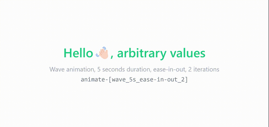
Let’s say you want to use the same wave keyframes rule, but instead of animating it linearly and infinitely for two seconds each time, you want to animate it only two times for five seconds with the ease-in-out timing function.
So, for our new animation, the utility class should look something like this:
<h1 class="flex font-semibold text-emerald-500">
 Hello <span class="animate-[wave_5s_ease-in-out_2]">👋🏻</span>, arbitrary values
</h1>
<p class="text-center text-xs text-gray-400">
 Wave animation, 5 seconds duration, ease-in-out, 2 iterations
</p>
<pre className="text-center text-xs text-gray-500">
 animate-[wave_5s_ease-in-out_2]
</pre>
Here’s the result:
👁 Custom Waving Hand Animation With Duration And Ease In Out Transition Utilities And Two Iterations
Tailwind CSS provides a set of utility classes to handle transitions in your UI elements. These utilities let you control the transition properties such as duration, timing function, delay, and the properties being animated giving a smooth transition from different states.
Here’s an overview and examples of how to use Tailwind’s transition utilities.
transition classThe transition class is used to enable transitions on an element. By default, it applies a transition to all properties:
Copy code
<div class="transition bg-blue-500 hover:bg-blue-700 p-4">
 Hover me
</div>
Tailwind provides utility classes to specify which properties should transition. For example:
transition-colors – Transitions color-related propertiestransition-opacity – Transitions opacitytransition-transform – Transitions transform propertiesYou can use these utility classes like so:
<div class="transition-transform transform scale-100 hover:scale-110 bg-green-500 p-4">
 Hover me to scale
</div>
duration classYou can control the duration of transitions in Tailwind with the duration-{time} class, where {time} is a value in milliseconds:
duration-75 – 75msduration-100 – 100msduration-150 – 150msFor example:
<div class="transition-transform duration-300 transform scale-100 hover:scale-110 bg-blue-500 p-4">
 Hover me for a 300ms scale transition
</div>
easeSpecify the timing function of the transition with the ease-{type} class, where {type} can be:
ease-linearease-inease-outease-in-outFor example, with this ease-in-out timing function that combines the ease-in and ease-out functions, our transition animation starts slowly, speeds up in the middle, and slows down again at the end for a fluid visual effect:
<div class="transition-transform duration-500 ease-in-out transform scale-100 hover:scale-110 bg-yellow-500 p-4">
 Smooth transition with ease-in-out
</div>
delay classControl when the transition starts with the delay-{time} class, where {time} is in milliseconds:
delay-75 – 75msdelay-100 – 100msHere, we add a delay of 150 milliseconds to our animation:
<div class="transition-opacity duration-300 delay-150 opacity-100 hover:opacity-50 bg-red-500 p-4">
 Transition opacity with delay
</div>
You can combine various transition utilities to create more complex effects. For instance, you might want to apply a transition to multiple properties with a specific duration, easing function, and delay:
<div class="transition-transform transition-opacity duration-500 ease-in-out delay-200 transform scale-100 opacity-100 hover:scale-110 hover:opacity-50 bg-purple-500 p-4">
 Hover to scale and fade
</div>
You can also apply transition utilities responsively or based on different states like hover, focus, or active:
<div class="transition-all duration-300 ease-in-out hover:bg-pink-500 hover:text-white p-4">
 Hover me to change background and text color
</div>
Browsers start to behave funny when your website’s CSS becomes too large, somewhere around 10 MB in size. You may start to notice some performance drawbacks, especially when using devtools in development.
With Tailwind CSS, the file size after installation can reach up to 3 MB. But as you configure and customize Tailwind further, the file can balloon to 15 MB or more.
Tailwind purges all unused styles in production, so the stylesheet is smaller. However, in development scenarios when your stylesheet is as big as 10 to 20 MB, you’re bound to run into problems.
As we incorporate a significant number of custom CSS animations into Tailwind, the stylesheet size will inevitably increase, which may lead to slower development and testing experiences. To address this, we can use Tailwind’s JIT engine to load only the CSS that we need in our app.
To enable just-in-time mode, set the mode option to 'jit' in your tailwind.config.js file:
 // tailwind.config.js
 module.exports = {
+ mode: 'jit',
 purge: [
 // ...
 ],
 theme: {
 // ...
 }
 // ...
 }
Make sure to configure the purge option in your tailwind.config.js file with all relevant template paths. Since JIT mode generates CSS on demand by scanning your template files, this config is crucial; otherwise, you may end up with an empty CSS output:
 // tailwind.config.js
 module.exports = {
 mode: 'jit',
+ //Customize these paths to match your project structure
+ purge: [
+ './public/**/*.html',
+ './src/**/*.{js,jsx,ts,tsx,vue}',
+ ],
 theme: {
 // ...
 }
 // ...
 }
Now Tailwind will generate styles on demand rather than pre-generating them all at once.
Thanks to Tailwind CSS’s theme configuration feature, you can extend the default theme not only to add custom colors, spacing, or breakpoints, but also to your custom animations without any compromises and stylesheets. This is why Tailwind CSS is such a popular choice for developers.
As web frontends get increasingly complex, resource-greedy features demand more and more from the browser. If you’re interested in monitoring and tracking client-side CPU usage, memory usage, and more for all of your users in production, try LogRocket.
👁 LogRocket Dashboard Free Trial BannerLogRocket lets you replay user sessions, eliminating guesswork around why bugs happen by showing exactly what users experienced. It captures console logs, errors, network requests, and pixel-perfect DOM recordings — compatible with all frameworks.
LogRocket's Galileo AI watches sessions for you, instantly identifying and explaining user struggles with automated monitoring of your entire product experience.
Modernize how you debug web and mobile apps — start monitoring for free.
Learn how to build a full React Native auth system using Better Auth and Expo — with email/password login, Google OAuth, session persistence, and protected routes.
Compare the top AI development tools and models of June 2026. View updated rankings, feature breakdowns, and find the best fit for you.
Learn how Bloom filters reduce database lookups for username availability checks while preserving correctness at scale.
Learn how to test Nuxt apps with Vitest, @nuxt/test-utils, runtime mocks, server route mocks, and Playwright e2e tests.
Would you be interested in joining LogRocket's developer community?
Join LogRocket’s Content Advisory Board. You’ll help inform the type of content we create and get access to exclusive meetups, social accreditation, and swag.
Sign up now