 |
VOOZH | about |
|
VOOZH | about |
Editor’s note: This article was last updated on 21 March 2023 to add information about creating a multilevel, or dropdown menu, sidebar.
👁 Create Smooth Sidebars With React Pro Sidebar MuiNavigation is an extremely important aspect of web development to consider when we want to provide a compelling user experience — users should be able to know where they are and quickly switch between pages without getting lost.
In order to ensure smooth browsing, we tend to gravitate towards adding a top or side navigation bar. However, implementing this functionality can be very time-consuming, and so a quicker alternative can be useful in these use cases.
Luckily, we have ready-made solutions for many of our problems, including this one! In this tutorial, I’ll show you how to use react-pro-sidebar to add an animated sidebar to your React application. We will also make use of Material UI icons for a more professional aesthetic.
Jump ahead:
The Replay is a weekly newsletter for dev and engineering leaders.
Delivered once a week, it's your curated guide to the most important conversations around frontend dev, emerging AI tools, and the state of modern software.
We will build a simple application that consists of a sidebar and a main page. The main page will only have a title on it, while the sidebar will have multiple elements with adjacent icons to demonstrate its functionality. When the user clicks the sidebar, it will collapse and only expand if clicked again.
As noted in their docs, “react-pro-sidebar provides a set of components for creating high-level and customizable side navigation.” In short, it makes creating sidebars in React a breeze — good news for us! While there are other competitors around, react-pro-sidebar is extremely popular within the community and is the safest bet for this particular use case. If you’d like to learn more about the package in general, you can check out the official docs while following this tutorial.
Material UI icons are the set of icons we’ll be using today. You don’t need to do your styling with MUI or know much about it at all; the only thing you need to do for this tutorial is to install the relevant packages, which we’ll get to in a moment.
MUI icons enable rapid development because, instead of looking for different icons in various places, everything we need can be found there. In general, I find MUI very useful in my projects and highly recommend their usage.
First off, let’s create our React application with the React CLI by entering the npx create-react-app sidebar-project command in our terminal.
Of course, you can choose any name you want for the project, but I‘m using sidebar-project.
Now, we need to install Material UI, its icons, and react-pro-sidebar.
Let’s go into the sidebar-project application we’ve just created and enter the following commands on the terminal:
npm install @mui/icons-material @mui/material @emotion/styled @emotion/react react-pro-sidebar
Now, we’re good to go!
In order to use react-pro-sidebar, we need to wrap our components within a ProSidebarProvider component that we’ll import from the package.
Take a look at the index.js where I’ve wrapped my application:
import React from "react";
import ReactDOM from "react-dom/client";
import "./index.css";
import App from "./App";
import { ProSidebarProvider } from "react-pro-sidebar";
const root = ReactDOM.createRoot(document.getElementById("root"));
root.render(
 <React.StrictMode>
 <ProSidebarProvider>
 <App />
 </ProSidebarProvider>
 </React.StrictMode>
);
Before we start building the logic, I want to add some global CSS, so I’ll go to the index.css file and add two lines of code there.
In the body tag, I’ll add a height of 100vh and a black background to the existing lines.
This is how it should look, once complete:
body {
 margin: 0;
 font-family: -apple-system, BlinkMacSystemFont, "Segoe UI", "Roboto", "Oxygen",
 "Ubuntu", "Cantarell", "Fira Sans", "Droid Sans", "Helvetica Neue",
 sans-serif;
 -webkit-font-smoothing: antialiased;
 -moz-osx-font-smoothing: grayscale;
 /* additions here*/
 height: 100vh;
 background: black;
}
code {
 font-family: source-code-pro, Menlo, Monaco, Consolas, "Courier New",
 monospace;
}
Now that our application is wrapped and we have our global styling, we can start building our logic.
Let’s go to our App.js file and start by importing the following from the react-pro-sidebar package:
import { Sidebar, Menu, MenuItem, useProSidebar } from "react-pro-sidebar";
While the first three imports are related to the UI, useProSidebar is a hook that lets us access and manage sidebar state. In the react-pro-sidebar documentation, it’s explained as such:
collapseSidebar: (collapsed?: boolean) => void: A function that enables you to update the sidebar’s collapsed state.
Now, we need to import the icons we’ll use for the sidebar. We don’t have to use these icons, but I like them because they help make the sidebar look more professional, as you might expect in a real-world use case.
So, just under our first import, let’s paste these lines:
import HomeOutlinedIcon from "@mui/icons-material/HomeOutlined";
import PeopleOutlinedIcon from "@mui/icons-material/PeopleOutlined";
import ContactsOutlinedIcon from "@mui/icons-material/ContactsOutlined";
import ReceiptOutlinedIcon from "@mui/icons-material/ReceiptOutlined";
import CalendarTodayOutlinedIcon from "@mui/icons-material/CalendarTodayOutlined";
import HelpOutlineOutlinedIcon from "@mui/icons-material/HelpOutlineOutlined";
import MenuOutlinedIcon from "@mui/icons-material/MenuOutlined";
Now that we’re done with our imports, we can start using them.
We first have an empty functional component, as per usual. Then, we can start adding some styles to the div, using the ID of app, so that the component will take the full window height and use flexbox — this is because we want to have the sidebar and a basic title next to it.
We can also add a constant of collapseSidebar that’s using the useProSidebar Hook coming from the react-pro-sidebar package. This hook, as mentioned before, will help us implement the collapse functionality:
function App() {
const { collapseSidebar } = useProSidebar();
 return (
 <div id="app" style={({ height: "100vh" }, { display: "flex" })}>
 </div>
 );
}

export default App;
Inside this div, I’ll add a Sidebar component that wraps a Menu component and a handful of MenuItem components that we’ve imported from react-pro-sidebar.
We will also input a height of 100vh to the Sidebar, so that it takes up the full height of the screen.
Next, we add the first MenuItem inside the Menu wrapper. Then, we add menuOutlinedIcon from Material UI, and then add a style that aligns the text we’ll put inside of it to the center, before finally adding an onClick event that fires the collapseSidebar Hook defined above.
We will also additionally add an h2 element with the text Admin in it, hence the reason for the alignment style:
<Sidebar style={{ height: "100vh" }}>
 <Menu>
 <MenuItem
 icon={<MenuOutlinedIcon />}
 onClick={() => {
 collapseSidebar();
 }}
 style={{ textAlign: "center" }}
 >
 {" "}
 <h2>Admin</h2>
 </MenuItem>
 </Menu>
 </Sidebar>
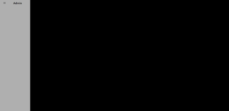
Easy-peasy! Now, if we click the Admin text, the sidebar should collapse; it’ll even take care of removing the text and leaving only the icon for us. How convenient is that?
👁 Sidebar Collapsed With Icon And Removed Text
Now, let’s add the remaining menu items. Still inside the Menu wrapper, under the last line we’ve written, enter the following:
 <MenuItem icon={<HomeOutlinedIcon />}>Home</MenuItem>
 <MenuItem icon={<PeopleOutlinedIcon />}>Team</MenuItem>
 <MenuItem icon={<ContactsOutlinedIcon />}>Contacts</MenuItem>
 <MenuItem icon={<ReceiptOutlinedIcon />}>Profile</MenuItem>
 <MenuItem icon={<HelpOutlineOutlinedIcon />}>FAQ</MenuItem>
 <MenuItem icon={<CalendarTodayOutlinedIcon />}>Calendar</MenuItem>
Then, close the Menu tag and add a title; the reason for our flex:
 <main>
 <h1 style={{ color: "white", marginLeft: "5rem" }}>
 React-Pro-Sidebar
 </h1>
 </main>
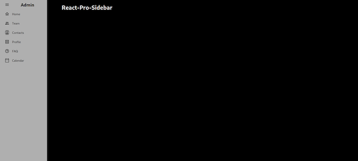
This is what our application should look like now:
👁 Sidebar With Options And Icons Not Collapsed
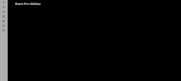
And this is what it looks like if we press the Admin text so that the sidebar collapses:
👁 Sidebar With Icons Collapsed
This is the final version of our component so far:
import { Sidebar, Menu, MenuItem, useProSidebar } from "react-pro-sidebar";
import HomeOutlinedIcon from "@mui/icons-material/HomeOutlined";
import PeopleOutlinedIcon from "@mui/icons-material/PeopleOutlined";
import ContactsOutlinedIcon from "@mui/icons-material/ContactsOutlined";
import ReceiptOutlinedIcon from "@mui/icons-material/ReceiptOutlined";
import CalendarTodayOutlinedIcon from "@mui/icons-material/CalendarTodayOutlined";
import HelpOutlineOutlinedIcon from "@mui/icons-material/HelpOutlineOutlined";
import MenuOutlinedIcon from "@mui/icons-material/MenuOutlined";

function App() {
 const { collapseSidebar } = useProSidebar();

 return (
 <div id="app" style={({ height: "100vh" }, { display: "flex" })}>
 <Sidebar style={{ height: "100vh" }}>
 <Menu>
 <MenuItem
 icon={<MenuOutlinedIcon />}
 onClick={() => {
 collapseSidebar();
 }}
 style={{ textAlign: "center" }}
 >
 {" "}
 <h2>Admin</h2>
 </MenuItem>

 <MenuItem icon={<HomeOutlinedIcon />}>Home</MenuItem>
 <MenuItem icon={<PeopleOutlinedIcon />}>Team</MenuItem>
 <MenuItem icon={<ContactsOutlinedIcon />}>Contacts</MenuItem>
 <MenuItem icon={<ReceiptOutlinedIcon />}>Profile</MenuItem>
 <MenuItem icon={<HelpOutlineOutlinedIcon />}>FAQ</MenuItem>
 <MenuItem icon={<CalendarTodayOutlinedIcon />}>Calendar</MenuItem>
 </Menu>
 </Sidebar>
 <main>
 <h1 style={{ color: "white", marginLeft: "5rem" }}>
 React-Pro-Sidebar
 </h1>
 </main>
 </div>
 );
}

export default App;
Now, let’s say we want our sidebar to be on the right side of the page.
We can easily do that using the rtl (right to left) prop from react-pro-sidebar. To do this, we will make some small changes to the above code.
First, let’s import the rtl prop in the useProSidebar hook, along with the collapseSidebar prop: const { collapseSidebar, rtl } = useProSidebar();.
Then, let’s reverse the flexDirection of the page because, at present, it displays the sidebar first and then the main body.
However, because we will soon be reversing the sidebar, it will look strange. So, we’ll reverse the page and then set the rtl prop to true, which is false by default. Check out the following snippet:
function App() {
 const { collapseSidebar, rtl } = useProSidebar();
 return (
 <div
 id="app"
 style={
//add flexDirection: "row-reverse" here
 ({ height: "100vh" }, { display: "flex", flexDirection: "row-reverse" })
 }
 >
//add rtl={true}, which was false by default.
 <Sidebar rtl={true} style={{ height: "100vh" }}>
 <Menu>
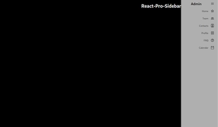
Now, the app should look like this:
👁 Sidebar With Orientation Variant Right Side
Now, let’s add some more functionality to our app. We want to change the background color of the sidebar and also have the ability to collapse it by toggling while keeping track of its toggle state.
To begin, we’ll change the app to its original state with the sidebar on the left. Then, change the background color by adding the following to our Sidebar element: backgroundColor="rgb(0, 249, 249)".
Next, add a toggle function that will log true or false to the console, depending on whether the sidebar is toggled or not. Remove the collapseSidebar function from the menu item and add the toggle function to an onClick event on the title.
Finally, we’ll add some text on the screen that specifies the toggle state to demonstrate what’s happening.
Let’s take a look at it in action. This is the toggle function I wrote:
function App() {
 const { collapseSidebar, toggleSidebar, collapsed, toggled, broken, rtl } =
 useProSidebar();
 const toggle = () => {
 toggleSidebar();
 if (toggled) {
 console.log(true);
 collapseSidebar();
 } else {
 console.log(false);
 collapseSidebar();
 }
 };
 return (
 <div
 id="app"
 style={({ height: "100vh" }, { display: "flex", flexDirection: "row" })}
 >
 <Sidebar
//change background color
 backgroundColor="rgb(0, 249, 249)"
 rtl={false}
 style={{ height: "100vh" }}
 >
...
And in the main statement, we can add the following:
 <main>
 <h1
 onClick={() => {
 toggle();
 }}
 style={{ color: "white", marginLeft: "5rem" }}
 >
 React-Pro-Sidebar
 </h1>
 {toggled ? (
 <h1 style={{ color: "white", marginLeft: "5rem" }}>Toggled</h1>
 ) : (
 <h1 style={{ color: "white", marginLeft: "5rem" }}>Not Toggled</h1>
 )}
 </main>
Now, whenever we click on the React-Pro-Sidebar title on the screen, the title under it will change accordingly. Check out the toggled and untoggled variations in the images below:
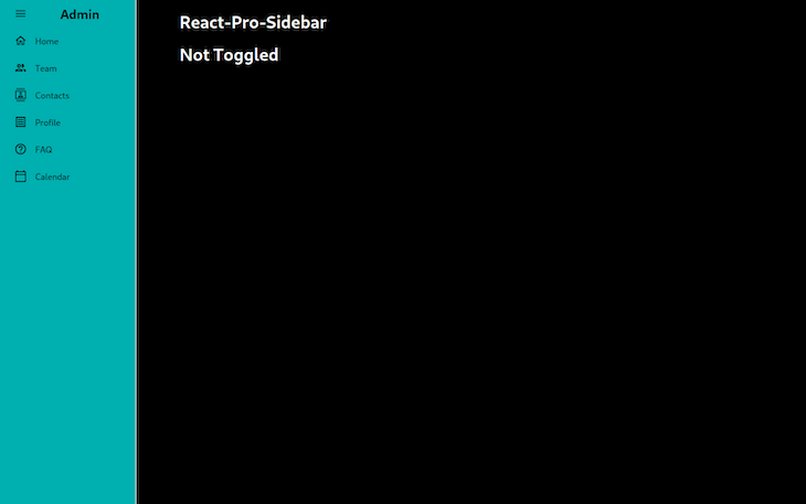
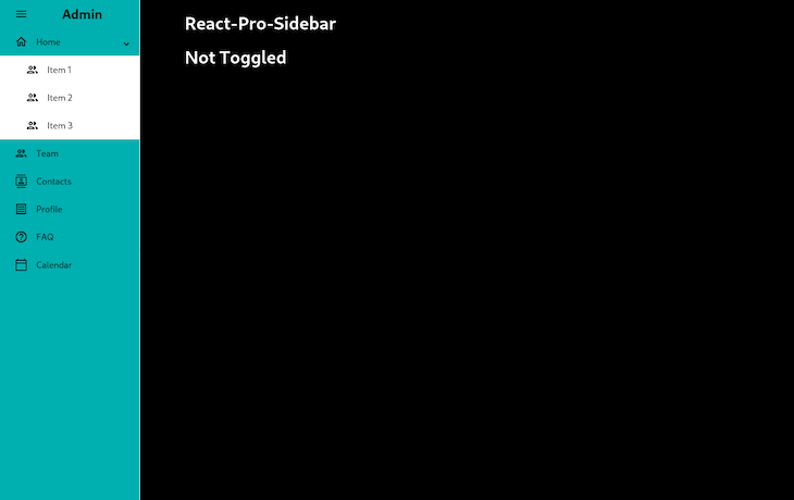
👁 Sidebar With Color Not Toggled
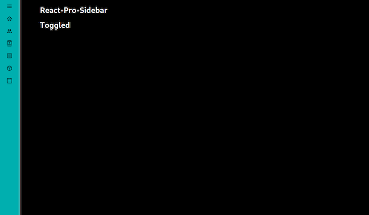
👁 Sidebar Background Color Toggled
The sidebar’s background color has changed, and I can keep track of the state of the sidebar with the toggle functionality.
If we wanted, we could add even more functionality to the app, such as changing the transition duration of the sidebar or adding breakpoints to exercise different behaviors.
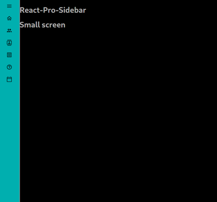
For example, the default transition duration of the sidebar is 300ms, but I want to make it a bit slower, so we can set it to 800ms. I also want to add some text saying “Small screen” when the screen is smaller; to do this, we will have to add two more props to the sidebar, like this:
 <Sidebar
 breakPoint="sm"
 transitionDuration={800}
...
Now, to control the breakpoints, we’ll use the broken method:
...
 {broken && (
 <h1 style={{ color: "white", marginLeft: "5rem" }}>Small screen</h1>
 )}
 </main>
👁 Sidebar Small Screen Breakpoint
The above text will only show up on smaller screens.
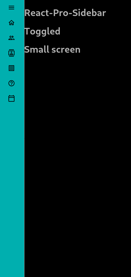
It is also worth noting that using breakpoints with react-pro-sidebar has the following behavior: when on a small screen, at each “not toggled” state, the sidebar will disappear, and when toggled again for the “toggled” state, the sidebar will show up as wide, and then narrow on the next cycle.
Let me show you how it works.
We’ll make the screen even smaller and bring back the “Toggled”/”Not Toggled” messages from the previous example for ease of understanding:
👁 React Pro Sidebar All Variations
If we collapse the sidebar from the previous example, you can see it will completely disappear. If we click once more, it will show up as wide, but with less opacity so that the text underneath can be read easily.
I’m pretty confident from my experience that this behavior captures all possible user inputs in using sidebars on small screens.
As it happens in real-world applications, we might want to use a multilevel sidebar approach in our design. This would mean that one or more elements on the sidebar would have dropdown qualities. Luckily for us, react-pro-sidebar has a built-in SubMenu property that allows that.
Consider the following scenario: I want to add a submenu, a dropdown, or an accordion you might say, that contains different items of its own. It is quite easy to accomplish this. Check the following snippet out:
import {
 Sidebar,
 Menu,
 MenuItem,
 useProSidebar,
 SubMenu,
} from "react-pro-sidebar";

...
 <SubMenu icon={<HomeOutlinedIcon />} label="Home">
 <MenuItem icon={<PeopleOutlinedIcon />}>Item 1</MenuItem>
 <MenuItem icon={<PeopleOutlinedIcon />}>Item 2</MenuItem>
 <MenuItem icon={<PeopleOutlinedIcon />}>Item 3</MenuItem>
 </SubMenu>
...
As you can see, I import SubMenu from react-pro-sidebar alongside with the previous imports. Then, in my code, while adding the Submenu as a component, you’ll realize that I’ve deleted my text Home and passed is as a label. Later on, inside the SubMenu, I’ve listed some MenuItems as usual (I actually copied the Team item) and added different texts on each of them. This is the result:
👁 Mulitlevel Sidebar, Or Dropdown Menu
Of course there is. This is the beauty and the curse of frontend development; there are just so (and sometimes too) many different packages to choose from. One example is react-burger-menu — with a whopping 50k weekly downloads, it has more followers than react-pro-sidebar. I won’t get into the details, but I can say that while react-pro-sidebar is more suitable for customization, react-burger-menu offers some great animations. In my opinion, if you want to have more power over your sidebar, I’d suggest you stick with react-pro-sidebar. But if you want some ready-made cool animations, check out react-burger-menu.
In this tutorial, we’ve seen how to add a responsive, dynamic sidebar using the react-pro-sidebar package. We also showed how combining it with Material UI icons allows us to quickly create a smooth sidebar while maintaining a professional look and feel that should be expected from a real-world project. If you would like to take a look at the finished version of this build, feel free to check out the repo. Let me know what your experiences are using react-pro-sidebar in the comments.
Install LogRocket via npm or script tag. LogRocket.init() must be called client-side, not
server-side
$ npm i --save logrocket

// Code:

import LogRocket from 'logrocket';
LogRocket.init('app/id');
// Add to your HTML:

<script src="https://cdn.lr-ingest.com/LogRocket.min.js"></script>
<script>window.LogRocket && window.LogRocket.init('app/id');</script>
Learn how to build a full React Native auth system using Better Auth and Expo — with email/password login, Google OAuth, session persistence, and protected routes.
Compare the top AI development tools and models of June 2026. View updated rankings, feature breakdowns, and find the best fit for you.
Learn how Bloom filters reduce database lookups for username availability checks while preserving correctness at scale.
Learn how to test Nuxt apps with Vitest, @nuxt/test-utils, runtime mocks, server route mocks, and Playwright e2e tests.
Would you be interested in joining LogRocket's developer community?
Join LogRocket’s Content Advisory Board. You’ll help inform the type of content we create and get access to exclusive meetups, social accreditation, and swag.
Sign up now