 |
VOOZH | about |
|
VOOZH | about |
Editor’s note: This post was updated by Alexander Godwin on 24 June 2024 to explore techniques for making backgrounds more responsive for different devices, as well as to cover changing background colors using CSS and JavaScript for advanced customization. The article also now covers fixed backgrounds and how they impact UX.
👁 Create A Full-Page Background With CSSOftentimes, you may come across webpages that have a background spanning the whole page. These kinds of full-page backgrounds can be used to create a cohesive look and feel for a website or to add visual interest and context to specific pages or sections. Used effectively, a full-page background can enhance the user experience and make a website stand out.
In this tutorial, we’ll demonstrate how to set a full-page background image and create a visually striking and immersive experience for users. We’ll explore different techniques for setting a full-page background using CSS, including using the background-image property, the image-set() function, and advanced techniques such as using multiple background images and adjusting the background-repeat, background-position, and background-size properties, and adding dynamic background images.
The Replay is a weekly newsletter for dev and engineering leaders.
Delivered once a week, it's your curated guide to the most important conversations around frontend dev, emerging AI tools, and the state of modern software.
The most basic way to set a full-page background is to use the CSS background-image property. This property accepts a value that is the URL of the image you want to use as the background.
Here’s an example of how to use the background-image property to set a full-page background:
body {
 background-image: url('/path/to/image.jpg');
}
This will set the body element as the container for the background image, which will cover the entire webpage.
When choosing a background image, it’s important to consider the dimensions of the image in relation to the size of the screen it will be displayed on. If the image is too small, it may appear pixelated or stretched when it’s displayed on larger screens. On the other hand, using an image that is too large can negatively impact performance, as it will take longer to load.
One way to optimize the size and resolution of your background image is to use an image editing tool to resize and crop the image to fit the dimensions of your webpage. You can also use the background-size property to specify how the image should be scaled to fit the webpage:
body {
 background-image: url('/path/to/image.jpg');
 background-size: cover;
}
The cover value tells the browser to scale the image up or down as needed to fit the entire webpage, maintaining the aspect ratio of the image. This can be a good choice if you want the image to fill the entire webpage but don’t want it to be stretched or distorted.
Here is a CSS sample that sets the body tag to be the size of the visible width and height and sets the background to be of size cover:
body {
 width: 100vw;
 height: 100vh;
 background: url('https://i.imgur.com/vHHl8Xk.jpg');
 background-size: cover;
}
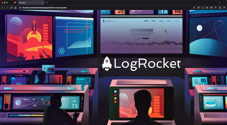
Here’s what the output will look like:
👁 Setting A Background Image Using The Cover Property
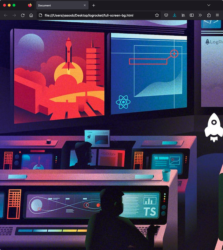
It looks fine, and when we resize the page, the image will perfectly scale while maintaining its aspect ratio to cover the whole page:
👁 Resizing The Background Image To Perfectly Scale
Notice that there are no scrollbars; the image is simply covering the whole background of the body.
background-size propertyThe background-size property has the following values:
auto: The default value; the background image’s size is determined by the actual size of the image filelength: You can specify the size of the background image using length values, such as 20px or 10em. This will set the width and height of the image to the specified valuespercentage: You can specify the size of the background image using percentages, such as 50% or 75%. This will set the width and height of the image to a percentage of the size of the elementcover: Scales the background image to be as large as possible so that the background image covers the entire element while preserving its aspect ratiocontain: Scales the background image to the largest size, such that both its width and height fit inside the elementinitial: Sets the property to its default valueinherit: Inherits the value from its parent elementimage-set() functionThe image-set() function allows you to provide different versions of an image for different device resolutions. This can be useful if you want to use a higher resolution image for devices with high pixel densities, such as smartphones and tablets, while using a lower resolution image for devices with lower pixel densities.
Here’s an example of how to use the image-set() function in a background-image declaration:
body {
 background-image: image-set(
 '/path/to/image-lowres.jpg' 1x,
 '/path/to/image-highres.jpg' 2x
 );
}
The image-set() function takes a series of image URLs and resolutions as arguments.
In this example, we’re providing two versions of the same image: a low-resolution version for devices with a pixel density of 1x, and a high-resolution version for devices with a pixel density of 2x. The browser will choose the appropriate version of the image based on the device’s pixel density.
In addition to the background-image and background-size properties, there are several other CSS properties that you can use to fine-tune the appearance of your full-page background.
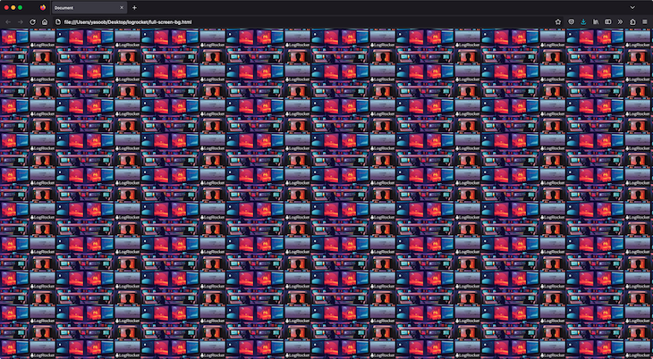
One useful property is background-repeat, which determines how the background image is repeated if it’s smaller than the container element. The default value is repeat, which means that the image will be tiled horizontally and vertically to fill the container. You can also set the value to repeat-x, repeat-y, or no-repeat to specify how the image should be repeated.
Let’s take a look at the same demo as before, but this time I have manually defined the size of the background and made it repeat across both axes:
body {
 font-weight: bold;
 width: 100vw;
 height: 100vh;
 background: url('https://i.imgur.com/vHHl8Xk.jpg');
 background-size: 250px;
 background-repeat: repeat-x repeat-y;
}
N.B., if you have set background-size to cover, then repeat won’t have any effect.
The background-position property allows you to specify the position of the background image within the container element. You can use this property to center the image or to adjust its position to the left, right, top, or bottom of the container.
In addition to these properties, you can also use the background-blend-mode property to overlay multiple background images and create more complex effects. This property allows you to specify how the colors of the background images should be combined, using options such as multiply, screen, and overlay.
Let’s look at an example of how you might use these properties to create a full-page background with multiple images and an overlay effect. Here are the two images that we used in our demo:
Here’s the relevant CSS:
body {
 background-image: url('https://imgur.com/Fn9FQwT.jpg'), url('https://imgur.com/VfcgZZ9.jpg');
 background-size: cover;
 background-blend-mode: difference;
}
And here is the output:
In this example, we’re using two images as the background for the body element, with the first image positioned in the center and the second image positioned at the bottom of the container. We’re also using the difference blend mode to overlay the two images, creating a more complex and visually interesting effect.
You can look at a slightly different example on JSFiddle. Feel free to play around and experiment with it.
To add dynamic background images in CSS, we can use CSS properties and JavaScript to change the background image dynamically based on user interactions or other events (e.g., changing the background after a certain interval).
Here’s an example of a dynamic background image:
See the Pen
dynamic-bg-example by King nelson (@D_kingnelson)
on CodePen.
In this example, whenever the user clicks on the change background button, we dynamically update the background image by using JavaScript to swap the images:
let dynamicBackground = document.getElementById('dynamic-background');
let button = document.getElementById('change-image-button');
let imageURLs = ['https://images.unsplash.com/photo-1680264173542-17b325a3ae8b?ixlib=rb-4.0.3&ixid=M3wxMjA3fDB8MHxwaG90by1wYWdlfHx8fGVufDB8fHx8fA%3D%3D&auto=format&fit=crop&w=1629&q=80', 'https://images.unsplash.com/photo-1680629197366-af64dd6ff2c7?ixlib=rb-4.0.3&ixid=M3wxMjA3fDB8MHxwaG90by1wYWdlfHx8fGVufDB8fHx8fA%3D%3D&auto=format&fit=crop&w=1042&q=80', 'https://images.unsplash.com/photo-1680629197575-09c7259542c9?ixlib=rb-4.0.3&ixid=M3wxMjA3fDB8MHxwaG90by1wYWdlfHx8fGVufDB8fHx8fA%3D%3D&auto=format&fit=crop&w=1034&q=80'];
let currentIndex = 0;

button.addEventListener('click', function() {
 currentIndex = (currentIndex + 1) % imageURLs.length;
 dynamicBackground.style.backgroundImage = `url( ${imageURLs[currentIndex]})`;
});
In the above code, we have an array, imageURLs, containing multiple image URLs. Clicking the button selects the image URL in the current index and sets that as the background image. Doing this continuously will cycle through these images and set them as the background image of the specified element.
Changing the background color of a webpage can be done using CSS and the background-color property, as shown below:
body {
 background-color: lightblue;
}

/* Background color for tablets */
@media (max-width: 768px) {
 body {
 background-color: lightgreen;
}

/* Background color for mobile devices */
@media (max-width: 480px) {
 body {
 background-color: lightcoral;
}
We can use JavaScript to change the background color dynamically as a response to an event. In the code snippet below, we change the background color in response to the click of a button:
<!DOCTYPE html>
<html lang="en">

<head>
 <meta charset="UTF-8">
 <meta name="viewport" content="width=device-width, initial-scale=1.0">
 <title>Change Background Color</title>
 <style>
 body {
 transition: background-color 0.5s;
 }

 #changeColorButton {
 padding: 10px 20px;
 font-size: 16px;
 }
 </style>
</head>

<body>
 <button id="changeColorButton">Change Background Color</button>
 <script>
 const button = document.getElementById('changeColorButton');
 button.addEventListener('click', () => {
 document.body.style.backgroundColor = getRandomColor();
 });

 function getRandomColor() {
 const letters = '0123456789ABCDEF';
 let color = '#';
 for (let i = 0; i < 6; i++) {
 color += letters[Math.floor(Math.random() * 16)];
 }
 return color;
 }
 </script>
</body>

</html>
Creating responsive backgrounds that adapt to different device widths, such as mobile and desktop, is an essential part of modern web design. In this section, we explore a couple of techniques that could help achieve responsive backgrounds.
With media queries, you can apply CSS styles based on different device features, such as screen resolution, aspect ratio, browser viewport width, height, and media types (like print vs. screen).
/* Default background for desktop */
body {
 background-image: url('desktop-background.jpg');
 background-size: cover;
 background-position: center;
}

/* Background for tablets */
@media (max-width: 768px) {
 body {
 background-image: url('tablet-background.jpg');
 }
}

/* Background for mobile devices */
@media (max-width: 480px) {
 body {
 background-image: url('mobile-background.jpg');
 }
}
background-size property can be adjusted to fit different device screen widths:
body {
 background-image: url('background.jpg');
 background-size: cover; /* Default for desktops */
 background-position: center;
}

/* Adjust for mobile devices */
@media (max-width: 480px) {
 body {
 background-size: contain;
 }
}
Even without media queries, you can still apply some techniques to make sure background images are responsive.
body {
 background-image: url('background.svg');
 background-size: cover; /* SVG will scale properly */
 background-position: center;
}
vw, vh) also help to create responsive backgrounds without media queries:
body {
 background-image: url('background.jpg');
 background-size: 100vw 100vh;
 background-position: center;
}
A fixed background refers to a background that stays in place while the remaining contents of the webpage scroll. Use the background-attachment: fixed CSS property to create a fixed background:
body {
 background-image: url('background.jpg');
 background-attachment: fixed;
 background-size: cover;
 background-position: center;
}
A well-chosen and implemented fixed background can:
When the background is not properly chosen or implemented, it might have the following negative effects on the UX of the webpage:
To effectively use fixed backgrounds, prioritize readability by ensuring the foreground has enough contrast. Additionally, choose appropriate images to be used as fixed backgrounds, and make sure to test fixed backgrounds properly on mobile devices.
background-image not working errorThere can be several reasons why the CSS background-image property may not work as expected. Here are some steps you can follow to troubleshoot the issue:
background-image property is defined. You may need to adjust the file path if the image file is in a different folderbackground-image property from working correctlybackground-image property is applied correctly. Look for any error messages or warnings related to the background-image propertyBy following these troubleshooting steps, you should be able to identify and resolve the issue causing the background-image property not to work as expected.
In this article, we covered different techniques for creating a full-page background using CSS. We looked at the background-image property and the image-set() function, and advanced techniques such as using multiple background images and adjusting the background-repeat, background-position, and background-size properties. We also demonstrated how to add dynamic background images and how to troubleshoot errors associated with the background-image property not working properly.
It’s important to consider the impact that background images can have on a website’s performance and to choose and optimize images appropriately to ensure a fast and smooth user experience. By using these techniques and considering the user’s device and connection speed, you can create visually striking and immersive full-page backgrounds that enhance the user experience on your website.
As web frontends get increasingly complex, resource-greedy features demand more and more from the browser. If you’re interested in monitoring and tracking client-side CPU usage, memory usage, and more for all of your users in production, try LogRocket.
👁 LogRocket Dashboard Free Trial BannerLogRocket lets you replay user sessions, eliminating guesswork around why bugs happen by showing exactly what users experienced. It captures console logs, errors, network requests, and pixel-perfect DOM recordings — compatible with all frameworks.
LogRocket's Galileo AI watches sessions for you, instantly identifying and explaining user struggles with automated monitoring of your entire product experience.
Modernize how you debug web and mobile apps — start monitoring for free.
TSRX adds first-class control flow, conditional hooks, and scoped styles to React via a TypeScript compiler extension — no new framework required.
Learn how to build a full React Native auth system using Better Auth and Expo — with email/password login, Google OAuth, session persistence, and protected routes.
Compare the top AI development tools and models of June 2026. View updated rankings, feature breakdowns, and find the best fit for you.
Learn how Bloom filters reduce database lookups for username availability checks while preserving correctness at scale.
Would you be interested in joining LogRocket's developer community?
Join LogRocket’s Content Advisory Board. You’ll help inform the type of content we create and get access to exclusive meetups, social accreditation, and swag.
Sign up now