 |
VOOZH | about |
|
VOOZH | about |
React Select is an open source select control created by Jed Watson with and for React. It was inspired by the shortcomings of the native HTML select control. It offers well-designed and battle-tested components and APIs that help you build powerful yet customizable select components. Some of its features include:
👁 React Select: A Comprehensive GuideIn this tutorial, we’ll walk through how to install, use, and customize React Select for modern React projects. We’ll also dive into various configuration options to tailor the component to our specific needs.
If you’re using an older version, you should upgrade using the upgrade guide. You can also check out our video tutorial on React Select.
Editor’s note: This article was last updated by Nelson Michael in March 2025.
The Replay is a weekly newsletter for dev and engineering leaders.
Delivered once a week, it's your curated guide to the most important conversations around frontend dev, emerging AI tools, and the state of modern software.
The native HTML <select> element has several limitations:
<select> does support keyboard navigation, its functionality is basic and less customizable.React Select addresses these limitations while providing:
React Select works with any React framework. To install the react-select package, run either one of the following commands in your terminal:
npm install react-select
# OR
yarn add react-select
# OR
pnpm install react-select
Using React Select is as easy as adding the canonical Select component and passing it some vital props such as options, onChange, and defaultValue:
import Select from 'react-select';
import { useState } from 'react';

interface Option {
 value: string;
 label: string;
}

const options: Array<Option> = [
 { value: 'blues', label: 'Blues' },
 { value: 'rock', label: 'Rock' },
 { value: 'jazz', label: 'Jazz' },
 { value: 'orchestra', label: 'Orchestra' }
];

export default function MusicGenreSelect() {
 const [selectedOption, setSelectedOption] = useState<Option | null>(null);

 return (
 <Select<Option>
 value={selectedOption}
 onChange={(option) => setSelectedOption(option)}
 options={options}
 isClearable
 isSearchable
 placeholder="Select a music genre..."
 aria-label="Music genre selector"
 />
 );
}
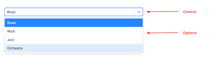
In the code snippet above, the select options are defined as music genres and passed into the Select component as props. defaultValue and onChange are wired to the stateful value selectedOption and its updater function, setSelectedOption. The result is a simple Select component:
👁 React Select Element Music Genre Example
Props are essential to how React Select works. They are also essential to customizing it. Apart from the props we passed in our first example, here are some common props you can pass to the Select component:
placeholder: Defines the text displayed in the text input
className: Sets a className attribute on the outer or root component
classNamePrefix: If provided, all inner components will be given a prefixed className attribute
autoFocus: Focuses the control when it is mounted
isMulti: Supports multiple selected options
noOptionsMessage: Text to display when there are no options found
menuIsOpen: Opens the dropdown menu by default
isLoading: Useful for async operations. For example, to indicate a loading state during a search
<Select
 {...props}
 placeholder="Select music genre"
 className="adebiyi"
 classNamePrefix="logrocket"
 autoFocus
 isMulti
 noOptionsMessage={({ inputValue }) => `No result found for "${inputValue}"`}
/>
React Select can be configured to allow multiple options to be selected in a single Select component. This can be achieved by toggling on the isMulti prop on the Select component:
import Select, { MultiValue } from "react-select";
import { useState } from "react";

const options = [
 { value: "blues", label: "Blues" },
 { value: "rock", label: "Rock" },
 { value: "jazz", label: "Jazz" },
 { value: "orchestra", label: "Orchestra" },
 ];

export default function App() {
 // We now have multiple options. Basically, an array of options.
 const [selectedOptions, setSelectedOptions] = useState<MultiValue<{
 value: string;
 label: string;
 }> | null>(null);

 return (
 <div>
 <Select
 defaultValue={selectedOptions}
 onChange={setSelectedOptions}
 options={options}
 isMulti
 />
 </div>
 );
}
You can also do some styling customization on the multi-select dropdown. Here’s how:
import Select from 'react-select';
import { useState } from 'react';

interface Tag {
 value: string;
 label: string;
 color: string;
}

const customStyles = {
 control: (base: any, state: any) => ({
 ...base,
 borderColor: state.isFocused ? '#2684FF' : '#ced4da',
 boxShadow: state.isFocused ? '0 0 0 1px #2684FF' : 'none',
 '&:hover': {
 borderColor: state.isFocused ? '#2684FF' : '#a1a7ae'
 }
 }),
 multiValue: (base: any, { data }: any) => ({
 ...base,
 backgroundColor: data.color,
 color: '#fff'
 }),
 multiValueLabel: (base: any) => ({
 ...base,
 color: 'inherit'
 })
};

function TagSelector() {
 const [selectedTags, setSelectedTags] = useState<Tag[]>([]);

 const options: Tag[] = [
 { value: 'react', label: 'React', color: '#61dafb' },
 { value: 'typescript', label: 'TypeScript', color: '#3178c6' },
 { value: 'javascript', label: 'JavaScript', color: '#f7df1e' }
 ];

 return (
 <Select<Tag, true>
 isMulti
 options={options}
 value={selectedTags}
 onChange={(newValue) => setSelectedTags(newValue as Tag[])}
 styles={customStyles}
 placeholder="Select tags..."
 closeMenuOnSelect={false}
 />
 );
}
React Select’s options props can be static and preselected, as shown in previous examples. They can also be dynamic and asynchronous; that is, generated on demand from an API or a database query. For this use case, React Select offers the Async component from react-select/async:
import AsyncSelect from 'react-select/async';
import { useState } from 'react';

interface User {
 value: string;
 label: string;
}

function UserSelect() {
 const [selectedUser, setSelectedUser] = useState<User | null>(null);

 const loadOptions = async (inputValue: string) => {
 try {
 const response = await fetch(
 `https://api.example.com/users?search=${inputValue}`
 );
 const data = await response.json();

 return data.map((user: any) => ({
 value: user.id,
 label: user.name
 }));
 } catch (error) {
 console.error('Error loading options:', error);
 return [];
 }
 };

 return (
 <AsyncSelect<User>
 value={selectedUser}
 loadOptions={loadOptions}
 onChange={setSelectedUser}
 isSearchable
 placeholder="Search users..."
 loadingMessage={() => "Searching..."}
 noOptionsMessage={({ inputValue }) =>
 inputValue ? `No users found for "${inputValue}"` : "Start typing to search..."
 }
 />
 );
}
The Async component extends the Select component with asynchronous features like loading state.
The loadOptions prop is an async function or a promise that exposes the search text (input value) and a callback that is automatically called once the input value changes.
The Async component includes provision for helpful props like:
cacheOptions: Caching fetched options
defaultOptions: Set default options before the remote options are loaded
Another component that may come in handy is the Fixed Options component, which makes it possible to have fixed options.
In some scenarios, you might want certain selections to remain permanent in a multi-select dropdown — these are “fixed” options that users should not be able to remove.
In this example, we use React Select’s customization capabilities to style these fixed options distinctively and enforce their permanence through our change handler logic. Here’s an example from the docs:
import React, { useState } from 'react';
import Select, { ActionMeta, OnChangeValue, StylesConfig } from 'react-select';
import { ColourOption, colourOptions } from '../data';

// Custom styles to visually differentiate fixed options
const customStyles: StylesConfig<ColourOption, true> = {
 multiValue: (base, state) =>
 state.data.isFixed ? { ...base, backgroundColor: 'gray' } : base,
 multiValueLabel: (base, state) =>
 state.data.isFixed
 ? { ...base, fontWeight: 'bold', color: 'white', paddingRight: 6 }
 : base,
 multiValueRemove: (base, state) =>
 state.data.isFixed ? { ...base, display: 'none' } : base,
};

// Helper function to always position fixed options before non-fixed ones
const orderOptions = (values: readonly ColourOption[]): readonly ColourOption[] => {
 return values.filter(v => v.isFixed).concat(values.filter(v => !v.isFixed));
};

export default function FixedOptionsExample() {
 // Initialize with a set of fixed and non-fixed options
 const [selectedOptions, setSelectedOptions] = useState<readonly ColourOption[]>(
 orderOptions([colourOptions[0], colourOptions[1], colourOptions[3]])
 );

 // Custom change handler to prevent removal of fixed options
 const handleChange = (
 newValue: OnChangeValue<ColourOption, true>,
 actionMeta: ActionMeta<ColourOption>
 ) => {
 switch (actionMeta.action) {
 case 'remove-value':
 case 'pop-value':
 // Prevent removal if the option is fixed
 if (actionMeta.removedValue.isFixed) {
 return;
 }
 break;
 case 'clear':
 // When clearing the selection, preserve only fixed options
 newValue = colourOptions.filter(v => v.isFixed);
 break;
 }
 // Reorder options to always show fixed ones first
 setSelectedOptions(orderOptions(newValue));
 };

 return (
 <Select
 value={selectedOptions}
 isMulti
 styles={customStyles}
 isClearable={selectedOptions.some(v => !v.isFixed)}
 name="colors"
 className="basic-multi-select"
 classNamePrefix="select"
 onChange={handleChange}
 options={colourOptions}
 />
 );
}
Creatable componentTypically, there is a dead end when there are no options after a search. However, you can choose to let users create a new option. For this use case, React Select offers the Creatable component for static options and AsyncCreatable components for dynamic options.
Using Creatable is the same as using Select:
import Creatable from "react-select/creatable";
import { useState } from "react";

const musicGenres = [
 { value: "blues", label: "Blues" },
 { value: "rock", label: "Rock" },
 { value: "jazz", label: "Jazz" },
 { value: "orchestra", label: "Orchestra" },
];

export default function App() {
 const [selectedOption, setSelectedOption] = useState(null);

 return (
 <>
 <div style={{ marginBlockEnd: "1rem", display: "flex" }}>
 <span>Selected option:</span>
 <pre> {JSON.stringify(selectedOption)} </pre>
 </div>
 <Creatable options={musicGenres} onChange={setSelectedOption} isMulti />
 </>
 );
}
👁 Form For Selecting Music Genre
And using AsyncCreatable is the same as using Async:
import AsyncCreatable from "react-select/async-creatable";
import { useState } from "react";

const musicGenres = [
 { value: "blues", label: "Blues" },
 { value: "rock", label: "Rock" },
 { value: "jazz", label: "Jazz" },
 { value: "orchestra", label: "Orchestra" },
];

function filterMusicGenre(inputValue) {
 return musicGenres.filter((musicGenre) => {
 const regex = new RegExp(inputValue, "gi");
 return musicGenre.label.match(regex);
 });
}

export default function App() {
 const [selectedOption, setSelectedOption] = useState(null);
 return (
 <>
 <AsyncCreatable
 loadOptions={(inputValue, callback) =>
 setTimeout(() => callback(filterMusicGenre(inputValue)), 1000)
 }
 onChange={setSelectedOption}
 isMulti
 isClearable
 />
 </>
 );
}
Integrating React Select with React Hook Form simplifies managing form state and validation. The example below shows how to use the Controller component from React Hook Form to integrate a React Select component seamlessly into your form:
import React from 'react';
import { useForm, Controller } from 'react-hook-form';
import Select from 'react-select';

interface Option {
 value: string;
 label: string;
}

interface FormData {
 category: Option | null;
}

const options: Option[] = [
 { value: 'news', label: 'News' },
 { value: 'sports', label: 'Sports' },
 { value: 'entertainment', label: 'Entertainment' }
];

function FormSelect() {
 const { control, handleSubmit } = useForm<FormData>();

 const onSubmit = (data: FormData) => {
 console.log(data.category);
 };

 return (
 <form onSubmit={handleSubmit(onSubmit)}>
 <Controller
 name="category"
 control={control}
 rules={{ required: 'Please select a category' }}
 render={({ field, fieldState: { error } }) => (
 <div>
 <Select
 {...field}
 options={options}
 isClearable
 placeholder="Select a category..."
 />
 {error && <span className="error">{error.message}</span>}
 </div>
 )}
 />
 <button type="submit">Submit</button>
 </form>
 );
}
For large datasets or frequent updates, optimizing React Select’s performance is crucial. This example demonstrates how to use memoization with useMemo and useCallback to ensure that expensive operations and custom filtering are executed efficiently:
import React, { useMemo, useCallback } from 'react';
import Select from 'react-select';

function generateLargeOptionsList() {
 // Example: generate a list of options dynamically
 return Array.from({ length: 1000 }, (_, i) => ({
 value: `option-${i}`,
 label: `Option ${i}`
 }));
}

function CustomOption(props: any) {
 // Custom option component logic
 return <div {...props.innerProps}>{props.data.label}</div>;
}

function CustomMultiValue(props: any) {
 // Custom multi-value component logic
 return <div {...props.innerProps}>{props.data.label}</div>;
}

function OptimizedSelect() {
 const options = useMemo(() => generateLargeOptionsList(), []);

 const filterOptions = useCallback((inputValue: string) => {
 return options.filter(option =>
 option.label.toLowerCase().includes(inputValue.toLowerCase())
 );
 }, [options]);

 const customComponents = useMemo(() => ({
 Option: CustomOption,
 MultiValue: CustomMultiValue
 }), []);

 return (
 <Select
 options={options}
 filterOption={filterOptions}
 components={customComponents}
 isSearchable
 isClearable
 />
 );
}
React Select also exposes several events to manage your select components (Select, Async, etc.). You’ve seen onChange and autoFocus. Some others include:
onBlur
onMenuOpen
onMenuClose
onInputChange
onMenuScrollToBottom
onMenuScrollToTop
These events are describable by name and are fairly straightforward to understand. For example, you could use onBlur to validate the select component. Additionally, if you have a long list of options, you can detect when the menu is scrolled to the bottom or top using onMenuScrollToBottom and onMenuScrollToTop.
Each of these events will expose the event to the callback function as in the case of onBlur in the code snippet below:
<Select
 {...props}
 onMenuOpen={() => console.log("Menu is open")}
 onMenuClose={() => console.log("Menu is close")}
 onBlur={(e) => console.log(e)}
 onMenuScrollToBottom={() =>
 console.log("Menu was scrolled to the bottom.")
 }
/>
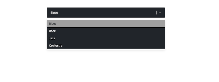
The Select component is composed of other child components, each with base styles that can be extended or overridden distinctly. These are components like control, placeholder, options, noOptionsMessage, etc:
👁 Add Custom Styles React Select
There are three APIs for styling these components: the styles prop, the classNames prop, and the classNamePrefix prop.
styles propYou can pass an object of callback functions to the styles prop. Each callback function represents a child component of Select, and automatically exposes the corresponding base or default styling and state.
N.B., you don’t have to expressly name the function arguments “defaultStyles” and “state.”
import Select from "react-select";
import { useState } from "react";

const options = [
 { value: "blues", label: "Blues" },
 { value: "rock", label: "Rock" },
 { value: "jazz", label: "Jazz" },
 { value: "orchestra", label: "Orchestra" },
];

const customStyles = {
 option: (defaultStyles, state) => ({
 // You can log the defaultStyles and state for inspection
 // You don't need to spread the defaultStyles
 ...defaultStyles,
 color: state.isSelected ? "#212529" : "#fff",
 backgroundColor: state.isSelected ? "#a0a0a0" : "#212529",
 }),

 control: (defaultStyles) => ({
 ...defaultStyles,
 // Notice how these are all CSS properties
 backgroundColor: "#212529",
 padding: "10px",
 border: "none",
 boxShadow: "none",
 }),
 singleValue: (defaultStyles) => ({ ...defaultStyles, color: "#fff" }),
};

export default function App() {
 const [selectedOption, setSelectedOption] = useState(null);

 return (
 <div>
 <Select
 defaultValue={selectedOption}
 onChange={setSelectedOption}
 options={options}
 styles={customStyles}
 />
 </div>
 );
}
In the code below, the Select component has been styled to have a dark appearance using the control, option, and singleValue child components. Here is the result:
classNames propWith the classNames props, you can add class names to each child component like so:
<Select
 {...props}
 classNames={{
 control: (state) =>
 `border ${state.isFocused ? "border-red-800" : "border-red-400"}`,
 option: () => "menu-item",
 }}
/>
In the code snippet above, the control component’s border is styled with respective class names based on the isFocused state of the Select component. This is typically how you’d use Tailwind CSS with React Select.
classNamePrefix propWhile the className prop is used to apply a class name on the root element of the Select component, the classNamePrefix is used to namespace every child component:
<Select
 defaultValue={selectedOption}
 onChange={setSelectedOption}
 options={options}
 className="for-root-component"
 classNamePrefix="for-child-components"
/>
The code snippet above, with className and classNamePrefix, will generate a DOM structure similar to this:
<div class="for-root-component react-select-container">
 <div class="for-child-components__control">
 <div class="for-child-components__value-container">...</div>
 <div class="for-child-components__indicators">...</div>
 </div>
 <div class="for-child-components__menu">
 <div class="for-child-components__menu-list">
 <div class="for-child-components__option">...</div>
 </div>
 </div>
</div>
You can then target each distinct class name property for styling, for example, in a .css file.
unstyled propIf you need to completely restyle the Select component, you can apply the unstyled prop to strip it clean to only the essentials, like so:
<Select
 {...props}
 unstyled
/>
Then you can use one of the three styling APIs mentioned above to restyle Select:
Select props
If you use either one of the styles or classNames APIs, you can get access to any custom prop you pass to the Select component through the state argument, like so:
<Select
 {...props}
 customProps={true} // You can pass a custom prop...
 styles={{
 control: (defaultStyles, state) => {
 // ...then access the props through `selectProps`
 // You can use it to style the component
 console.log(state.selectProps["customProps"]);
 return {
 ...defaultStyles,
 color: state.isSelected ? "#212529" : "#fff",
 backgroundColor: state.isSelected ? "#a0a0a0" : "#212529",
 };
 },
 }}
/>
Effectively styling the Select requires that you know the component(s) you intend to style and choose one of the styling APIs above to achieve your goal. If you break a component down for your bare metal needs, let cx and custom components be your styling guide.
React Select is a powerful component that can significantly enhance your application’s user experience. By following this guide and implementing the examples above, you can create accessible, performant, and feature-rich select components that meet modern web application requirements.
For more advanced use cases and detailed API documentation, visit the official React Select documentation. If you’re evaluating different select libraries for your project, check out our guide to the best React Select component libraries.
Install LogRocket via npm or script tag. LogRocket.init() must be called client-side, not
server-side
$ npm i --save logrocket

// Code:

import LogRocket from 'logrocket';
LogRocket.init('app/id');
// Add to your HTML:

<script src="https://cdn.lr-ingest.com/LogRocket.min.js"></script>
<script>window.LogRocket && window.LogRocket.init('app/id');</script>
TSRX adds first-class control flow, conditional hooks, and scoped styles to React via a TypeScript compiler extension — no new framework required.
Learn how to build a full React Native auth system using Better Auth and Expo — with email/password login, Google OAuth, session persistence, and protected routes.
Compare the top AI development tools and models of June 2026. View updated rankings, feature breakdowns, and find the best fit for you.
Learn how Bloom filters reduce database lookups for username availability checks while preserving correctness at scale.
Hey there, want to help make our blog better?
Join LogRocket’s Content Advisory Board. You’ll help inform the type of content we create and get access to exclusive meetups, social accreditation, and swag.
Sign up now