 |
VOOZH | about |
|
VOOZH | about |
Editor’s note: This post was updated on 6 April 2023 to include updated code, as well as a comparison of SCSS and styled-components in terms of code readability.
👁 SCSS Styled-Components Advantages CaveatsFrontend frameworks like React and Vue have revolutionized the separation of concerns in web development. Unlike the traditional approach of separating HTML, CSS, and JavaScript, these frameworks break down an application into reusable components that contain rendering logic and UI logic. These independent pieces are developed separately and later combined into templates, pages, and compositions.
While this approach, which combines markup and behavior, is widely used in frontend development, developers have differing opinions on how to handle styling. Some prefer using styled-components, while others prefer Sass/SCSS.
In this guide, we’ll explore both options and evaluate the advantages and disadvantages of moving from SCSS to styled-components in a React application.
For a visual representation, we’ll create an author box in React and compare styling it using SCSS vs. styled-components. We’ll start by demonstrating how to build the author card with SCSS and then further explore how to rebuild the same interface using styled-components. You can also find the code used in this article here:
Our finished product will look like this:
👁 Styled Author Box React App Finished Product
Let’s dive in!
Jump ahead:
The Replay is a weekly newsletter for dev and engineering leaders.
Delivered once a week, it's your curated guide to the most important conversations around frontend dev, emerging AI tools, and the state of modern software.
In this tutorial, we’ll use React to create components. You don’t need to be familiar with styled-components or Sass to follow along with the demo portion of this article, but you should ideally have some hands-on experience with JavaScript and CSS.
Let’s get started by creating a new React application. You can choose from a variety of installation options; however, for the sake of this tutorial, we’ll go with the Vite + React combo.
First, create a new React application by running the below command:
npm create vite@latest my-app -- --template react
# OR
yarn create vite my-app --template react
Next, let’s set up the necessary packages to make our React app work with styled-components and SCSS. To get SCSS to work in our Vite + React application, we simply need to install the Sass dependency:
npm add -D sass
We also need to install styled-components:
npm install styled-components
Now we can proceed with creating SCSS files and styling our markup elements with the styled-components package.
The next step is to create the markup for our author card. Create a new AuthorBox.jsx file in the default /src directory and paste the following code into this new file:
// import "./styles.scss";

export const AuthorBox = () => {
 return (
 <div className="wrapper wrapper-border">
 <img src="https://picsum.photos/id/237/200/200" alt="" />
 <h3 className="author-name">Author name</h3>
 <p>
 Lorem ipsum dolor, sit amet consectetur adipiscing elit. Fugiat, et.
 </p>
 <a href="#socialURL" className="author-socialUrl">
 Social URL
 </a>
 </div>
 );
};
In the above code, we defined the markup for our card and added the necessary class names we’d use to style it. Our component consists of the following elements:
<h3>: author name<p>: author bio<a href>: social URL<img>: author avatar<div>: wrapper to hold all the elementsN.B., notice that we also imported a style.scss and the styled-components package; however, they are commented for now — we’ll get to them in a bit
Next, let’s render this file in our entry component. Open the default src/App.jsx file and update it with the below code:
import { AuthorBox } from "./AuthorBox";
function App() {
 return <AuthorBox />;
}
export default App;
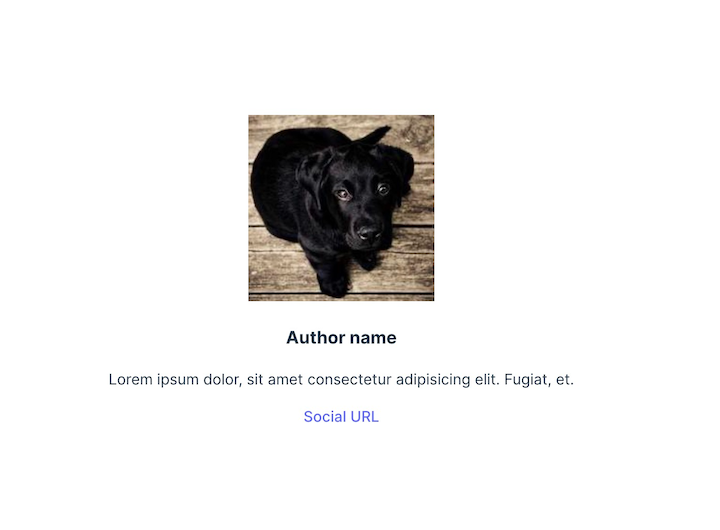
Here we simply updated the App.jsx file to render our AuthorBox components, rather than the default content.
If we run the application at this point, we should see the following output:
Now we can start styling. We’ll add SCSS styles, then refactor the code to styled-components.
To start, create a new style.scss file inside the /src directory and add the following code:
$size-s: 14px;
$size-m: 16px;
$size-l: 24px;
$size-xl: 30px;

.wrapper {
 display: flex;
 color: #fff;
 flex-flow: column nowrap;
 justify-content: flex-start;
 align-items: flex-start;
 align-content: center;
 padding: 10px;
 &-border {
 border: solid 1px grey;
 }
}
.author {
 &-name {
 font-size: $size-l;
 margin-bottom: 0;
 }
 &-bio {
 font-size: $size-s;
 }
 &-socialUrl {
 text-decoration: underline;
 font-size: $size-m;
 }
}
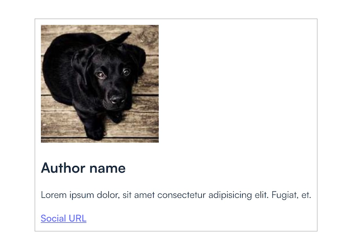
Next, uncomment the first line of the AuthorBox.jsx file so that it now imports the style.scss file:
import "./styles.scss";
After this update, the component should render like this:
Now, what if we want to assign different color schemes to the author boxes, such as a primary and secondary themed box with different font colors? First, we’ll need to update our styling to include the themes’ new class definitions:
.bg {
 &-primary {
 background-color: #3F51B5;

 a {
 color: #2196F3;
 }
 }

 &-secondary {
 background-color: #312f41;

 a {
 color: #2196F3;
 }
 }
}
To add the background colors, we’ll need to pass a background property to the AuthorBox component. We’ll make the background primary if the AuthorBox has the isPrimary property, and secondary otherwise:
const background = `${isPrimary ? "bg-primary" : "bg-secondary"}`;
To include the features mentioned above, update the AuthorBox file with the following code:
export const AuthorBox = ({ isPrimary }) => {
 const background = `${isPrimary ? "bg-primary" : "bg-secondary"}`;
 return (
 <div className={`wrapper wrapper-border ${background}`}>
 <img src="https://picsum.photos/id/237/200/200" alt="" />
 <h3 className="author-name">Author name</h3>
 <p>
 Lorem ipsum dolor, sit amet consectetur adipisicing elit. Fugiat, et.
 </p>
 <a href="#socialURL" className="author-socialUrl">
 Social URL
 </a>
 </div>
 );
};
Now, let’s duplicate the author box in the app output so that we can see both styles in parallel. To do this, adjust the default export code in the App.js file:
export default function App() {
 return (
 <>
 <AuthorBox />
 <AuthorBox />
 </>in
 );
}
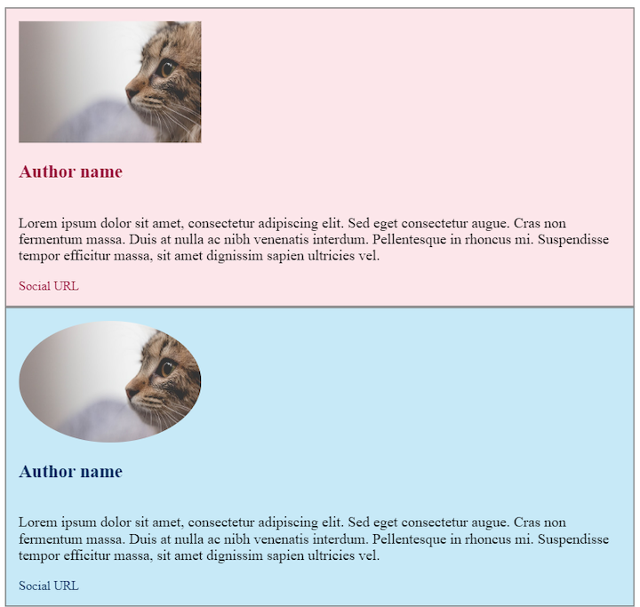
Below are our final components:
👁 Author Cards SCSS Styling Background Color
While this is approach definitely achievable for small projects, as the code base grows, it will become increasingly troublesome to maintain the styles. Let’s see what the same components would look like using styled-components.
To start, create a new styles.js file inside the src directory and paste in the following code:
import styled from "styled-components";

const sizeS = "14px";
const sizeM = "16px";
const sizeL = "24px";

export const Wrapper = styled.div`
 display: flex;
 color: #fff;
 flex-flow: column nowrap;
 justify-content: flex-start;
 align-items: flex-start;
 align-content: center;
 padding: ${sizeS};
 border: solid 1px grey;
 background-color: ${(props) => (props.isPrimary ? "#3F51B5" : "#312f41")};
`;

export const Name = styled.h3`
 font-size: ${sizeL};
 margin-bottom: 0;
`;

export const Bio = styled.p`
 font-size: ${sizeM};
`;

export const SocialURL = styled.a`
 text-decoration: none;
 font-size: ${sizeS};
 color: #2196f3;
`;
The above code is basically recreating the styling from our styles.scss file with styled-components. We defined the styling we wanted each markup element to have, so we can import them into our actual components.
N.B., notice that this is 32 lines of code vs. 47 lines of code for the SCSS version, which is a significant improvement
Next, replace the content in AuthorBox.jsx file with the below code to import the previous styled-components:
import { Wrapper, Name, Bio, SocialURL } from "./styles";

export const AuthorBox = ({ isPrimary }) => {
 return (
 <Wrapper isPrimary={isPrimary}>
 <img src="https://picsum.photos/id/237/200/200" alt="" width="200" />
 <Name isPrimary={isPrimary}>Author name</Name>
 <Bio>
 Lorem ipsum dolor, sit amet consectetur adipisicing elit. Fugiat, et.
 </Bio>
 <SocialURL isPrimary={isPrimary} href="#socialURL">
 Social URL
 </SocialURL>
 </Wrapper>
 );
};
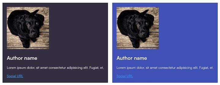
Our component should still render in the same style; here’s the output:
👁 Author Cards Styled-Components Background Color
styled-components enables us to fully separate the UI from the function and state of components. But, is styled-components really better than Sass/SCSS? Let’s compare the advantages and drawbacks of each library.
styled-components doesn’t come with any globally scoped selectors, so we don’t need to worry about conflicts and styles overwriting each other. Although Sass comes with nice upgrades, such as nesting and variables, it’s more likely to lead to overwriting styles.
styled-components offers simplicity in naming. With Sass/SCSS — whether combined with BEM (Block Element Modifier) or not — there’s a lot of going back and forth to find the correct classes. Imagine what a challenge it would be to determine what overwrites what in a large project!
Also, in the case of Sass stylesheets, the code quickly becomes crowded when we start adding classes, especially if we want the additional styling to be optional for the user.
Components crested with styled-components are easier to reuse than those styled with Sass. If we want to share a component between two higher-order components or even between two apps, we can be sure that the logic and styling will remain consistent.
Styled-components is also easy to customize by simply passing additional props. The ability to condition properties, such as sizes and colors, to props makes the styles more dynamic and easier to handle in big projects.
Components created with styled-components are rendered only if the component is on screen, while those created with Sass are always processed, in most cases — although this can be controlled. This is a point for styled-components, except the drawback is that once the styles are parsed, all the code is added t the index.html file and there’s no way to separate the CSS from the rest of the code.
Another disadvantage of styled-components is that the class names are generated dynamically. This can cause issues with caching between builds or renders. With Sass, this issue doesn’t exist.
The method of scoping styled-components is superior to that of SCSS in terms of reusability and customization, but because the components are more generic, thye can be harder to debug. Additionally, due to all the conditioning and logic mixed with styles, styled-compents are also harder to read. With Sass/SCSS, the output is plain CSS and debugging is easier.
SCSS and styled-components each have unique strengths and weaknesses when it comes to code readability. SCSS’s nested syntax and variable system can help keep code organized, but when combined with BEM, the number of classes required can make the code harder to read.
styled-components uses a more declarative syntax that’s easier to understand, and with modern JavaScript syntax, it’s easier to write and read code. While SCSS can improve code readability, in some cases, styled-components offers a simpler, more intuitive approach to writing CSS that prioritizes readability and simplicity.
The learning curve for styled-components is steeper than that of Sass/SCSS, and not all developers like to mix their CSS with JavaScript. But with styled-components, we can still use plain CSS. We don’t have the flexibility to do things both ways with Sass.
Finally, Sass is more likely to be found in legacy projects. Integrating both libraries into a single application can be confusing. Although styled-components offers a myriad of advantages, some developers prefer the stability and more universal character of Sass over the novelty of styled-components.
Switching from SCSS to styled-components in a React project can provide a number of benefits, such as improved readability, reduced CSS bloat, and better support for theming and dynamic styles. However, there are also some potential challenges and caveats to consider, such as the need to learn a new syntax and potential performance issues. Finally, whether or not to make the switch will be determined by your project’s specific needs and goals, as well as by your personal preferences and expertise.
As web frontends get increasingly complex, resource-greedy features demand more and more from the browser. If you’re interested in monitoring and tracking client-side CPU usage, memory usage, and more for all of your users in production, try LogRocket.
👁 LogRocket Dashboard Free Trial BannerLogRocket lets you replay user sessions, eliminating guesswork around why bugs happen by showing exactly what users experienced. It captures console logs, errors, network requests, and pixel-perfect DOM recordings — compatible with all frameworks.
LogRocket's Galileo AI watches sessions for you, instantly identifying and explaining user struggles with automated monitoring of your entire product experience.
Modernize how you debug web and mobile apps — start monitoring for free.
Build dynamic LLM routing in Next.js with OpenRouter, TanStack AI, task classification, model fallbacks, and cost-aware routing.
TSRX adds first-class control flow, conditional hooks, and scoped styles to React via a TypeScript compiler extension — no new framework required.
Learn how to build a full React Native auth system using Better Auth and Expo — with email/password login, Google OAuth, session persistence, and protected routes.
Compare the top AI development tools and models of June 2026. View updated rankings, feature breakdowns, and find the best fit for you.
Would you be interested in joining LogRocket's developer community?
Join LogRocket’s Content Advisory Board. You’ll help inform the type of content we create and get access to exclusive meetups, social accreditation, and swag.
Sign up now