 |
VOOZH | about |
|
VOOZH | about |
Growing up, I enjoyed playing with Legos because they enable you to endlessly put together different combinations of creative toys using the same pieces.
👁 An image of the Storybook logo.You can think of components in UI development as Lego bricks.
In the same way, they allow you to assemble different interfaces from a pool of pieces.
Imagine there exists a tool that helps you organize all these components — or bricks — in an isolated manner to enable you to build, share, and test them efficiently.
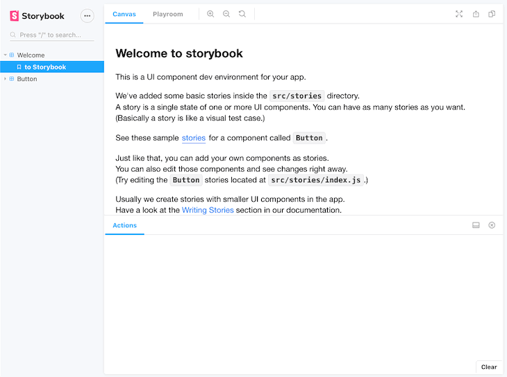
This is the role of Storybook, and it’s defined on their website as follows:
Storybook is an open source tool for developing UI components in isolation for React, Vue, and Angular.
It makes building stunning UIs organized and efficient.
The Replay is a weekly newsletter for dev and engineering leaders.
Delivered once a week, it's your curated guide to the most important conversations around frontend dev, emerging AI tools, and the state of modern software.
Addons are plugins that help supercharge your Storybook with new custom advanced functionalities and workflows.
These addons are contributed by the core maintainers (official addons) and by the developer community (community addons).
If you have been using Storybook, you’ve probably seen some official addons like Knobs and Actions.
Addons are still a growing feature of Storybook.
Below are some major addons that greatly enhance your workflow:
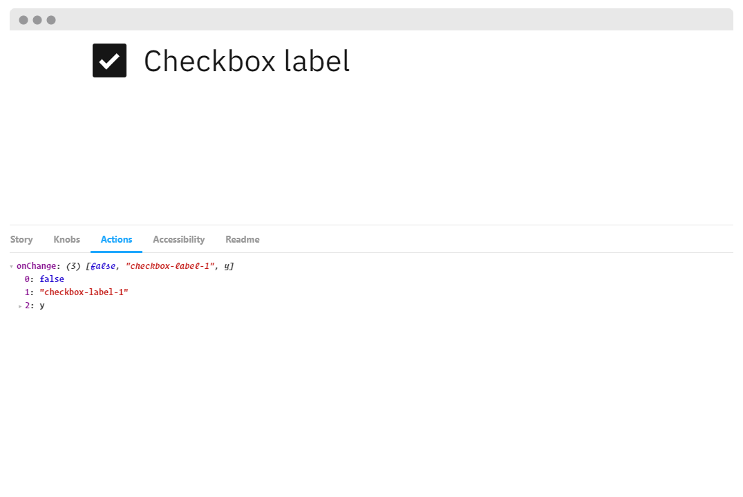
👁 A screenshot of the Knobs Storybook addons.
Knobs allow you to dynamically edit props through the Storybook interface.
It’s a great development, testing, and debugging tool.
With Knobs, you are able to change a button’s state or text from enabled to disabled simply by checking a box or changing a field.
👁 A screenshot of the Actions Storybook addon.
The Actions addon is used to display data received by event handlers.
It’s basically your event console.log().
With this addon, you can monitor multiple actions on your component.
You can even process the data before sending it to the logger incase you need to do some cleanup before.
Tip:
The Events addon can also enable you to add (emit) custom events for your stories.
You can mimic an event and customize the payload.
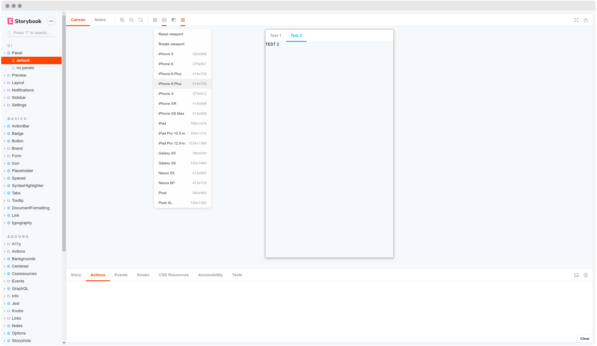
👁 A screenshot of the Viewport addon.
The Viewport addon allows you to display your stories in different sizes and layouts.
This addon basically functions as your browser developer tools.
You are able to set popular (iPhone 6, iPhone X, Pixel XL etc..), edit them, or add custom viewports on your components to help visualize them in different environments.
import { addParameters } from '@storybook/react';

const customViewports = {
 kindleFire2: {
 name: 'Kindle Fire 2',
 styles: {
 width: '600px',
 height: '963px',
 },
 },
 kindleFireHD: {
 name: 'Kindle Fire HD',
 styles: {
 width: '533px',
 height: '801px',
 },
 },
};

addParameters({
 viewport: { viewports: customViewports },
});
Tip:
You can improve your component’s responsiveness tests with taffy and responsive views.
Taffy enables a dynamic draggable re-sizer and responsive views is able to set media queries to help test your components.
This addon simply adds the stories code sources in the addon panel.
This enables the reader to see the component’s implementation.
You are even able to add a prettier configuration (or formatting rules) to the code.
Moreover, you can add dark and light syntax themes to the code.
Tip:
In case you are a React user, there’s a React live edit plugin.
As its name says, it helps you to live edit a story’s code.
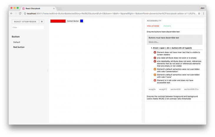
👁 A screenshot of a Storybook addon intended to ensure accessibility.
The a11y addon checks your components against common accessibility rules.
This helps developers understand which of these rules their components respect and which ones they violate.
It even provides hints for how to fix it, as well as links to get more information.
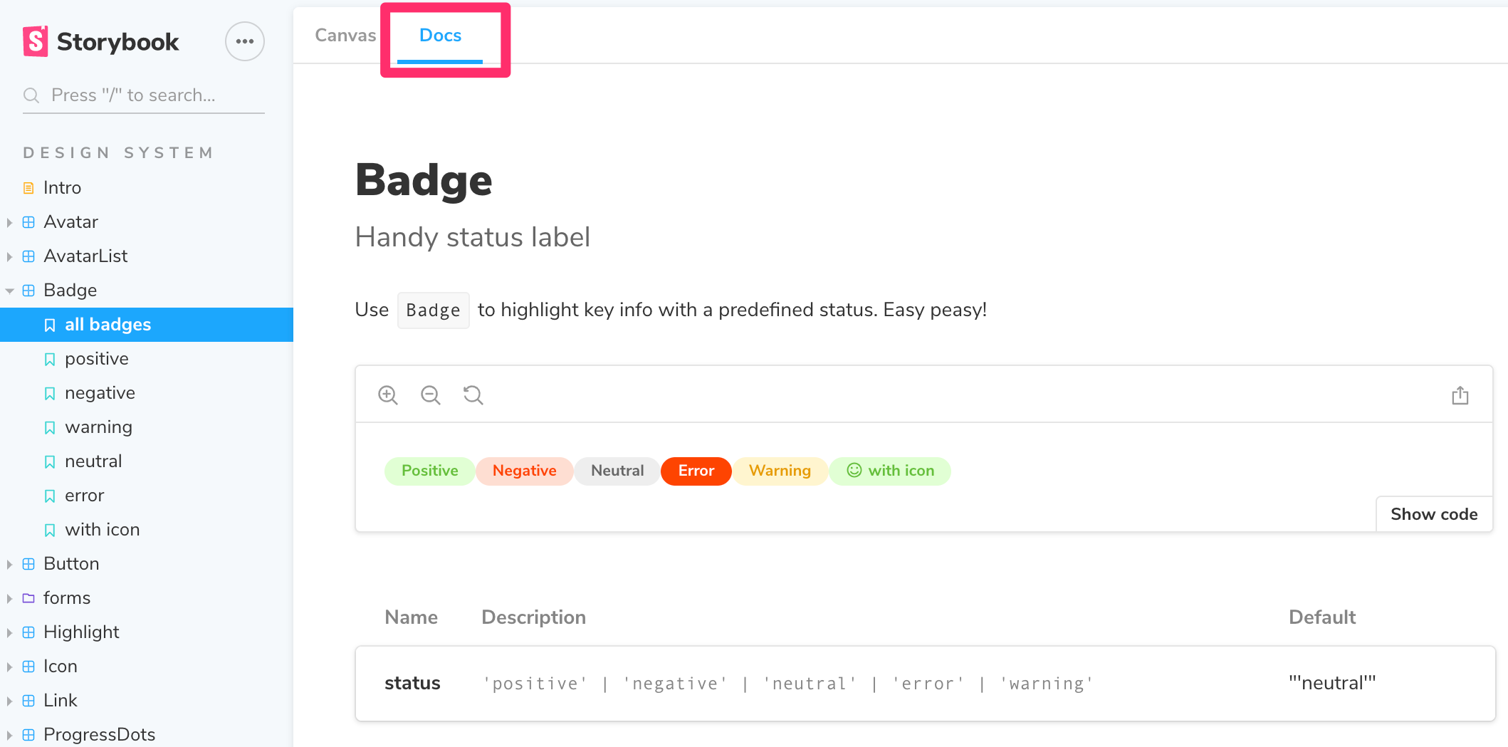
👁 An image of the Storybook docs.
Storybook Docs transform your Storybook stories into world-class component documentation.
Out of the box, all your stories get a DocsPage.
DocsPage is a zero-config aggregation of your component stories, text descriptions, docgen comments, props tables, and code examples into clean, readable pages.
MDX If you want more control, MDX allows you to write long-form markdown documentation and stories into one file.
You can also use it to write pure documentation pages and embed them inside your Storybook alongside your stories.
Tip:
You can use notes and chapters addons to organize and supercharge even more of your components’ documentation.
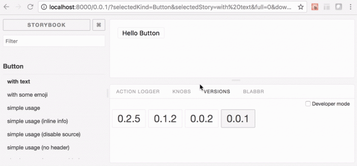
👁 A screenshot Versions, which is basically the git of the Storybook.
Versions is basically your git for the components in your storybook.
This addon allows you to navigate through different versions of your components via a versions panel, in case you have a setup that produces a different static Storybook build for each of your versions.
If you work with the Apollo client to help query and mutate your GraphQL API, the Apollo storybook addon has you covered.
You are able to provide a mock object which will be consumed by your component.
Furthermore, if your graphQL API relies on Hygraph (previously Graph CMS), the Graph kit addon helps you visualize all your data directly in appropriate components.
You’re also able to browse the database in a friendly, visible form.
Formik addon
Now, just in case you happen to use the well known Formik to build your forms without tears in React, this Storybook addon wraps your Formik fields and tracks their state in a panel to provide you with a nice experience.
i18n is a tool that simply helps to change a component’s locale.
The addon is made completely library-agnostic (it doesn’t depend on any particular internationalization tool).
With the different style addons in Storybook, you are able to present your components in various ways.
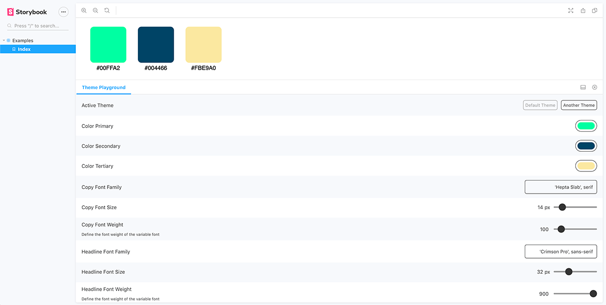
Theme playground
Theme playground provides a panel where the theme values predefined in the components can be tweaked easily.
👁 A screenshot of the UI of the Storybook theme playground.
If you have any flavored stylesheets, you may use the following:
Playroom is probably one of the greatest community Storybook addons.
The playroom enables you to play along with all of your components while testing them against popular screen breakpoints.
Using this addon, you can start designing combinations of components using each story source as a starting point.
If you wish to have your Adobe XD or Figma UI designs embedded in your Storybook page for any reason, you can use the XD addon and Figma addon, respectively.
You can also use the vertical rhythm addon each time your high-fidelity designs have very sensitive specs.
They will help you deal with your component’s sizes, depths, and line heights.
Tip:
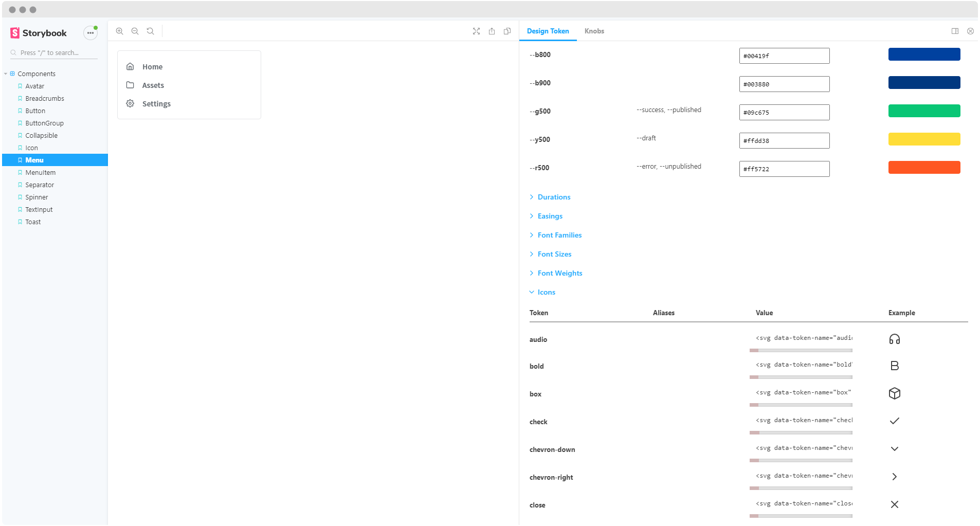
There also exists a Design token addon that enables you to automatically generate design token documentation from your stylesheets.
👁 A screenshot of Storybook components.
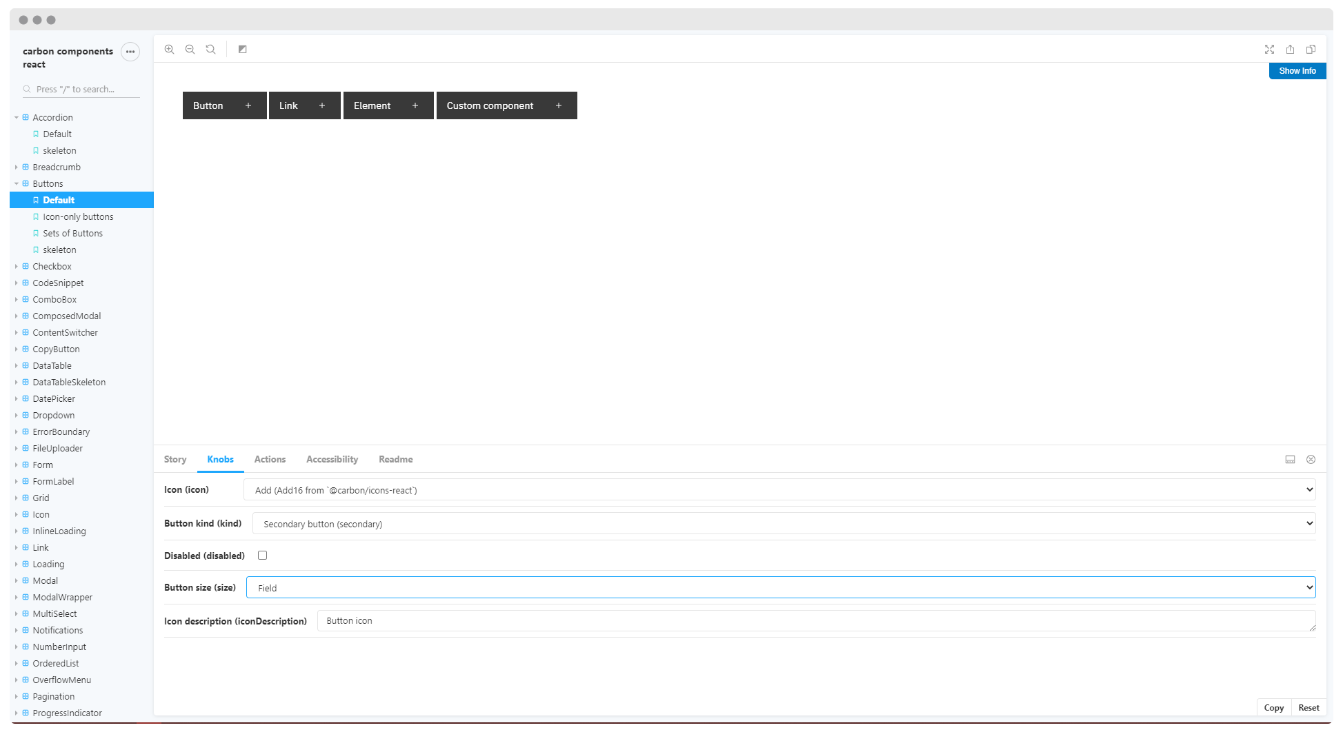
React carbon design system has included in their Storybook a good collection of addons. You can use it to check out most of the aforementioned addons.
Storybook already offers a great approach to frontend development, and addons only increase its power.
Addons are a great addition to Storybook and its vision of giving developers a better experience.
Install LogRocket via npm or script tag. LogRocket.init() must be called client-side, not
server-side
$ npm i --save logrocket

// Code:

import LogRocket from 'logrocket';
LogRocket.init('app/id');
// Add to your HTML:

<script src="https://cdn.lr-ingest.com/LogRocket.min.js"></script>
<script>window.LogRocket && window.LogRocket.init('app/id');</script>
Build dynamic LLM routing in Next.js with OpenRouter, TanStack AI, task classification, model fallbacks, and cost-aware routing.
TSRX adds first-class control flow, conditional hooks, and scoped styles to React via a TypeScript compiler extension — no new framework required.
Learn how to build a full React Native auth system using Better Auth and Expo — with email/password login, Google OAuth, session persistence, and protected routes.
Compare the top AI development tools and models of June 2026. View updated rankings, feature breakdowns, and find the best fit for you.
Would you be interested in joining LogRocket's developer community?
Join LogRocket’s Content Advisory Board. You’ll help inform the type of content we create and get access to exclusive meetups, social accreditation, and swag.
Sign up now