 |
VOOZH | about |
|
VOOZH | about |
The View Transition API simplifies changing the DOM with an animated transition, and unlocks new transition effects when navigating between pages. The API is supported in Chrome ≥ 111.
👁 Using the View Transitions API in AstroView Transitions unlocks native browser transition effects between pages for Astro 3.0 using new platform APIs. The good part? Astro is the first major web framework to mainstream View Transitions, and this article will get you started with the new API.
Jump ahead:
The Replay is a weekly newsletter for dev and engineering leaders.
Delivered once a week, it's your curated guide to the most important conversations around frontend dev, emerging AI tools, and the state of modern software.
Let’s explore Astro view transitions with a starter project. Run the following command:
git clone https://github.com/understanding-astro/astro-view-transitions-starter.git && cd astro-view-transitions-starter && npm install && npm start
This will:
Open the local port (localhost:4321) and view the starter application. Make sure to transition between the home page (with the card list) and the main article page, as shown below:
What we have here is a standard navigation between pages in Astro. Let’s now add some view transitions.
Astro view transitions kick in when navigating from one page to another. When you click a link on the origin page, Astro intercepts the click, prevents the default routing behavior, and provides the transition effect from the origin page to the destination page.
To enable view transitions in Astro, we import and render the ViewTransitions component in the head of an Astro page.
ViewTransitions is responsible for adding a client script to your origin page that intercepts clicks to other pages and there are two ways to leverage ViewTransitions.
If you need to add view transitions to a single page or between specific pages, go ahead and render ViewTransitions in the head of the specific pages:
// some-page.astro
---
import { ViewTransitions } from "astro:transitions";
---

<head>
 <ViewTransitions />
</head>

// ...
Note that you must add ViewTransitions to the <head> of both the origin and destination pages:
To add view transitions to every page in your application, render ViewTransitions within the <head> element rendered in a shared Layout component (or similar).
With our starter project, we may go to layouts/Main.astro and render the ViewTransitions component within <head>, as shown below:
// import the view transitions component
import { ViewTransitions } from "astro:transitions";
---

<html lang="en">
 <head>
 ...
 <!-- Render the view transitions component -->
 <ViewTransitions />
 </head>
 ...
</html>
Adding ViewTransitions as discussed in standalone pages or shared layout components will capture clicks to other pages and provide a default fade transition, as shown below. Refresh the page if you don’t notice the transition right away:
Based on the type of DOM element and its location in the DOM, Astro automatically infers corresponding elements in the origin and destination page.
For finer control, we may leverage transition directives:
transition:nametransition:animatetransition:persisttransition:nameWith transition:name we can specifically associate a pair of DOM elements from the origin and destination page.
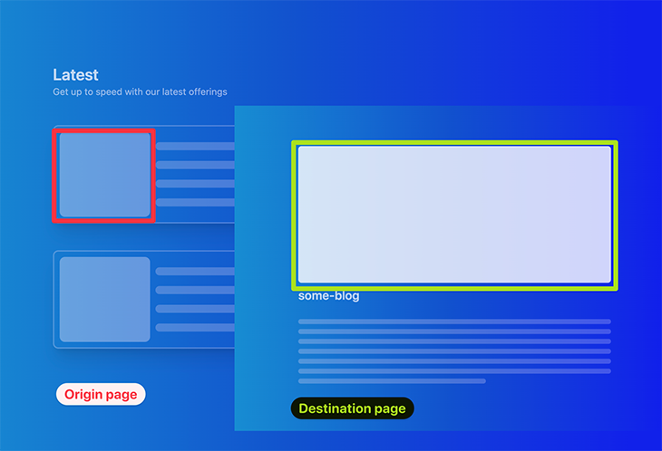
To do this, we provide the same transition:name attribute to the origin and destination page elements. This name must be unique across each page.
Let’s give this a try. In our demo application, we can associate the media elements on the home and overview pages:
To associate these elements, we can give them the same transition:name attribute value. In pages/blog/[...path].astro, find the destination element and provide the transition:name as shown below:
<!-- 📂 pages/blog/[...path].astro -->
---
const { path } = Astro.params;
---

<Main>
 <div
 class="bg-white/80 min-w-[100%] min-h-[40vh] rounded-lg transition-all"
 transition:name=`media-image-${path}`
 >
...
</div>
...
</Main>
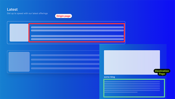
The path variable refers to the blog path e.g., some-blog or another-blog. Now, do the same for the origin page.
Pass a mediaTransitionName prop to Card. This will be translated to a media-image-${path} attribute on the media element on the origin page:
<!-- 📂 pages/index.astro -->

<Card
 to={`/blog/${path`}
 mediaTransitionName={`media-image-${path}`}
/>
By doing this, we now have both elements associated and animated accordingly:
transition:animateViewTransitions always applies a default fade animation, but we can assertively customize the behavior of specific transitions by adding the transition:animate directive to individual elements.
There are four default animations supported via transition:animate:
fade (default): An opinionated crossfade animation where the old content fades out and the new content fades ininitial: Uses the browser’s default stylingslide: The old content slides left, new slides right. This is reversed on backwards navigationnone: Disables the browser’s default animationsLet’s use slide on our content elements:
The origin page is represented by pages/index.astro. Go ahead and add the transition:animate directive to the content stripes by passing a contentTransitionAnimate prop, as shown below:
// 📂 pages/index.astro

<Card
 to={`/blog/${path}`}
 contentTransitionAnimate="slide"
 />
Now, add transition:animate to the destination content parent element as shown below:
// 📂 pages/blog/[...path].astro

<article class="flex gap-3 flex-col mt-10" transition:animate="slide">
 // ...
</article>
We should now have the content slide animation on both forwards and backwards navigation:
Aside from the default animations, we may also configure custom animations via transition:animate. We can customize an existing default animation, such as fade or slide, or create a new animation altogether.
Consider the example below that changes the duration of the slide animation on the media content:
// 📂 pages/blog/[...path].astro
---
import { slide } from "astro:transitions";
---

<article
 class="flex gap-3 flex-col mt-10"
 // 👀 look here
 transition:animate={slide({ duration: "0.4s" })}
 >
 ...
</article>
Now, the content slide animation will come in later, as shown below:
How about creating an altogether custom animation? Let’s make a bounce animation.
Go to the layouts/Main.astro component and add a global style with the keyframes for the bounce animation, as shown below:
// 📂 layouts/Main.astro

<body>
// ...
 <style is:global>
 @keyframes bounce {
 from,
 20%,
 53%,
 to {
 animation-timing-function: cubic-bezier(0.215, 0.61, 0.355, 1);
 transform: translate3d(0, 0, 0);
 }

 40%,
 43% {
 animation-timing-function: cubic-bezier(0.755, 0.05, 0.855, 0.06);
 transform: translate3d(0, -30px, 0) scaleY(1.1);
 }

 70% {
 animation-timing-function: cubic-bezier(0.755, 0.05, 0.855, 0.06);
 transform: translate3d(0, -15px, 0) scaleY(1.05);
 }

 80% {
 transition-timing-function: cubic-bezier(0.215, 0.61, 0.355, 1);
 transform: translate3d(0, 0, 0) scaleY(0.95);
 }

 90% {
 transform: translate3d(0, -4px, 0) scaleY(1.02);
 }
 }
 </style>
</body>
To create a valid animation, we must follow a strict interface similar to the following:
export interface TransitionAnimation {
 name: string;
 delay?: number | string;
 duration?: number | string;
 easing?: string;
 fillMode?: string;
 direction?: string;
}

export interface TransitionAnimationPair {
 old: TransitionAnimation | TransitionAnimation[];
 new: TransitionAnimation | TransitionAnimation[];
}

export interface TransitionDirectionalAnimations {
 forwards: TransitionAnimationPair;
 backwards: TransitionAnimationPair;
}
The above describes the expected behavior when navigating between old and new pages. It includes forwards and backwards movement directions.
Let’s put this into practice. Go to the pages/blog/[...path].astro page and create the actual bounce custom animation in the frontmatter, as shown below:
// 📂 pages/blog/[...path].astro
---
//...
const bounceAnimation = {
 old: {
 name: "bounce", // same name as the keyframe in layouts/Main
 duration: "0.7s",
 easing: "linear",
 fillMode: "forwards",
 },
 new: {
 name: "bounce",
 duration: "0.7s",
 easing: "linear",
 fillMode: "backwards",
 },
};

const bounce = {
 forwards: bounceAnimation,
 backwards: bounceAnimation,
};
---
Finally, use this animation for the destination page content as shown below:
// 📂 pages/blog/[...path].astro
<article class="flex gap-3 flex-col mt-10" transition:animate={bounce}>
//...
</article>
Now, navigate from the home page to the blog destination page and watch the content bounce:
transition:persistUpon navigation, we can use the transition:persist directive to persist components and HTML elements across the origin and destination pages.
For example, if we had a video playing on the origin page, we could persist the state of the video component, if it’s rendered in the destination page by doing the following:
<video transition:persist>
...
</video>
This is the same with Astro Islands.
Let’s put this into practice. For this, I’ve prepared a basic counter component built in React, called ReactCounter. In the demo home page, go ahead and render the ReactCounter island as shown below:
// 📂 pages/index.astro
---
import { ReactCounter } from "../components/ReactCounter";
---


<Card
 to={`/blog/${path}`}
 mediaTransitionName={`media-image-${path}`}
 contentTransitionAnimate="slide">
 {/** 👀 Render counter island */}

 <ReactCounter client:load />
</Card>
This will render the counter within the card media element:
Note that clicking the media element updates the counter. To navigate to the blog page, you must click outside the media element, which in our case is the card content.
Go ahead and also render the counter in the blog destination page as shown below:
// 📂 pages/blog/[...path].astro
---
import { ReactCounter } from "../../components/ReactCounter";
---

<Main>
 <div
 class="bg-white/80 min-w-[100%] h-[40vh] rounded-lg transition-all"
 transition:name=`media-image-${path}`
 >
 <ReactCounter client:load />
 </div>
 // ...
</Main>
This will render the counter in the main blog media element:
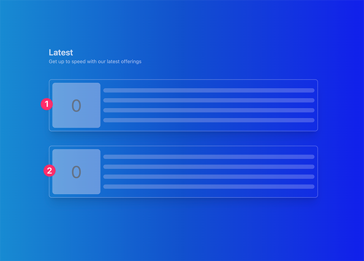
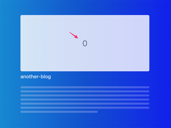
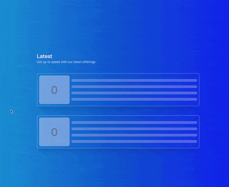
By default, if we transition between the home page and the blog page, the state of the counter is always reset as shown below:
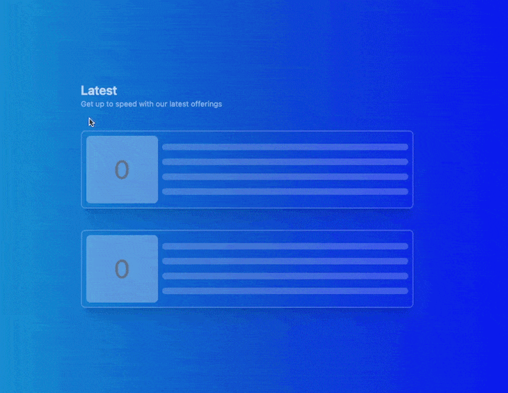
However, we can change that by adding transition:persist to the rendered ReactCounter islands and giving the counters a unique transition:name to make sure the multiple islands on the home page are treated as distinct elements:
// 📂 index.astro
<ReactCounter
 client:load
 transition:persist
 transition:name={`counter-${path}`}
/>

// 📂 pages/blog/[...path].astro

<ReactCounter
 client:load
 transition:persist
 transition:name={`counter-${path}`}
/>
Now, navigate from the home page to the blog and back. Note that the counter’s state remains preserved:
<ViewTransitions /> works best for browsers that support view transitions, i.e., Chromium-browsers. However, it also ships support for other browsers.
For example, at the time of writing, Firefox doesn’t support view transitions, but here’s our demo in Firefox:
👁 View transitions in Astro using Firefox
Astro still tries to provide a comparable transition experience. If you wish to disable support in other browsers, pass none to the fallback prop, as shown below:
<ViewTransitions fallback="none" />
This will trigger a full page reload in non-supporting browsers. To disable a full-page reload and disable animations upon navigation, pass the swap prop value as shown below:
class="language-javascript hljs"><ViewTransitions fallback="swap" />
View transitions bring a native feel to the web, and with Astro being the first major web framework to support them, you can start building arguably better transitions today.
Visit the Astro view transitions examples GitHub repo for all the examples discussed here.
Install LogRocket via npm or script tag. LogRocket.init() must be called client-side, not
server-side
$ npm i --save logrocket

// Code:

import LogRocket from 'logrocket';
LogRocket.init('app/id');
// Add to your HTML:

<script src="https://cdn.lr-ingest.com/LogRocket.min.js"></script>
<script>window.LogRocket && window.LogRocket.init('app/id');</script>
TSRX adds first-class control flow, conditional hooks, and scoped styles to React via a TypeScript compiler extension — no new framework required.
Learn how to build a full React Native auth system using Better Auth and Expo — with email/password login, Google OAuth, session persistence, and protected routes.
Compare the top AI development tools and models of June 2026. View updated rankings, feature breakdowns, and find the best fit for you.
Learn how Bloom filters reduce database lookups for username availability checks while preserving correctness at scale.
Hey there, want to help make our blog better?
Join LogRocket’s Content Advisory Board. You’ll help inform the type of content we create and get access to exclusive meetups, social accreditation, and swag.
Sign up now