 |
VOOZH | about |
|
VOOZH | about |
Editor’s note: This article was updated by Oscar Jite-Orimiono on 13 November 2024 to cover both general modal UX design and specific cases, provide actionable best practices, discuss detailed examples of different modal types, answer common questions about modal UX design, and more.
👁 Modal UX Design Patterns Examples And Best PracticesA modal is a window that is displayed over the main content on a website or application. Modals display additional actionable content to assist the user.
Modals are ubiquitous in modern digital products — it’s nearly impossible to use any website or app and not come across one. But from a user perspective, modals can be quite disruptive, especially when they prompt or “force” the user to complete a task or perform an action before they can continue interacting with the rest of the UI.
By nature, modals are disruptive because they sit on top of the main application. However, modals are most annoying when they’re:
It’s important to understand and practice good modal UX design principles to avoid negatively impacting user experiences.
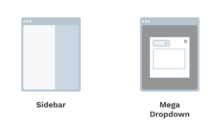
Consider these two kinds of modals:
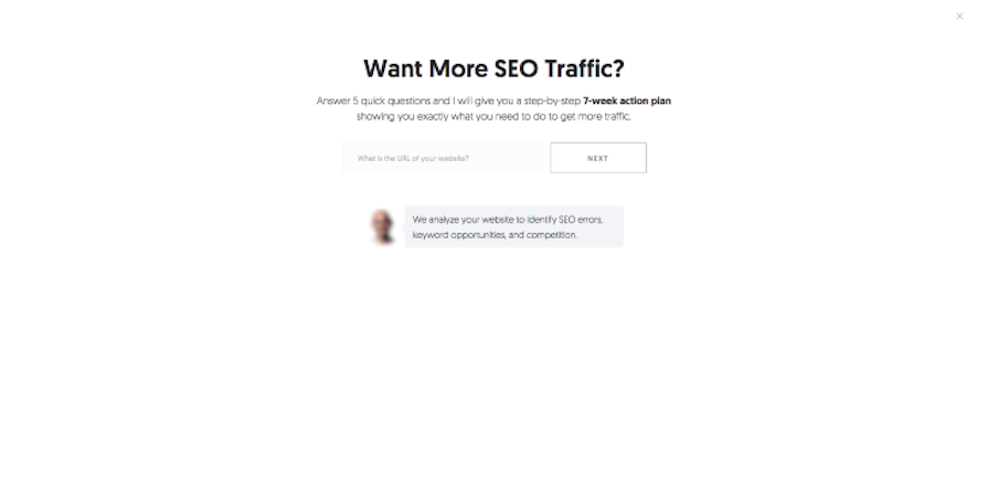
Installation modals guide users through multi-step processes. If you try printing this page, for example, with ctrl (or command) + p, you would have to define multiple variables, like color, orientation, and the number of pages. These types of modals are self-activated or initiated.
Interruptive modals, as the name suggests, appear unexpectedly or are auto-triggered. Interruptive modal examples include app permissions, error messages, warnings, or urgent alerts. Good modal UX design must be implemented to minimize user frustration.
When designing a modal, you must determine its purpose. It will help you decide if it should be blocking or non-blocking:
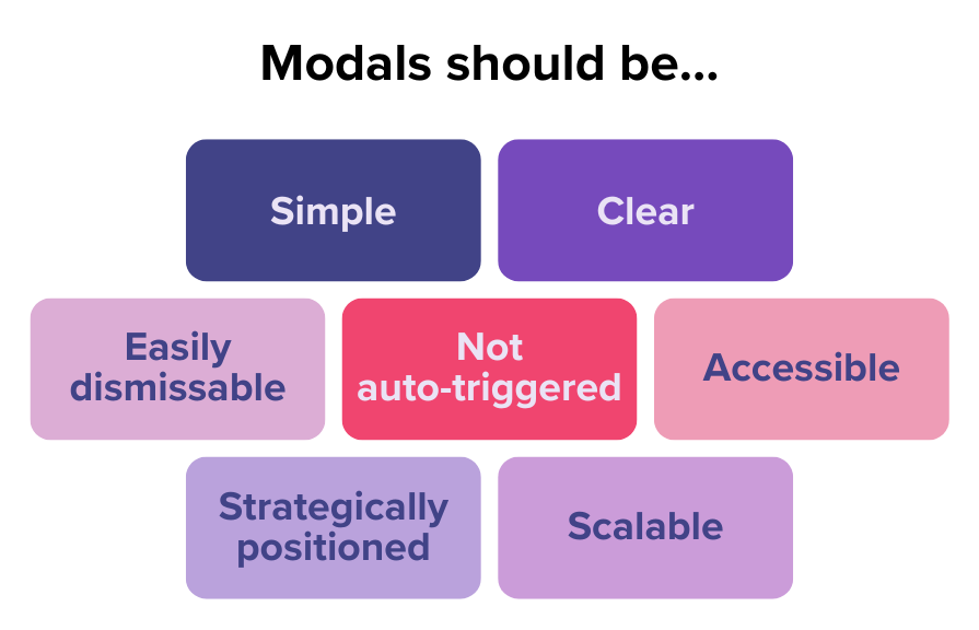
Effective modal UX design requires balancing principles like clarity, accessibility, control, and more:
Let’s look at some examples and explore some best practices for implementing modals, while learning how and when to use them well.
Modals don’t need too much information, so minimize the content and options facing the user:
At the same time, in situations where the modal content doesn’t require too much space, you should try utilizing more subtle, non-modal UI elements like tooltips, notification bars, or snack bars.
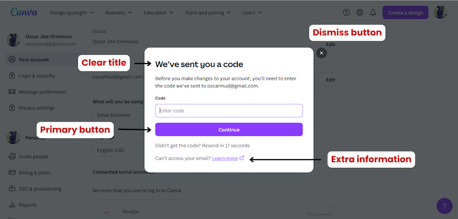
Since we know modals are disruptive, make modal content easy to understand with a clear, descriptive but concise title. It’s also good practice to include instructional subtitles for the user to help them understand their context and purpose:
Pop-up modal messaging should be direct and conversational. For instance, a delete confirmation should ask, “Are you sure you want to delete?” and not, “Free up storage?” The first question does a better job of ensuring the user fully understands that the action they’re about to take is irreversible.
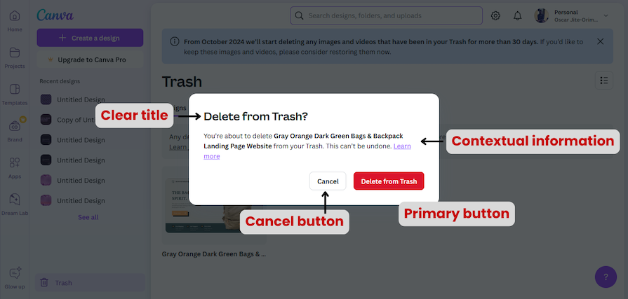
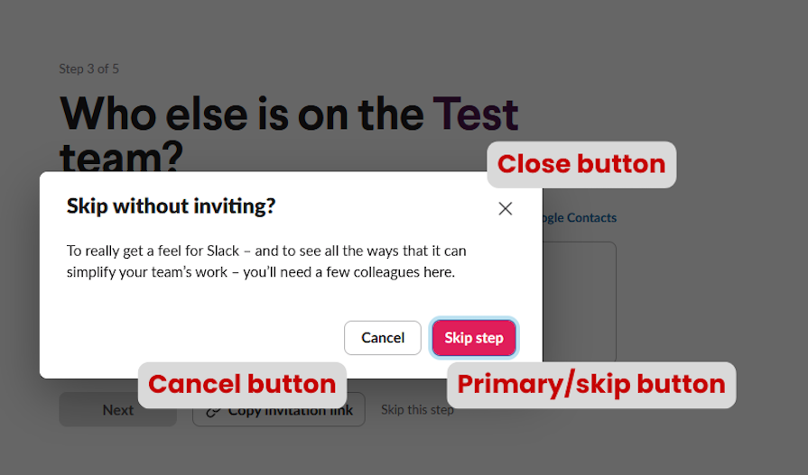
A modal should be easy to dismiss or close. Give the users multiple options like a cancel button, a close (X) button, using the escape key, or clicking outside the window:
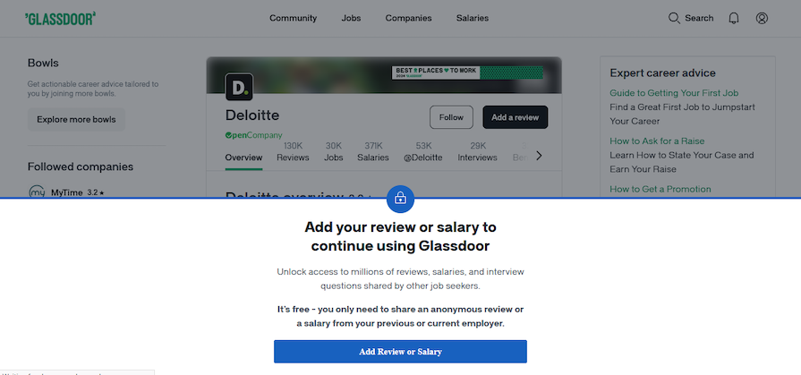
Here’s an interruptive modal example that may help convey why this is so important:
This auto-triggered modal pops up when you try to view a company’s job vacancies without completing your Glassdoor profile, asking you to add a review or salary before continuing. While Glassdoor’s overall UX is usually great, this aspect could use some improvement.
Not only are auto-triggered modals the worst kind of modal (which we’ll talk about a little more next), you also can’t dismiss it, and they don’t give a clear reason why you must complete this task. The only button on the modal redirects you to a new page where you’re finally given a reason why you must leave a review (after a few more clicks).
These extra steps take users further away from their primary activity. And what about users who have never been employed? What happens when they can’t provide the requested information?
All these could be prevented by implementing the modal the moment you click on the company name. There should be a tooltip explaining why leaving a review is important, and users should be able to dismiss it and continue on the site.
Users like to be in control of their actions, and intrusive, auto-triggered modals can disrupt their flow.
In the Glassdoor example we covered above, the navigation bar suggests that you can search for hiring companies as you can search for jobs. But when the company page opens, the auto-triggered modal immediately appears.
This can be jarring and extremely frustrating, especially for first-time users. We’ve already discussed that this particular modal is problematic because it might force them to abandon their search or switch to another site.
Only implement auto-triggered modals in scenarios where users will appreciate the disruption. If the modal helps them avoid mistakes, like forgetting to save a file before closing a tab or alerts them of a security breach, then they’ll value the interruption.
Users should be able to navigate through modals. Ensure the focus is shifted to the modal when it is active so every user can properly interact with it.
If you hit the tab key on your keyboard when on a website, the browser should cycle through every clickable or interactive UI element. This should also happen within a modal when it’s open. Disable the focus state of the main page until the user dismisses the modal.
The position and size of a modal should be able to properly direct the user’s focus without creating visual clutter. Good modals will have ample whitespace and clear visual hierarchy.
If it’s a lightbox modal where the background is dimmed, then focus is quite easily achieved. For non-blocking and small modals, where the background is still visible, it’s a good idea to use motion to draw the users’ attention.
More than half the amount of web traffic comes from mobile devices and modals should be able to adapt to different screen sizes.
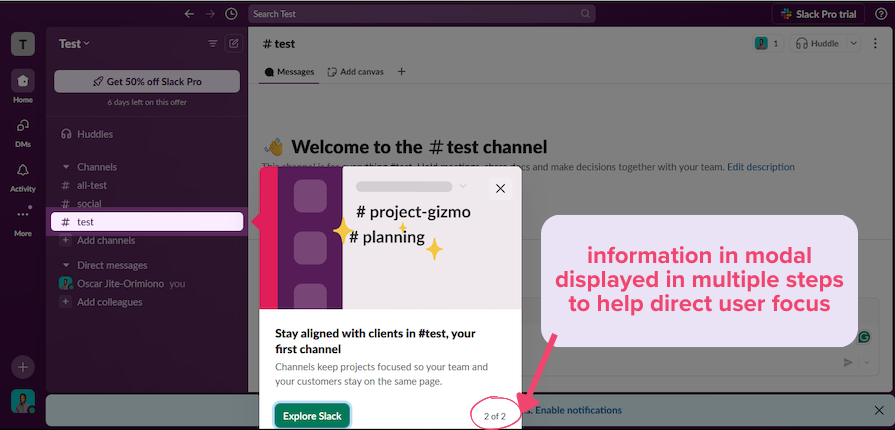
Modals can have pagination or steps on smaller screens, where users can click Next to move to more steps. In such cases, there must be a progress bar so the user’s expectations are properly managed and they understand where they are in the process. It’s also a good idea to autosave the user’s last entered data to avoid frustration.
Modals should not generally be used to display error messages, loading, or success states because these can occur frequently, disrupting the user experience by blocking the main screen. Instead, embed such messages directly into the existing UI.
For example, a loading state can be reflected in the button that triggers the action, while error or success messages can appear within the main UI. Modals are best reserved for irreversible actions or situations that require explicit user confirmation, ensuring user focus and reducing errors.
Modals can be classified based on their specific use cases and characteristics. Let’s go through three types and when best to use them: dialog modals, lightbox and pop-up modals, and fullscreen modals.
Like a conversation between people, dialog modals communication with users, prompting them to enter information or make a decision using UI elements like buttons, text fields, select inputs/controls, and forms.
Dialog modals can be input dialogs or confirmation dialogs. These two formats serve different purposes. They’re generally blocking objects, meaning the user must acknowledge or close them before proceeding with any other tasks.
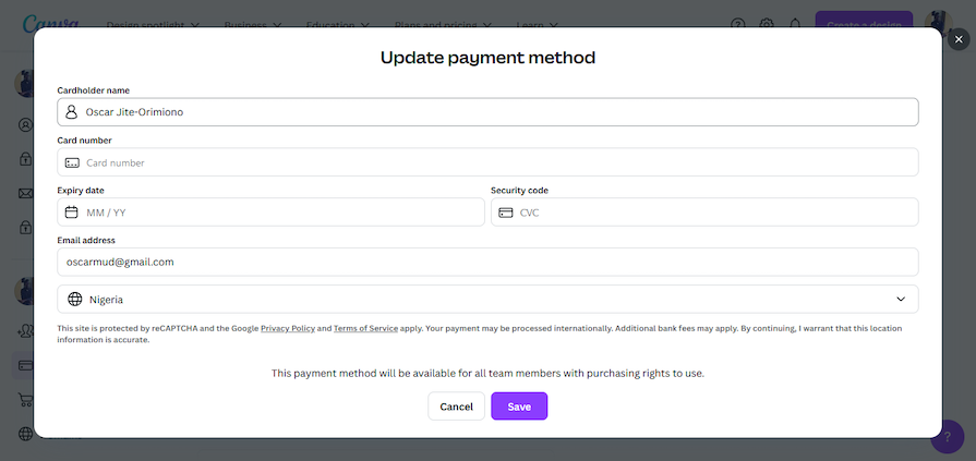
Input dialogs require users to enter information by providing a form or select options. For example, checkout forms on an ecommerce site typically ask you to enter billing information and more:
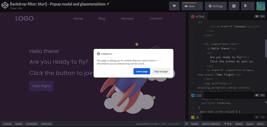
Confirmation dialogs prompt users to confirm or cancel an action. For instance, if you try to leave a site or app with unsaved work, a dialog modal might appear asking you to confirm if you want to leave and check if your data was saved:
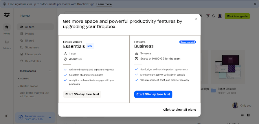
Lightboxes and pop-ups dim the main content in the background to make the modal content the primary focus. They are often used for ads or promotions:
Lightboxes generally contain non-critical information and usually appear automatically without any user action, such as an opt-in form on a website. However, they tend to be very easy to dismiss by clicking on a close or skip button, or clicking outside the modal:
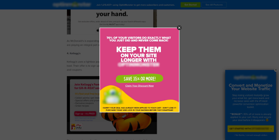
👁 Advertisement Popping Up As A Lightbox Modal
Lightboxes and pop-ups also have a habit of appearing repeatedly. To prevent bad UX, keep the following points in mind when implementing pop-ups:
Fullscreen modals occupy the entire screen or browser window, hiding the main content completely. These modals are particularly useful when we want the user’s undivided attention and don’t want them distracted by the underlying content.
For example, this fullscreen pop-up shows when a user moves the cursor outside the body area of the website (i.e., when the user is trying to exit the website):
Installation modals guide users through multi-step processes without overwhelming them. These processes include onboarding new users, purchasing items online, installing new software, customizing an app, managing subscriptions, and more.
Let’s go through some best practices for designing user-friendly installation modals:
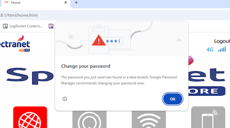
Interruptive modals, as the name suggests, disrupt the user’s flow or task to present information. These types of modals must be only used for critical information or urgent tasks to avoid distracting the user from their primary task.
Some best practices include:
At this point, we’ve established that modal dialogs can be disruptive, distracting, interruptive, and more. Non-modal dialogs are, in most cases, the opposite.
Modal and non-modal dialogs can have the same purpose and perform the same task. The main difference between them is how they treat the main content. Modals disable the main content in the background while non-modal dialogs do not.
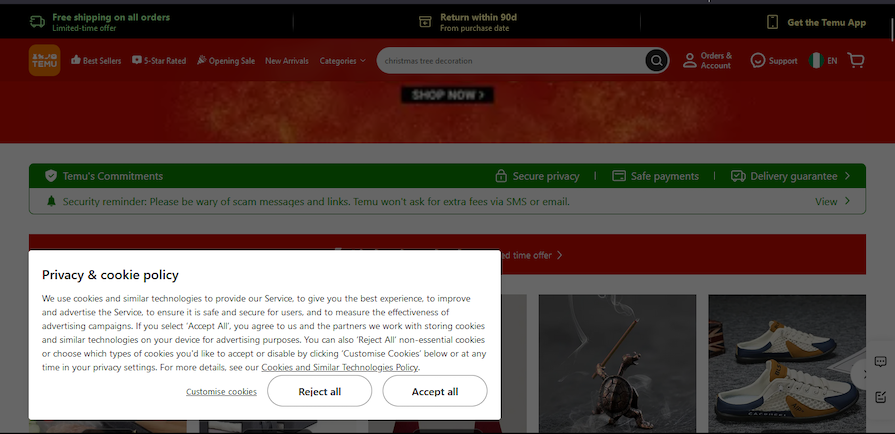
Here’s an example of a modal from Temu containing information about cookies:
This modal disables the background so you can’t shop unless you accept or reject the cookies.
One of the benefits of implementing modal dialogs is that they demand the user’s full attention. It’s hard to miss critical information and they can help prevent errors.
The downside is that modals are intrusive and disruptive. They often demand immediate action, interrupting the user’s workflow. Modals block/disable the main content in the background and users can’t continue with their initial task
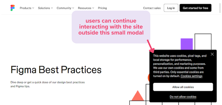
Here’s an example of a non-modal cookie notification from Figma:
Figma’s cookie notification doesn’t take up much space, and users can continue interacting with the main content with the dialog open.
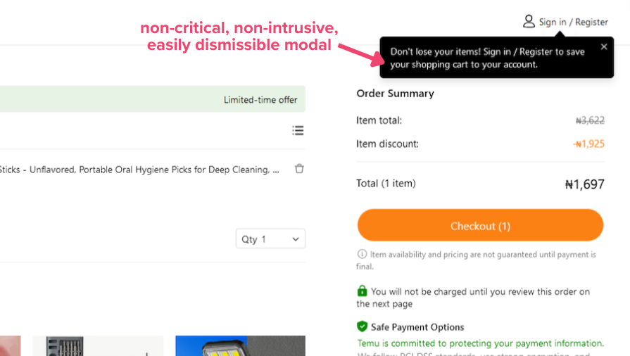
Non-modal dialogs should be used for non-critical tasks because of how easy they are to ignore and dismiss. They can be used for search bars, notifications, and error messages.
Here’s an example:
Non-modal dialogs have a few benefits:
When designing modals, you must ensure that every user can interact effectively with them. Accessible modals will help create an inclusive experience for users with disabilities, and those who use keyboards and screen readers. A few things to consider are:
Aria labels can be a bit confusing, so let’s discuss them in a little more detail. The aria labels you can add to modals include:
aria-labelledby — Defines the title of the modal.aria-describedby — For additional informationrole= "dialog" and role= "alertdialog" — Define the role of the modal container. The alertdialog role is for critical tasks like delete confirmation, while dialog is for other (reversible) actions like a login formaria-label="Close" — Defines the close buttonaria-hidden — Disables the background contentHere’s a CodePen from Harvard University demonstrating how aria labels work.
For installation modals, provide progress indicators with aria progressbar roles like aria-valuetext, aria-valuenow, and aria-valuemax. Include clear instructions for each step in the process and ensure users can easily navigate between them. It’s also a good idea to provide options to exit or skip for non-essential steps.
For interruptive modals, provide clear context and keep the content minimal. Use the appropriate aria labels and ensure there’s always a way to dismiss.
We’ve covered quite a lot of information about modal UX design and best practices. Here are some answers to a few common questions you might have:
If you have any other questions, feel free to comment below!
To implement modals that don’t hurt UX, we must maintain good modal anatomy. Modals must have a well defined purpose, contain clear messaging and have dismiss options. They should be triggered at appropriate times to not interrupt key user interactions.
The most important aspect of the modal design is deciding when modals are appropriate to use. Consider non-modal alternatives for non-critical tasks.
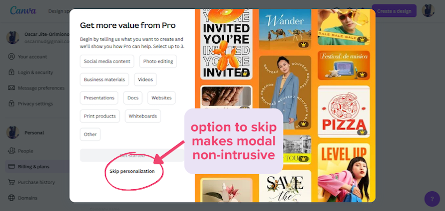
Well-designed installation modals will simplify multi-step processes, offering clear guidance without overwhelming the user. Including Skip or Dismiss buttons can make user experiences feel less restrictive.
Similarly, interruptive modals should only be used for confirmations or critical alerts. They must be concise, easy to dismiss, and timed properly to minimize frustration.
Modals should be accessible to every user, especially those you rely on assistive technology. Ensure users can access every interactive modal element by pressing the tab key.
By following and implementing these practices, you can create modals for websites and applications that enhance user experiences.
LogRocket's Galileo AI watches sessions and understands user feedback for you, automating the most time-intensive parts of your job and giving you more time to focus on great design.
See how design choices, interactions, and issues affect your users — get a demo of LogRocket today.
In A/B, A/B/n, or multivariate testing scenarios, using p-value with traditional null-hypothesis-based statistical analysis is so common, and most designers […]
Traditional A/B testing splits traffic evenly, but multi-armed bandits dynamically send more users to the better-performing version. Here’s how the method works, where it helps, and when UX teams should use it over classic A/B testing.
AI agent simulations promise faster, lower-risk UX testing by replacing real users with AI-simulated personas. Here’s how the method works, where it falls short, and when designers should rely on simulated users versus real user testing.
A/B testing is great for comparing two versions of a design, but multivariate testing helps teams evaluate multiple design element combinations at once. Here’s how both methods work, how they differ, and when UX teams should use each one.