Production-ready components
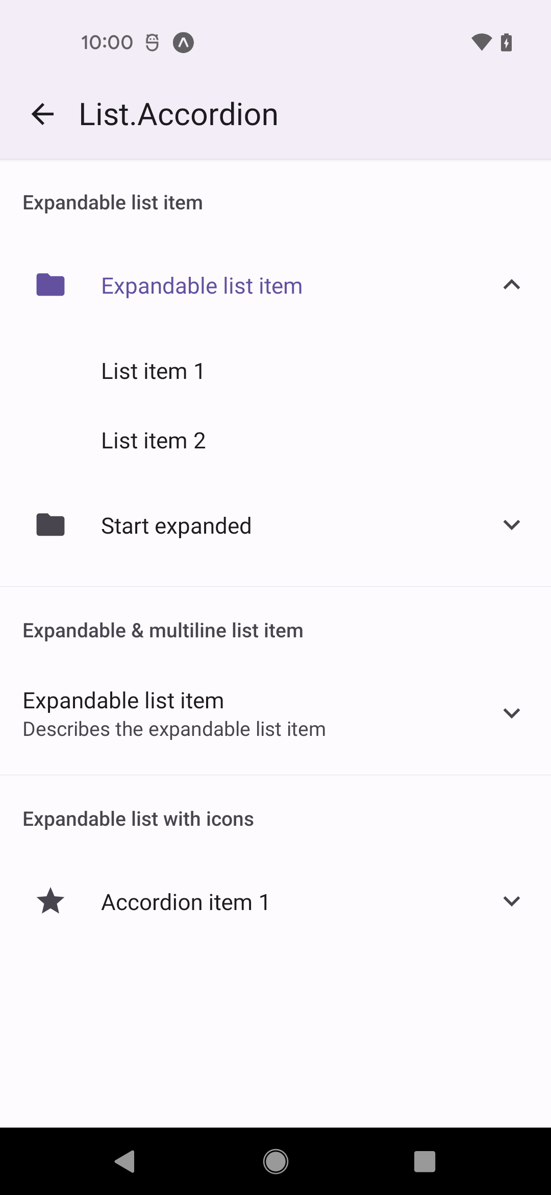
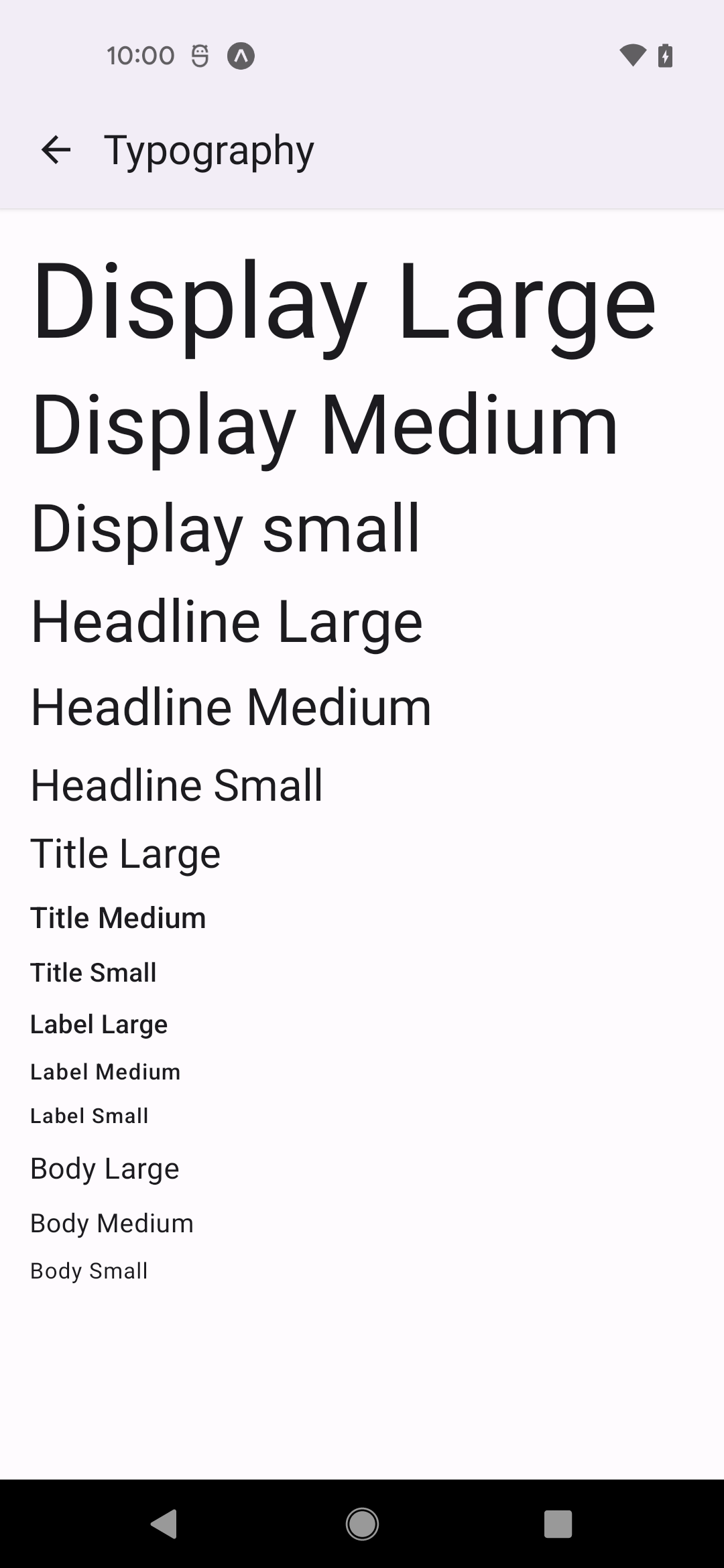
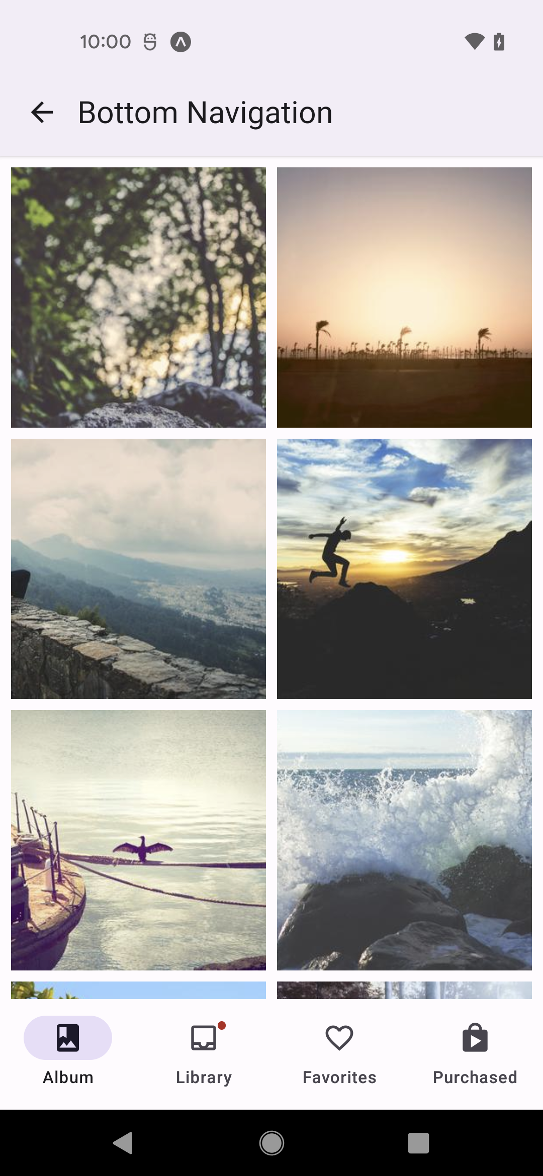
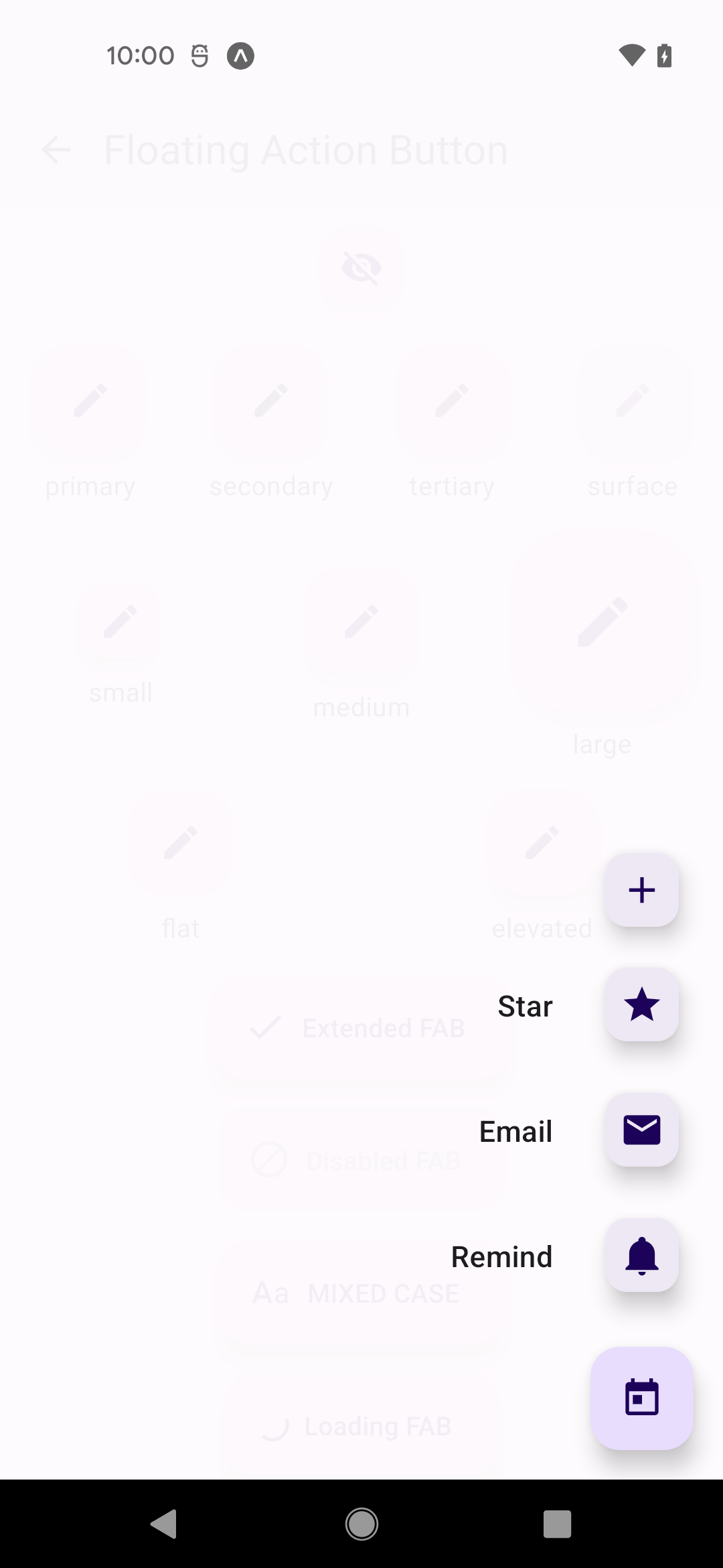
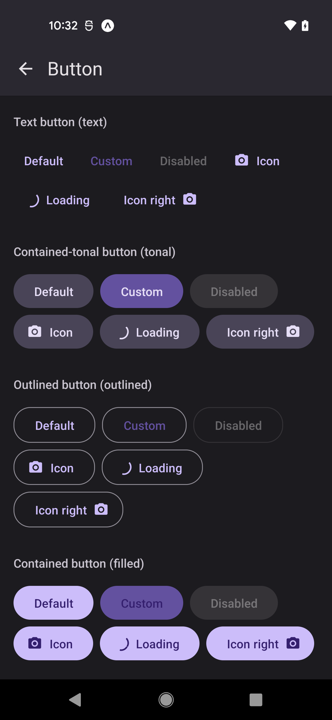
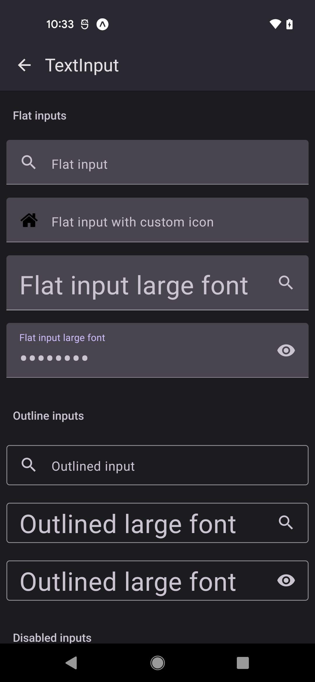
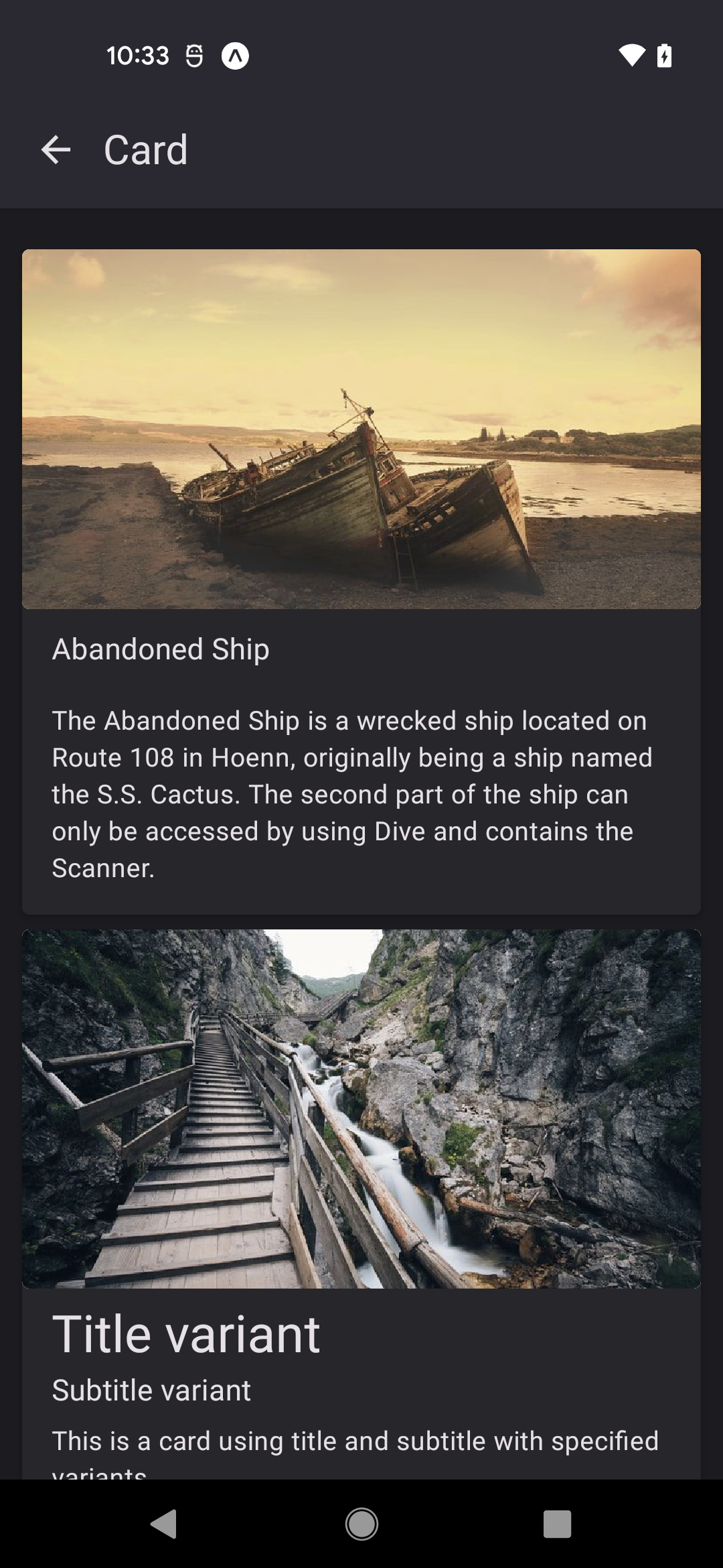
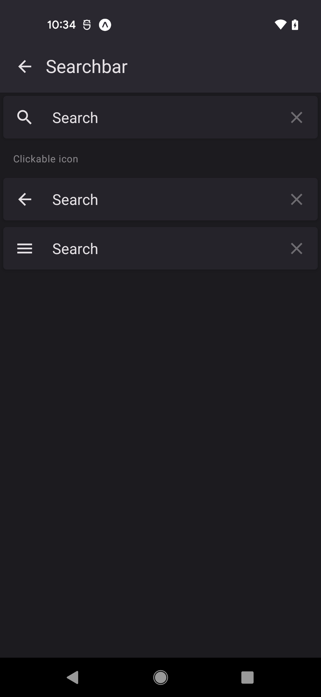
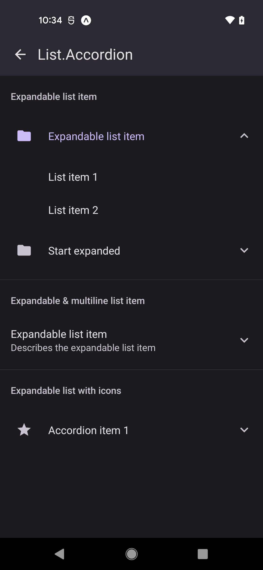
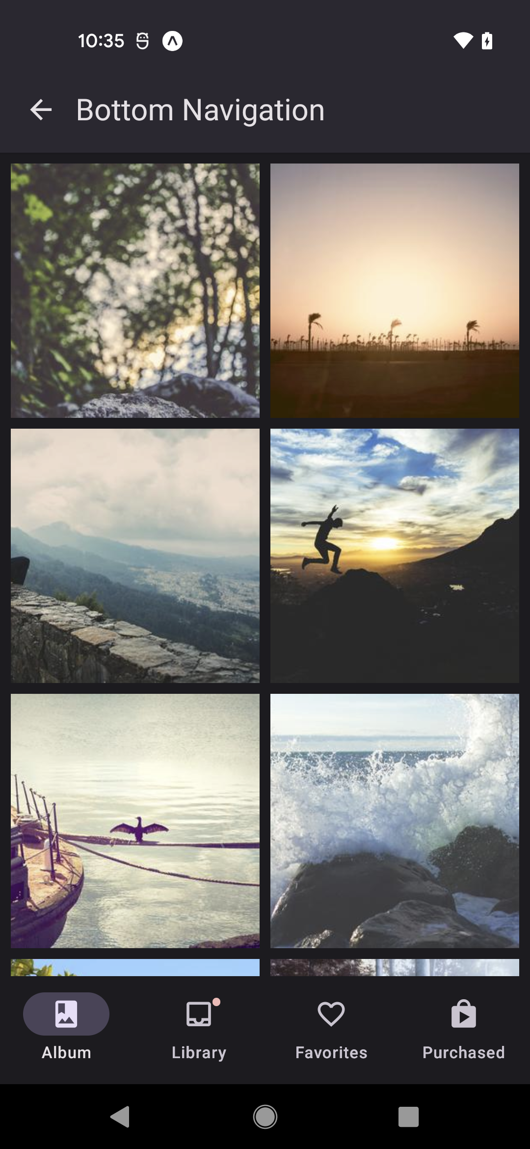
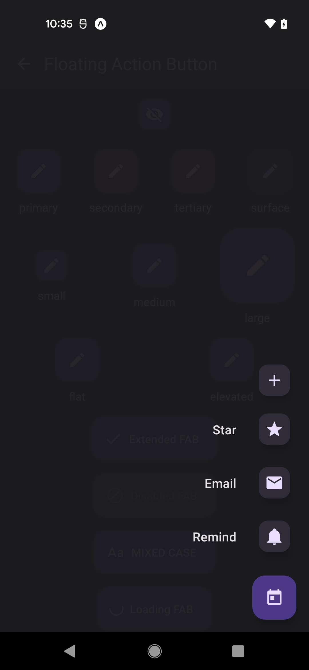
Buttons, inputs, lists, cards, menus, dialogs, navigation, and feedback patterns built for day-to-day product work.
 |
VOOZH | about |
Buttons, inputs, lists, cards, menus, dialogs, navigation, and feedback patterns built for day-to-day product work.
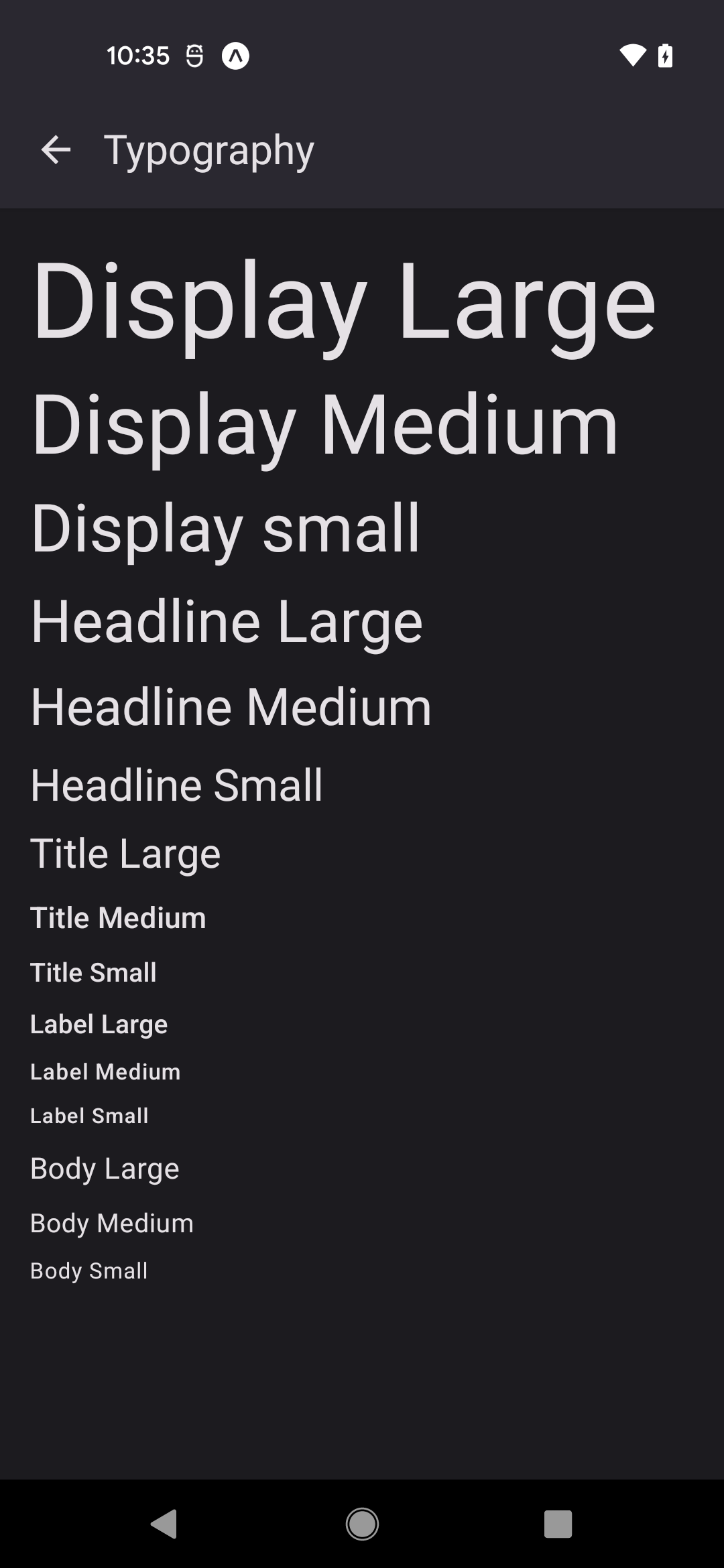
Adopt Material 3 color, typography, elevation, and state layers with a theme system designed for real apps.
Common interactions, contrast, and state handling are already baked into the component surface instead of left to each screen.
Keep design language and component behavior aligned across iOS, Android, and React Native Web from one codebase.
Ship light and dark experiences with the same primitives, including adaptive surfaces and semantic color roles.
Browse stable 5.x, preview 6.x, and legacy static docs from one version selector without splitting the docs experience.
In practice
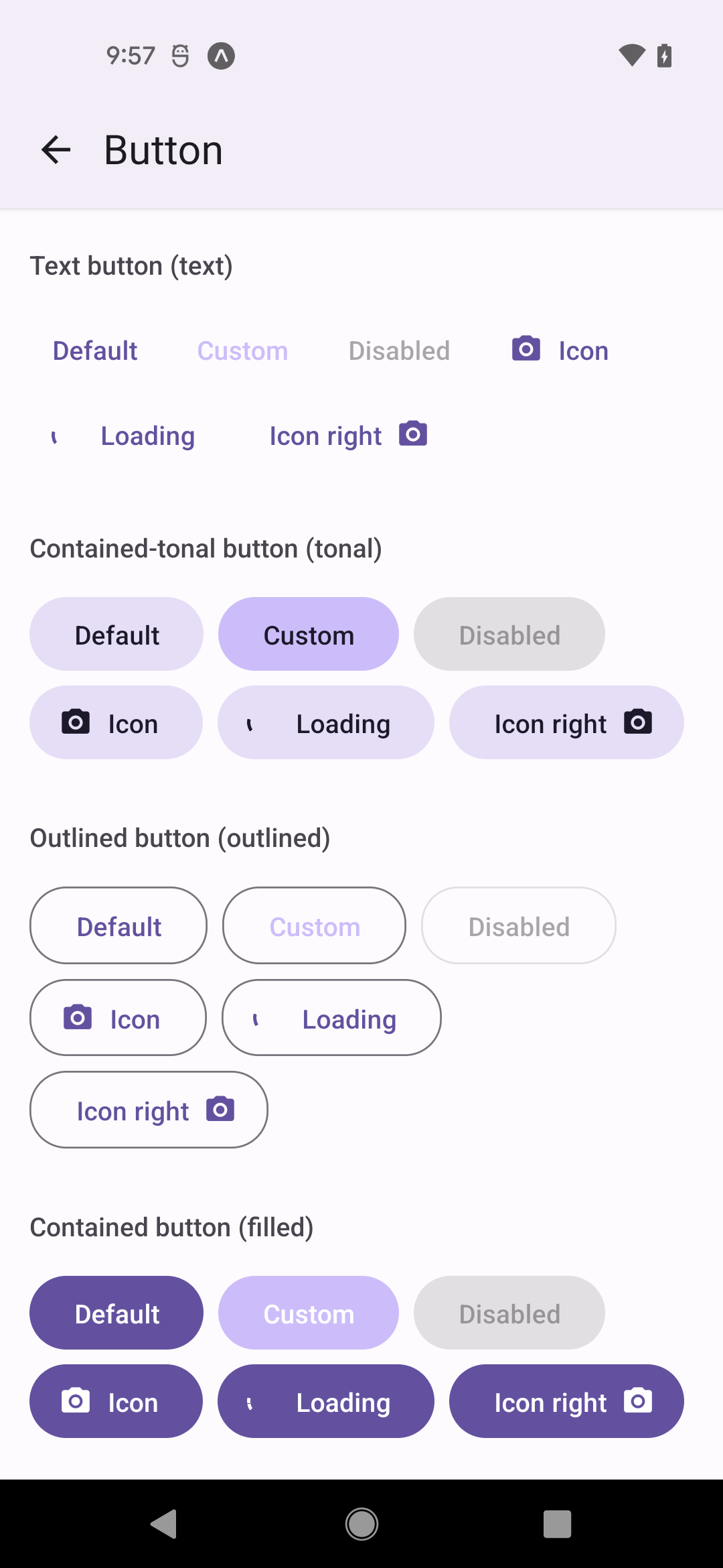
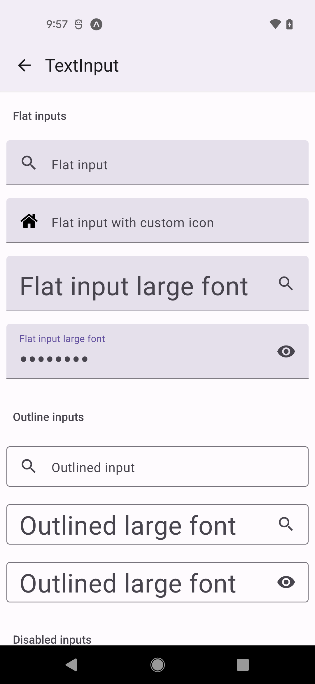
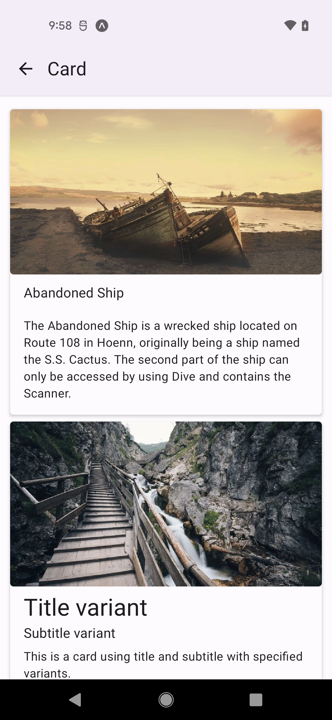
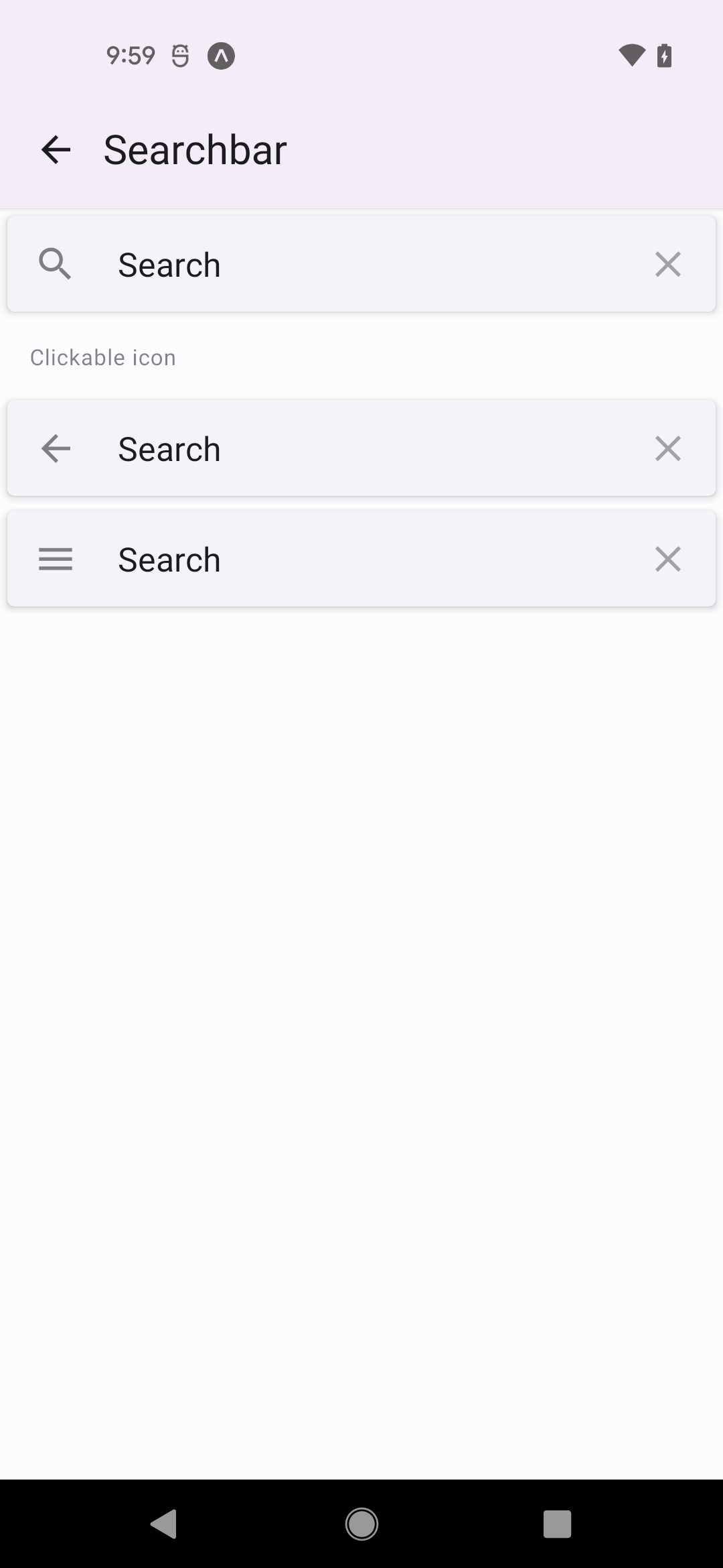
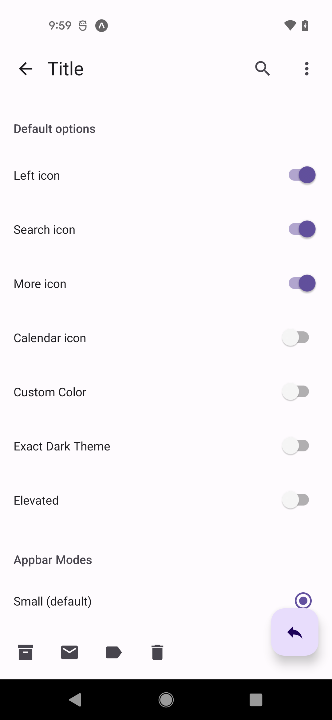
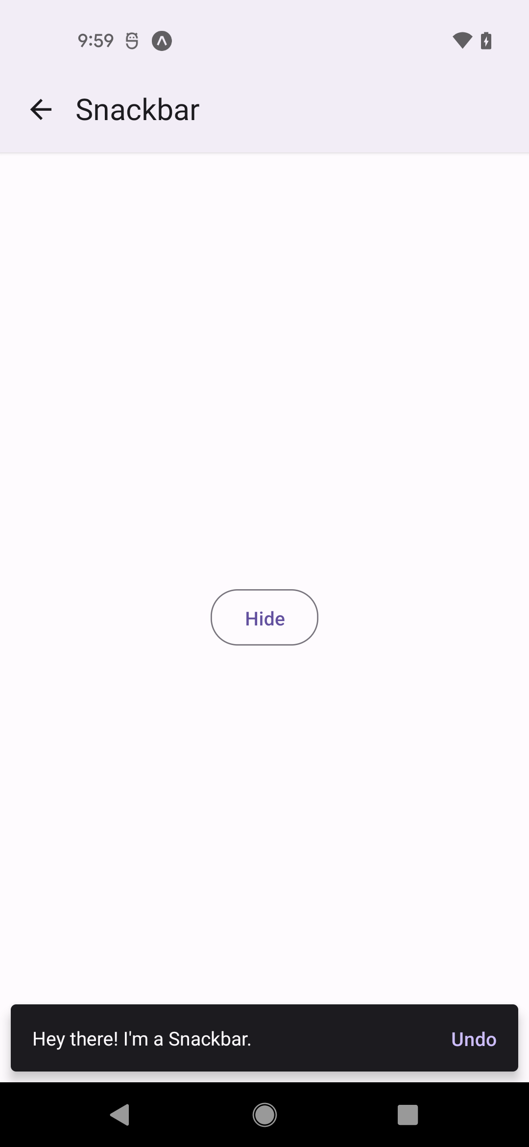
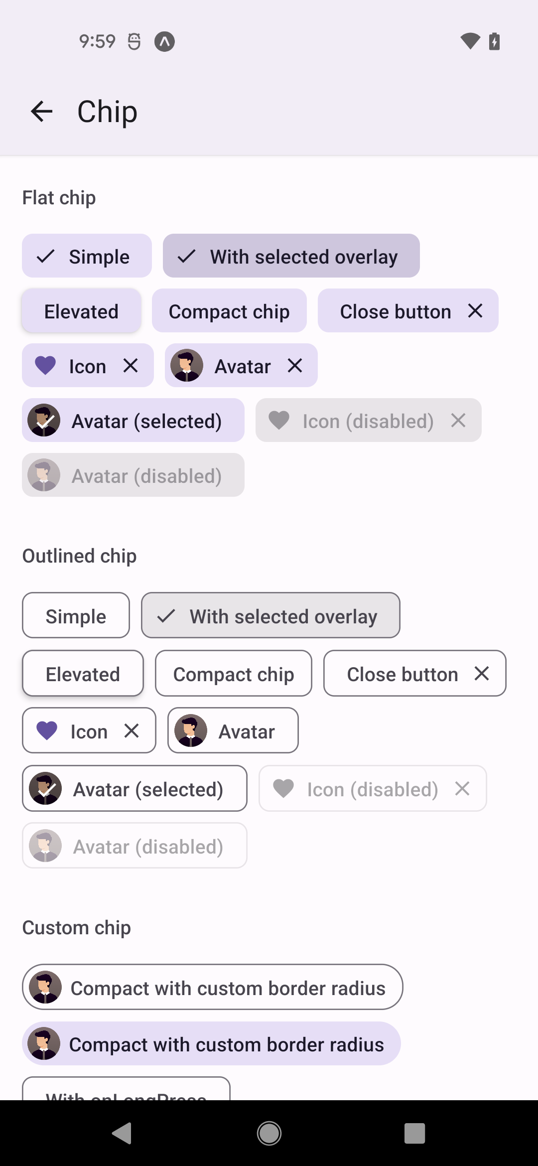
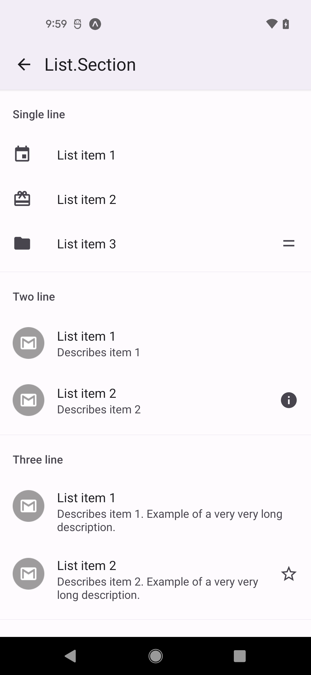
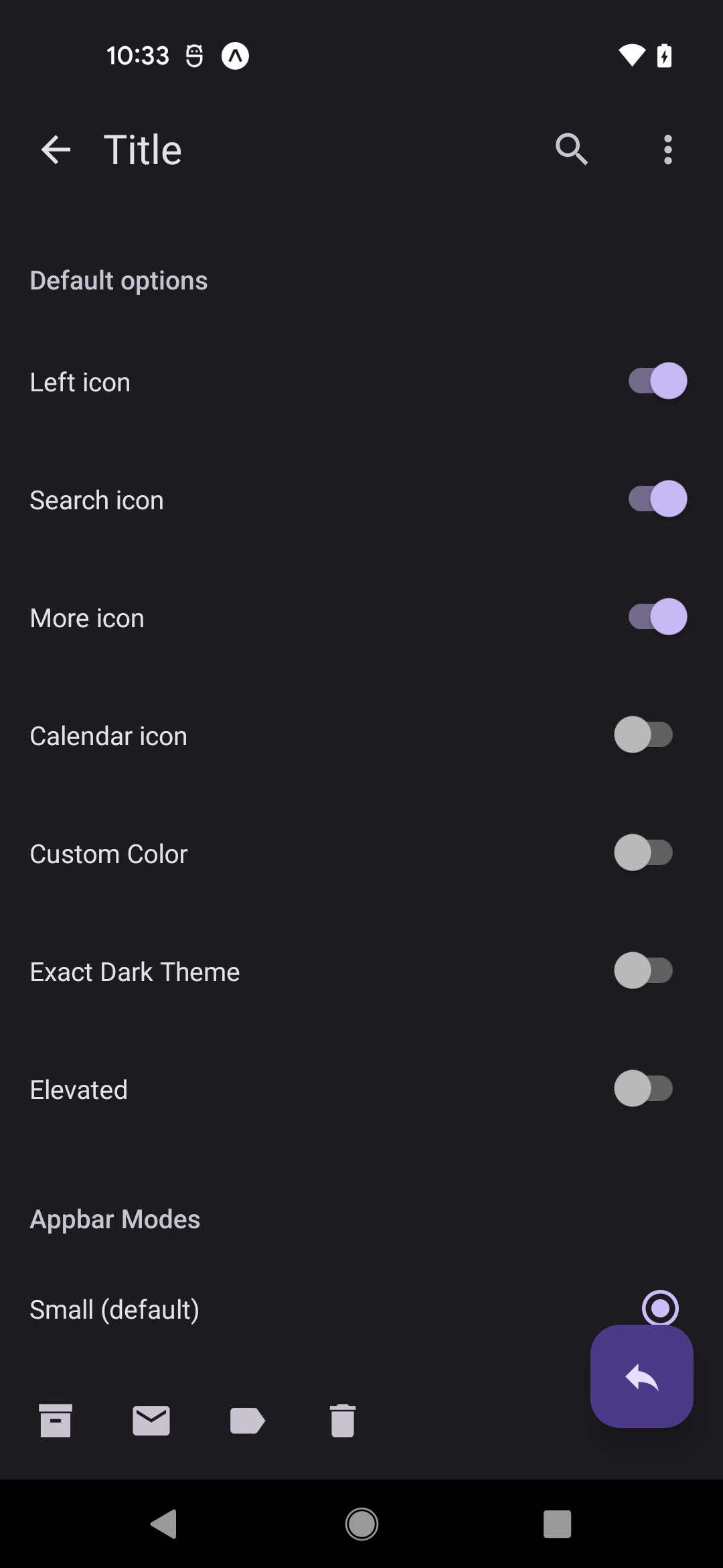
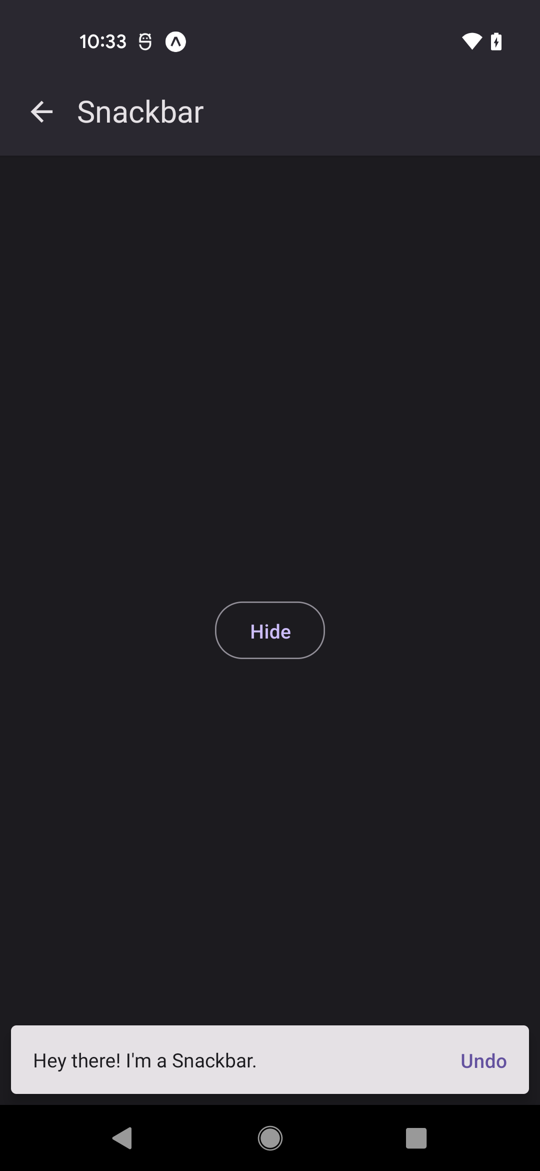
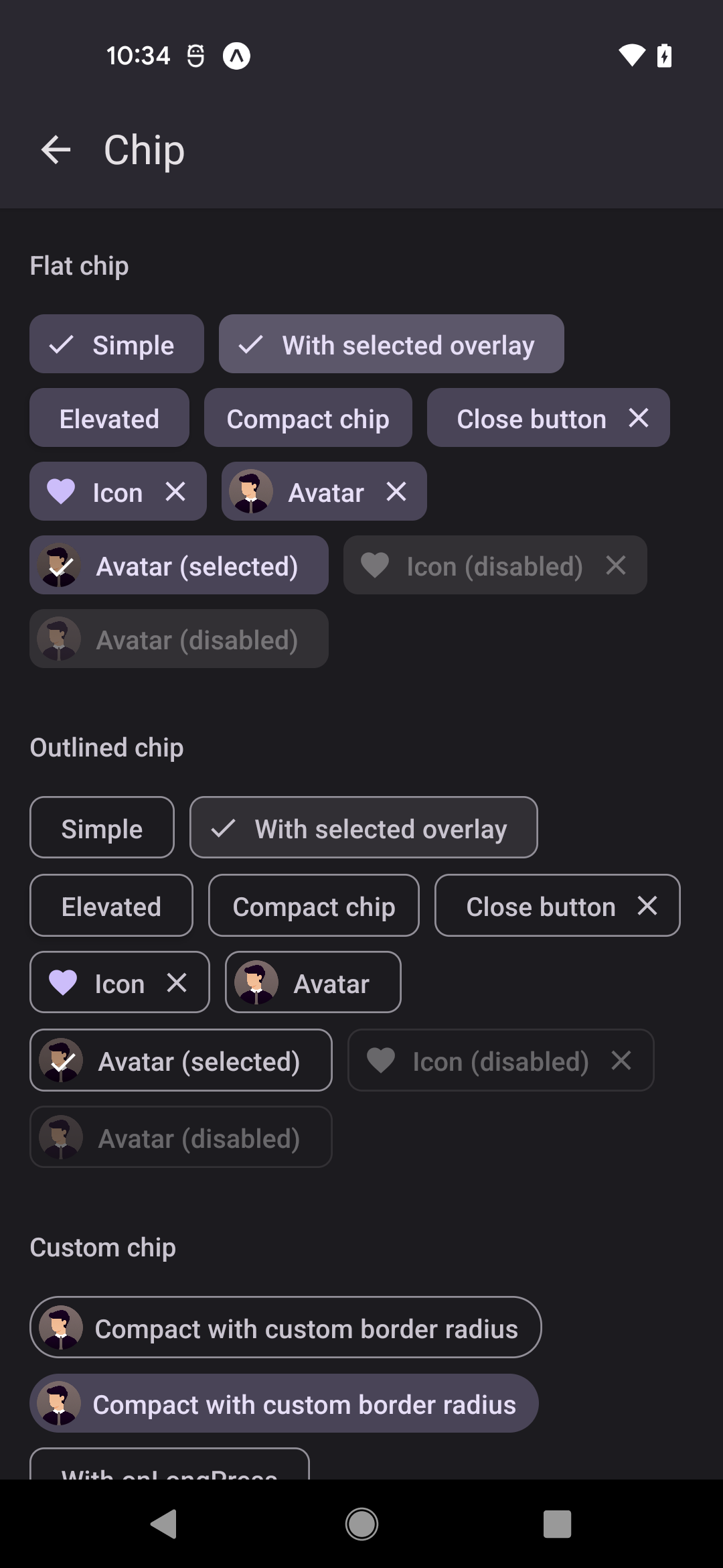
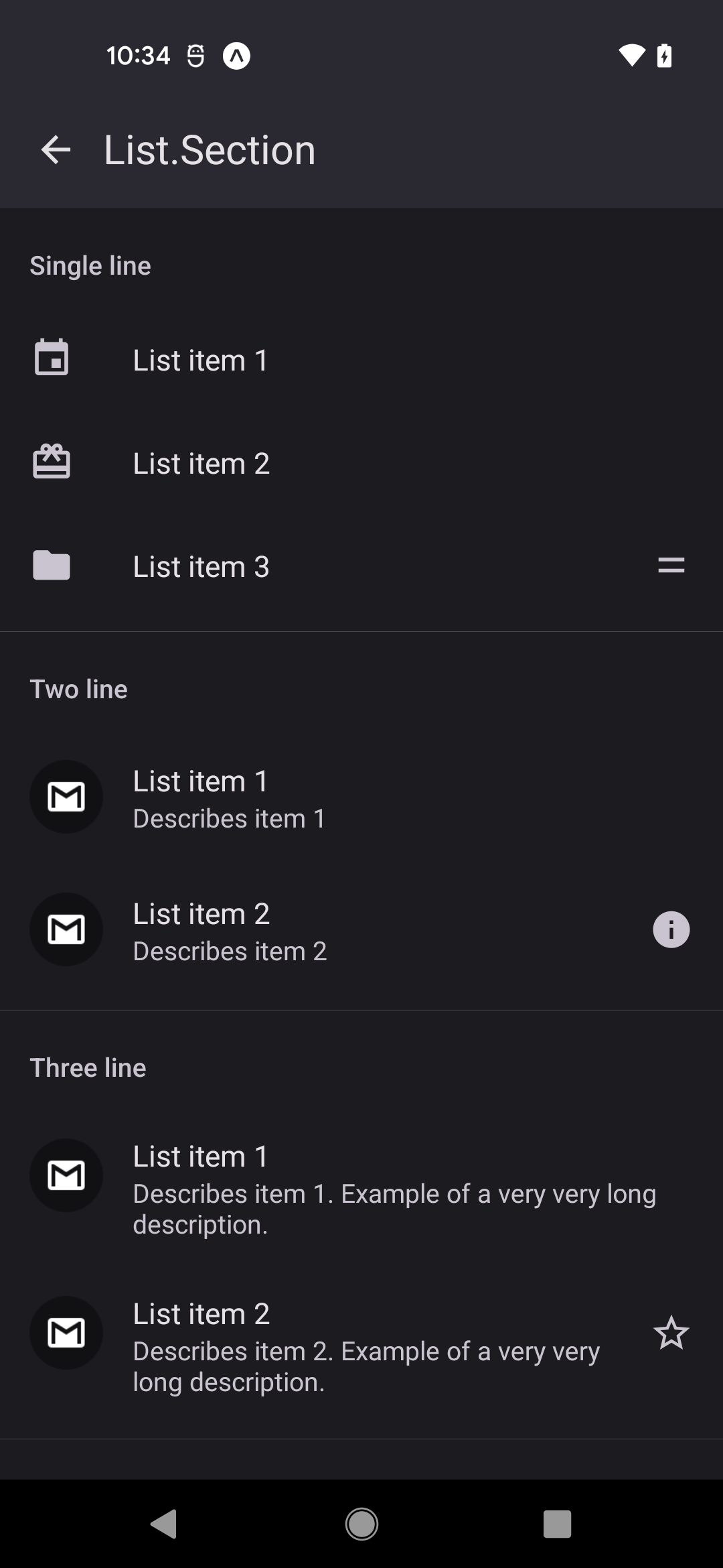
Browse the component surface the way it appears in real product UI, not as generic documentation chrome.
We've spent years building full-stack, cross-platform apps and solving tough technical challenges.