
Demo: FilterListBox is used to show matching items in a ListWithSearch
⇲
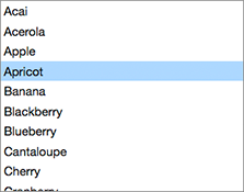
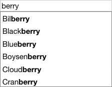
FilterListBox as a type of ListBox that displays only those items that match a text filter. Additionally, for each item that matches, the component highlights the matching portion of the item's text.
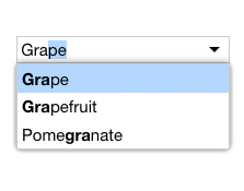
FilterListBox is used to fill the list role of a ListWithSearch (above). FilterListBox also fills the list role in a FilterComboBox:
Fruit:
Demo: FilterListBox in a FilterComboBox
⇲
import FilterListBox from 'elix/define/FilterListBox.js';
const filterListBox = new FilterListBox(); // or
const filterListBox = document.createElement('elix-filter-list-box');
In HTML:
<script type="module" src="node_modules/elix/define/FilterListBox.js"></script>
<!-- By default, only show items that contain the text "berry". -->
<elix-filter-list-box filter="b">
 <div>Acai</div>
 <div>Akee</div>
 <div>Apple</div>
 <div>Apricot</div>
 <div>Avocado</div>
 <div>Banana</div>
 <div>Bilberry</div>
 <div>Black sapote</div>
 <!-- other items... -->
</elix-filter-list-box>
Class hierarchy:
ListBox
Single-selection list box
Built with AriaListMixin • ComposedFocusMixin • CursorInViewMixin • CursorAPIMixin • DirectionCursorMixin • FocusVisibleMixin • FormElementMixin • ItemsAPIMixin • ItemsCursorMixin • ItemsTextMixin • KeyboardDirectionMixin • KeyboardMixin • KeyboardPagedCursorMixin • KeyboardPrefixCursorMixin • LanguageDirectionMixin • SelectedTextAPIMixin • SelectedValueAPIMixin • SingleSelectAPIMixin • SlotItemsMixin • TapCursorMixin
This element is used as a shadow part in FilterComboBox and ListWithSearch.