 |
VOOZH | about |
|
VOOZH | about |
Updated every day at 05:00am (Paris time, UTC+2) with last day data.
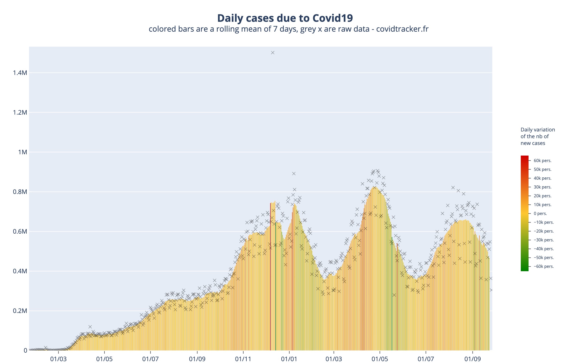
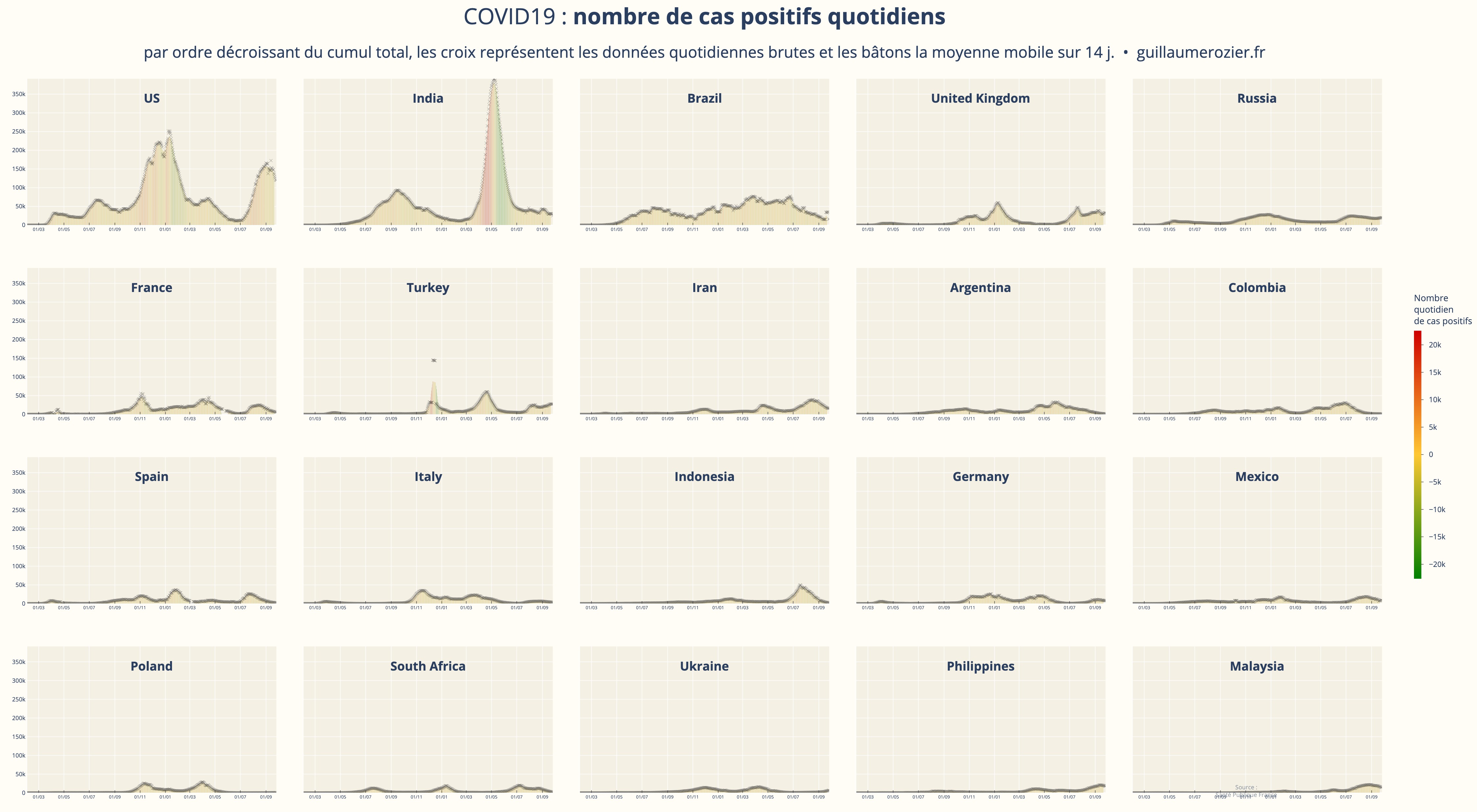
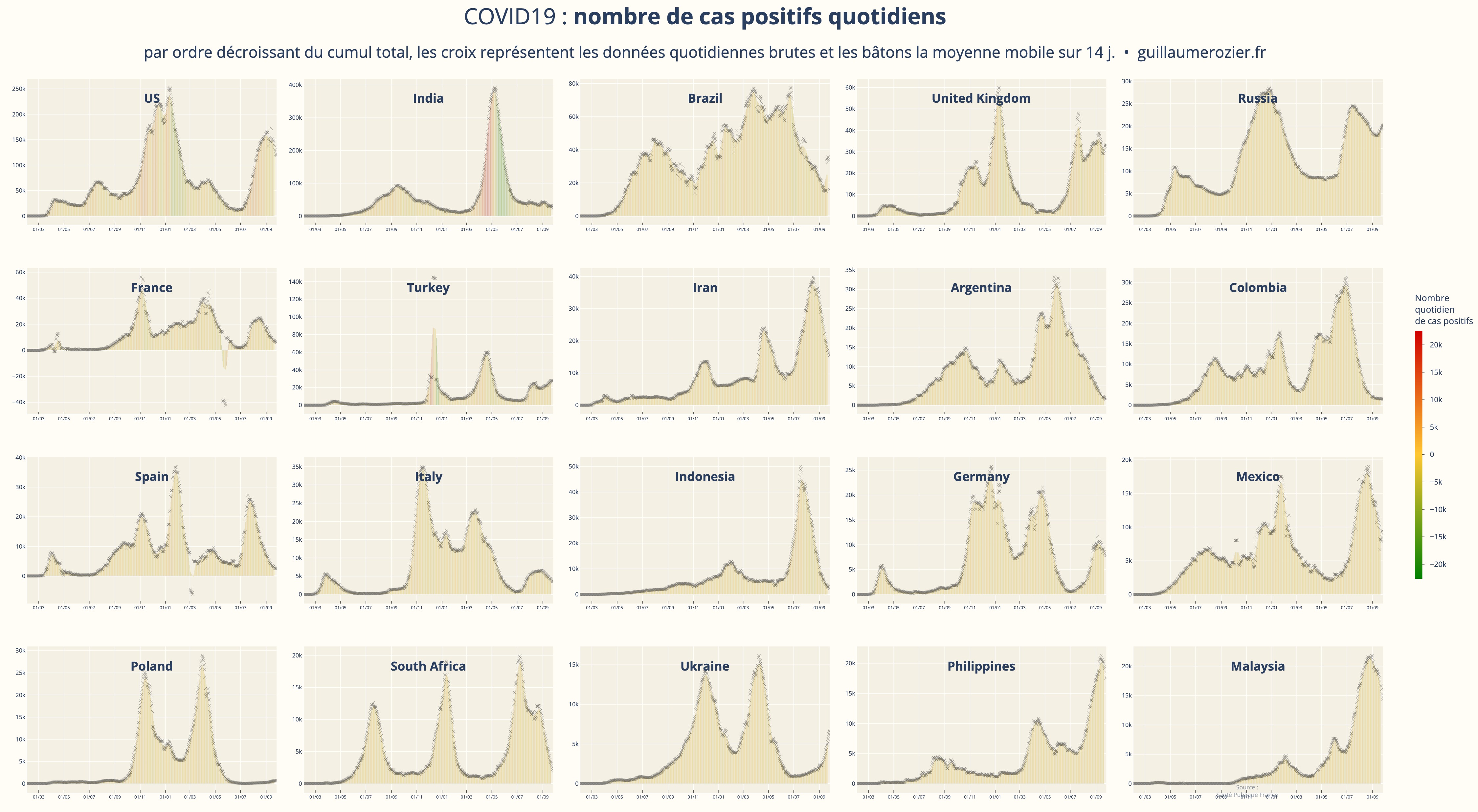
This chart represents the daily number of confirmed cases of COVID-19 against time, in days. A rolling mean of 4 days has been applied. The color represents the daily variation of new cases.
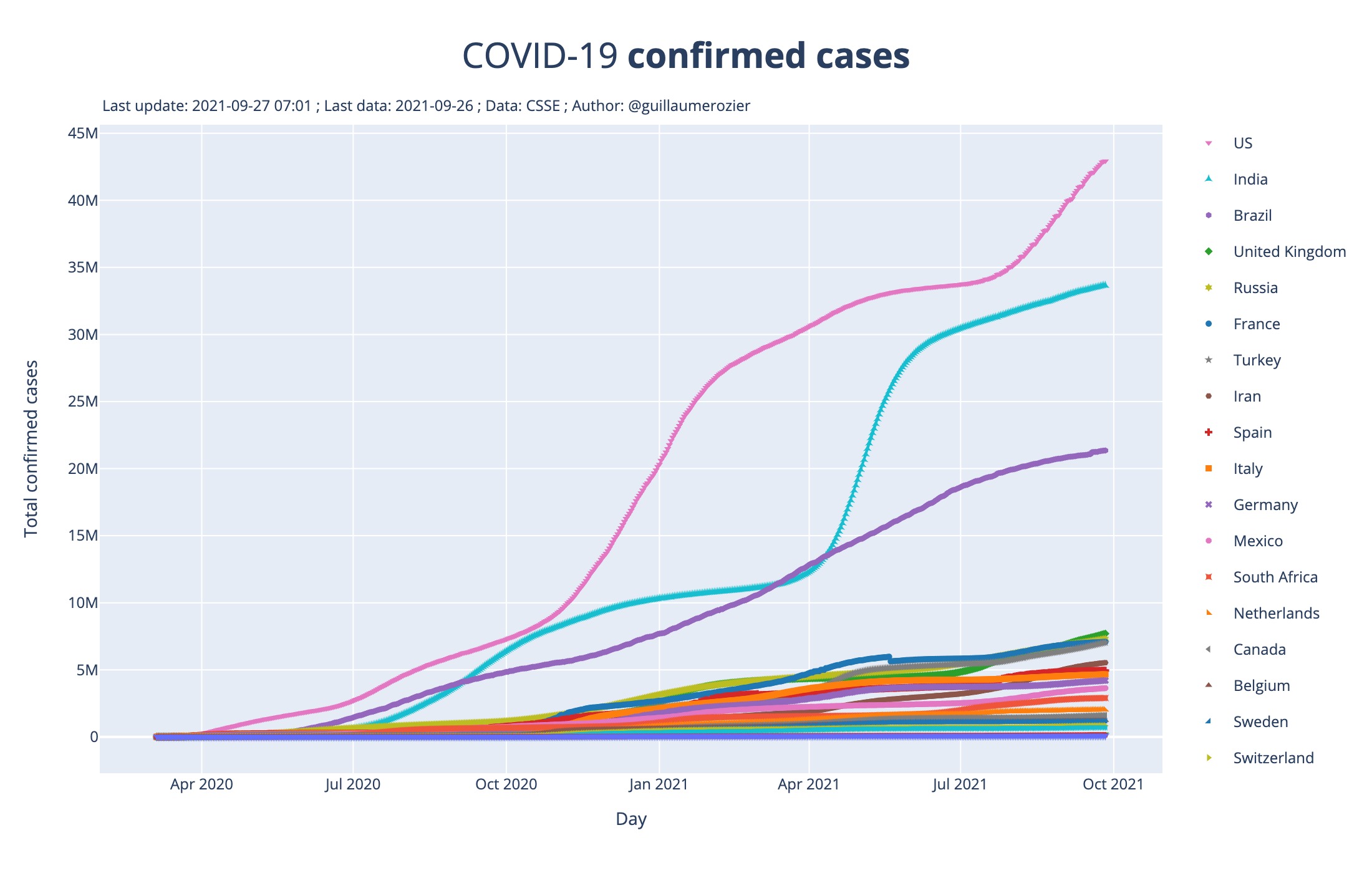
This chart represents the total number of confirmed cases of COVID-19 against time, in days.
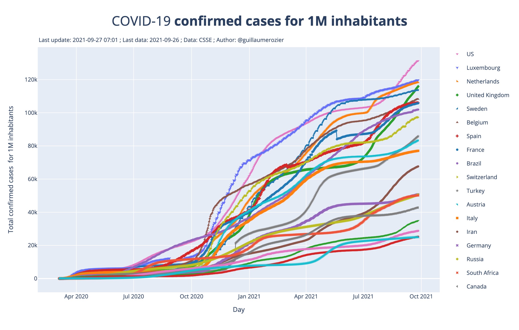
Same as the first one, but the number of cases is divided by the population of each country. So the plotted data is the number of confirmed cases for 1 million inhabitants.
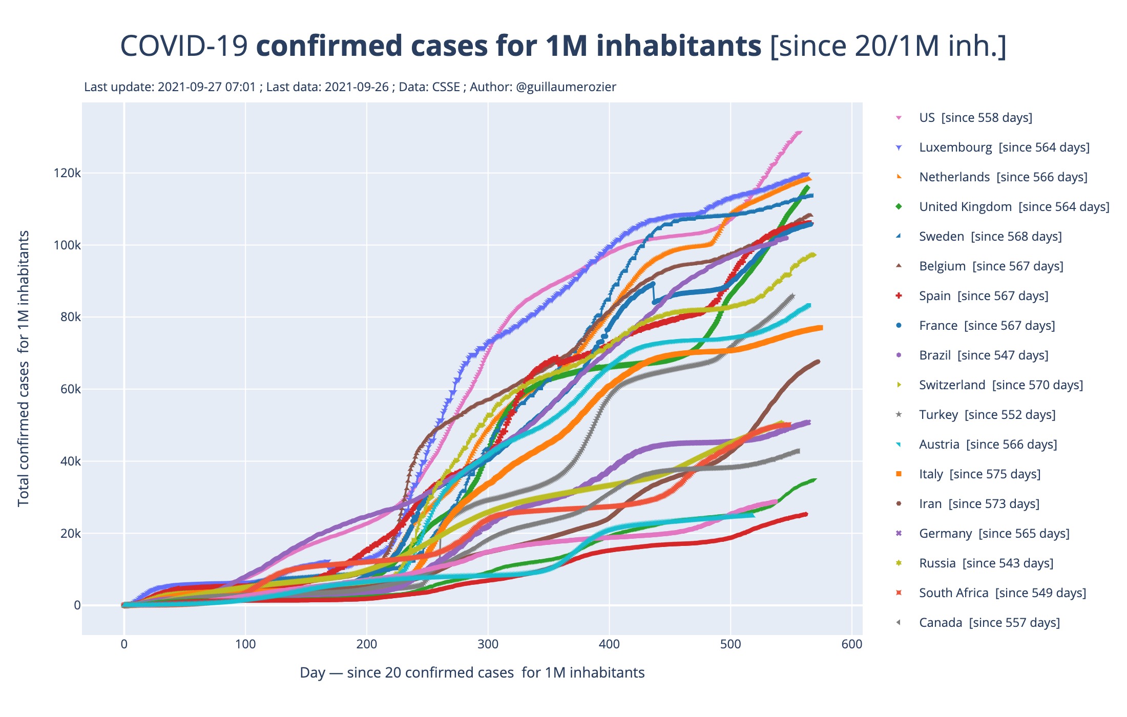
Same as the second one, but each country is displayed from the day a certain threshold has been reached. This makes it possible to compare the recent increase in the number of cases between countries.
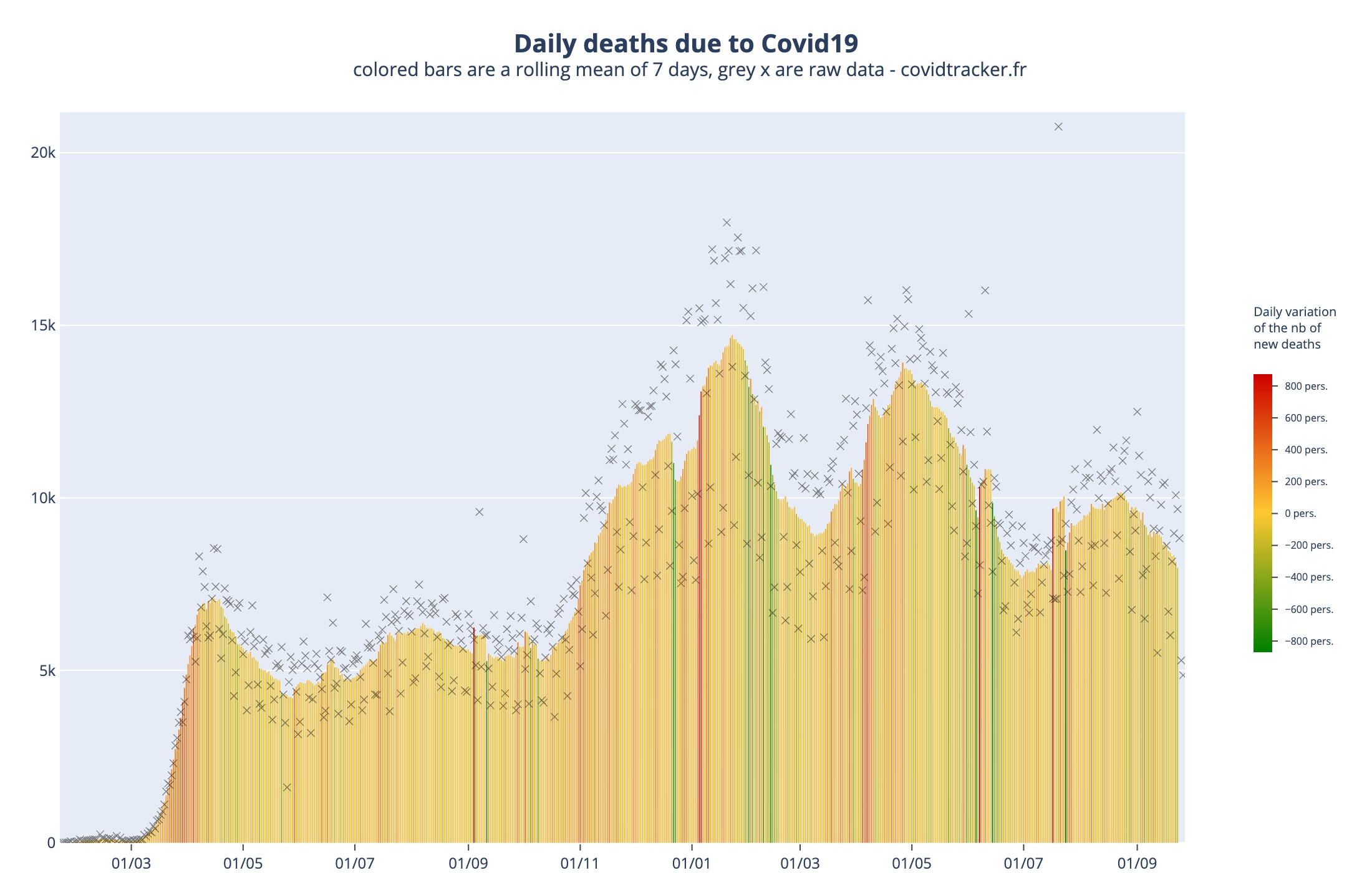
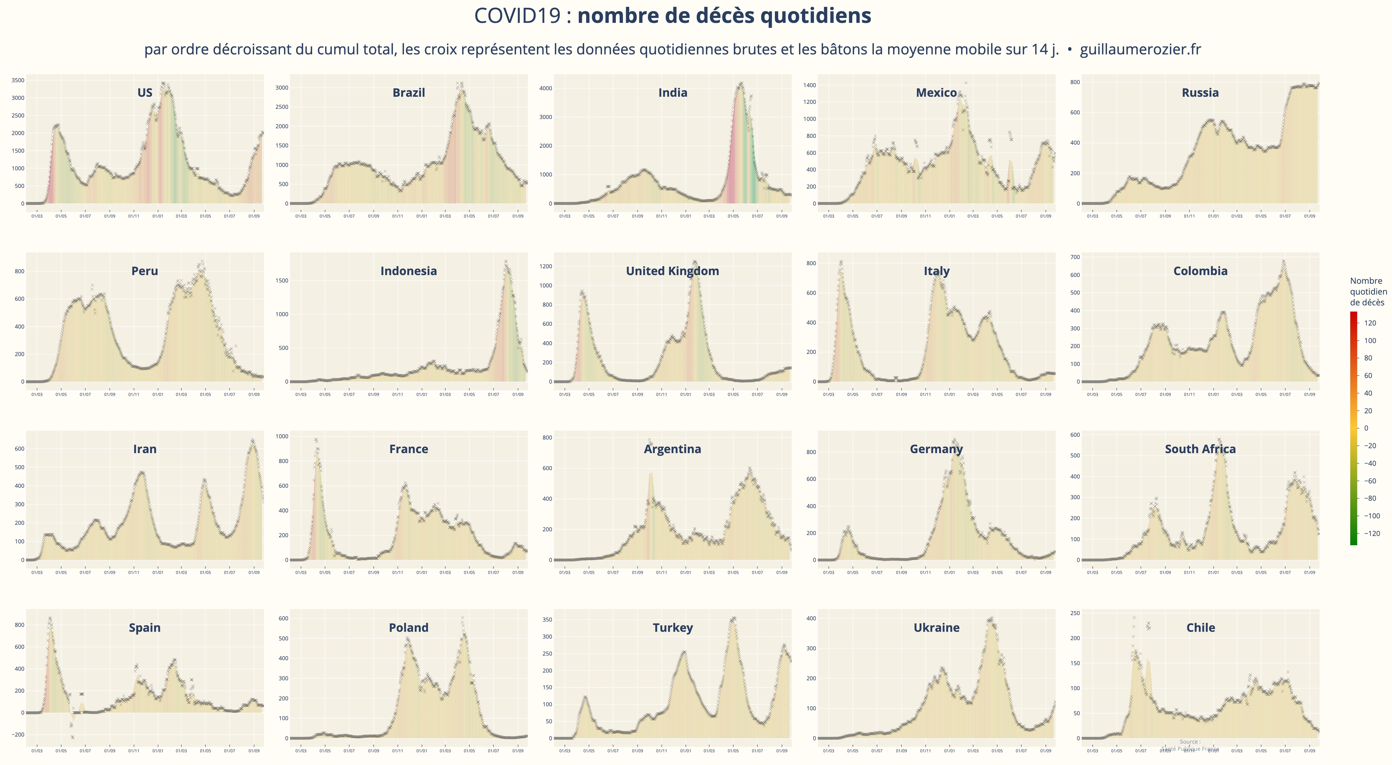
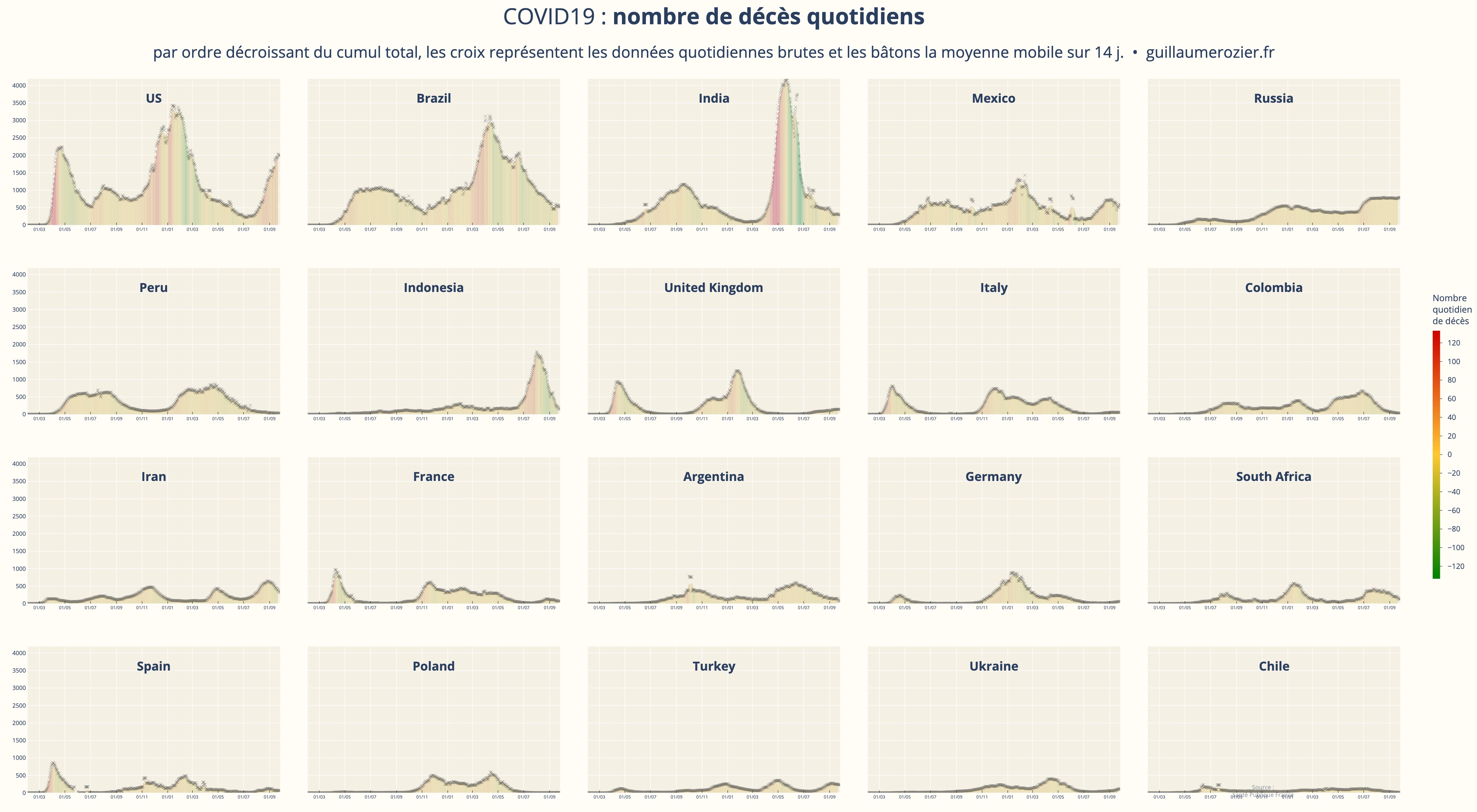
This chart represents the daily number of deaths of COVID-19 against time, in days. A rolling mean of 4 days has been applied. The color represents the daily variation of new deaths.
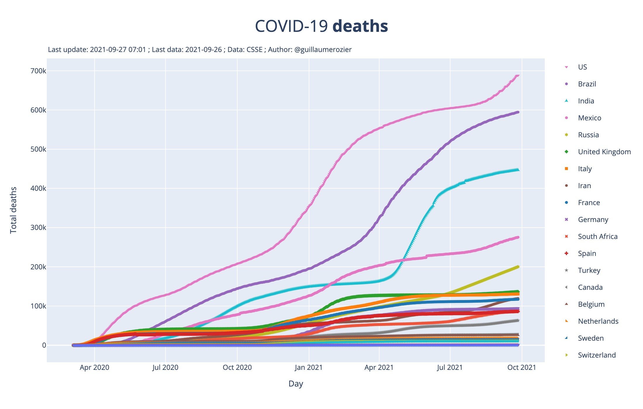
This chart represents the total number of deaths of COVID-19 against time, in days.
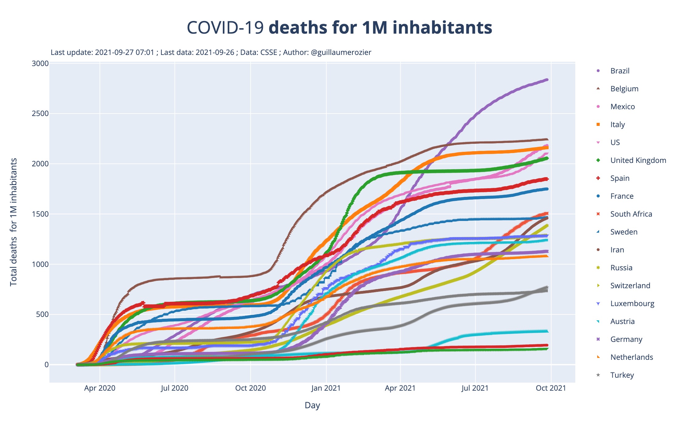
Same as the first one, but the number of deaths is divided by the population of each country. So the plotted data is the number of confirmed deaths for 1 million inhabitants.
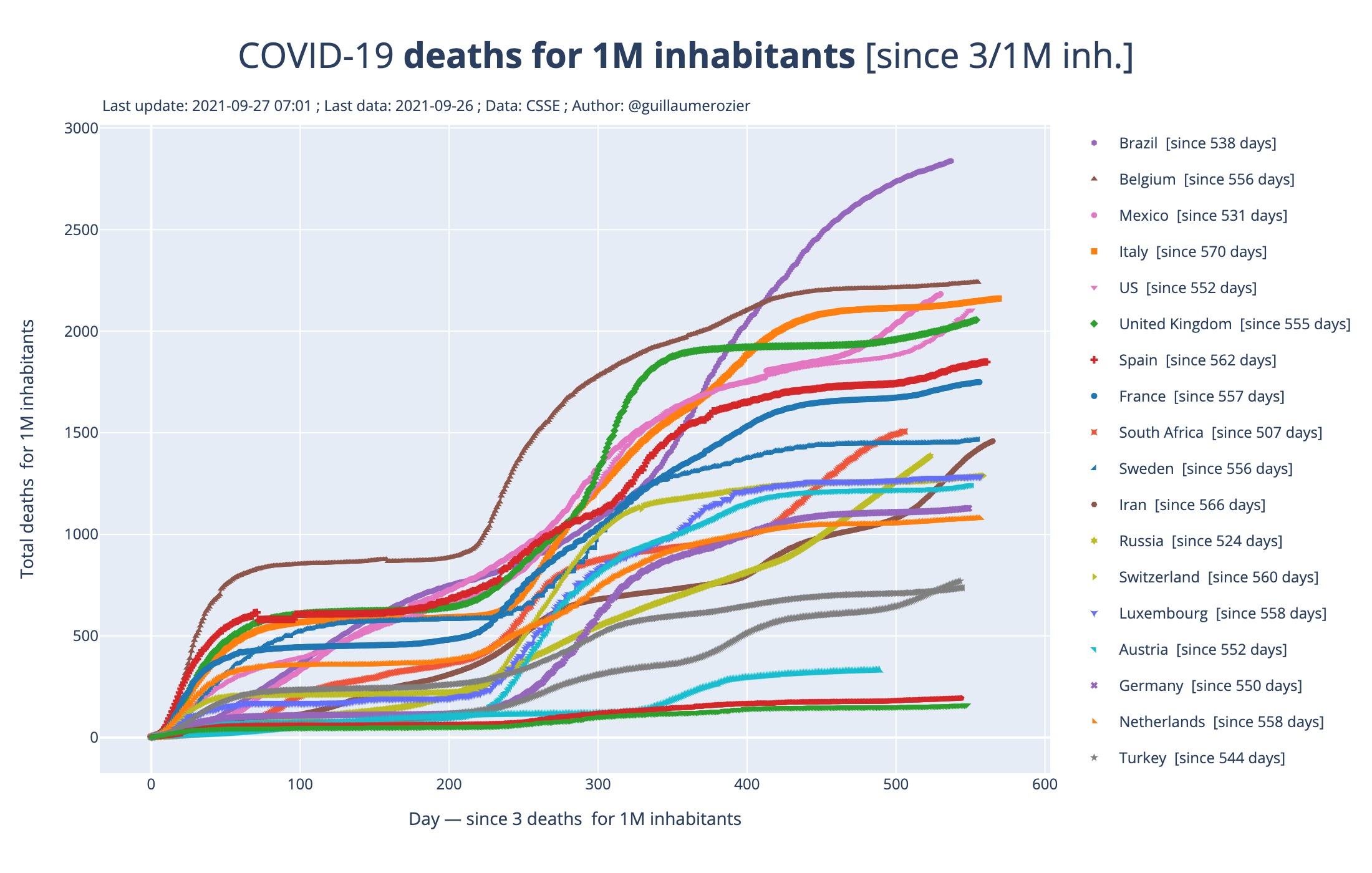
Same as the second one, but each country is displayed from the day a certain threshold has been reached. This makes it possible to compare the recent increase in the number of deaths between countries.
If you have any question or feedback please ask me by email or on Twitter.
To build these graphs, data from the CSSE of John-Hopkins University (USA) are used. This is the largest and most reliable database to date. However it is important to note that Covid’s « probable » cases are counted as confirmed cases. The figures may therefore be over or underestimated in some countries.
2026 - Guillaume Rozier - Tous droits réservés