
-
👁 GLOBE Observer, Simplified (App Improvement Track) – screenshot 1
Improved homepage
-
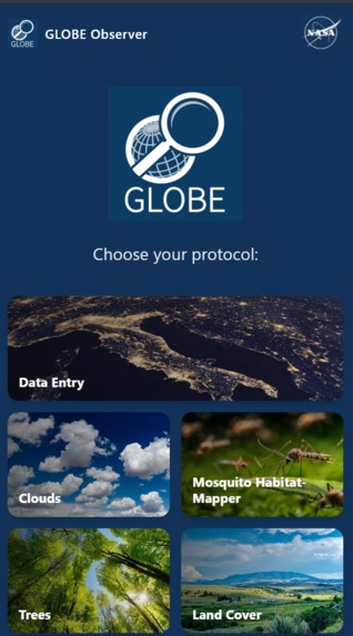
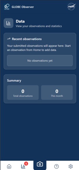
👁 GLOBE Observer, Simplified (App Improvement Track) – screenshot 2
Improved data section
-
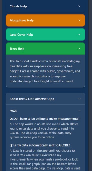
👁 GLOBE Observer, Simplified (App Improvement Track) – screenshot 3
Improved help section with dropdowns
-
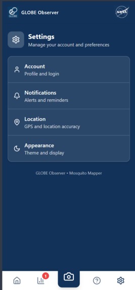
👁 GLOBE Observer, Simplified (App Improvement Track) – screenshot 4
Improved settings with better accessibility
-
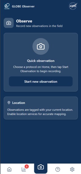
👁 GLOBE Observer, Simplified (App Improvement Track) – screenshot 5
Improved observation section with better accessibility
Inspiration
NASA’s GLOBE Observer app enables citizens around the world to contribute real scientific data to ongoing Earth research. While the mission behind the app is impactful, we noticed that the user experience could feel overwhelming or unintuitive, especially for first-time users, students, and non-technical contributors.
We were inspired to make the app more accessible and welcoming while maintaining its scientific purpose. Our goal was to redesign the experience so that contributing to real NASA-supported research feels intuitive, professional, and approachable for everyone.
What it does
Our prototype improves the GLOBE Observer experience by allowing users to observe and record environmental data through a clearer and more accessible interface. The app guides users through the data collection process in a way that is easier to understand while maintaining accuracy.
The redesigned interface improves readability, navigation, and overall visual consistency, helping users feel confident about the data they are submitting and why it matters.
How we built it
We began by analyzing the existing GLOBE Observer workflow and identifying areas where users might struggle with navigation, clarity, or visual hierarchy. Based on these findings, we redesigned the user flow to simplify observation and data entry.
Accessibility and usability were central to our design process. We focused on cleaner layouts, clearer text, and more intuitive interactions. The final result is a functional prototype that demonstrates how thoughtful design improvements can significantly enhance the user experience.
Challenges we ran into
One of the biggest challenges was simplifying the interface without reducing the quality or accuracy of the data being collected. Since GLOBE Observer supports real scientific research, it was important to ensure that usability improvements did not compromise scientific integrity.
Another challenge was modernizing the look and feel while staying consistent with the app’s existing mission and structure.
Accomplishments that we're proud of
We are proud of creating a more accessible and inclusive version of the GLOBE Observer experience. The redesigned prototype feels more professional, easier to use, and better suited for a wider range of users.
We are also proud that our improvements focus on increasing participation and confidence rather than changing the core mission of the app.
What we learned
This project taught us that accessibility and design clarity play a major role in user engagement and data quality. Small changes in layout, language, and flow can make a meaningful difference in how users interact with scientific tools.
We also gained valuable experience working on a real-world application tied to scientific research, reinforcing the importance of designing with both users and data integrity in mind.
What's next for GLOBE Observer, Simplified (App Improvement Track)
Future improvements include expanding accessibility features such as guided onboarding and in-app explanations. We would also like to test the design with real users, including students and educators, to gather feedback and iterate further.
Additional enhancements could include clearer feedback on submitted observations and improved data visualization to help users better understand the impact of their contributions.
Built With
- javascript
- react
- tailwind
- typescript