 |
VOOZH | about |
|
VOOZH | about |
UsageStep 1: Add a reference to HandyControls or search for HandyControls on the nuget;
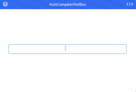
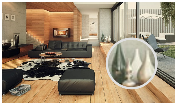
Step 2: Add code in App.xaml as follows: OverviewLatest examplesWinUI Mica MaterialAutoCompleteTextBoxElementGroupUniformSpacingPanelFlexPanelCheckComboBoxImageSelectorPropertyGridHistory publicationScreenshotGooeyEffectGlowWindowFlowDocumentScrollViewerStyle👁 FlowDocumentScrollViewerStyle PinBoxEffectsRelativePanelDrawerPoptipDividerGeometryAnimationSplitButtonFloatingBlockHoneycombPanelRunningBlockImageBlockMagnifierCardButtonGroupGridSideMenuNotifyIconDialogWaveProgressBarBadgeGravatarGoToTopChatBubbleLabelTransferProgressButtonCoverFlowCoverViewMessageBoxWaterfallPanelRateBlurWindowFlipClockShieldOutlineTextTagToolBarSliderRangeSliderCircleProgressBarButtonStyleToggleButtonStyleRadioButtonStyleCheckBoxStyleListBoxStyleTreeViewStyleListViewStyleDataGridNow you can switch to dark themeColorPickerLoadingCarouselPaginationExpanderTimeBarImageBrowserPreviewSliderCompareSliderGrowlAnimationPathProgressBarTabControlTabControlStyleGroupBoxStepBarGifImageContextMenuCalendarClockCalendarWithClockTextBlockRichTextBoxStyleTextBoxComboBoxNumericUpDownSearchBarPasswordBoxDatePickerTimePickerDateTimePickerScrollViewerCirclePanelTransitioningContentControlBorderStyleBrush |