
rias/craft-colour-swatches
Let clients choose from a predefined set of colours.
Maintainers
Package info
github.com/riasvdv/craft-colour-swatches
Type:craft-plugin
pkg:composer/rias/craft-colour-swatches
Requires
- craftcms/cms: ^3.0.0
Requires (Dev)
None
Suggests
None
Provides
None
Conflicts
None
Replaces
None
MIT 1243fa62c143f26478abf3e29055b0e1887ebc83
README
Colour Swatches plugin for Craft CMS 3.x
Let clients choose from a predefined set of colours.
Requirements
This plugin requires Craft CMS 3.0.0-beta.23 or later.
Installation
To install the plugin, follow these instructions.
-
Open your terminal and go to your Craft project:
cd /path/to/project -
Then tell Composer to load the plugin:
composer require percipioglobal/craft-colour-swatches -
In the Control Panel, go to Settings → Plugins and click the “Install” button for Colour Swatches.
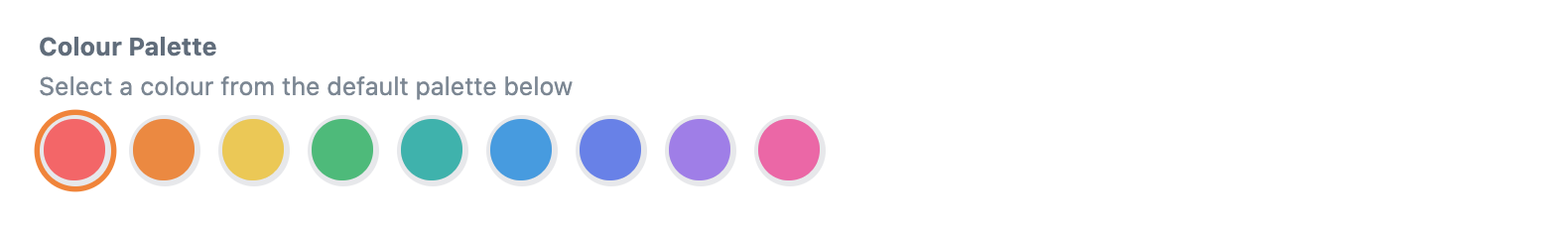
Colour Swatches Overview
Instead of providing a user a full color picker, Color Swatches gives an admin the ability to provide a selection of colors for a user to choose from.
Configuring Colour Swatches
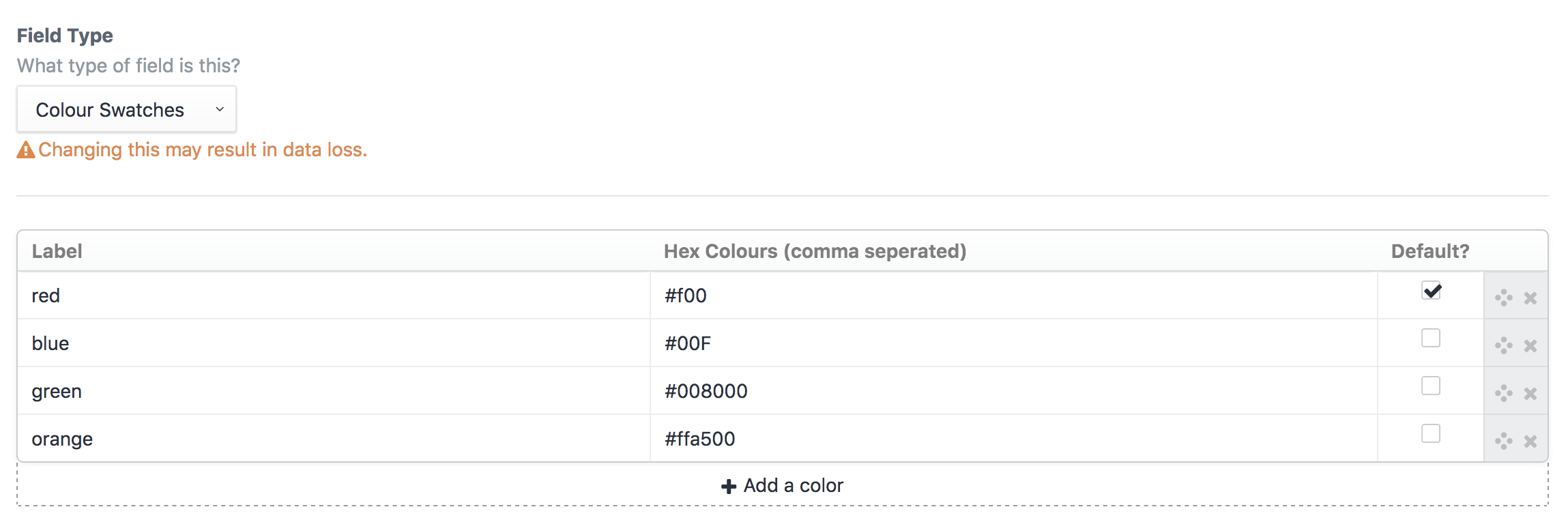
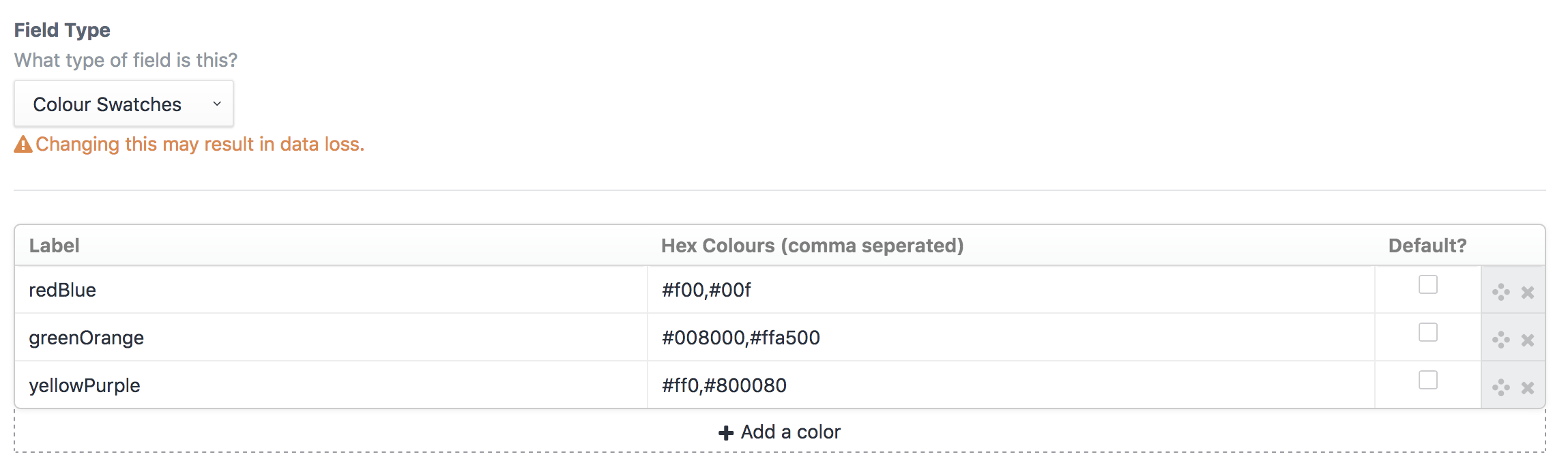
Create a Color Swatches field and provide label and hex value options.
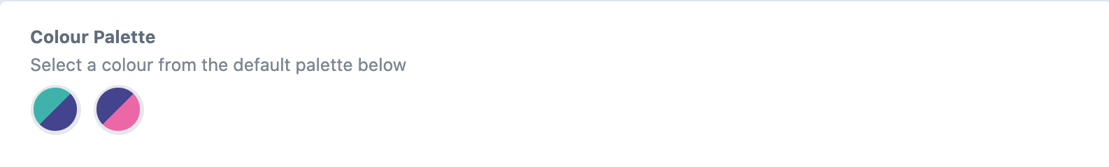
Multiple colours are possible by seperating them with a comma
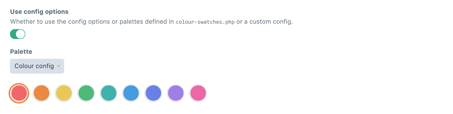
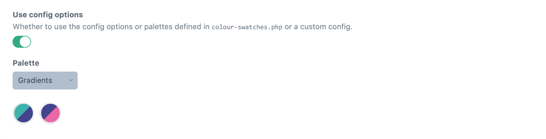
Using the config file
You can create a config/colour-swatches.php file to predefine the possible colours or define different palettes.
Take a look at the config file in this repo for an example.
return [
 // Predefined colours, fixed options [label, colour, default (boolean)]
 'colours' => [
 [
 'label' => 'red',
 'color' => '#F56565',
 'default' => true,
 ],
 [
 'label' => 'orange',
 'color' => '#ED8936',
 'default' => false,
 ],
 [
 'label' => 'yellow',
 'color' => '#ECC94B',
 'default' => false,
 ],
 [
 'label' => 'green',
 'color' => '#48BB78',
 'default' => false,
 ],
 [
 'label' => 'teal',
 'color' => '#38B2AC',
 'default' => false,
 ],
 [
 'label' => 'blue',
 'color' => '#4299E1',
 'default' => false,
 ],
 [
 'label' => 'indigo',
 'color' => '#667EEA',
 'default' => false,
 ],
 [
 'label' => 'purple',
 'color' => '#9F7AEA',
 'default' => false,
 ],
 [
 'label' => 'pink',
 'color' => '#ED64A6',
 'default' => false,
 ],
 ],

 // Custom palettes, fixed options [label, default (boolean), colour (array(colour, customOptions)) ]
 'palettes' => [
 'Primary' => [ // custom label
 [
 'label' => 'primary', // custom label
 'default' => false,
 'color' => [
 [
 'color' => '#38B2AC', // the colour shown in the fieldtype (required)
 'class' => 'teal-500', // custom attribute
 'btnClass' => 'blue-500', // custom attribute,
 ],
 ]
 ],
 [
 'label' => 'secondary', // custom label
 'default' => false,
 'color' => [
 [
 'color' => '#4299E1', // the colour shown in the fieldtype (required)
 'class' => 'blue-500', // custom attribute
 'btnClass' => 'teal-500', // custom attribute
 ],
 ]
 ],
 [
 'label' => 'tertiary', // custom label
 'default' => false,
 'color' => [
 [
 'color' => '#ED64A6', // the colour shown in the fieldtype (required)
 'class' => 'pink-500', // custom attribute
 'btnClass' => 'blue-500', // custom attribute
 ],
 ]
 ],
 ],
 'Gradients' => [
 [
 'label' => 'primary',
 'default' => false,
 'color' => [
 [
 'color' => '#38B2AC', // the colour shown in the fieldtype (required)
 ],
 [
 'color' => '#434190', // the next colour in this loop
 ],
 ]
 ],
 [
 'label' => 'secondary', // custom label
 'default' => false,
 'color' => [
 [
 'color' => '#434190', // the colour shown in the fieldtype (required)
 ],
 [
 'color' => '#ED64A6', // the next colour in this loop
 ],
 ]
 ],
 ],
 ],
];
In your field settings you can then have the possibility to have it use the predefined colours.
Using Colour Swatches
You can access both the label and color in your template. By default, the label will display:
{{ fieldName }}
{{ fieldName.label }}
{{ fieldName.labels }} {# Returns an array of all labels #}
{{ fieldName.color }}
{{ fieldName.colours }} {# Returns an array of all colours #}
OR to access custom attributes from the config file
{% for field in fieldName.color %}
 {{ field.color }}
 {{ field.CUSTOM }}
{% endfor %}
Based on the awesome Craft 2 plugin from Vigetlabs
Brought to you by Percipio