
More than 5 years have passed since last update.
tags: rBasicLearning
散布図
使用するデータ
今回は, データとしてmtcarsを使う.
library(datasets)mtcars散布図を使う場合
ヒストグラムは, 二つの量的データの関係性の概観を見る時に使う.
まずは, 量的データの概観を一つずつヒストグラムで見ていく
まずは, それぞれの変数のヒストグラムを見て, 概観を掴む.
hist(mtcars$wt)hist(mtcars$mpg)
散布図をプロットする
散布図は, 以下のコードで書くことができる.
plot(mtcars$wt,mtcars$mpg)
散布図に装飾を加える
散布図は, 以下のように装飾を加えることができる.
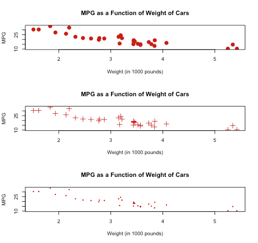
pchは, プロットの点の種類(pch = 19は丸)
cexは, プロットのサイズの拡大・縮小を表す(cex = 1.5は, プロットのサイズを1.5倍にする)
colは色, mainはグラフのタイトル, xlabはx軸ラベル, ylabはy軸ラベル.
plot(mtcars$wt,mtcars$mpg,pch=19,# Solid circlecex=1.5,# Make 150% sizecol="#cc0000",# Redmain="MPG as a Function of Weight of Cars",xlab="Weight (in 1000 pounds)",ylab="MPG")plot(mtcars$wt,mtcars$mpg,pch=3,# plus markcex=1.5,# Make 150% sizecol="#cc0000",# Redmain="MPG as a Function of Weight of Cars",xlab="Weight (in 1000 pounds)",ylab="MPG")plot(mtcars$wt,mtcars$mpg,pch=19,# Solid circlecex=0.3,# Make 30% sizecol="#cc0000",# Redmain="MPG as a Function of Weight of Cars",xlab="Weight (in 1000 pounds)",ylab="MPG")
Register as a new user and use Qiita more conveniently
- You get articles that match your needs
- You can efficiently read back useful information
- You can use dark theme