
A Practical Guide to Linear Regression
From EDA to Feature Engineering to Model Evaluation
Linear regression is a typical regression algorithm that is responsible for numeric prediction. It is distinct to classification models – such as decision tree, support vector machine or neural network. In a nutshell, a linear regression finds the optimal linear relationship between independent variables and dependent variables, then makes prediction accordingly.
I guess most people have frequently encountered the function y = b0 + b1x in math class. It is basically the form of simple linear regression, where b0 defines the intercept and b1 defines the slope of the line. I will explain more theory behind the algorithm in the section "Model Implementation", and the aim of this article is to go practical! And if you would like to access the code, please visit my website.
Define Objectives
I use Kaggle public dataset "Insurance Premium Prediction" in this exercise. The data includes independent variables: age, sex, bmi, children, smoker, region, and target variable – expenses. Firstly, let’s load the data and have a preliminary examination of the data using df.info()
import pandas as pd
import seaborn as sns
import matplotlib.pyplot as plt
from pandas.api.types import is_string_dtype, is_numeric_dtype
df = pd.read_csv('../input/insurance-premium-prediction/insurance.csv')
df.info()
Key take-away:
- categorical variables: sex, smoker, region
- numerical variables: age, bmi, children, expenses
- no missing data among 1338 records
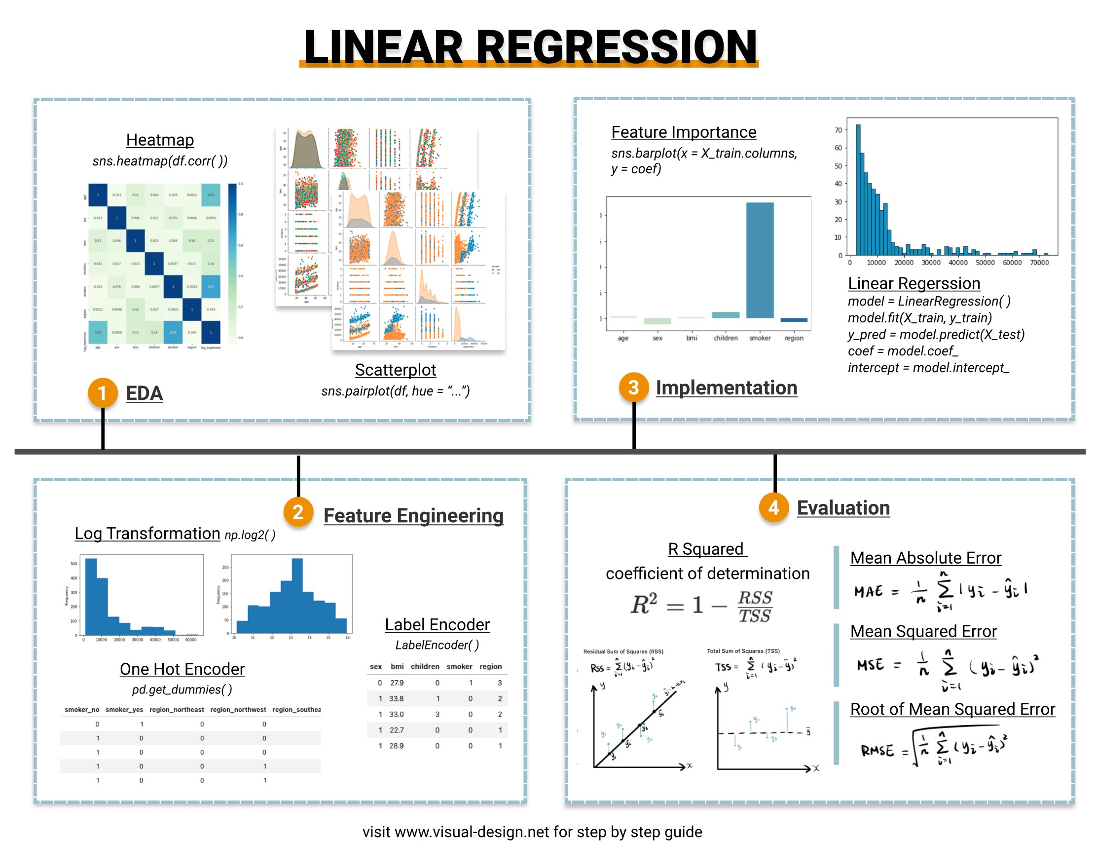
Exploratory Data Analysis (EDA)
EDA is essential to both investigate the data quality and reveal hidden correlations among variables. In this exercise, I cover three techniques relevant to linear regression. To have a comprehensive view of EDA, check out:
1. Univariate Analysis
Visualize the data distribution using histogram for numeric variables and bar chart for categorical variables.
Why do we need univariate analysis?
- identify if dataset contains outliers
- identify if need data transformation or feature engineering
In this case, we found out that "expenses" follows a power law distribution, which means that log transformation is required as a step of feature engineering step, to convert it to normal distribution.
2. Multivariate Analysis
When thinking of linear regression, the first visualization technique that we can think of is scatterplot. By plotting the target variable against the independent variables using a single line of code sns.pairplot(df), the underlying linear relationship becomes more evident.
Now, how about adding the categorical variable as the legend?
From the scatter plot segmented by smoker vs. non-smoker, we can observe that smokers (in blue color) have distinctively higher medical expenses. It indicates that the feature "smoker" can potentially be a strong predictor of expenses.
3. Correlation Analysis
Correlation analysis examines the linear correlation between variable pairs. And this is can be achieved by combining corr() function with sns.heatmap() .
Note that this is after the categorical variable encoding (as in "Feature Engineering" section), so that not only numerical variables are shown in the heatmap.
Why do we need correlation analysis?
- identify collinearity between independent variables – linear regression assumes no collinearity among independent features, therefore it is essential to drop some features if collinearity exists. In this example, none of the independent variables are highly correlated with another, hence no need of dropping any.
- identify independent variables that are strongly correlated with the target – they are the strong predictors. Once again, we can see that "smoker" is correlated with expenses.
Feature Engineering
EDA brought some insights of what types of feature engineering techniques are suitable for the dataset.
1. Log Transformation
We have found out that target variable – "expenses" is right skewed and follows a power law distribution. Since linear regression assumes linear relationship between input and output variable, it is necessary to use log transformation to "expenses" variable. As shown below, the data tends to be more normally distributed after applying np.log2(). Besides, spoiler alert, this transformation does increase the linear regression model score from 0.76 to 0.78.
2. Encoding Categorical Variable
Another requirement of machine learning algorithms is to encode categorical variable into numbers. Two common methods are one-hot encoding and label encoding. If you would like to know more about the difference, please check out: "Feature Selection and EDA in Machine Learning".
Here I compare the implementation of these two and the outcome.
- one hot encoding
df = pd.get_dummies(df, columns = cat_list)
- label encoding
However both methods result in a model score of 0.78, suggesting that choosing either doesn’t make a significant difference in this sense.
Model Implementation
A simple linear regression, y = b0 + b1x, predicts relationship between one independent variable x and one dependent variable y, for instance, the classic height – weight correlation. As more features/independent variables are introduced, it evolves into multiple linear regression y = b0 + b1x1 + b2x2 + … + bnxn, which cannot be easily plotted using a line in a two dimensional space.
I applied LinearRegression() from scikit-learn to implement the linear regression. I specified normalize = True so that independent variables will be normalized and transformed into same scale. scikit-learn linear regression utilizes Ordinary Least Squares to find the optimal line to fit the data. So that the line, defined by coefficients b0, b1, b2 … bn, minimizes the residual sum of squares between the observed targets and the predictions (the blue lines in chart)
The implementation is quite straightforward and returns some attributes:
- model.coef_: the coefficient values – b1, b2, b3 … bn
- model.intercept_: the constant values – b0
- model.score: the determination R squared of the prediction which helps to evaluation model performance (more detail in model evaluation section)
Let’s roughly estimate the feature importance using coefficient value and visualize it. As expected, smoker is the primary predictor of medical expenses.
sns.barplot(x = X_train.columns, y = coef, palette = "GnBu")
Recall that we have log transformed the target variable, therefore don’t forget to used _2**ypred to revert back to the actual predicted expenses.
Model Evaluation
Linear regression model can be qualitatively evaluated by visualizing error distribution. There are also quantitative measures such as MAE, MSE, RMSE and R squared.
1. Error Distribution
Firstly, I use histogram to visualize the distribution of error. Ideally, it should somewhat conform to a normal distribution. A non-normal error distribution may indicates that there is non-linear relationship that model failed to pick up, or more data transformations are necessary.
2. MAE, MSE, RMSE
Mean Absolute Error (MAE): the mean of the absolute value of the errors
Mean Squared Error (MSE): the mean of the squared errors
Root Mean Squared Error (RMSE): the square root of the mean of the squared errors
All three methods measures the errors by calculating the difference between predicted values ŷ and actual value y, hence the smaller the better. The main difference is that MSE/RMSE penalized large errors and are differentiable whereas MAE is not differentiable which makes it hard to apply in gradient descent. Compared to MSE, RMSE takes the square root thus maintains the original data scale.
3. R Squared – coefficient of determination
R squared or coefficient of determination is a value between 0 and 1, indicating the amount of variance in actual target variables explained by the model. R squared is defined as 1 – RSS/TSS, 1 minus the ratio between sum of squares of residuals (RSS) and total sum of squares (TSS). Higher R squared means better model performance.
Residual Sum of Squares (RSS)
Total Sum of Squares (TSS)
In this case, a R squared value of 0.78 indicating that the model explains 78% of variation in target variable, which is generally considered as a good rate and not reaching the level of overfitting.
Hope you enjoy my article :). If you would like to read more of my articles on Medium, I would really appreciate your support by signing up Medium membership.
Take Home Message
This article provides a practical guide to implement linear regression, walking through the model building lifecycle:
- EDA: univariate analysis, scatter plot, correlation analysis
- Feature Engineering: log transformation, categorical variable encoding
- Model implementation: scikit learn LinearRegression()
- Model evaluation: MAE, MSE, RMSE, R Squared
And if you are interested in a Video Guide 🙂
https://www.youtube.com/watch?v=tMcbmyK6QiM
More Articles Like This
Simple Logistic Regression in Python
Originally published at https://www.visual-design.net on September 18th, 2021.
Share This Article
Towards Data Science is a community publication. Submit your insights to reach our global audience and earn through the TDS Author Payment Program.
Write for TDS