 |
VOOZH | about |
|
VOOZH | about |
*This article was originally published in 2015 and updated in April 2020.
I’ve always admired the immense power of Excel. This software is not only capable of doing basic data computations, but you can also perform data analysis using it. It is widely used for many purposes including the likes of financial modeling and business planning. It can become a good stepping stone for people who are new to the world of business analytics.
Even before learning R or Python, it is advisable to have knowledge of Excel. It does no harm to add Excel to your skillset. Excel, with its wide range of functions, visualizations, and arrays empowers you to quickly generate insights from data which would be hard to see otherwise. And this is a crucial aspect of any business analytics project.
In fact, we have designed an entire comprehensive program on Business Analytics for you, with Excel as a key component! Make sure you check it out and give yourself the gift of a business analytics career.
I feel fortunate that my journey started with Excel. Over the years, I’ve learned many tricks to work to deal with data faster than ever. Excel has numerous functions. It becomes confusing at times to choose the best one.
In this article, I’ll provide you some tips and tricks to work on Excel and save you time. This article is best suited to people keen to upgrade their data analysis skills.
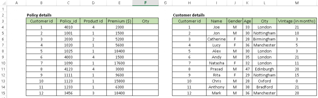
1. Vlookup(): It helps to search a value in a table and returns a corresponding value. Let’s look at the table below (Policy and Customer). In Policy table, we want to map city name from the customer tables based on common key “Customer id”. Here, function vlookup() would help to perform this task.👁 excel, data analysis, lookup
Syntax: =VLOOKUP(Key to lookup, Source_table, column of source table, are you ok with relative match?)
For the above problem, we can write the formula in cell “F4” as =VLOOKUP(B4, $H$4:$L$15, 5, 0) and this will return the city name for all the Customer id 1 and post that copy this formula for all Customer ids.
Tip: Do not forget to lock the range of the second table using a “$” sign – a common error when copying this formula down. This is known as relative referencing.
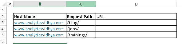
2. CONCATENATE(): It is very useful to combine text from two or more cells into one cell. For example, we want to create a URL based on the input of hostname and request path.👁 excel, data analysis, concatenate
Syntax: =Concatenate(Text1, Text2,.....Textn)
Above problem can be solved using formula, =concatenate(B3, C3) and copy it.
Tip: I prefer using the “&” symbol, because it is shorter than typing a full “concatenate” formula, and does the exact same thing. The formula can be written as “= B3&C3”.
3. LEN() – This function tells you about the length of a cell i.e. number of characters including spaces and special characters.
Syntax: =Len(Text)
Example: =Len(B3) = 23
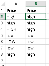
4. LOWER(), UPPER() and PROPER() –These three functions help to change the text to lower, upper, and sentence case respectively (First letter of each word capital).
Syntax: =Upper(Text)/ Lower(Text) / Proper(Text)
In a data analysis project, these are helpful in converting classes of a different case to a single case else these are considered as different classes of the given feature. Look at the below snapshot, column A has five classes (labels) whereas Column B has only two because we have converted the content to lower case.
👁 excel, data analysis
5. TRIM(): This is a handy function used to clean text that has leading and trailing white space. Often when you get a dump of data from a database the text you’re dealing with is padded with blanks. And if you don’t deal with them, they are also treated as unique entries in a list, which is certainly not helpful.
Syntax: =Trim(Text)
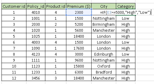
6. IF(): I find it one of the most useful functions in excel. It lets you use conditional formulas that calculate one way when a certain thing is true and another way when false. For example, you want to mark each sales as “High” and “Low”. If sales are greater than or equals to $5000 then “High” else “Low”.
Syntax: =IF(condition, True Statement, False Statement)
👁 excel, data analysis, conditional
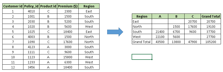
1. Pivot Table: Whenever you are working with company data, you seek answers for questions like “How much revenue is contributed by branches of North region?” or “What was the average number of customers for product A?” and many others.
Excel’s PivotTable helps you to answer these questions effortlessly. A pivot table is a summary table that lets you count, average, sum, and perform other calculations according to the reference feature you have selected i.e. It converts a data table to an inference table which helps us to make decisions. Look at the below snapshot:
👁 excel, data analysis, Pivot
Above, you can see that table on the left has sales detail against each customer with the region and product mapping. In the table to the right, we have summarized the information at region level which now helps us to generate an inference that the South region has the highest sales.
Methods to create Pivot table:
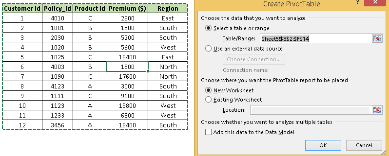
Step-1: Click somewhere in the list of data. Choose the Insert tab, and click PivotTable. Excel will automatically select the area containing data, including the headings. If it does not select the area correctly, drag over the area to select it manually. Placing the PivotTable on a new sheet is best, so click New Worksheet for the location and then click OK👁 excel pivot
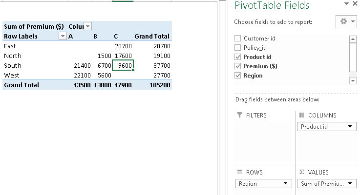
Step-2: Now, you can see the PivotTable Field List panel, which contains the fields from your list; all you need to do is to arrange them in the boxes at the foot of the panel. Once you have done that, the diagram on the left becomes your PivotTable.
👁 excel pivot
Above, you can see that we have arranged “Region” in row, “Product id” in column and sum of “Premium” is taken as value. Now you are ready with pivot table which shows Region and Product wise sum of premium. You can also use count, average, min, max and other summary metrics.
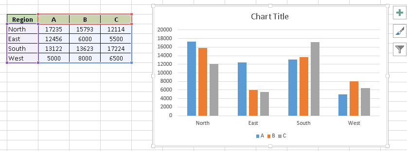
2. Creating Charts: Building a chart/ graph in excel requires nothing more than selecting the range of data you wish to chart and press F11. This will create an Excel chart in default chart style but you can change it by selecting different chart style. If you prefer the chart to be on the same worksheet as the data, instead of pressing F11, press ALT + F1.
Of course, in either case, once you have created the chart, you can customize to your particular needs to communicate your desired message.👁 excel charts
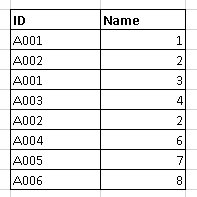
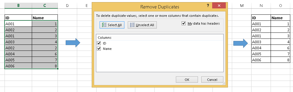
1. Remove duplicate values: Excel has inbuilt feature to remove duplicate values from a table. It removes the duplicate values from given table based on selected columns i.e. if you have selected two columns then it searches for duplicate value having same combination of both columns data.
👁 excel, remove duplicates
Above, you can see that A001 and A002 have duplicate value but if we select both columns “ID” and “Name” then we have only one duplicate value (A002, 2).
Follow the these steps to remove duplicate values: Select data –> Go to Data ribbon –> Remove Duplicates👁 remove duplicates
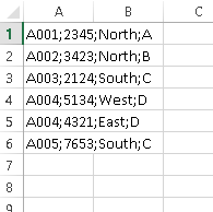
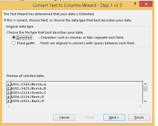
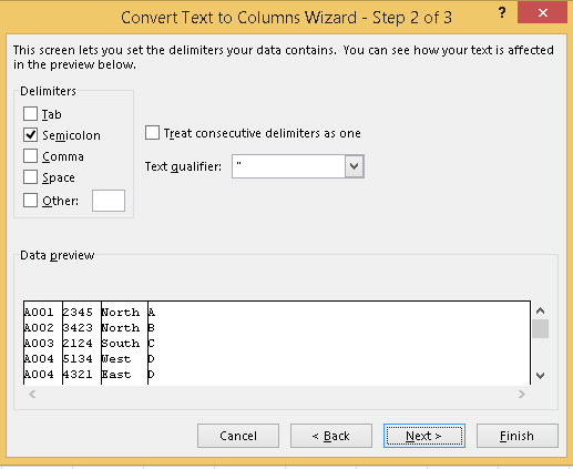
2. Text to Columns: Let’s say you have data stored in the column as shown in below snapshot.
👁 data formatting, text to columns
Above, you can see that values are separated by semicolon “;”. Now to split these values in a different column, I will recommend to use the “Text to Columns” feature in excel. Follow the below steps to convert it to different columns:
Keyboard shortcuts are the best way to navigate cells or enter formulas more quickly. We’ve listed our favorites below.
Note: This isn’t an exhaustive list. Feel free to share your favorite keyboard shortcuts in Excel in the comments section below. Literally, I do 80% of excel tasks using shortcuts.
Excel is arguably one of the best tools ever made, and it has remained the gold standard for nearly all businesses worldwide. But whether you’re a newbie or a power user, there’s always something left to learn. Or do you think you’ve seen it all and done it all? Let us know what we’ve missed in the comments.
Looking to get started in the data field? We have curated the perfect multi-course program for you! Check out the Certified Business Analytics Program and launch your career!
Sunil Ray is Chief Content Officer at Analytics Vidhya, India's largest Analytics community. I am deeply passionate about understanding and explaining concepts from first principles. In my current role, I am responsible for creating top notch content for Analytics Vidhya including its courses, conferences, blogs and Competitions.
I thrive in fast paced environment and love building and scaling products which unleash huge value for customers using data and technology. Over the last 6 years, I have built the content team and created multiple data products at Analytics Vidhya.
Prior to Analytics Vidhya, I have 7+ years of experience working with several insurance companies like Max Life, Max Bupa, Birla Sun Life & Aviva Life Insurance in different data roles.
Industry exposure: Insurance, and EdTech
Major capabilities: Content Development, Product Management, Analytics, Growth Strategy.
GPT-4 vs. Llama 3.1 – Which Model is Better?
Llama-3.1-Storm-8B: The 8B LLM Powerhouse Surpa...
A Comprehensive Guide to Building Agentic RAG S...
Top 10 Machine Learning Algorithms in 2026
45 Questions to Test a Data Scientist on Basics...
90+ Python Interview Questions and Answers (202...
8 Easy Ways to Access ChatGPT for Free
Prompt Engineering: Definition, Examples, Tips ...
What is LangChain?
What is Retrieval-Augmented Generation (RAG)?
The article is very good, maybe you can add SUMIF, SUMIFS and MATCH which I use a lot.
This article is written in a very self-explanatory way !!! Anyone can easily understand and apply...
I really admire the topics related to analytics spoken in such forums. And no one does it better than Analytics Vidhya. I have been involved in interviews over the last 5 months or so (all Data Science/Analytics positions, both operational & leadership). I was amazed at the number of times anything to do with Excel was mentioned or asked. Literally 0 (I'm not joking). Excel is a very powerful tool according to me too. Whenever I start doing any analytics I first start off with Excel. It is amazing how just by playing around with a pivot & a chart it's thought provoking. Great job people. Keep up the good work!
Also Can you plz tell us the Analytics tools plugin in excel and some of its features
Edit
Resend OTP
Resend OTP in 45s