
Data Visualizations with Plotly
Keep adding new skills with 10,000+ programs for $239 (usually $399). Save now.
Data Visualizations with Plotly
This course is part of Data Visualization with Excel and Python Specialization
Instructor: Madecraft
Included with
Ask Coursera
Recommended experience
Recommended experience
What you'll learn
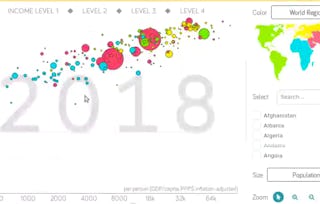
Build interactive Plotly charts, from statistical distributions and geographic maps to sunburst charts and Sankey diagrams.
Deploy a Dash web application that lets stakeholders drive your data visualizations directly in a browser, with no Python required on their end.
Skills you'll gain
Tools you'll learn
Details to know
June 2026
See how employees at top companies are mastering in-demand skills
Build your subject-matter expertise
- Learn new concepts from industry experts
- Gain a foundational understanding of a subject or tool
- Develop job-relevant skills with hands-on projects
- Earn a shareable career certificate
There are 6 modules in this course
Data science projects live or die on communication. Without clear, compelling visuals, even the most rigorous analysis gets ignored, misread, or shelved. Plotly gives Python practitioners a direct path from raw numbers to interactive, publication-quality charts that stakeholders can interpret and act on, all without leaving Python.
You'll build a full command of Plotly's visualization library: from basic line, bar, and scatter charts to statistical distributions, 3D plots, geographic maps, sunburst diagrams, and Sankey flows. Along the way, you'll configure figures using both Plotly Express and Graph Objects, add interactive controls like sliders and dropdown menus, combine charts into subplots, and deploy a Dash dashboard that brings all your visuals together in one shareable application. By the end of this course, you'll produce a full suite of interactive, presentation-ready data visualizations in Python that communicate your findings with clarity and confidence to any stakeholder audience.
Your analyses are only as powerful as your ability to share them with the people who need them. In this module, you'll survey Plotly's chart library, map its capabilities to your visualization needs, and produce your first interactive chart using Plotly Express.
What's included
3 videos1 reading1 assignment
3 videos•Total 5 minutes
- Why Data Visualization Is Critical to Data Science Success•1 minute
- What Is Plotly?•1 minute
- Getting Started with Plotly•2 minutes
1 reading•Total 10 minutes
- The Communication Gap That Breaks Data Science Projects•10 minutes
1 assignment•Total 10 minutes
- From Setup to Stakeholder: Your First Interactive Charts•10 minutes
Your chart is only as impactful as your ability to customize and share it on your terms. In this module, you'll configure Plotly figure attributes using update_layout and magic underscore syntax, choose between Plotly Express and Graph Objects for each use case, and export your visuals as interactive HTML files ready to share with any audience.
What's included
3 videos1 reading2 assignments
3 videos•Total 11 minutes
- Introduction to the Figure in Plotly•3 minutes
- Plotly Express vs. Graph Objects•3 minutes
- Making Charts and Sharing Your Work•5 minutes
1 reading•Total 10 minutes
- Two APIs, One Library: Choosing the Right Plotly Interface for Your Project•10 minutes
2 assignments•Total 20 minutes
- Choosing Between Plotly Express and Graph_Objects•10 minutes
- Beyond the Chart: Configuring and Sharing Plotly Figures•10 minutes
Your data tells a story, but the chart type you choose determines whether your audience can read it. In this module, you'll build line, bar, scatter, and bubble charts with Plotly Express, apply statistical charts to reveal distribution patterns in your data, and extend your toolkit to interactive 3D visualizations that give your audience a new perspective on multi-dimensional relationships.
What's included
3 videos1 reading2 assignments
3 videos•Total 17 minutes
- Basic Charts with Plotly•6 minutes
- Statistical Charts with Plotly•8 minutes
- 3D Plotting with Plotly•3 minutes
1 reading•Total 10 minutes
- Don't Just Count It: How Statistical Visualization Changes What You See in Your Data•10 minutes
2 assignments•Total 40 minutes
- Selecting the Right Statistical Chart•10 minutes
- Pick the Right Chart: From Basics to 3D in Plotly•30 minutes
Your most memorable data stories are often told by chart types your colleagues have never seen before. In this module, you'll build three of Plotly's most striking specialized chart types: geographic maps that display location-based data on interactive backgrounds, sunburst charts that reveal proportions within hierarchical data, and Sankey diagrams that trace flows between sequential states.
What's included
3 videos1 reading1 assignment
3 videos•Total 13 minutes
- Mapping with Plotly•4 minutes
- Creating a Sunburst Graph•4 minutes
- Creating a Sankey Diagram•5 minutes
1 reading•Total 10 minutes
- When a Pie Chart Isn't Enough: Making Hierarchy Visible with Sunburst Charts•10 minutes
1 assignment•Total 10 minutes
- Maps, Hierarchies, and Flows: Plotly's Most Striking Charts•10 minutes
Your visualizations become tools when your audience can interact with them. In this module, you'll add dropdown menus and button controls to individual Plotly figures, combine multiple charts into a unified subplot layout, and package your visuals into a live Dash web application that users can drive directly from a browser.
What's included
3 videos1 reading2 assignments
3 videos•Total 9 minutes
- Creating Dropdowns and Buttons•3 minutes
- Creating Subplots•4 minutes
- Creating Dashboards with Dash•2 minutes
1 reading•Total 10 minutes
- One Canvas, Many Stories: When and How to Use Subplots in Plotly•10 minutes
2 assignments•Total 20 minutes
- Configuring Buttons and Sliders in Plotly•10 minutes
- Interactive Controls, Subplots, and Dash: Building the Full Stack•10 minutes
What's included
1 video1 assignment
1 video•Total 1 minute
- Your path forward using Plotly•1 minute
1 assignment•Total 30 minutes
- From Figure to Application: Your Plotly Skills in Practice•30 minutes
Earn a career certificate
Add this credential to your LinkedIn profile, resume, or CV. Share it on social media and in your performance review.
Instructor
Explore more from Data Analysis
Guided Project
- Status: FreeC
Coursera
Guided Project
Guided Project
- Status: Free Trial
Course
Why people choose Coursera for their career
Frequently asked questions
To access the course materials, assignments and to earn a Certificate, you will need to purchase the Certificate experience when you enroll in a course. You can try a Free Trial instead, or apply for Financial Aid. The course may offer 'Full Course, No Certificate' instead. This option lets you see all course materials, submit required assessments, and get a final grade. This also means that you will not be able to purchase a Certificate experience.
When you enroll in the course, you get access to all of the courses in the Specialization, and you earn a certificate when you complete the work. Your electronic Certificate will be added to your Accomplishments page - from there, you can print your Certificate or add it to your LinkedIn profile.
Yes. In select learning programs, you can apply for financial aid or a scholarship if you can’t afford the enrollment fee. If fin aid or scholarship is available for your learning program selection, you’ll find a link to apply on the description page.
More questions
Financial aid available,
¹ Some assignments in this course are AI-graded. For these assignments, your data will be used in accordance with Coursera's Privacy Notice.