
Advanced Styling with Responsive Design
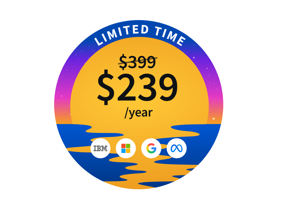
Ends soon! Keep adding new skills with 10,000+ programs for $239 (usually $399). Save now.
Advanced Styling with Responsive Design
This course is part of Web Design for Everybody: Basics of Web Development & Coding Specialization
137,827 already enrolled
Included with
Ask Coursera
4,607 reviews
4,607 reviews
What you'll learn
Describe basic knowledge of browser tools for responsive design.
Understand the importance of a "mobile-first" paradigm for web design.
Write rules for responsive design for a mobile and large-screen view.
Skills you'll gain
Details to know
See how employees at top companies are mastering in-demand skills
Build your subject-matter expertise
- Learn new concepts from industry experts
- Gain a foundational understanding of a subject or tool
- Develop job-relevant skills with hands-on projects
- Earn a shareable career certificate
There are 4 modules in this course
It used to be the case that everyone viewed web pages on about the same size screen - a desktop computer. But now it is just as likely that someone will be using a smart phone, tablet, or assistive technology to access the Internet. Therefore, people viewing your site will now expect that it will perform regardless of the device (smartphone, tablet, laptop, desktop computer, or screen reader) AND take into account some common personal settings such as color schemes. This ability to respond to any platform and user preferences is called Responsive Design.
This course will expand upon the basic knowledge of CSS3 to include topics such as wireframes, fluid design, media queries, and the use of existing styling paradigms. After the course, learners will be able to: ** Explain the mobile-first paradigm and the importance of wireframes in the design phase ** Create sites that behave across a range of platforms ** Recognize existing design frameworks such as Bootstrap A basic understanding of HTML and CSS is expected when you enroll in this class, so it can be taken third or fourth in the Web Design for Everybody specialization. Additional courses focus on adding interactivity with the JavaScript Programming Language and completing a capstone project.
What does it mean to have responsive design for your site? How can you tell if your existing site is responsive? This week we will begin with the theories behind the "mobile-first paradigm" - the idea that your mobile site should provide everything needed, not a pared-down version of a good page. We end the week by taking the first concrete step of using fluid measurements in your CSS.
What's included
11 videos9 readings1 assignment3 discussion prompts
11 videos•Total 61 minutes
- Introduction to Responsive Design•6 minutes
- Getting Started with Github•5 minutes
- Downloading and Uploading Code with VSCode and Github•4 minutes
- Copying Code with GitHub Codespaces•4 minutes
- Uploading to GitHub Pages•8 minutes
- Review: Publishing Your Site•5 minutes
- What is Responsive Design?•5 minutes
- Testing Sites•6 minutes
- Benefits of Responsive Design•5 minutes
- Fluid Measurements•7 minutes
- Code With Me: Fluid Measurements•6 minutes
9 readings•Total 47 minutes
- Course Syllabus•5 minutes
- Pre-Course Survey•5 minutes
- Course Resources•5 minutes
- Frequently Asked Questions (FAQ)•2 minutes
- Week 1 Resources•5 minutes
- Examples of Poor Responsive Design•10 minutes
- What To Do When Your Tool is Deprecated•5 minutes
- Fluid Measurements Background Readings•5 minutes
- Additional Tools and Resources•5 minutes
1 assignment•Total 30 minutes
- Basic Concepts in Responsive Design Approaches•30 minutes
3 discussion prompts•Total 30 minutes
- Site Reviews•10 minutes
- Can a file use fluid and absolute measurements together?•10 minutes
- Your Personal Responsive Design Story•10 minutes
This week you will get a chance to put the theories into practice using media queries in your CSS. These queries can automatically change the look and functionality of your site based on the size of the browser being used to view the page. This allows you to decide what type of look you want to achieve at various screen sizes, also called "viewports".
What's included
7 videos4 readings2 assignments1 peer review1 app item
7 videos•Total 47 minutes
- Media Queries•6 minutes
- Code With Me: Fluid Measurements and Media Queries•4 minutes
- Wire Frames•8 minutes
- Breakpoints•8 minutes
- Media Queries Part Two•10 minutes
- Code With Me: Responsive Navigation•9 minutes
- Homework Review: Basic Media Queries•3 minutes
4 readings•Total 20 minutes
- Week 2 Resources•2 minutes
- Homework Description•5 minutes
- Introduction to the Gamut Gallery•3 minutes
- Additional Resources•10 minutes
2 assignments•Total 60 minutes
- Week Two Review: Media Queries and Breakpoints•30 minutes
- Practice Quiz -- Challenge Problem•30 minutes
1 peer review•Total 60 minutes
- Create a Responsive Stylesheet •60 minutes
1 app item•Total 10 minutes
- Homework: Optional Gallery Submission•10 minutes
Knowing what your want your site to look like is the first step, but actually writing the code is another. This week we look at the grid and flex display properties to suggest ways to organize the layout of your page. We also talk about media queries that you should be including to increase the accessibility of your page. These queries can react to user preferences about color schemes, animation, and more.
What's included
5 videos5 readings
5 videos•Total 37 minutes
- Preview of Week 3•2 minutes
- Code With Me: Using Media Queries with Grid •10 minutes
- Code With Me: Using Media Queries with Flex •4 minutes
- Media Queries for Accessibility•9 minutes
- Accessibility Testing•12 minutes
5 readings•Total 57 minutes
- Week 3 Resources•2 minutes
- Prefers Reduced Motion•15 minutes
- Color Schemes and Color Contrast•10 minutes
- Accessilibity Testing Options•10 minutes
- Additional Resources•20 minutes
After every good programmer has put in time creating sites from scratch, it is common to utilize existing tools out there. After all, why recreate the wheel? The work you have done up to this point will give you the knowledge needed to craft your own unique sites from these frameworks. This week we will work with Bootstrap, a framework that uses HTML5, CSS, and JavaScript (but don't worry if you have never used JavaScript yourself).
What's included
8 videos6 readings1 assignment1 peer review1 app item
8 videos•Total 52 minutes
- Using Frameworks•3 minutes
- Introduction to Bootstrap•6 minutes
- Bootstrap Grid System•12 minutes
- Optional: Interview with M W•8 minutes
- Optional: Interview with H W•7 minutes
- Optional: Interview with H N•9 minutes
- Homework Review: Final Project•6 minutes
- Conclusion•3 minutes
6 readings•Total 57 minutes
- Week 4 Resources•2 minutes
- Getting Started With Bootstrap•5 minutes
- Bootstrap Resources and Examples•10 minutes
- Additional Resources •20 minutes
- Final Project Description•10 minutes
- Post-course Survey•10 minutes
1 assignment•Total 30 minutes
- Responsive Design Final Quiz•30 minutes
1 peer review•Total 75 minutes
- Final Project: Photo Gallery•75 minutes
1 app item•Total 10 minutes
- Final Project: Optional Gallery Submission•10 minutes
Earn a career certificate
Add this credential to your LinkedIn profile, resume, or CV. Share it on social media and in your performance review.
Instructors
Offered by
Explore more from Mobile and Web Development
- Status: Free TrialU
University of Washington
Course
- Status: Free Trial
Course
- Status: Free TrialB
Board Infinity
Course
Why people choose Coursera for their career
Learner reviews
- 5 stars
78.68%
- 4 stars
16.84%
- 3 stars
3.42%
- 2 stars
0.75%
- 1 star
0.28%
Showing 3 of 4607
Reviewed on Mar 20, 2020
Firstly i thank you all to this good material , and i give my appreciate and thanks to Ph,Dr. Colleen van Lent. And its very useful to me to learn this course .Thank you very much <3
Reviewed on Jan 12, 2017
The course is quite good and intriguing for it offers challenges which are interesting at the same time. Always good to take up a challenge, oh what an experience
Reviewed on Sep 5, 2020
At first I was not good in designing or responsive designing but after learning about bootstrap from this course I am pretty much confident that I can easily design a website
Frequently asked questions
To access the course materials, assignments and to earn a Certificate, you will need to purchase the Certificate experience when you enroll in a course. You can try a Free Trial instead, or apply for Financial Aid. The course may offer 'Full Course, No Certificate' instead. This option lets you see all course materials, submit required assessments, and get a final grade. This also means that you will not be able to purchase a Certificate experience.
When you enroll in the course, you get access to all of the courses in the Specialization, and you earn a certificate when you complete the work. Your electronic Certificate will be added to your Accomplishments page - from there, you can print your Certificate or add it to your LinkedIn profile.
Yes. In select learning programs, you can apply for financial aid or a scholarship if you can’t afford the enrollment fee. If fin aid or scholarship is available for your learning program selection, you’ll find a link to apply on the description page.
More questions
Financial aid available,