 |
VOOZH | about |
|
VOOZH | about |
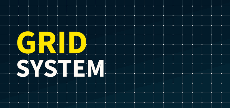
A grid system is a framework used in graphic design to organize content in a structured and consistent layout. It consists of a series of intersecting horizontal and vertical lines that divide the page into sections, helping designers arrange elements like text, images, and graphics in a way that enhances readability and visual appeal.
Grid systems are essential in various fields, including web design, print layout, and typography, providing a foundation for creating balanced and harmonious compositions. In fact, studies show that designs with a structured layout can improve user comprehension by up to 50%, making grids crucial for effective communication.
Grid System History: How Grid System Popular in Design?
Grid systems became popular in graphic design during the 20th century, especially in Swiss design, where they were used to achieve clarity and order. They are important because they provide a guide for positioning elements consistently, making the design process faster and easier. Whether it's for web design, magazine layouts, or advertising, using a grid system in graphic design ensures that all components are aligned, creating a visually cohesive outcome.
This article will explore what a grid system in graphic design is, why it's important, and how it can be applied to various projects to enhance visual organization and aesthetics.
Table of Content
A grid system is a framework that allows for the arrangement of content on a web page or a design layout using a series of rows and columns. It is a way to structure information in a consistent and organized manner, making content easier to read, understand, and interact with. Grid systems are widely used ingraphic design, web development, and print media to create visually appealing and functional layouts.
These were some basic terminologies a designer should know before using a grid system. One thing to keep in mind is that “Elements don't need to end at the same marking but all elements should start at the same marking” when using a grid system.
As the grid is flexible to create a similar layout for different size devices. It is also available in different ways to use multiple kinds of Grid systems. Now let’s look at the different types of grids system in UI Design that we have and how to use them:
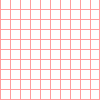
This types of grid system in UI Design are evenly spread, which means all the elements are aligned with the center. Such grid systems consist of an equal number of rows and columns. These look very pleasing to the eye and elements are evenly spread on the screen. Give a formal and clean look to the designs.
Column Grid:
The most commonly used grid type, where a frame is split into multiple columns separated with gutters. It is pleasing to the eye and creates a balanced visual hierarchy. Screen elements like text, images, and buttons are aligned using these columns. Column grids are mostly used in magazines and newspapers. Margins are fixed and independently sized.
It is a type of symmetrical grid, where the layout is fixed having columns and rows that make it appear like a grid cage. It feels like one has super zoomed into Figma or just like our math elementary notebook. This grid type helps in creating pixel-perfect designs, each box denotes a pixel itself. Designers occasionally close in to make pixel-by-pixel adjustments to the millions of pixels that make up digital screens.
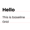
It is also a type of symmetrical grid, where the layout is fixed having only horizontal lines as a guide, a ruled notebook is a straightforward illustration of a baseline grid. To make sure that the lines of text in each column align consistently across a spread, baseline grids are frequently used in conjunction with column grids.
👁 Baseline GridModular grid:
It is another type of symmetrical grid that appears to be very pleasing to the eye. Modular grid got the name because of the “Modules” which are created by the intersection of columns and rows that are very well organized and placed using gutters. Margins are consistent which gives a boxy look, this type is generally used by business magazines.
👁 Modular GridManuscript grid:
It is a type of symmetrical grid, also known as a “Single columned” or “one-columned” grid as well. As the name suggests, the manuscript grid has only one column that guides the layout. This grid type is often used for books, especially folk or traditional books. Due to its appearance, it makes reading easier by using short lines with fixed margins from all sides.
👁 Manuscript GridThis type of Grid System in UI Design are opposite to symmetric grids as there is no restriction of the grid being aligned to the center. It is also called the broken glass grid, as pieces are unevenly placed which gives a funky, modern, and abstract look to the designs.
Hierarchical grid: It is a type of asymmetrical grid, where the layout is not fixed. A hierarchical grid is entirely freeform, made up of two or more grids that are overlaid, or contain other grid components within themselves. To avoid having a boxy vibe, many contemporary website interfaces use hierarchical grid layouts. As it is asymmetrical it is more modern and abstract, setting a playful mood on websites when used.
👁 Hierarchical gridThese are some popular types of grids that are used based on different requirements and needs. It is good to know about each of these so that as a designer one can utilize and leverage the best guiding layout grid system.
To know the optimal usage of a grid system, knowing how to use the grid is very important. As a beginner using a grid can be very overwhelming and confusing but not to worry, We're here to rescue you. Now let’s look into how to use the grid to create an organized and consistent layout.
Using grids in design can greatly enhance the organization and visual appeal of your projects. Here's a step-by-step guide on how to effectively use grids:
Choose the appropriate grid system for your project. Common types include column grids for text layouts, modular grids for complex graphic interfaces, and baseline grids for aligning text.
Establish the parameters of your grid, such as the number of columns, gutter width (space between columns), and margins around the content area. Use design software tools like Adobe Photoshop, Illustrator, Sketch, or Figma to set up these grids accurately.
Align your design elements—text, images, icons, and others—within the grid columns. This helps to maintain consistency and balance throughout your design, making it easier to navigate and visually appealing.
Apply the same grid layout across all pages or sections of your project to ensure a cohesive look and feel. Consistent use of a grid helps to establish a rhythm that guides the viewer’s eye and makes the content more digestible.
While it’s important to stick to the grid, don’t hesitate to break away from it when needed to highlight certain elements or to add visual interest. Breaking the grid can draw attention to specific parts of your design and add dynamism.
Review your design on different devices (if digital) or in different formats (if print) to see how well the grid serves the layout. Make adjustments based on feedback and practical testing to refine the user experience.
When you're exploring web design, understanding how grid layouts work can really expand your creativity and efficiency. Here are some classic examples of website types that often use grid layouts effectively:
In web development, grid systems are essential for creating responsive layouts. Frameworks like Bootstrap and CSS Grid provide pre-defined grid systems that help developers to create fluid and adaptive designs.
A grid system is a crucial tool in design and web development, providing a structured approach to organizing content. Whether you are designing a website, a print layout, or an app interface, a grid system helps ensure consistency, efficiency, and visual appeal in your design.
Related Articles: