 |
VOOZH | about |
|
VOOZH | about |
Charts help visually represent data and make it easier to understand. Google Docs offers types like bar, column, line, and pie charts, allowing you to create, customize, and update them for clear and appealing documents.
Google Docs offers a variety of chart types to help you visually represent your data effectively. Here's the explanation of the charts given below for your reference. Read below to know more about the types of charts available in Google Docs.
Bar graphs are the visual representation of data in your Google Docs application. This type of chart can make your data into a bar type of data to compare your sources.
A column chart is a vertical bar representation of your data that can also help you compare your data across categories. We can use a column chart to compare changes over time such as yearly, monthly, or quarterly.
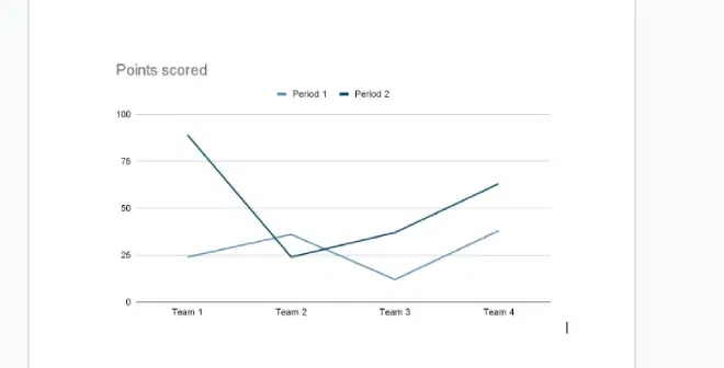
This type of chart shows how data changes over time using lines. Line charts can be used to compare multiple data sets such as profits, sales, etc. at different times.
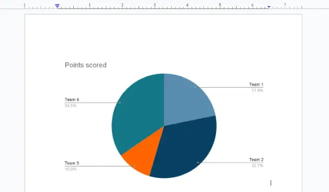
This type of chart shows the proportion of different categories in a data set. It shows how the whole is divided into different parts. A pie chart can be used to highlight a small or large segment of the total, such as the best or worst performer, or the most or least popular option.
Making a chart in Google Docs is a very easy process. Google Docs provides options for adding different types of charts, you can select from the given options according to your wish. We will discuss about different types of charts offered by Google Docs further in this article.
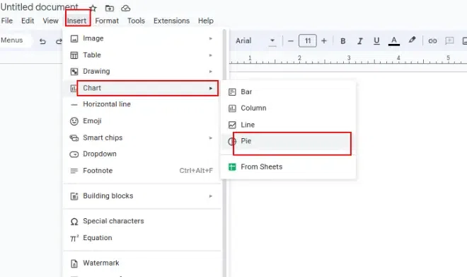
Open a new or an existing document on Google Docs. Go to the Insert tab, and a drop-down menu will be displayed, select Charts from different options in the dropdown. After clicking on the charts again a dropdown menu will be displayed. Select the desired Chart from the given type of chart.
After selecting the type of chart, it will be inserted into the document. You can preview it.
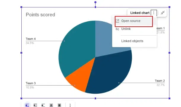
Select the chart you inserted and want to edit by right-clicking on it. Click on the 3-dot icon (linked charts option) in the top right corner and then click on the open-source button. Google Docs will automatically open the Google Sheets application.
Now you can update the chart in the original document in Google Docs by clicking the Update button on the top right corner of the chart after editing in sheets.
The updated chart will be applied to your Google document.