 |
VOOZH | about |
|
VOOZH | about |
Any data or variable that is limited to having certain values is known as discrete data. Many examples of discrete data can be observed in real life such as:
When dealing with such data, we may require to plot graphs, histograms, or any other form of visual representation to analyze the data and achieve desired results.
MATLAB offers a wide variety of ways to plot discrete data. These include:
Let us first take some sample 2-D data to work with while demonstrating these different types of plots.
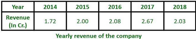
👁 ImageThe above data shows the yearly revenue of a company for the duration of 5 years. This data can be shown in any of the above-mentioned plots:
This plot draws bars at positions specified by the array "Year" with the heights as specified in the array "Revenue"
Example:
Output:
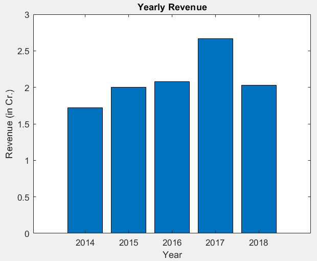
👁 ImageThis plot draws horizontal bars at positions specified by the array "Year" with the lengths as specified in the array "Revenue".
Example:
Output:
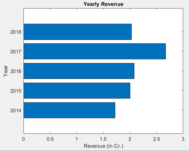
👁 ImageThis plot shows vertical bars corresponding to the values of the data in descending order of value. This also shows a curve made with the cumulative values above each bar. In addition to this, the right side of the graph has a percentage scale that shows how much percentage each bar contributes to the sum of all values.
Example:
Output:
👁 ImageBar Graphs (both vertical and horizontal) and Pareto charts can be used to represent data such as marks of a student in different subjects, rainfall received in different months, and many other data sets.
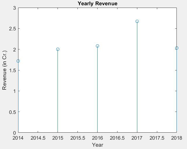
This plot shows a straight line with a bulb at the top (or bottom for negative values) corresponding to the values given in the data. The X-axis is scaled from the least to the highest value given. which may result in the first and last value being situated right at the border of the graph.
Example:
Output:
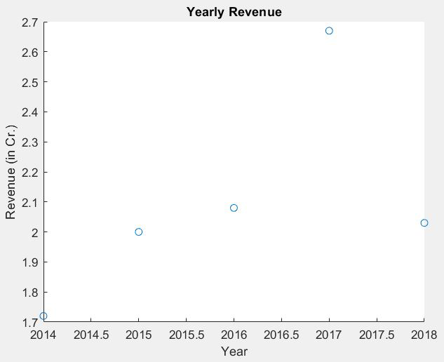
👁 ImageThis plot shows dots placed at the values given in the data. The Y-axis is scaled from the lowest to the highest value in the data. The X-axis is scaled similarly as in stem charts, from least to highest value.
Example:
Output:
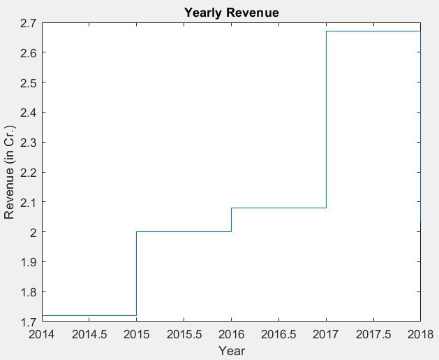
👁 ImageThis plot shows a staircase-like structure with each step beginning at the next value given in the data. Similar to the scatter plot, X and Y axes scale from the lowest to the highest values given.
Example:
Output:
👁 ImageStem, Scatter, and Stairstep plots are ideally used when working with digital signals.