 |
VOOZH | about |
|
VOOZH | about |
Negative space, also known as white space, is the empty area between design elements like text, images, and buttons. This isn't just empty space; it's an essential part of the design that helps to define everything else around it, making the overall design easier to understand and more attractive.
Whether it's in creating logos, web design, or any visual artwork, using white space and negative space properly can make designs stand out by making them look more organized and engaging. This article explores how white space and negative space are used in design, showing why they are so important for making designs effective and memorable.
Table of Content
Negative space, also known as white space, is the empty area around and between design elements like text, images, and buttons. It's an important part of design because it helps make everything easier to read and more visually appealing. By using negative space effectively, you can highlight key parts of your design, create balance, and improve the overall user experience. Whether you're working on a website, an app, or any other project, paying attention to negative space can make your design cleaner and more professional.
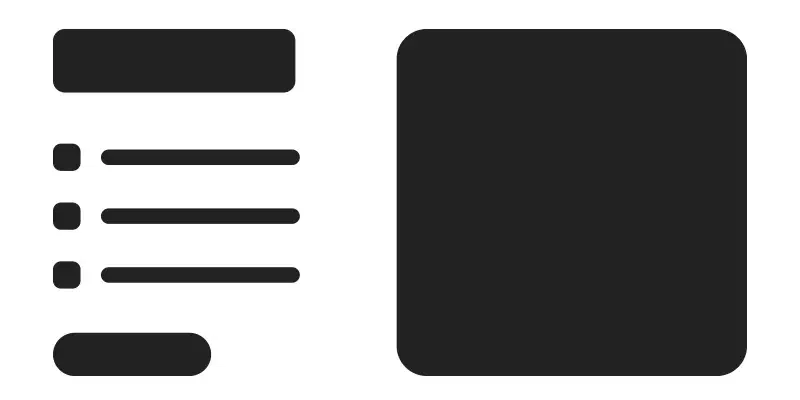
| Aspect | Positive Space | Negative Space |
|---|---|---|
| Definition | Area occupied by main subjects or elements. | Area around and between the subjects; also known as white space. |
| Role in Design | Draws attention, carries the main content. | Defines boundaries of positive space, adds balance, and can create implicit shapes. |
| Examples | Person, objects, text, and main images in a layout. | Backgrounds, spaces between and around elements, and the formed shapes not immediately obvious. |
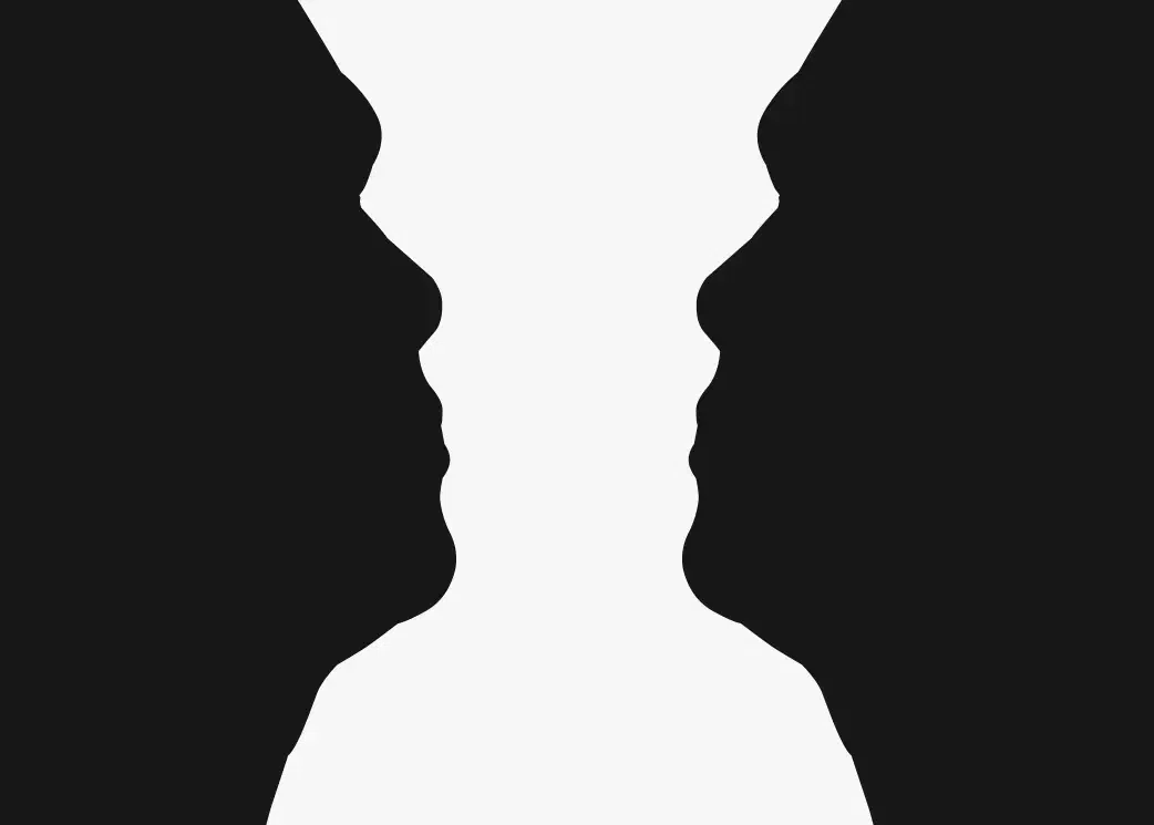
White space and negative space are essentially the same concept, just with different names based on their origins.
"White space" comes from print design when pages were typically white, so the empty areas around text and images were called white space. Nowadays, it refers to any open or unused space, regardless of color. "Negative space," on the other hand, comes from photography, where it describes the background or empty areas around the main subject of a photo.
In modern design, both terms mean the same thing: the space between and around elements. It doesn’t have to be white; it can be any color, pattern, or texture.
“Less is more” is the key idea in UX and UI design. Negative space, also known as whitespace, is the empty space between design elements. It plays a crucial role in creating a visually appealing and user-friendly interface by giving elements room to breathe and directing attention to important areas. Proper use of negative space can greatly enhance the effectiveness and usability of a design. Reasons why Negative space or white space is important in Design:
Negative space, also known as white space, makes text and images easier to read by giving them room to breathe.
It draws attention to the most important parts of your design, guiding the viewer's eye to key elements like headlines, images, or buttons.
Using negative space helps create a balanced and clean layout, making your design look organized.
A design with well-used negative space looks more polished and professional, adding a touch of elegance.
It prevents your design from looking too crowded, making it easier for users to find what they’re looking for.
Negative space makes information easier to understand, leading to a more effective and user-friendly design.
To use negative space well in web design, consider these straightforward tips:
The following are some of the different fields of design where negative space or white space is used:
In UI design, negative space is the empty area around things. It makes text and elements easy to read, helps grab attention, and ensures a clean and user-friendly look. Good use of negative space is essential for a design that looks nice and works well.
In web design, negative space is the empty area around things. It helps text and elements stand out, organizes information, and makes the design look nice. Using it well makes the website easier to use and more enjoyable.
Negative space in graphic design is the empty area around images. It makes the design look good, keeps it balanced, and helps you notice important things. A nice design depends on using negative space well.
The drawing shows someone writing with a pen under a light, and if you look closely, the shadows create the tip of the pen, tying the whole scene together.
There are two parts. If you examine it closely, you'll notice smoke and machinery inside what initially looks like a skull. It combines the themes of the industrial revolution and death, suggesting the damage to the environment and lives lost during that time.
The Target catalog cuts photos to match their logo shape, making it look more interesting and enhancing their brand style, compared to using just square or rectangular photos.
In conclusion, effectively utilizing negative space, also known as white space, is crucial in design. It helps to balance the visual layout and enhance the interplay between negative and positive space, making your content more readable and visually appealing. Whether you’re designing a website, a logo, or any visual content, paying attention to the space around and between elements can transform your designs from good to great. This approach not only improves aesthetics but also supports better user engagement and communication.