
Vibe-coding isn't really something that's been on my radar when it started blowing up, mostly because I assumed it was a developer thing. But it turns out, as someone who doesn't know code, I'm the perfect candidate for vibe-coding tools, and I've already been doing my own version of it with Claude's Artifacts feature without realizing it was technically vibe-coding.
Fast forward to today, I've been testing a whole bunch of dedicated vibe-coding tools, and UI is where my eye goes first every time. User experience and user flow are ultimately what make or break an app - there's no use in having a good-looking app if it just makes a user frustrated or doesn't solve their problem. But the look of the interface is what tends to get you in the door.
So far, my top options with great UI design have been Replit, Figma Make, and Claude Design. Replit and Figma Make have both had time to marinate and build a real reputation. Claude Design is the newest of the three, but it's Anthropic, so it wasn't exactly starting from zero. They're three completely different tools that approach the concept of vibe-coding from different angles. And each one held its own - but one came out on top for UI design.
Want to stay in the loop with the latest in AI? The XDA AI Insider newsletter drops weekly with deep dives, tool recommendations, and hands-on coverage you won't find anywhere else on the site. Subscribe by modifying your newsletter.
The idea
Before we get started
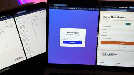
Firstly, my idea going in was a music and mood tracker - you log what you're listening to and it maps your emotional patterns over time. This is an idea I've been meaning to test for a minute, so I gave it my best shot. Also noting that I used the same prompt for each tool. I tried to be specific with certain aspects of the screens, but also left enough room for the AI to fill in the gaps with whatever it deemed fit. This way, I could get a sense of which tool followed my prompt the best, but was also able to understand the context and generate the most appropriate visuals for the theme.
I tried Replit, Lovable, and Claude Code to build the same app — here's the only one worth using
Same prompt, very different results.
Replit didn't disappoint…entirely
One of the most reliable vibe-coding tools
As soon as Replit spit out the first iteration, I knew the hex codes I gave it had to be changed because the color palette looked a little rough - the purple was ugly and it didn't match the amber. So that was on me. I will give it credit for sticking to the prompt though. It also did a really good job with the emojis I asked for, keeping them minimalist and not overbearing, plus it closely followed my typography instructions. The rest, it handled on its own, and it had a near-perfect arrangement for the buttons.
I hunted down more suitable hex codes and added them as mere suggestions this time. The second time around, the color palette was a massive improvement; however, it changed the layout quite a lot. The dashboard got shrunken down, leaving empty space at the bottom, and the main event (the mood display) was the same size as the secondary elements.
If I could combine the colors from the second try with the layout from the first, this would have been the perfect app and exactly what I was aiming for. Ultimately, Replit is one of the best dedicated vibe-coding tools I've tried across the board, at least from the designer's perspective. It's a full coding environment too, so you can deploy functional apps with production-ready code.
Figma knows how to handle UI
It had the best layout of them all
Figma Make is a completely different tool from Replit. It lives inside Figma's existing ecosystem, so the assumption is that you're already designing and it's just speeding up the parts in between - it's clearly optimized for UI design, since that's Figma's whole thing. And this was apparent with its first attempt. It nailed the color palette, nailed the layout and spacing, and did well with the typography too.
The only thing I didn't like was the emojis - it gave me mobile OS emojis, which looked really busy for the vibe I was going for. So I asked it to make the emojis minimalist, and it took my prompt a bit too literally, giving me plain colored shapes instead. Third time was the charm: I specifically asked for line art, and it delivered. I also wanted to test out a slightly different font and improve the contrast of the elements against the background, and Figma pulled through with the iterations in seconds.
When you give Figma explicit instructions, it seems to interpret them as matter-of-fact. Take my "minimalist emojis" instructions for example - it just gave me shapes. So I had to explicitly describe the type of emojis I wanted. However, when you don't give it instructions and just let it handle a screen on its own, it seems to do a better job than I would have with a custom prompt. For UI design specifically, it's hard to argue with the results - Figma Make just thinks like a designer. And you can move the file into the design space to carry on with manual edits.
Claude Design surprised me
And it loves a good gradient, apparently
Claude Design only just launched a few weeks ago and is still in beta, so I was ready to lower my expectations. While I've been using the free versions of the other two, you unfortunately won't have access to Claude Design without a paid account. That said, it's a very welcome addition to my Pro account, and I've been playing around with it non-stop since it dropped. I really love how it combines a vibe-coding and a canvas design space into one window.
Claude definitely gave me the best color palette out of the gate. It nailed the contrast between the clickable and non-clickable elements and the background. And it seemed to go all in on the gradient request from my prompt, applying it, well, to pretty much everything - maybe too much gradient.
It actually also had a good layout, and was probably one of the most realistic-looking apps - if I had to guess which of the three were apps that already existed, Claude's would be my pick. My only problem is that it was too busy and squeezed too much into the screen space, so it didn't quite stick to the theme of "calm" that I requested in my prompt.
The cool thing about Claude Design is that it comes with editing controls inside the rendering canvas, so you can click on individual elements and adjust them using the editing tools without having to reprompt or move the whole file into a separate editing space.
I tried vibe coding a real app in Bolt, v0, and Lovable, and one of them is all you need
Same prompt. Three tools. Very different results.
They were all good, but there was a winner
The clear winner for me was Figma Make. It didn't really come as a surprise given Figma is behind many of the apps we love and use every day. It was built through a UI lens and knows how to lay down elements on a screen. The close second was a surprise though - Claude Design. This up-and-coming design-vibecoding hybrid seemed to really understand the assignment, despite not delivering on every aspect. Replit is a decent tool, but it takes a little more finesse to get what you want.
All of them are capable of high-quality UI design. At the end of the day, it depends on your workflow. If you're launching a product with no design skills, Replit or Claude would be the better fit. If you're a designer who just wants to speed up their design workflow, Figma Make is the way to go.