
24 Comments
Hey Adrian, I’m working on a design system that’s using a vw plus rem scaling
font-size: calc(1rem + 0.2vw)and it seems to be responding just fine to both browser zoom and font-size settings in the browser config.Have I not explored all the scenarios in which this kind of responsive type would break or do you think this solution is okay?
Mark, I think
0.2vwis such a small number that it might not matter. But be aware that for a user who zooms, thevwvalue in yourcalc()will not change with zoom. But since theremis the major value it may not be a big deal except in very wide windows.As always, test those edge cases so you at least know what happens.
I couldn’t replicate the zoom discrepancy between https://cdpn.io/aardrian/debug/XWJmjrN and https://cdpn.io/aardrian/debug/NWPPJRo . Both looks the same at 500% in firefox. What am I missing? Thanks for this post.
Oh sorry I see it now if I view it in the ‘Responsive design mode’. Cool. Thanks!
Hey Adrian, I think I might have a solution that respects zoom while resulting in the same effect.
Basically I’m using javascript to multiply the root font size by some value which is clamped at a min or max. So it respects both a users font size and zoom. Of course it affects all elements that use REM, but that tends to be what I want.
What do you think?
I think if it never prevents a user from getting the text to 200% and it does not spin their fans into oblivion, then sure.
Hey Adrian, you say “Then only set subsequent text size values using %, em, or rem units, avoiding values below 100%, 1em, or 1rem (unless scaling down in something already scaled up).” What’s the problem with setting a small font to 0.875rem (the equivalent of 14px, I believe)? It will still scale, if the users needs to make it bigger through the browser font settings. In fact in the Comments section on this blog, you use both 80% and 0.8rem, which seems a perfectly reasonable use case…
That statement was in the context of setting the base font size to 100%, which keys off the user’s own settings / preferences.
You are suggesting setting the base font size smaller, using my comments section (which is set to 80% the size of the base size of the rest of the content) as justification.
You don’t note that my content size is 130%, or computed as 20.8px. That means my 80%-size comments are 16.64px in a default browser set-up, or still larger than the user’s default font size (104% of default).
So, to answer your question, I suggest you do not do that. Look at the computed values in the dev tools, not the CSS declarations.
Aha! I wasn’t suggesting setting the base font to 80%, just noting that you do use 80%. What I didn’t check, as you say, is that the content font size is 130%. So that makes sense. You’re right, I should have checked the computed values! Thanks once again for your time.
Hi Adrian,
I’m still trying to unpick the mechanics of WHY this happens. Is it only when you have a prefferred value entirely in vw (because vw doesn’t change)?Can I ask if this (https://royalfig.github.io/fluid-typography-calculator/) has solved around the issue or is there still a risk?
Nathan, There is a WCAG failure that describes the issue with viewport units alone: Failure of Success Criterion 1.4.4 due to incorrect use of viewport units to resize text.
As for the tool you linked, I don’t know without breaking it apart. However, note how when the slider at the bottom hits a viewport width of 1,950px, the base font stops getting bigger (it anchors at 20px). That comes from the “Max Font Size” set above, which at 1.25rem means a user may not be able to zoom it enough for their needs.
The simplest answer, IMO, is to never set a maximum font size (so do not use
clamp()) or, if you only care about minimum WCAG conformance, never set the maximum font size to a value below twice the base font size.
If it helps, I have done some extra mathematical analysis of this and have found the following….
Even when not applying a max, you cna hit a “200% not possible” violation. The three biggest variables in this outcome are:
(a) the steepness of the change (i.e. if a linear growth – the steeper the growth, the more likely 200% can’t be achieved)
(b) the max zoom of browsers (e.g. if sometimes you need to go to 300% to hit 200% text growth – eventually some browsers won’t be able to deliver the zoom scale needed.
(c) the worst case viewport width (on a growth curve from 2.625rem at 320px to 3.325rem at 1440px viewport and then larger to maintain linear growth beyond that, even at 300% zoom the 200% text increase is not possible on a 3840 screen. Whilst it is likely that a 4k screen is already upscaled, its not guaranteed.
So, since we don’t control screen sizes or browser zoom levels etc, there will always be a risk with responsive text and the only way around it is to avoid it or, when your growth curve hits a snag, add a breakpoint to go back to a value that avoids vw, etc.
This is indeed interesting info. At the very least, having something to identify where the growth curve flatlines so you can add a breakpoint is handy.
A few extra developments. After running a bunch of maths and creating a “Fluid Type” calculator in Excel to try and protect the upper bound, I also have the thoughr that can’t techniques be combined to meet the accessibility criteria?
Say for example your zoom topped out at 194% (never reaching the magic 200%). If the user also changes their browser settings to enlarge text then that would bump it over the 200% (assuming em/rem units are involved).
Thoughts?
Is this no longer an issue? Chrome on Android, Samsung browser, and Safari both seem to be zooming without breaking the layout now when viewport units are used.
Jonathan, this post deals with desktop browsers, though I could have been more explicit in the post instead of relying on the screen shots to convey that. You have cited mobile browsers where zooming (pinch/spread) is a very different model. Those are analogous to desktop browsers that also use pinch-zoom (via touch screen or track pad).
There’s strain to the eye if you have to read all the monitor, despite font size… that should be accounted for through the usage of columns and not zoom alone.
Thanks, Adrian, for highlighting this.
Reading the WCAG 1.4.4 it seems that:
“Content satisfies the Success Criterion if it can be scaled up to 200% using at least one text scaling mechanism supported by user agents.”
So, zoom alone is not sufficient to pass the test, but it is not true that if you fail the zoom (cmd/ctrl +), you don’t pass the 1.4.4 test, at least for what I read from the specs. Am I wrong?
This is also important for media queries that change the font size of an element based on the viewport, or for rem/em based media-query.
MakhBeth, zoom alone can be sufficient for WCAG. However, if the user cannot use other methods (such as zoom) and relies on scaling text via + , then the user has a problem. And arguably a case to make.
There’s something I have a lot of difficulties to understand and check correctly, it’s the difference between the fluid problems and using media-queries to change the size.
It says here ( https://www.w3.org/WAI/WCAG21/Techniques/failures/F94.html ) “If media queries were used to adjust the size of text or unit of measure at different screen sizes, it may not be a failure of Resize Text.”
And the site itself has different media queries that decrease the title size for smaller viewports. At 400% the h1 is 1.5rem, at 250% to 300% the h1 is 2rem, and at min 60em it’s 2.375rem. So it’s never twice the default size and at some point it’s not getting bigger.
What’s the difference between decreasing/increasing the size with media queries and using clamp ? If I set a lot of media-queries isn’t the result the same ?
At 400% the h1 is 1.5rem, at 250% to 300% the h1 is 2rem, and at min 60em it’s 2.375rem.
Width media queries (which is what I assume you are using) want length units that map to specific values. If they work with percentages (eg:
@media (min-width: 250%)), then that is something I’ve just learned but also never needed and never seen in the wild?Meanwhile,
clamp()sets an upper and lower bound for sizing (with a preferred in the middle). You could useclamp()instead of media queries for text sizing.What’s the difference between decreasing/increasing the size with media queries and using clamp ? If I set a lot of media-queries isn’t the result the same ?
This post isn’t about you as the author setting a lot of sizes. This post is about you as the author not preventing the user from zooming regardless of your method for creating responsive type.
Sorry it wasn’t clear at all, the percentage was the browser zoom with ctrl+/- ^^”
If I zoom, the media query for smaller viewport is applied, so smaller font size.I don’t want to prevent the user from zooming, that’s why I try to understand the difference and what not to do, but my brain doesn’t seem to click on how a media query don’t prevent the user from zooming when clamp do (other than the case when a text visibly get smaller when you zoom, but that could happen to with a weird media query) .
This is my understanding:
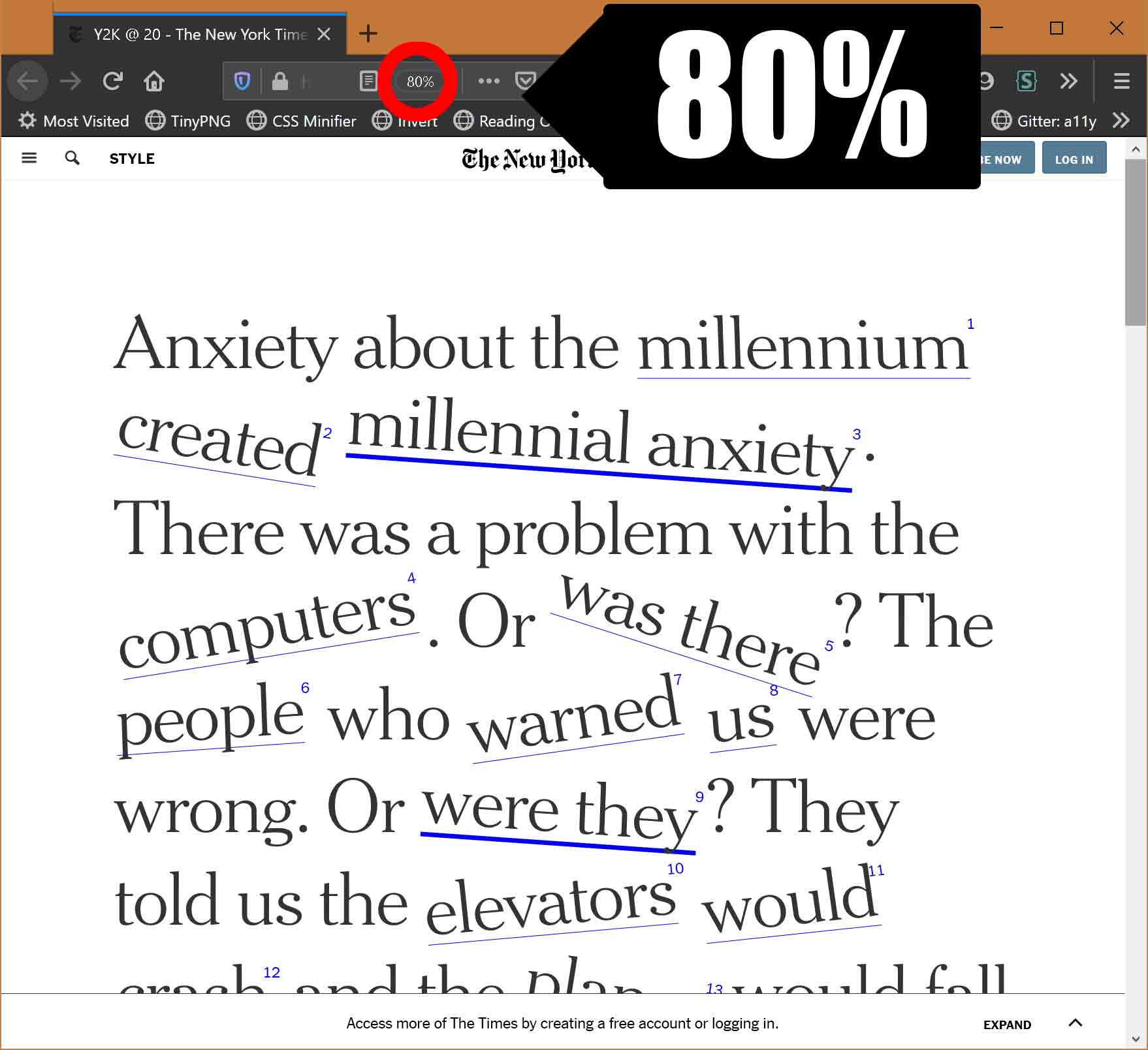
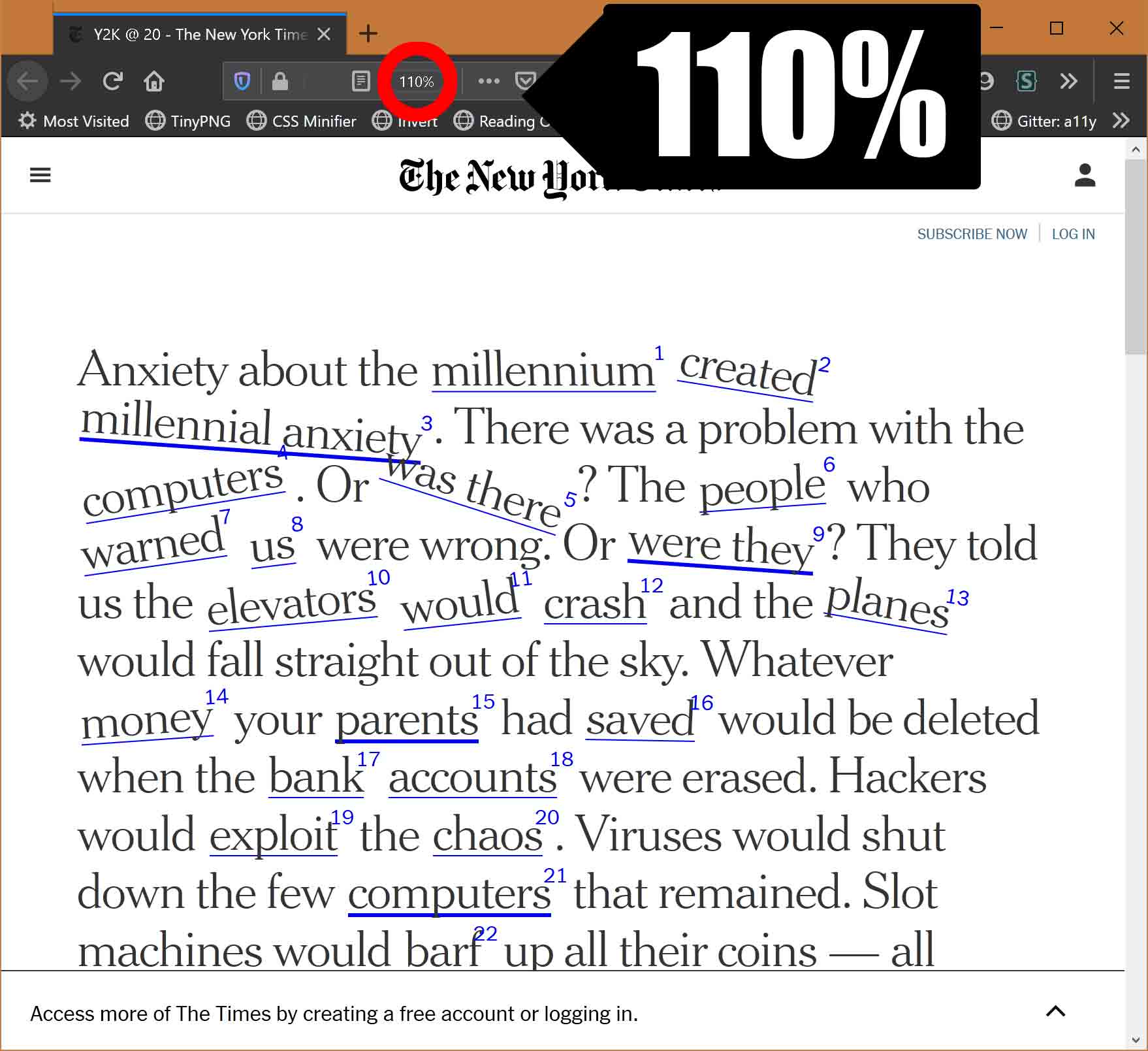
– When zooming in using browser zoom, two things are happening. Firstly, the viewport is decreasing in size. For example, my normal width is 1920px. Doing a 110% zoom brings it to 1745px. Secondly, the actual browser is zooming in (i.e. one css pixel takes up more space on the screen).
– If you zoom in enough, you may even start hitting your mobile breakpoints (e.g. collapsing some side menu) because your viewport width has decreased that far in size.
– Case 1: Font size doesn’t scale with vw. Browser zoom doesn’t affect font size at all so it still takes up the same number of pixels but the pixels themselves become larger, resulting in the text getting larger.
– Case 2: Font size does scale with vw. Browser zoom causes viewport size to decrease resulting in calculated font size to decrease. At the same time, the pixels themselves become larger, resulting in the text getting larger. The overall neutralizing effect is that browser zoom does not appear to work in making the font size larger.
– This effect is not reliant on clamp or setting a max/min font size. By opting into responsive text size that scales with viewport size, decreasing viewport size must necessarily cause the calculated font size to decrease, thus neutralizing the browser zoom in effect.
– In fact, by having a min clamp, you can mitigate this effect a bit. Let’s say I clamp my minimum font size to 16px. Once I zoom in sufficiently far, any further viewport size decreases will no longer affect my font size which is capped at 16px. After this point, the zoom will behave exactly the same as a nonresponsive text page where font size is set to 16px. The same logic applies for max clamp helping mitigate the neutralizing effects of zooming out.Hope that helps.
To elaborate just a little bit more, I think in most reasonable cases, the aforementioned neutralizing effect is actually minimal and unnoticeable.
In the most extreme case, you can have something like font-size: 3vw. On an 800px wide viewport, the computed font size is 24px. When zooming in to 200%, the viewport shrinks to 400px, the font size becomes 12px, the pixels becomes 2x as wide, and so the end result is the text stays perfectly unchanged throughout the entire zoom.
Actually, if you look at the Responsive vs. Static example codepen at the top of this article, this is exactly what it’s doing! Shrinking the viewport by half (from 800px -> 400px) results in the font size exactly shrinking by half (from 24 -> 12px). That’s why the 200% and 300% screenshots show no change. The CSS additionally does clamping (any width above 800px is capped at 24px) so the first screenshot which is at a width > 800px is captured at 24px font size and most of the zoom towards 200% has no decreasing font size so there is a noticeable zoom between the 100% and 200% screenshots, thanks to the clamp.
In the real world, I think very few sites would have it set up so their font sizes shrink at exactly the same rate as their viewport (or even close). For example, https://utopia.fyi/type/calculator, the default is 18px at 320px wide viewport and 20px at 1240px (and every size between is linearly interpolated). The font size decreases by a mere 10% for a 387.5% zoom which would slow down the rate of zoom imperceptibly until a clamp point is hit at which point the rate of zoom jumps back up to normal (also imperceptibly). The site itself uses the font size linear interpolation system it’s describing and I don’t perceive the zoom to be any slower or jarring compared to other sites.
If I’m using static breakpoints with set font sizes compared to linear interpolation, the same math applies. Say normal font size is 24px but at 400px wide viewport and below, it jumps to 12px. If starting at 800px and then slowly zooming to 200%, you would see the zoom take effect at normal speed but when reaching exactly 200%, the text will suddenly shrink back to the size at which you started zooming. Most sites use static breakpoints but never run into issues like this because at its core, the craziness is just a function of jumping an entire 12px in font size after only 400px of viewport width decrease.
Leave a Comment or Response Cancel response