 |
VOOZH | about |
|
VOOZH | about |
There are a lot of options out there for how to handle styling in an application. We’ve gone from the traditional “HTML, CSS and JS” textbook format to having more flexible and performant options . Recently, there has been a growing trend of writing CSS in JS and this can be seen by the number of CSS-in-JS libraries that have sprung up. Utility classes have also been around for some time and the positive inclination around them isn’t going away anytime soon. In this article, we’ll take a look at atomic CSS-in-JS libraries and utility-first CSS frameworks, how they compare to each other, their shortcomings, and some awesome projects using both concepts.
👁 ImageThe Replay is a weekly newsletter for dev and engineering leaders.
Delivered once a week, it's your curated guide to the most important conversations around frontend dev, emerging AI tools, and the state of modern software.
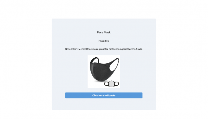
When working with CSS-in-JS libraries, all styles and dependencies are written alongside your application’s logic. This eliminates the need to append or import stylesheets. A very good library that works this way is styled-components. Let’s say you have a React app – a donation page – that needs to be styled:
import React, { useState } from "react";
import styled from "styled-components";

const ProductState = {
 products: {
 item: "Face Mask",
 price: "10",
 description: "Medical face mask, great for protection against human fluids.",
 image: "https://res.cloudinary.com/fullstackmafia/image/upload/v1589655457/face-mask_ara8yf.jpg"
 }
};

const App = () => {
 const [state] = useState(ProductState);
 return (
 <div>
 <h2>{state.products.item}</h2>
 <h4>Price: ${state.products.price}</h4>
 <p>
 Description: {state.products.description}
 </p>
 <img width={240} src={state.products.image} alt="Item View" />
 <button>Click Here to Donate</button>
 </div>
 );
};
export default App;
The following snippet of code dynamically styles the global HTML element div , then retains, and equates its properties to a newly created component ProductDiv:
 import styled from "styled-components";

 const ProductDiv = styled.div`
 display: grid;
 justify-content: center;
 text-align: center;
 margin: auto;
 border-radius: 5px;
 background-color: #66ccff;
 width: 50%;
 padding: 35px;
 `;
Creating components for styling this way is great because they can be exported to other parts of the app and be reused without having to create additional components. The styled keyword is appended to an HTML element and the styling itself is enclosed in template literals. The embedded syntax looks a lot like traditional CSS except now it is controlled by a component. Instances like this:
// style.css

.ProductHeader h2 {
 font-size: 25px;
 font-family: "Lucida Console", Monaco, monospace;
}
Become this:
const ProductHeader = styled.h2`
 font-size: 25px;
 font-family: "Lucida Console", Monaco, monospace;
`;
It’s then seamless to plug in the final results into your app’s component:
import React, { useState } from "react";
import styled from "styled-components";

const ProductState = {
 products: {
 item: "Face Mask",
 price: "10",
 description: "Medical face mask, great for protection against human fluids.",
 image: "https://res.cloudinary.com/fullstackmafia/image/upload/v1589655457/face-mask_ara8yf.jpg"
 }
};

const ProductDiv = styled.div`
 display: grid;
 justify-content: center;
 text-align: center;
 margin: auto;
 border-radius: 5px;
 background-color: #66ccff;
 width: 50%;
 padding: 35px;
`;

const ProductHeader = styled.h2`
 font-size: 25px;
 font-family: "Lucida Console", Monaco, monospace;
`;

const App = () => {
 const [state] = useState(ProductState);
 return (
 <ProductDiv>
 <ProductHeader>{state.products.item}</ProductHeader>
 // rest of the app is styled accordingly...
 </ProductDiv>
 );
};
export default App;
There are a number of advantages to styling an app this way:
Writing CSS with utility classes stems from the need to just focus on applying all your styles within HTML (or JSX for some frontend frameworks). There are a couple of libraries that work with this philosophy – one of which is Tailwind CSS. Every bit of styling is just expressed alongside the element it’s meant for. This brings up markup that’s pretty straightforward like this:
<p className="flex justify-center my-4 font-sans text-center">
 Description: This is a Product
</p>
Styling the previous example of a React app using a utility class approach would look something like this:
import React, { useState } from "react";
import "./tailwind.generated.css";

const ProductState = {
 products: {
 item: "Face Mask",
 price: "10",
 description: "Medical face mask, great for protection against human fluids.",
 image: "https://res.cloudinary.com/fullstackmafia/image/upload/v1589655457/face-mask_ara8yf.jpg"
 }
};

const App = () => {
 const [state] = useState(ProductState);
 return (
 <div className="grid justify-center m-auto mt-32 p-16 w-1/2 bg-gray-200 rounded-md">
 <h2 className="flex justify-center my-4 font-sans text-center text-xl">
 {state.products.item}
 </h2>
 /* rest of the app is styled accordingly... */
 </div>
 );
};
export default App;
As the above code sample shows, the focus is heavily invested in markup and it’s important that each class is as strictly categorized as much as possible or else the foundational meaning of a utility class is lost. Unlike styled-components, where a component name has presence, utility classes like grid, m-auto, or text-center could easily be placed anywhere in your markup so it’s important to keep track of the rules being set and to ensure they all have single responsibilities.
One key advantage of utility classes is its beginner-friendly approach. Let’s say you had a button you wanted to add a hover property to – using utility classes would be pretty straightforward:
<button className="bg-red-400 hover:bg-grey-700 text-white font-bold rounded">
 Click Here to Donate
</button>
Although negligible to an extent, utility classes save an amount of space and file size. For every styled component created, there’s an extra variable declaration out there, one liner utility classes with straightforward commands like text-xl could be all you need instead of creating a new component for the font size of an updated header.
Although the argument exists that writing CSS-in-JS improves efficiency, it does have some downsides to it. For starters, it’s not very beginner-friendly. CSS-in-JS libraries tend to come up with definitions of logic for various concepts almost peculiar to each library. Take a look at this concept in styled-components that enables you to refer to a different component within one component:
import React from "react";
import styled from "styled-components";

 const Link = styled.a`
 display: grid;
 justify-content: center;
 padding: 5px 10px;
 background: #ffd9b3;
 color: #003300;
 `;
 const HotButton = styled.button`
 flex: none;
 transition: background 2s;
 width: 50px;
 height: 50px;
 ${Link}:hover & {
 background: #80bfff;
 }
 `;

 const App = () => {
 return (
 <Link>
 <HotButton>
 Click To Review
 </HotButton>
 </Link>
 );
 };

export default App;
Screen Recording 2020 05 24 at 19 14 50
Uploaded by Raphael Ugwu on 2020-05-24.
The Link component is styled by referring to it in a different component – HotButton. This sure seems like a great way to override a component’s styling but if used on a large scale, it could cause problems and could make styling unmaintainable.
Another key issue, and this may sound unlikely, is security. A library like styled-components lets you embed JavaScript in CSS, this implies that if there’s sensitive code, like user input in your CSS, your app would be prone to XSS attacks. Thus it’s important to keep stuff like user input away from your styles and for everyone else on your team – if it’s a collaborative project – to understand this as well. Given this security risk, it’s worth asking if styling a JS component is even worth it.
The silver lining with the major issues in utility classes is that they can be avoided if utility classes are used sparingly and not on a large scale. Utility classes bank on the appearance of an element remaining constant and in large scale projects, this is often not the case. You’ll know there’s an issue when you start having a lot of elements embedding one particular rule but they aren’t following that rule. Say elements that have float-left in their markup but are aligned to the center and right.
Another key issue is designing for responsiveness. To what extent can the space between elements be modified without making markup hard to understand? Also, when rules like space-x-40 and -space-x-40 are used often, they could be interchanged and things could become pretty unpleasant.
Furthermore, rule enforcement could become pretty inconsistent when using utility classes. In a bid to make a style work, collaborators could easily find themselves adding different utility classes to an element. This deviation, bit by bit, can easily lead up to a broad codebase with huge inconsistencies. Needless to say, this would make code maintenance very difficult if not possible.
Both CSS-in-JS and utility classes are great concepts when used properly. However, for both of them, it’s important to have team members or contributors who are very familiar with both concepts or any specific rules set for the project involved.
As web frontends get increasingly complex, resource-greedy features demand more and more from the browser. If you’re interested in monitoring and tracking client-side CPU usage, memory usage, and more for all of your users in production, try LogRocket.
👁 LogRocket Dashboard Free Trial BannerLogRocket lets you replay user sessions, eliminating guesswork around why bugs happen by showing exactly what users experienced. It captures console logs, errors, network requests, and pixel-perfect DOM recordings — compatible with all frameworks.
LogRocket's Galileo AI watches sessions for you, instantly identifying and explaining user struggles with automated monitoring of your entire product experience.
Modernize how you debug web and mobile apps — start monitoring for free.
Learn how next-browser gives AI agents runtime context for debugging Next.js apps, including React props, hydration, PPR, forms, and performance.
Build dynamic LLM routing in Next.js with OpenRouter, TanStack AI, task classification, model fallbacks, and cost-aware routing.
TSRX adds first-class control flow, conditional hooks, and scoped styles to React via a TypeScript compiler extension — no new framework required.
Learn how to build a full React Native auth system using Better Auth and Expo — with email/password login, Google OAuth, session persistence, and protected routes.
Hey there, want to help make our blog better?
Join LogRocket’s Content Advisory Board. You’ll help inform the type of content we create and get access to exclusive meetups, social accreditation, and swag.
Sign up now