 |
VOOZH | about |
|
VOOZH | about |
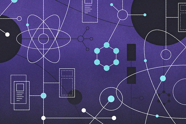
One of the most popular ways of organizing and maintaining components and modules used by design teams today is Atomic Design, a file structure methodology that breaks down all the elements of a page into simple buckets.
👁 Understanding How Atomic Design Is Used in React NativeA file structure is a way of arranging various files — i.e., components, classes, etc. — in a specific way in order to ensure development processes are as efficient as possible. In this article, we will be looking at Atomic Design: what it is and the role of each element that makes up the methodology as a whole.
The Replay is a weekly newsletter for dev and engineering leaders.
Delivered once a week, it's your curated guide to the most important conversations around frontend dev, emerging AI tools, and the state of modern software.
Atomic Design is a specific way of organizing the components of a project; it is directly inspired by Atomic concepts of chemistry, hence the name. Atomic Design takes inspiration from the concept of an atom being the smallest unit, followed by a molecule being the combination of atoms, and, finally, organisms being made of molecules.
To take an example, atoms specify the smallest components, like buttons and inputs. Molecules signify the combination of these atoms (e.g., forms). The entire page that consists of these molecules can be considered the organism, comprised of all elements.
In essence, Atomic Design is used to build user interfaces in a modular manner, with a primary focus on creating components.
Now that we understand how Atomic Design came about, how do frontend engineers apply this concept in their projects? Let’s take a look at how to implement Atomic Design principles to better organize components and pages in React Native projects.
To follow along, you should be familiar with the basics of React Native, including JSX, components (class and functional), and styling. This guide assumes you’ve already done the basic setup for your app.
You can simply copy and paste the code blocks from this guide if you wish, but I would suggest reading through the whole tutorial for a complete understanding. This guide assumes you’ve already done the basic setup for your app.
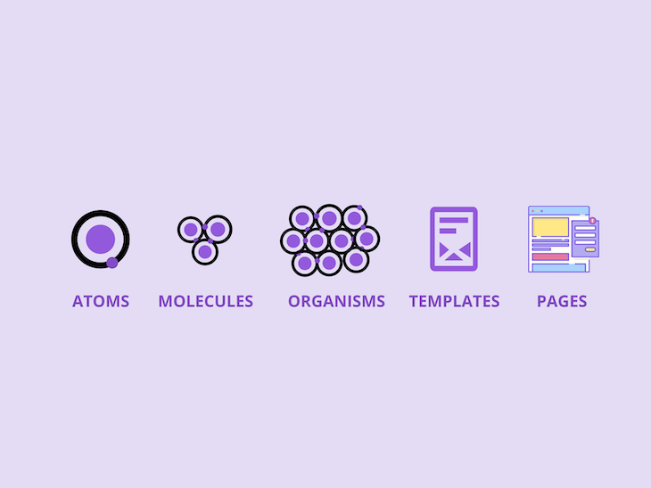
👁 Five Levels Of Atomic Design Methodology
As we discussed above, Atomic Design takes inspiration from chemistry’s concept of atoms and molecules. It consists of these five distinct levels:
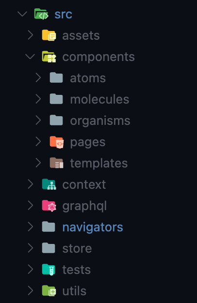
👁 React Native Atomic Design File Structure
This is what a typical project structure should look like, after organizing components according to Atomic Design principles.
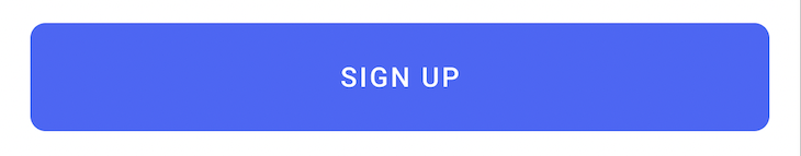
Atoms are the fundamental units of a project. They are the basic building blocks the whole design depends upon. These can be inputs and buttons, as well as color palettes and animations. They are the smallest possible units that can be used throughout the project in molecules, organisms, and templates.
They should be easily and globally accessible and built in a way that makes them usable anywhere throughout the project due to their having many states — for example, a button or input that may be disabled in certain cases.
The following code blocks contain the code for a button, a Text, and a Loader component. For custom fonts used in these code blocks, do check out the guide available here.
import React, {ReactElement} from 'react';
import {View, StyleSheet, ViewProps, StyleProp, TextStyle} from 'react-native';
import {Text as UKText, TextProps} from '@ui-kitten/components';
type Props = {
 // style?: StyleProp<TextStyle>;
 [key: string]: any;
};
const Text = ({style, ...props}: Props) => {
 return (
 <UKText style={StyleSheet.flatten([styles.txt, style])} {...props}>
 {props.children}
 </UKText>
 );
};
const styles = StyleSheet.create({
 txt: {
 fontFamily: 'Inter',
 },
});
export default Text;
import MaskedView from '@react-native-masked-view/masked-view';
import React from 'react';
import {ActivityIndicator, ActivityIndicatorProps} from 'react-native';
import LinearGradient from 'react-native-linear-gradient';
type Props = {
 colors: string[];
 start?: {x: number; y: number};
 end?: {x: number; y: number};
} & ActivityIndicatorProps;
const LoaderGrad = ({colors, start, end, ...props}: Props) => {
 return (
 <MaskedView maskElement={<ActivityIndicator {...props} />}>
 <LinearGradient colors={colors} start={start} end={end}>
 <ActivityIndicator {...props} style={[props.style, {opacity: 0}]} />
 </LinearGradient>
 </MaskedView>
 );
};
export default LoaderGrad;
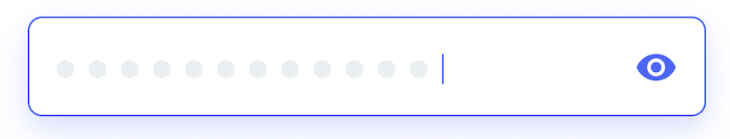
As we know, when two or more atoms bind together, they form a molecule that offers new combined qualities. Similarly, molecules in Atomic Designs are a combination of various atomic components to build a whole new component.
In the example above, We can see an input group built using a view, input, and a button. Combining these three atomic components allows us to build this molecule, i.e., the grouped component for the password input section, which enables a user to press on the eye to show or hide their password in the input.
Here we have the example of a custom button with a loading indicator — grouped to form a molecule in our design:
import {Layout} from '@ui-kitten/components';
import AnimatedLottieView from 'lottie-react-native';
import React, {ReactNode} from 'react';
import {
 StyleSheet,
 View,
 Pressable,
 PressableProps,
 ViewStyle,
 TextStyle,
} from 'react-native';
import LinearGradient from 'react-native-linear-gradient';
import {GLOBAL_STYLE} from '../../../assets/theme';
import {HAPTICS} from '../../../utils';
import {LoaderGrad} from '../Activity';
import {Text, TextGrad} from '../Typography';
type Props = {
 children?: React.ReactNode;
 child?: (pressed: any) => React.ReactNode;
 style?: ViewStyle;
 containerStyle?: ViewStyle;
 boxStyle?: ViewStyle;
 title?: string;
 icon?: any;
 name?: string;
 size?: number;
 lottie?: any;
 noShadow?: boolean;
 noBg?: boolean;
 loading?: boolean;
 color?: string;
} & PressableProps;
const PrimeBtn = ({
 style,
 containerStyle,
 boxStyle,
 title,
 icon,
 name,
 size,
 noShadow,
 lottie,
 noBg,
 loading,
 color,
 onPress,
 disabled,
 ...props
}: Props) => {
 const Icon = icon;
 const onPressIn = () => {
 HAPTICS.heavy();
 };
 const onPressOut = () => {
 HAPTICS.heavy();
 };
 return (
 <Pressable
 onPressIn={onPressIn}
 onPressOut={onPressOut}
 style={StyleSheet.flatten([boxStyle])}
 onPress={onPress}
 disabled={disabled || loading}>
 {({pressed}) => (
 <LinearGradient
 colors={GLOBAL_STYLE.gradients.prime_btn}
 style={StyleSheet.flatten([
 styles.container,
 {opacity: disabled ? 0.5 : 1},
 ])}
 start={{
 x: 0,
 y: 0,
 }}
 end={{
 x: 1,
 y: 0.5,
 }}>
 <Layout
 style={{
 ...StyleSheet.flatten([
 styles.btn,
 style,
 {
 opacity: pressed ? 0.95 : 1,
 },
 noBg && {
 backgroundColor: 'transparent',
 },
 ]),
 }}>
 {loading ? (
 <LoaderGrad
 colors={
 noBg ? ['#fff', '#fff'] : GLOBAL_STYLE.gradients.prime_btn
 }
 start={{
 x: 0,
 y: 0,
 }}
 end={{
 x: 1,
 y: 1,
 }}
 />
 ) : (
 <>
 {Icon && (
 <Icon
 name={name}
 size={size || 24}
 color={
 pressed
 ? GLOBAL_STYLE.colors.primary
 : GLOBAL_STYLE.colors.primary_dark
 }
 />
 )}
 <TextGrad
 colors={
 noBg
 ? color
 ? [color, color]
 : ['#fff', '#fff']
 : GLOBAL_STYLE.gradients.prime_btn
 }
 start={{
 x: 0,
 y: 0,
 }}
 end={{
 x: 1,
 y: 1,
 }}
 style={{
 ...StyleSheet.flatten([
 styles.txt,
 {
 opacity: pressed ? 0.9 : 1,
 },
 color && {color: color},
 ]),
 }}>
 {title || ''}
 </TextGrad>
 </>
 )}
 </Layout>
 </LinearGradient>
 )}
 </Pressable>
 );
};
const styles = StyleSheet.create({
 container: {
 // width: 50,
 height: 55,
 padding: 1,
 borderRadius: 15,
 },
 btn: {
 flex: 1,
 alignItems: 'center',
 justifyContent: 'center',
 borderRadius: 14,
 },
 txt: {
 fontWeight: 'bold',
 },
});
export default PrimeBtn;
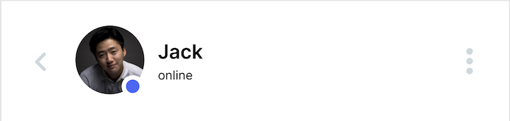
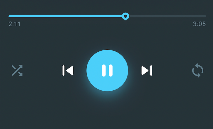
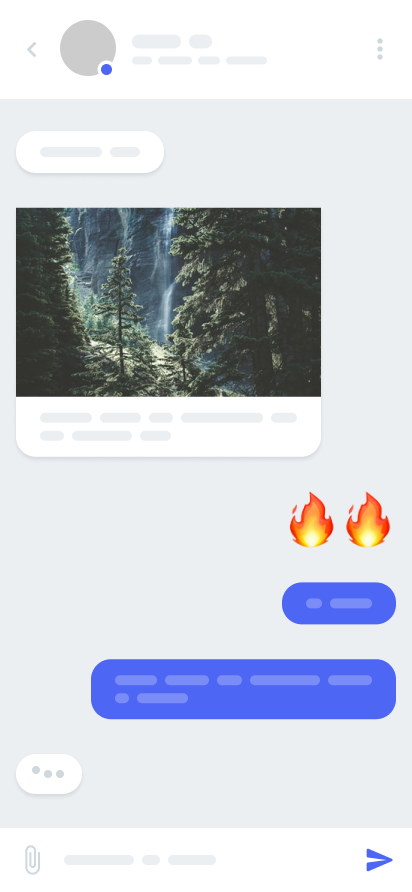
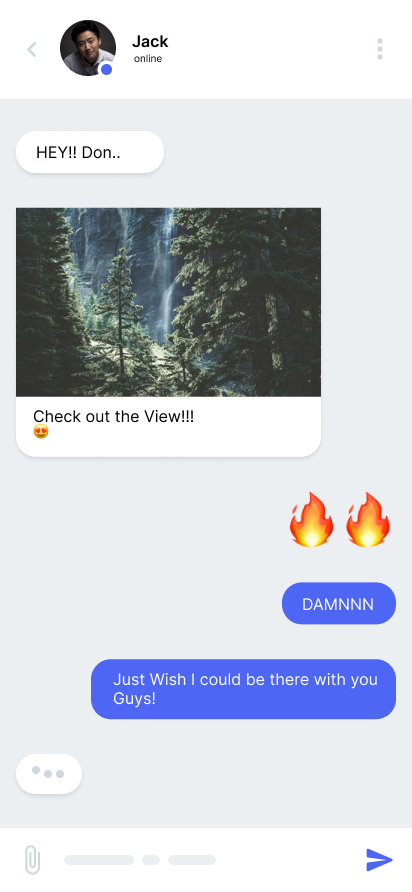
Again, as we go up the chain and group together multiple molecules, we get an organism. Organisms still can’t be considered a whole structure of the project as they are supposed to be independent and reusable on various parts of any given project.
At this stage, we start to see a somewhat formed structure of the UI. In the above examples, various molecules are combined together for the header and music controls. Headers are reusable on various pages of a project because they hold the same structure on most pages.
Here we have the example of a basic header that contains button and text components:
import React from 'react';
import {View, StyleSheet} from 'react-native';
import {Layout} from '@ui-kitten/components';
import {RoundBtn} from '../../atoms/Buttons';
import {Text} from '../../atoms/Typography';
type Props = {
 title?: string;
};
const BasicHeader = ({title}: Props) => {
 return (
 <View style={styles.container}>
 <RoundBtn noShadow />
 <View style={styles.mid}>
 <Text style={styles.title}>{title}</Text>
 </View>
 <RoundBtn style={{opacity: 0}} active={true} />
 </View>
 );
};
const styles = StyleSheet.create({
 container: {
 flexDirection: 'row',
 alignSelf: 'stretch',
 paddingHorizontal: 10,
 },
 mid: {
 flex: 1,
 alignItems: 'center',
 justifyContent: 'center',
 },
 title: {
 fontSize: 21,
 fontWeight: '600',
 },
});
export default BasicHeader;
These are multiple organisms grouped together to form the skeleton of a page or layout. This is where all the aspects collectively come together in terms of design; it’s like a blueprint for the pages. These do not hold any data to show on their own other than the defaults required by the UI designs.
Pages are instances of templates. They are the complete form of the design that comes into full shape in templates. The data is combined with the templates, and the desired result is what we get in the form of a page.
Pages also demonstrate the feasibility of the templates. For example, how the designs will react when more data is added to them — as one example, chats can have multiple forms of data as messages. There can be a lot of messages containing either text, images, or videos. We get to see all these things rendered on the screen with pages.
Pages are the end result of all the things that we’ve built with the Atomic Design. Although of course pages do not come from the concept of atoms in chemistry, they represent the end product of using Atomic Design as a basis for building a page.
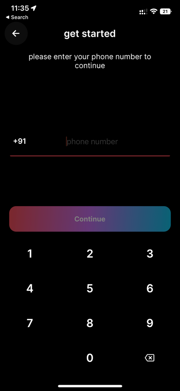
Here, at last, we have the registration page, built using the atoms and molecules we created.
import React, {useState} from 'react';
import {View, StyleSheet, KeyboardAvoidingView} from 'react-native';
import {Input, Layout} from '@ui-kitten/components';
import {PrimeBtn, SecBtn} from '../../molecules/Buttons';
import {useSafeAreaInsets} from 'react-native-safe-area-context';
import {Keypad, PhoneInput} from '../../molecules/Inputs';
import {BasicHeader} from '../../molecules/Headers';
import {Text} from '../../atoms/Typography';
import {GLOBAL_STYLE} from '../../../assets/theme';
import {useNavigation} from '@react-navigation/native';
const Register = () => {
 const insets = useSafeAreaInsets();
 const [phone, setPhone] = useState('');
 const nav = useNavigation<any>();
 const _signUp = () => {
 nav.navigate('OTP_SCREEN');
 };
 return (
 <KeyboardAvoidingView style={{flex: 1}}>
 <Layout
 style={StyleSheet.flatten([
 styles.container,
 {paddingTop: insets.top, paddingBottom: insets.bottom},
 ])}>
 <BasicHeader title={'get started'} />
 <View style={styles.topCon}>
 <View style={styles.infoCon}>
 <Text style={styles.infoTxt}>
 please enter your phone number to continue
 </Text>
 </View>
 <View style={styles.inputCon}>
 <PhoneInput
 size={'large'}
 placeholder={'phone number'}
 value={phone}
 />
 </View>
 </View>
 <View style={styles.bottomCon}>
 <PrimeBtn
 title={'Continue'}
 boxStyle={{marginBottom: 10, marginHorizontal: 20}}
 noBg={true}
 // color={GLOBAL_STYLE.colors.dark}
 disabled={phone?.length != 10}
 // loading
 onPress={_signUp}
 />
 <Keypad onChangeValue={setPhone} />
 </View>
 </Layout>
 </KeyboardAvoidingView>
 );
};
const styles = StyleSheet.create({
 container: {
 flex: 1,
 },
 topCon: {
 flex: 1,
 },
 infoCon: {
 alignSelf: 'stretch',
 paddingHorizontal: 35,
 paddingVertical: 15,
 },
 infoTxt: {
 textAlign: 'center',
 fontSize: 16,
 },
 inputCon: {
 paddingHorizontal: 20,
 flex: 1,
 justifyContent: 'center',
 },
 input: {},
 bottomCon: {
 // paddingHorizontal: 20,
 },
});
export default Register;
Once we’ve completed assembling all of our elements using Atomic Design principles, here’s what our product will look like:
There are a lot of different methods you can use to structure your React Native projects. Even on React’s official website, it’s noted that there is no standard for how files and folders should be managed. If you’re looking for a simple but effective approach to organizing your project files when you make an app, Atomic Design might be the one for you.
Atomic Design is my primary method for organizing my projects, and I hope this approach helps you the way it has helped me and many other developers.
LogRocket's Galileo AI watches sessions for you and and surfaces the technical and usability issues holding back your React Native apps.
LogRocket also helps you increase conversion rates and product usage by showing you exactly how users are interacting with your app. LogRocket's product analytics features surface the reasons why users don't complete a particular flow or don't adopt a new feature.
Start proactively monitoring your React Native apps — try LogRocket for free.
Learn how next-browser gives AI agents runtime context for debugging Next.js apps, including React props, hydration, PPR, forms, and performance.
Build dynamic LLM routing in Next.js with OpenRouter, TanStack AI, task classification, model fallbacks, and cost-aware routing.
TSRX adds first-class control flow, conditional hooks, and scoped styles to React via a TypeScript compiler extension — no new framework required.
Learn how to build a full React Native auth system using Better Auth and Expo — with email/password login, Google OAuth, session persistence, and protected routes.
Hey there, want to help make our blog better?
Join LogRocket’s Content Advisory Board. You’ll help inform the type of content we create and get access to exclusive meetups, social accreditation, and swag.
Sign up now