 |
VOOZH | about |
|
VOOZH | about |
When designing a page with content overflowing the viewport, an indirect way to instruct users to keep scrolling is to display new content partially. One such approach is the masonry layout, which places elements inline and allows them to move up to fill empty spaces.
👁 Creating Css Masonry Style LayoutsWithin this tutorial, we will explore the experimental masonry layout added to the CSS Grid Level 3 Specification. We will also consider other similar ways to replicate the masonry layout with CSS.
Jump ahead:
Before you begin building, let’s take some time out to understand how the concept of masonry-style layouts came about.
The Replay is a weekly newsletter for dev and engineering leaders.
Delivered once a week, it's your curated guide to the most important conversations around frontend dev, emerging AI tools, and the state of modern software.
As its name suggests, the masonry layout has to do with the masonry craft in which workers called masons laid bricks to build concrete walls.
In the practice of their craft, masons often stacked bricks using the stretcher bond pattern, meaning the bricks were staggered by half over each other. Besides its stability and aesthetic appeal, the stretcher bond pattern also reduced material waste, as there was no need to cut the bricks in half at every joint.
When it comes to front-end development, the masonry layout has proven to be an effective way to display multiple items in a grid by partially revealing content. This layout has become widely adopted and popularized by platforms such as Pinterest.
With no native CSS grid support for masonry layouts, developers relied on using libraries such as Masonry.js or Brick.js to replicate this visual design. These libraries can accomplish masonry-style layouts without CSS by using JavaScript to manipulate the DOM, then placing each element within the appropriate spaces.
However, these libraries were reported to have a drastic impact on performance. They had to make frequent expensive computations to find the available areas within the layout, resulting in a laggy scroll experience.
Fast forward to more recent years — now that CSS specifications have improved and become more robust, can developers achieve masonry layouts using only CSS? Let’s explore how to create a masonry layout in CSS by building the feed page of a sample blog website.
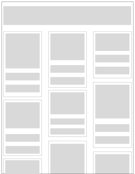
Let’s create a page to display the blog posts. Each post element will contain a cover image, title, and description as shown in the prototype below:
To get started, create a directory to store the HTML and CSS files for the website about to be built.
Within your new directory, create an index.html file and add the contents of the code block below into the file. To make it easier to use, the images within the code have been remotely stored within a bucket on Cloudinary:
<!DOCTYPE html>
<html lang="en">
 <head>
 <meta charset="UTF-8" />
 <meta http-equiv="X-UA-Compatible" content="IE=edge" />
 <meta name="viewport" content="width=device-width, initial-scale=1.0" />
 <title>CSS Masonry Playground</title>

 <link rel="stylesheet" href="/index.css" />
 </head>
 <body>
 <div class="container">
 <div>
 <h1>CSS Masonry Playground</h1>

 <p>
 Lorem ipsum dolor sit amet consectetur adipisicing elit. A recusandae
 sunt perspiciatis magnam neque, quae aliquid cupiditate dignissimos
 omnis adipisci praesentium et maiores vero corporis atque ipsum harum
 quisquam iusto.
 </p>
 </div>

 <div class="gallery-container">
 <figure>
 <img
 src="https://res.cloudinary.com/dkfptto8m/image/upload/v1674371886/logrocket-css-masonry/10.jpg"
 alt="blog post one"
 />
 <h2>One Blog Title Here</h2>
 <figcaption>
 Lorem ipsum dolor sit amet consectetur, adipisicing elit. Soluta eos
 expedita quis perspiciatis dicta qui magni?
 </figcaption>
 </figure>

 <figure>
 <img
 src="https://res.cloudinary.com/dkfptto8m/image/upload/v1674344289/logrocket-css-masonry/8.jpg"
 alt="blog post two"
 />
 <h2>Two Blog Title Here</h2>
 <figcaption>
 Lorem ipsum dolor sit amet consectetur, adipisicing elit. Soluta eos
 expedita quis perspiciatis dicta qui magni?
 </figcaption>
 </figure>

 <figure>
 <img
 src="https://res.cloudinary.com/dkfptto8m/image/upload/v1674373487/logrocket-css-masonry/window.jpg"
 alt="blog post three"
 />
 <h2>Three Blog Title Here</h2>
 <p>
 Lorem ipsum dolor sit amet consectetur, adipisicing elit. Soluta eos
 expedita quis perspiciatis dicta qui magni?
 </p>
 </figure>

 <figure>
 <img
 src="https://res.cloudinary.com/dkfptto8m/image/upload/v1674344282/logrocket-css-masonry/4.jpg"
 alt="blog post four"
 />
 <h2>Four Blog Title Here</h2>
 <figcaption>
 Lorem ipsum dolor sit amet consectetur, adipisicing elit. Soluta eos
 expedita quis perspiciatis dicta qui magni?
 </figcaption>
 </figure>

 <figure>
 <img
 src="https://res.cloudinary.com/dkfptto8m/image/upload/v1674344280/logrocket-css-masonry/7.jpg"
 alt="blog post five"
 />
 <h2>Five Blog Title Here</h2>
 <figcaption>
 Lorem ipsum dolor sit amet consectetur, adipisicing elit. Soluta eos
 expedita quis perspiciatis dicta qui magni?
 </figcaption>
 </figure>

 <figure>
 <img
 src="https://res.cloudinary.com/dkfptto8m/image/upload/v1674344279/logrocket-css-masonry/6.jpg"
 alt="blog post six"
 />
 <h2>Six Blog Title Here</h2>
 <figcaption>
 Lorem ipsum dolor sit amet consectetur, adipisicing elit. Soluta eos
 expedita quis perspiciatis dicta qui magni?
 </figcaption>
 </figure>

 <figure>
 <img
 src="https://res.cloudinary.com/dkfptto8m/image/upload/v1674344278/logrocket-css-masonry/1.jpg"
 alt="blog post seven"
 />
 <h2>Seven Blog Title Here</h2>
 <figcaption>
 Lorem ipsum dolor sit amet consectetur, adipisicing elit. Soluta eos
 expedita quis perspiciatis dicta qui magni?
 </figcaption>
 </figure>

 <figure>
 <img
 src="https://res.cloudinary.com/dkfptto8m/image/upload/v1674344277/logrocket-css-masonry/9.jpg"
 alt="blog post eight"
 />
 <h2>Eight Blog Title Here</h2>
 <figcaption>
 Lorem ipsum dolor sit amet consectetur, adipisicing elit. Soluta eos
 expedita quis perspiciatis dicta qui magni?
 </figcaption>
 </figure>

 <figure>
 <img
 src="https://res.cloudinary.com/dkfptto8m/image/upload/v1674344276/logrocket-css-masonry/3.jpg"
 alt="blog post nine"
 />
 <h2>Nine Blog Title Here</h2>
 <figcaption>
 Lorem ipsum dolor sit amet consectetur, adipisicing elit. Soluta eos
 expedita quis perspiciatis dicta qui magni?
 </figcaption>
 </figure>
 </div>
 </div>
 </body>
</html>
At this point, the website has been built; however, it has no styles because the /index.css file has not been created.
Let’s proceed to add some styling in the next section.
Within the project directory, create a file and name it index.css to store the CSS stylesheets.
Add the following CSS code into the index.css file to only style the div and img elements within the page:
.container {
 max-width: 1224px;
 margin: 0 auto;
}

img {
 width: 500px;
 object-fit: contain;
 border-radius: 15px;
}

figure {
 margin: 0;
}
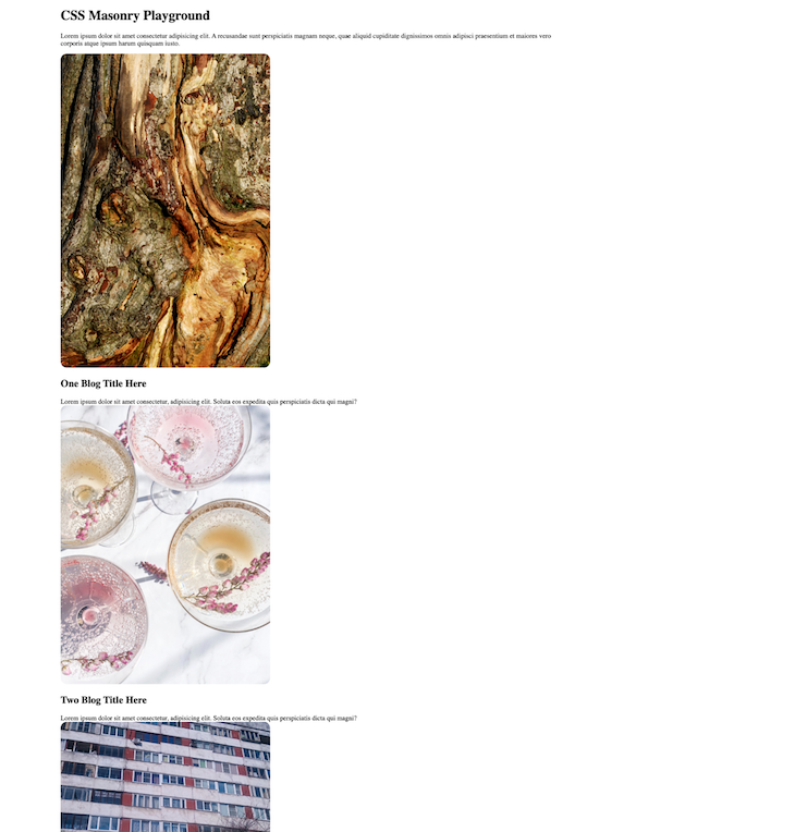
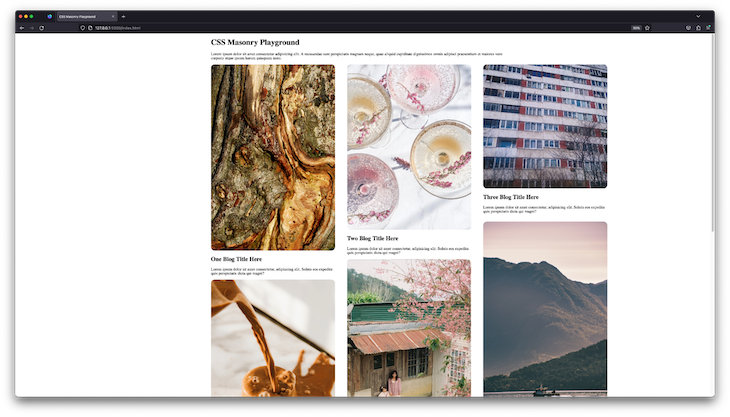
As shown in the image below, the parent div containing the list of images was not styled to achieve the masonry layout:
👁 Project Images Displayed In List Without Css Masonry Styling
Over the next subsections, you will explore various ways to create a masonry look in various CSS layout modules. Let’s start with the experimental CSS grid masonry support.
Open the index.css file and add the .gallery-container selector to the existing selectors you added during the previous step:
.gallery-container {
 display: grid;
 grid-template-columns: repeat(3, 1fr);
 grid-gap: 1rem 3rem;
 grid-template-rows: masonry;
}
The magic word within the .gallery-container selector above is the masonry value provided to the grid-template-rows property.
As a feature still in draft status at this time, the grid masonry layout will only work in a browser with support for beta features. Hence, the grid-template-rows property will not be applied when you open the blog website via stable browsers such as Chrome, Mozilla, or Safari.
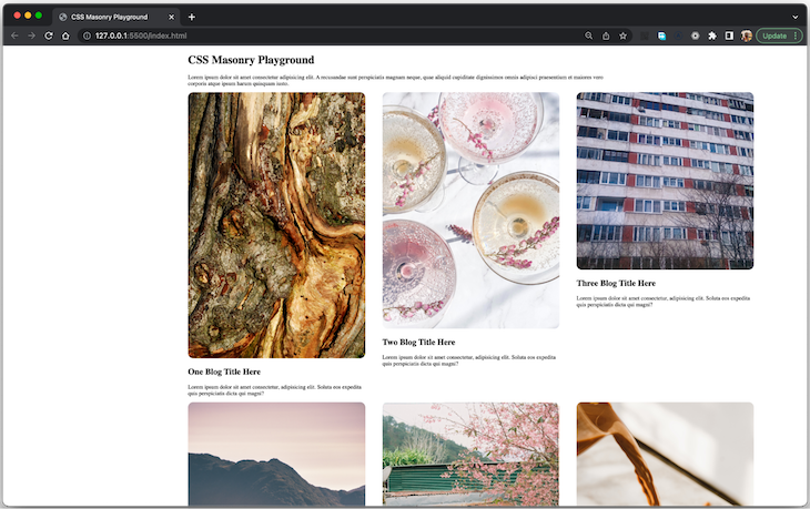
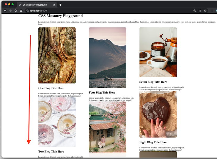
The image below shows the layout of the blogs being viewed via Chrome browser. Notice that the images are arranged in a grid, but not a masonry-style grid. The columns have a strict axis, causing a blank space below blog posts with a smaller image:
To see the masonry layout, download and open the website using the Firefox Nightly build, allowing you to experience yet-to-be-released next-generation features of the web:
👁 Project Images In Masonry Layout Using Experimental Css Grid Feature Displayed In Firefox Nightly
Note that the Google Chrome browser and the Mozilla Firefox browser also allow you to test experimental features by setting the flags for these experimental features.
At this point, you have learned how to create a masonry layout using the experimental CSS grid-template-rows property. Considering that this property is yet to be released with full browser support, you cannot use it while building for the public.
Let’s consider another solution on how to create a masonry layout using the multi-column layout.
This approach will leverage the CSS CSS multi-column layout with a defined column-count to have the browser figure out how to arrange elements within the columns without a strict height, thus creating a masonry layout.
Replace the rules within the .gallery-container and figure class selectors within the index.css file with the code below:
.gallery-container {
 column-count: 3;
 column-gap: 20px 20px;
 width: 1200px;
}

figure {
 margin: 0;
 display: inline-block;
 margin-bottom: 0px;
 width: 100%;
}
The new CSS rules above will style the blog posts into a three column layout without a defined vertical axis. This will cause the elements to fill up the available vertical space, making it appear visually similar to a masonry layout:
As pointed out in the image above, the ordering and sequence of the blog posts are vertical — from top to bottom — rather than being shown horizontally from left to right. This causes a disconnect between the visual order as seen by users and the DOM order.
Before you adopt this approach of creating a masonry-style layout using CSS, it is important that you consider the effect the lack of intuitive ordering will have on users, especially those who depend on web accessibility features.
Without text or some visual element to explain the ordering of elements, users will expect that the elements are ordered from left to right. Those who rely on their keyboards to navigate the list will find this very confusing, as each press of the tab key will move them through the content from top to bottom, rather than right to left as visually expected.
Huge congratulations to you on completing this tutorial!
At the start of the tutorial, we set out to learn more about the masonry layout and how we could achieve it using only CSS. To achieve our goal, we dug deeper into the origin of the masonry layout and built the post feed page of a vanilla HTML website using two different approaches with CSS.
As you anticipate the general release of the masonry CSS grid layout, you can check if a user’s browser supports it through the CSS.supports() method. By doing this, you can replace your masonry hacks with the simplified masonry layout implementation once it’s supported.
If you enjoyed learning about the experimental masonry property for the grid layout, check out some articles about other new CSS features, such as LCH and LAB support.
As web frontends get increasingly complex, resource-greedy features demand more and more from the browser. If you’re interested in monitoring and tracking client-side CPU usage, memory usage, and more for all of your users in production, try LogRocket.
👁 LogRocket Dashboard Free Trial BannerLogRocket lets you replay user sessions, eliminating guesswork around why bugs happen by showing exactly what users experienced. It captures console logs, errors, network requests, and pixel-perfect DOM recordings — compatible with all frameworks.
LogRocket's Galileo AI watches sessions for you, instantly identifying and explaining user struggles with automated monitoring of your entire product experience.
Modernize how you debug web and mobile apps — start monitoring for free.
Learn how next-browser gives AI agents runtime context for debugging Next.js apps, including React props, hydration, PPR, forms, and performance.
Build dynamic LLM routing in Next.js with OpenRouter, TanStack AI, task classification, model fallbacks, and cost-aware routing.
TSRX adds first-class control flow, conditional hooks, and scoped styles to React via a TypeScript compiler extension — no new framework required.
Learn how to build a full React Native auth system using Better Auth and Expo — with email/password login, Google OAuth, session persistence, and protected routes.
Would you be interested in joining LogRocket's developer community?
Join LogRocket’s Content Advisory Board. You’ll help inform the type of content we create and get access to exclusive meetups, social accreditation, and swag.
Sign up now