 |
VOOZH | about |
|
VOOZH | about |
Editor’s note: This article was last updated by Ibadehin Mojeed on 9 December 2024 to include improved accessibility features, seamless keyboard navigation, and focus management for an improved user experience. It also now introduces dynamic styling for the select widget, an option to reset the selected value, and functionality to close the dropdown when clicking outside.
👁 Creating A Custom Dropdown With CSSIn this tutorial, we’ll explore how to customize the native <select> element using pure CSS to improve its appearance while maintaining its functionality.
We’ll also discuss the key differences between select dropdowns, dropdown menus, and CSS selectors to clarify their unique roles in web development. Finally, we’ll build a fully custom and accessible <select> dropdown from scratch, leveraging JavaScript to enhance its functionality and interactivity.
The Replay is a weekly newsletter for dev and engineering leaders.
Delivered once a week, it's your curated guide to the most important conversations around frontend dev, emerging AI tools, and the state of modern software.
While both select dropdowns and dropdown menus present a list of options for users, they serve different purposes. A select dropdown (typically created with the native <select> element) is commonly used in forms to collect user input or as a filtering mechanism. In contrast, dropdown menus are primarily used for navigation or quick actions.
CSS selectors, on the other hand, serve an entirely different purpose. They are used to target elements in the DOM for styling purposes. CSS selectors range from simple types — like ID and class selectors — to more complex types like nesting selectors and combinator selectors.
Before we dive into the implementation, the GIFs below will help visualize the select dropdown — one implemented with CSS only and the other with a custom solution using CSS and JavaScript.
Here is the demo that only uses CSS:
👁 Dropdown Select Implementation On Windows
Here is the demo that uses CSS and JavaScript:
👁 Custom Dropdown Select Implementation For Consistent Behavior Across Browsers
<select> dropdown with CSSBefore writing code, let’s examine the inner mechanism of the native <select> element. This way, we can understand why styling it is often challenging.
<select> element worksUsing the following HTML markup, we can create a dropdown list with seven selectable options:
<select>
 <option>Open this select menu</option>
 <option>GitHub</option>
 <option>Instagram</option>
 <option>Facebook</option>
 <option>LinkedIn</option>
 <option>Twitter</option>
 <option>Reddit</option>
</select>
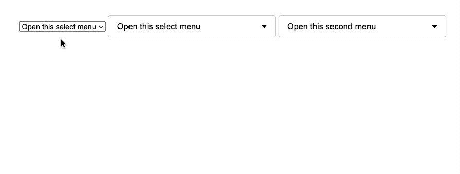
We’ll get a widget that looks like one of the following, with slight differences depending on the user’s browser:
👁 Three Simple Select Menus Styled Slightly Differently Based On Browser
If you’re using Chrome and inspect the widget through the browser’s developer tools, you’ll see that it’s built as a web component within a shadow DOM.
To view the shadow DOM, enable the Show user agent shadow DOM option in your Chrome browser’s settings:
In our guide to creating custom form elements like range sliders, we discussed how web browsers manage and isolate UI controls, often using the Shadow DOM.
The Shadow DOM helps prevent style conflicts by encapsulating both the structure and styles of a component. However, this also limits what can be styled from outside the Shadow DOM. For the <select> element, Chrome and other Chromium-based browsers use the Shadow DOM for the dropdown (list of options), making it hard to fully style with CSS.
While we can style properties like color or font on the <select> element itself, the dropdown’s appearance is mainly controlled by the browser, offering limited styling options. Notably, other browsers may not use the Shadow DOM for the dropdown but still offer limited customization options:
<select> dropdown with only CSSCreate a new select dropdown by wrapping the previous select markup with a div element as follows:
<div class="custom-select">
 <select>
 <option>Open this select menu</option>
 <option>GitHub</option>
 <option>Instagram</option>
 <option>Facebook</option>
 <option>LinkedIn</option>
 <option>Twitter</option>
 <option>Reddit</option>
 </select>
</div>
We can add the following CSS to provide some basic styling:
.custom-select {
 min-width: 350px;
}

.custom-select select {
 appearance: none;
 width: 100%;
 font-size: 1.15rem;
 padding: 0.675em 6em 0.675em 1em;
 background-color: #fff;
 border: 1px solid #caced1;
 border-radius: 0.25rem;
 color: #000;
 cursor: pointer;
}
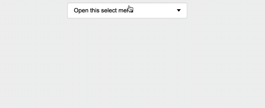
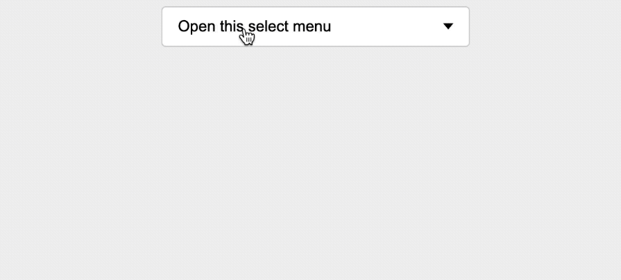
One important piece of code here is the appearance: none declaration. It instructs the browser to remove the default appearance styles of the native dropdown. This is a crucial step we need to take before we apply our custom styles.
Looking at the result below, you can see that setting the appearance property to none also removes the native dropdown arrow:
👁 Select Menu With No Dropdown Arrow Displayed As Widget Labeled Open This Select Menu
The appearance of the dropdown options is determined by the browser and the operating system.
<select> dropdownBy utilizing CSS pseudo-elements, we can create a custom arrow without adding an HTML element. To achieve this, we’ll apply a position: relative property to the container element:
.custom-select {
 /* ... */
 position: relative;
}
Then, we’ll position our CSS pseudo-elements — such as ::before and ::after — inside the container with absolute positioning:
.custom-select::before,
.custom-select::after {
 --size: 0.3rem;
 position: absolute;
 content: "";
 right: 1rem;
 pointer-events: none;
}

.custom-select::before {
 border-left: var(--size) solid transparent;
 border-right: var(--size) solid transparent;
 border-bottom: var(--size) solid black;
 top: 40%;
}

.custom-select::after {
 border-left: var(--size) solid transparent;
 border-right: var(--size) solid transparent;
 border-top: var(--size) solid black;
 top: 55%;
}
In the code, we employed the “border trick” to create both the up and down arrow indicators. By utilizing CSS borders in this way, we have designed arrow shapes that suit the desired appearance.
Additionally, we have disallowed pointer events on the arrow element to enforce proper functionality. This way, when users click on the arrow, the selected element receives the click event, not the arrow itself.
Below is the behavior without the CSS pointer-events: none; declaration:
Disallowing pointer events on the arrow element ensures that the dropdown opens as expected when interacting with the arrow indicator, providing a seamless and user-friendly experience:
See the Pen
Custom-select-dropdown-CSS by Shalitha Suranga (@shalithasuranga)
on CodePen.
There are a few things you should consider when customizing the <select> dropdown using this method.
For consistent design across browsers, we adopt a strategic approach by styling the native <select> dropdown to closely resemble the browser’s default appearance. This ensures the dropdown maintains a familiar and uniform look, giving users a consistent experience across web browsers.
Additionally, with the native <select> element, we have control over the initial appearance of the dropdown — that is, how the select dropdown looks before it is opened. However, once the <select> element is opened, the list of options will take the browser’s default styling.
If you want the dropdown to appear black initially, with white arrows and text, you can modify the CSS to the following:
.custom-select select {
 /* ... */
 background-color: #000;
 color: #fff;
}

.custom-select::before {
 /* ... */
 border-bottom: var(--size) solid #fff;
}

.custom-select::after {
 /* ... */
 border-top: var(--size) solid #fff;
}
The above code snippet applies a black background to the initial select box. It also affects the dropdown menu in Chrome on Windows. However, in Chrome on macOS, the dropdown menu may not adopt the black background, as it relies more on the operating system’s native styling for form elements.
In Firefox, the dropdown menu may display a gray background due to the browser’s default styling, even when styles are applied to the <select> element:
👁 A Native Dropdown That Is Styled With CSS To Use Custom Background And Foreground Colors
It’s also possible to style your custom dropdowns based on the system color scheme with CSS media queries and CSS variables, as shown in the following code snippet:
:root {
 /* light theme */
 --dropdown-background: #fff;
 --dropdown-text-color: #000;
 --dropdown-hover-color: #eee;
 --dropdown-border-color: #caced1;
 --dropdown-border-radius: 0.25em;
 --dropdown-icon-color: #000;
 --background-color: #eee;
 --text-color: #000;
}

body {
 /* ... */
 background-color: var(--background-color);
 color: var(--text-color);
}

.custom-select select {
 /* ... */
 background-color: var(--dropdown-background);
 border-radius: var(--dropdown-border-radius);
 color: var(--dropdown-text-color);
 border: 1px solid var(--dropdown-border-color);
}

.custom-select select:hover {
 background-color: var(--dropdown-hover-color);
}

.custom-select::before {
 /* ... */
 border-bottom: var(--size) solid var(--dropdown-icon-color)
}

.custom-select::after {
 /* ... */
 border-top: var(--size) solid var(--dropdown-icon-color);
}

/* dark theme */
@media (prefers-color-scheme: dark) {
 :root {
 --dropdown-background: #000;
 --dropdown-text-color: #fff;
 --dropdown-hover-color: #222;
 --dropdown-border-color: #555;
 --dropdown-border-radius: 0.25em;
 --dropdown-icon-color: #fff;
 --background-color: #000;
 --text-color: #fff;
 }
}
👁 Using Different Custom Styles For Select Elements On Light and Dark Modes
Similarly, you can build various themes for your web app by using different values for --dropdown-background-like CSS variables we used in the above example.
Again, custom styles are limited to the initial appearance of the dropdown. We can’t customize the opened list of options, add additional elements like images, or achieve a consistent background color for each option.
Implementing consistent customization for native select elements with CSS is limited due to browser limitations, but it’s possible to implement customizations for the initial select box and basic color customizations for the native dropdown list. For example, we can change the native select dropdown background and text color using color and background-color on the <select> element on most browsers.
Some browsers may support additional properties and some won’t. For example, you can use font-style with <select> to set styles for the native dropdown list items on Chrome, but that property won’t work on Firefox:
👁 Chrome Sets The Italic Style For The Dropdown Item Text, But Firefox Doesn’t
So, we can’t expect better cross-browser compatibility for styling the native dropdown list with CSS, but we can style the DOM-based initial dropdown select box using the appearance property as we demonstrated above.
Because the native <select> element offers limited control over its appearance via CSS, we will create a custom select component that allows full styling control using CSS and JavaScript.
<select> dropdown from scratch with CSS and JavaScriptOur custom select menu will include options for secondary information like social icons, and a clear button to reset the selected value. You can interact with the project in the CodePen below:
See the Pen
custom select dropdown with CSS + JS by Ibaslogic (@ibaslogic)
on CodePen.
The starting code includes a button that displays the selected option and also toggles the visibility of the dropdown, along with a list (<ul>) that shows the available options when clicked:
<!-- Custom Dropdown Structure -->
<div class="custom-select">
 <button class="select-button">
 <span class="selected-value">Open this select menu</span>
 <span class="arrow"></span>
 </button>
 <ul class="select-dropdown hidden">
 <li>GitHub</li>
 <li>Instagram</li>
 <li>Facebook</li>
 <li>LinkedIn</li>
 <li>Twitter</li>
 <li>Reddit</li>
 </ul>
</div>
The CSS below positions the dropdown menu directly below the trigger button using position: absolute. It also customizes scrolling with styled scrollbars, creating a visually appealing dropdown interface:
.custom-select {
 margin-top: 3rem;
 position: relative;
 display: inline-block;
 width: 300px;
 max-width: 100%;
}
.select-button {
 font-size: 15px;
 display: flex;
 justify-content: space-between;
 align-items: center;
 width: 100%;
 padding: 0.675em 1em;
 border: 1px solid #caced1;
 border-radius: 0.25rem;
 background-color: white;
 cursor: pointer;
}
.arrow {
 border-left: 5px solid transparent;
 border-right: 5px solid transparent;
 border-top: 6px solid #000;
 transition: transform ease-in-out 0.3s;
}
.select-dropdown {
 position: absolute;
 top: 100%;
 left: 0;
 width: 100%;
 border: 1px solid #caced1;
 border-radius: 0.25rem;
 background-color: white;
 list-style: none;
 padding: 10px;
 margin: 10px 0 0;
 box-shadow: 0 10px 25px rgba(0, 0, 0, 0.2);
 max-height: 200px;
 overflow-y: auto;
}
.select-dropdown::-webkit-scrollbar {
 width: 7px;
}
.select-dropdown::-webkit-scrollbar-track {
 background: #f1f1f1;
 border-radius: 25px;
}
.select-dropdown::-webkit-scrollbar-thumb {
 background: #ccc;
 border-radius: 25px;
}
.select-dropdown li {
 padding: 10px;
 cursor: pointer;
}
/* Highlight the selected option */
.select-dropdown li.selected {
 background-color: #f2f2f2;
 border-radius: 4px;
 font-weight: bold;
}
.select-dropdown li:hover,
.select-dropdown li:focus {
 background-color: #f2f2f2;
 border-radius: 4px;
}
Here’s the result:
We’ll start by implementing the toggling the visibility of the dropdown. Let’s begin by hiding the dropdown using the hidden class:
.select-dropdown.hidden {
 display: none;
}
The function below toggles the dropdown’s visibility and updates the ARIA attributes for accessibility, which we’ll discuss in more detail later:
document.addEventListener("DOMContentLoaded", () => {
 const customSelects = document.querySelectorAll(".custom-select");
 customSelects.forEach((customSelect) => {
 const selectButton = customSelect.querySelector(".select-button");
 const dropdown = customSelect.querySelector(".select-dropdown");
 const toggleDropdown = (expand = null) => {
 const isOpen =
 expand !== null ? expand : dropdown.classList.contains("hidden");
 dropdown.classList.toggle("hidden", !isOpen);
 selectButton.setAttribute("aria-expanded", isOpen);
 };
 selectButton.addEventListener("click", () => {
 toggleDropdown();
 });
 });
});
The toggleDropdown() function accepts an optional parameter. If not provided, it toggles the dropdown state based on whether the hidden class is present. When a value is passed, it explicitly opens (true) or closes (false) the dropdown.
In our implementation, we ensure that multiple custom select elements on the same page do not conflict with each other or native select elements, as shown in the GIF below:
👁 Multiple Custom Select Elements
The code below updates the selected value when a user clicks or selects an option:
document.addEventListener("DOMContentLoaded", () => {
 const customSelects = document.querySelectorAll(".custom-select");
 customSelects.forEach((customSelect) => {
 // ...
 const options = dropdown.querySelectorAll("li");
 const selectedValue = selectButton.querySelector(".selected-value");
 // ...
 const handleOptionSelect = (option) => {
 options.forEach((opt) => opt.classList.remove("selected"));
 option.classList.add("selected");
 selectedValue.textContent = option.textContent.trim(); // Update selected value
 };
 options.forEach((option) => {
 option.addEventListener("click", () => {
 handleOptionSelect(option);
 toggleDropdown(false);
 });
 });
 // ...
 });
});
It adds a selected class to the chosen option to highlight it. The styling for this class is defined in our CSS file:
/* Highlight the selected option */
.select-dropdown li.selected {
 background-color: #f2f2f2;
 border-radius: 4px;
 font-weight: bold;
}
The code also invokes toggleDropdown(false) to close the dropdown once an option is selected:
👁 Closing The Dropdown After An Option Is Selected
Let’s add icons alongside the options using Boxicons. Start by adding the Boxicons CDN to the <head> element:
<head>
 <!-- ... -->
 <link
 href="https://unpkg.com/[email protected]/css/boxicons.min.css"
 rel="stylesheet"
 />
</head>
Then, add the icons alongside the item text:
<ul class="select-dropdown hidden">
 <li><i class="bx bxl-github"></i> GitHub</li>
 <li><i class="bx bxl-instagram"></i> Instagram</li>
 <li><i class="bx bxl-facebook-circle"></i> Facebook</li>
 <li><i class="bx bxl-linkedin-square"></i> LinkedIn</li>
 <li><i class="bx bxl-twitter"></i> Twitter</li>
 <li><i class="bx bxl-reddit"></i> Reddit</li>
</ul>
After that, apply the following CSS for better spacing and alignment:
.select-dropdown li {
 /* ... */
 display: flex;
 gap: 0.5rem;
 align-items: center;
}
Here’s how the project currently looks:
To close the dropdown when users click outside it, we add a document-level click listener to detect clicks outside the custom select. If a click occurs outside, toggleDropdown(false) is invoked to close the dropdown:
customSelects.forEach((customSelect) => {
 // ...
 document.addEventListener("click", (event) => {
 const isOutsideClick = !customSelect.contains(event.target);
 if (isOutsideClick) {
 toggleDropdown(false);
 }
 });
});
To enhance accessibility for the dropdown select, we will add critical attributes. The trigger button will include the following:
<button
 id="dropdown-button"
 class="select-button"
 role="combobox"
 aria-label="select button"
 aria-haspopup="listbox"
 aria-expanded="false"
 aria-controls="select-dropdown"
>
 <!-- ... -->
</button>
Meanwhile, the dropdown and its options will include these attributes:
<ul
 class="select-dropdown hidden"
 role="listbox"
 id="select-dropdown"
 aria-labelledby="dropdown-button"
>
 <li role="option">...</li>
 <!-- ... -->
</ul>
The ARIA attributes, including aria-haspopup, aria-expanded, and aria-controls on the button, provide assistive technologies with clear context about the dropdown’s functionality and state. The button is assigned the role="combobox", signaling that it is a combobox, and as mentioned earlier, we dynamically update the aria-expanded attribute to reflect whether the dropdown is open or closed. The dropdown itself is given the role="listbox" and is associated with the button through the aria-labelledby attribute, establishing their relationship.
This ensures that screen readers can accurately announce both the dropdown and its options in context with the button.
Let’s enhance the select dropdown to improve keyboard navigation and overall accessibility. We will add support for arrow key navigation, allowing users to open the dropdown with the ArrowDown key and move between menu items using both the ArrowUp andArrowDown arrow keys. Users can select items with the Enter and Space keys.
To achieve this, we will introduce a focusedIndex variable to track the focused index of dropdown options:
let focusedIndex = -1;
Setting a value of -1 indicates that no option in the dropdown is focused initially.
Next, we will expand the existing toggleDropdown() function to manage focus states when the dropdown is toggled:
const toggleDropdown = (expand = null) => {
 // ...
 if (isOpen) {
 focusedIndex = [...options].findIndex((option) =>
 option.classList.contains("selected")
 );
 focusedIndex = focusedIndex === -1 ? 0 : focusedIndex;
 updateFocus();
 } else {
 focusedIndex = -1;
 selectButton.focus();
 }
};
When the dropdown is opened, focus is set on the selected option or defaults to the first option. Otherwise, reset the focus and move it back to the button.
Below is the updateFocus() logic:
const updateFocus = () => {
 options.forEach((option, index) => {
 if (option) {
 option.setAttribute("tabindex", index === focusedIndex ? "0" : "-1");
 if (index === focusedIndex) option.focus();
 }
 });
};
The code focuses on the currently tracked option and updates the tabindex for options to ensure accessibility.
Let’s enhance the button to respond to keyboard events with this code:
selectButton.addEventListener("keydown", (event) => {
 if (event.key === "ArrowDown") {
 event.preventDefault();
 toggleDropdown(true);
 } else if (event.key === "Escape") {
 toggleDropdown(false);
 }
});
The code opens the dropdown with the ArrowDown key and closes the dropdown with the Escape key. Then, we will enable navigation inside the dropdown with the following code:
dropdown.addEventListener("keydown", (event) => {
 if (event.key === "ArrowDown") {
 event.preventDefault();
 focusedIndex = (focusedIndex + 1) % options.length;
 updateFocus();
 } else if (event.key === "ArrowUp") {
 event.preventDefault();
 focusedIndex = (focusedIndex - 1 + options.length) % options.length;
 updateFocus();
 } else if (event.key === "Enter" || event.key === " ") {
 event.preventDefault();
 handleOptionSelect(options[focusedIndex]);
 toggleDropdown(false);
 } else if (event.key === "Escape") {
 toggleDropdown(false);
 }
});
The code ensures we navigate between options using ArrowDown and ArrowUp, select an option with Enter or Space, and close the dropdown with the Escape key.
To allow users to reset their selection, we can add a Clear selection option to the dropdown list:
<ul ...>
 <!-- Clear option to reset selection -->
 <li role="option" data-value="clear">
 <span>Clear selection</span>
 </li>
</ul>
Next, we can update the handleOptionSelect function to handle the Clear selection option:
const handleOptionSelect = (option) => {
 // ...
 if (option.dataset.value === "clear") {
 // Reset to the default value
 selectedValue.textContent = "Open this select menu";
 options.forEach((opt) => opt.classList.remove("selected"));
 return;
 }
};
Check out the GIF demonstration so far:
👁 Demonstrating Keyboard Navigation
As you can see, keyboard navigation and focus management are functioning correctly, and the selected value can also be reset.
We will use CSS to rotate the dropdown arrow 180 degrees when the aria-expanded attribute is set to true. This visual change indicates that the dropdown is open, improving the user experience:
.select-button[aria-expanded="true"] .arrow {
 transform: rotate(180deg);
}
<select> when a valid option is chosenBefore we wrap things up, let’s explore how to change the style of a <select> after an option has been selected.
We’ll use the native <select> element in our first project, which looks like this:
<div class="custom-select">
 <select>
 <option value="">Open this select menu</option>
 <option value="github">GitHub</option>
 <option value="instagram">Instagram</option>
 <option value="facebook">Facebook</option>
 <option value="linkedin">LinkedIn</option>
 <option value="twitter">Twitter</option>
 <option value="reddit">Reddit</option>
 </select>
</div>
We can implement a simple JavaScript function that listens for changes in the <select> element and adds the select-valid class to the .custom-select container when a valid option (other than the placeholder) is selected:
document.addEventListener('DOMContentLoaded', function() {
 const selectElement = document.querySelector('select');
 const customSelect = document.querySelector('.custom-select');
 const updateSelectStyles = () => {
 customSelect.classList.toggle('select-valid', selectElement.value !== "");
 };
 selectElement.addEventListener('change', updateSelectStyles);
});
The updateSelectStyles function checks if the selected option’s value is non-empty (i.e., the placeholder is not selected). If a valid option is chosen, it toggles the select-valid class on the .custom-select element.
We can then target this class in our CSS and apply the styles like this:
/* Styles when a valid option is selected (other than placeholder) */
.custom-select.select-valid select {
 background-color: #e9f7df;
 border-color: #28a745;
}
You can try out the code on CodePen:
See the Pen
change the style of a <select> by Ibaslogic (@ibaslogic)
on CodePen.
The native <select> dropdown, like other native HTML form elements, can be challenging to style because it renders a native dropdown list that is not part of the standard DOM. In this tutorial, we learned two approaches.
The first approach used CSS to customize the native <select> element. We achieved a custom style by carefully styling the initial appearance and allowing for a more consistent and visually appealing component. Customizing the initial style of the native select dropdown is undoubtedly simple and fast, but its customizations are limited because we can’t style <option> elements, so it is a good styling method for minimal customization requirements.
In the second approach, we built a custom dropdown from scratch using HTML, CSS, and JavaScript. This implementation incorporates accessibility features, keyboard navigation, and focus management to ensure a seamless user experience. By leveraging semantic elements, we designed a fully custom select dropdown with enhanced interactivity. This approach offers maximum flexibility and customizability by utilizing standard DOM elements instead of the native <select> dropdown, making it ideal for advanced dropdowns that display secondary items within list items.
If you found this tutorial helpful, please share it with others. Your feedback and contributions are welcome in the comment section.
As web frontends get increasingly complex, resource-greedy features demand more and more from the browser. If you’re interested in monitoring and tracking client-side CPU usage, memory usage, and more for all of your users in production, try LogRocket.
👁 LogRocket Dashboard Free Trial BannerLogRocket lets you replay user sessions, eliminating guesswork around why bugs happen by showing exactly what users experienced. It captures console logs, errors, network requests, and pixel-perfect DOM recordings — compatible with all frameworks.
LogRocket's Galileo AI watches sessions for you, instantly identifying and explaining user struggles with automated monitoring of your entire product experience.
Modernize how you debug web and mobile apps — start monitoring for free.
Build dynamic LLM routing in Next.js with OpenRouter, TanStack AI, task classification, model fallbacks, and cost-aware routing.
TSRX adds first-class control flow, conditional hooks, and scoped styles to React via a TypeScript compiler extension — no new framework required.
Learn how to build a full React Native auth system using Better Auth and Expo — with email/password login, Google OAuth, session persistence, and protected routes.
Compare the top AI development tools and models of June 2026. View updated rankings, feature breakdowns, and find the best fit for you.
Would you be interested in joining LogRocket's developer community?
Join LogRocket’s Content Advisory Board. You’ll help inform the type of content we create and get access to exclusive meetups, social accreditation, and swag.
Sign up now