 |
VOOZH | about |
|
VOOZH | about |
Buttons serve many purposes on websites — there are large buttons for hovering over images and navigating around a webpage, and more subtle buttons used to display information about your products or services.
👁 Styling And Improving Accessibility For Buttons With CSSHowever, buttons can intimidate even experienced web designers. Buttons have many properties that can take a long time to master and can add up to unnecessarily large file sizes in your CSS if used improperly or excessively.
This article will cover how to apply elegant styles to your buttons to create an attractive, reusable button component ready for business. We will also pay particular attention to the accessibility considerations you should consider when making buttons in 2022. Without wasting any more time, let’s get to it.
To jump ahead:
The Replay is a weekly newsletter for dev and engineering leaders.
Delivered once a week, it's your curated guide to the most important conversations around frontend dev, emerging AI tools, and the state of modern software.
In this section, we’ll be styling two buttons — one plain button, and one retro-style button, both with hover animations.
Creating a button is super easy. All you need to do is insert the following into your HTML code.
<html lang="en">
<head>
 <meta charset="UTF-8">
 <meta http-equiv="X-UA-Compatible" content="IE=edge">
 <meta name="viewport" content="width=device-width, initial-scale=1.0">
 <link rel="stylesheet" href="style.css">
 <title>Document</title>
</head>
<body>
 <button class = btn>Button</button>

</body>
</html>
I used a class of btn but you can name your button whatever you want. Next comes the more complicated part: styling the button. Here’s what an unstyled button looks like.
To properly style a button, we’ll target the class and make some changes with CSS. We’ve previously talked about how to create and style basic buttons in this article, but today we’re going to be looking at them more closely.
Let’s add some CSS to our button.
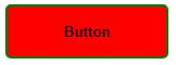
.btn {
 min-width: 150px;
 height: 50px;
 color: #fff;
 padding: 5px 10px;
 font-weight: bold;
 cursor: pointer;
 transition: all 0.3s ease;
 position: relative;
 display: inline-block;
 outline: none;
 border-radius: 5px;
 z-index: 0;
 background: red;
 overflow: hidden;
 border: 2px solid green;
 color: black;
 }
Now the button looks a lot better:
If you’d like your button to be rounded, you can increase its border radius to 25px.
You can use a plain button like this for your website, but in 2022, there are more advanced ways to style your buttons. One of the most popular features for styling buttons is animation. By combining CSS animations with CSS hover effects, you can make a plain button responsive, which makes your website more intuitive and fun for users to navigate. This article goes into more detail about animating buttons.
Let’s add animations to our button with the following code.
.btn:hover {
 color: #fff;
 }
 .btn:hover:after {
 width: 100%;
 }
 .btn:after {
 content: "";
 position: absolute;
 z-index: -1;
 transition: all 0.3s ease;
 left: 0;
 top: 0;
 width: 0;
 height: 100%;
 background: blue;
 }
In the code above, when you hover on the button, there will be a sliding animation that slides in from left to right and changes the background color to blue. You can view the animated button in the codepen below:
See the Pen
Button 1 by fimber elems (@Fimbosky1)
on CodePen.
If you’d like your button animation to move from right to left instead, just change left: 0; to right: 0;.
When styling a button, animations are vital because they bring life to the component. Whether you’re creating a big call-to-action button or a smaller button for a dropdown menu, you can get creative with animations.
Let’s create the second button with a more aesthetically pleasing retro look.
Here’s the HTML:
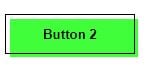
<button class="btn2">Button 2</button>
Next, let’s input the CSS:
.btn2 {
 min-width: 130px;
 height: 40px;
 color: #fff;
 padding: 5px 10px;
 font-weight: bold;
 cursor: pointer;
 transition: all 0.3s ease;
 position: relative;
 display: inline-block;
 outline: none;
 border: 1px solid #000;
 color: #000;
 background: transparent;
 }

 .btn2:hover:after {
 top: 0;
 left: 0;
 }

 .btn2:after {
 content: "";
 width: 100%;
 z-index: -1;
 position: absolute;
 height: 100%;
 top: 5px;
 left: 5px;
 transition: 0.7s;
 background-color: #40ff3a;
 }
The above code will result in this:
If you want to play around with these buttons, check out the codepen below.
See the Pen
Styled buttons by fimber elems (@Fimbosky1)
on CodePen.
You can also check out this codepen for other beautiful buttons you can use:
See the Pen
Candy Color Button Animation by Yuhomyan (@yuhomyan)
on CodePen.
One of the main problems developers face is not knowing when to use buttons. It might sound silly, but it’s a real problem because buttons can easily be replaced by links styled as buttons. While this might work, it’s not a good practice, primarily because of screen readers.
When a screen reader or any sort of assistive device scans a webpage, it gets information about the HTML structure of the page and reads the contents out loud, so using a link element <a> when you should use the <button> element can be problematic for users who have to use these assistive technologies to interact with the page.
Knowing when to use either element is simple. According to Angular, the <button> element should be used for any interaction that performs an action on the current page, and the <a> element should be used for any interaction that navigates to another view or page. It’s that simple!
As a developer, you should know how to use the right semantic HTML element when creating a button. It gives users a reasonable expectation of the control’s behavior, allows you to write lighter and better code, and makes your site easier to maintain.
You can check out this article to learn more about modern web applications’ links vs. buttons.
Button sizes are a vital part of styling buttons in 2022. So vital, in fact, that Apple included a recommended button size of 44x44px in the iPhone Human Interface Guidelines. Smaller buttons lead to poor accessibility for people who have reduced dexterity, and increase error rates for your site.
Using the right sized buttons also improves your site’s SEO or web app, because Google and other search engines rank pages based on how mobile-friendly they are. Making sure your buttons are both big and far enough apart increases the accessibility of your page and allows it to rank higher.
We discussed using the <button> element above, but let’s delve deeper into it. The importance of using the correct semantic HTML element has a heavy impact on the accessibility of a site, and I’ll briefly explain why.
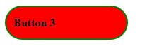
First, let’s recreate the first button we used earlier, but this time, instead of using the <button> element, we will create the button using a div.
Here’s the HTML:
<div class="btn3">Button 3</div>
Now, here’s the CSS:
.btn3 {
 display: flex;
 align-items: center;
 min-width: 150px;
 height: 35px;
 color: #fff;
 padding: 5px 10px;
 font-weight: bold;
 cursor: pointer;
 transition: all 0.3s ease;
 position: relative;
 margin-left: 20px;
 outline: none;
 border-radius: 25px;
 z-index: 0;
 background: red;
 overflow: hidden;
 border: 2px solid green;
 color: black;
 }

 .btn3:hover {
 color: #fff;
 }
 .btn3:hover:after {
 width: 100%;
 }
 .btn3:after {
 content: "";
 position: absolute;
 z-index: -1;
 transition: all 0.3s ease;
 left: 0;
 top: 0;
 width: 0;
 height: 100%;
 background: blue;
 }
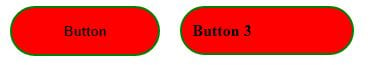
The result of the code above will look like this.
👁 Button Resulting From <Div> Element
Put side by side with our original button, an average person would find it challenging to pick out the actual button between the two, given that with a bit of JavaScript, you can make them both do the same thing.
Learn how next-browser gives AI agents runtime context for debugging Next.js apps, including React props, hydration, PPR, forms, and performance.
Build dynamic LLM routing in Next.js with OpenRouter, TanStack AI, task classification, model fallbacks, and cost-aware routing.
TSRX adds first-class control flow, conditional hooks, and scoped styles to React via a TypeScript compiler extension — no new framework required.
Learn how to build a full React Native auth system using Better Auth and Expo — with email/password login, Google OAuth, session persistence, and protected routes.
Would you be interested in joining LogRocket's developer community?
Join LogRocket’s Content Advisory Board. You’ll help inform the type of content we create and get access to exclusive meetups, social accreditation, and swag.
Sign up now