 |
VOOZH | about |
|
VOOZH | about |
The Replay is a weekly newsletter for dev and engineering leaders.
Delivered once a week, it's your curated guide to the most important conversations around frontend dev, emerging AI tools, and the state of modern software.
An awesome thing about working with animations in Svelte is that you don’t need to download extra packages. Animations and transitions come built in with Svelte. This means you can add powerful and delightful interactions to applications without increasing their size. This also goes a long way to boost the speed and performance of your application.
👁 ImageIn this article, I will explain how transitions and animations work in Svelte. I also provide some demos where we apply the knowledge we gain in practice.
We start by installing the sveltejs package with the following code:
npx degit sveltejs/template my-svelte-project
Svelte provides seven transition functions: fade, blur, fly, slide, scale, draw, and crossfade. To use any of these functions, you have to import them from the svelte/transition module.
Below is a demo of the transition we will be making to an image carousel:
👁 Gif of an image carousel in action
Let’s see how to add transitions to an image carousel. Add the code snippet below to your App.svelte file:
<script>
 import { fade, blur, fly, slide, scale } from "svelte/transition";
 import { quintOut } from "svelte/easing";

 let books = [
 //array of links to books
 ];

 setInterval(() => {
 //logic goes here
 }, 1000);
</script>
<section style="display:flex;justify-content:center">
 {#each books as book, i}
 {#if activeIndex === i}
 <img
 transition:scale={{ delay: 250, duration: 300, easing: quintOut }}
 style="position:absolute"
 src={book}
 width="500"
 height="300"
 alt=""
 />
 {/if}
 {/each}
</section>
In the code snippet above, we import the transition functions we’ll be using. We also import the quintOut easing function. Svelte provides several easing functions out of the box.
To add transitions to Svelte, we make use of the transition directive. We pass in the transition directive to the img element.
Transition functions can accept parameters. We define the delay, duration, and easing for the transition by passing in a configuration object.
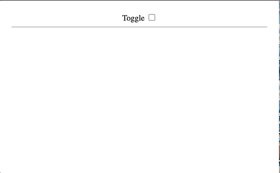
When working with transitions in Svelte, we can define separate transition functions for the in and out transitions of the elements. The gif below is the demo of in and out transitions we will be making:
👁 Gif of transition function toggled by a checkbox
Let’s implement in and out transitions in another demo. Copy the code below into your App.svelte file:
<script>
 import { fade, scale } from "svelte/transition";
 let show = false;
</script>

<label>
 Toggle
 <input type="checkbox" bind:checked={show} />
</label>
<hr />
{#if show}
 <h1 in:scale out:fade>My name is Nefe James</h1>
{/if}
We switch out the transition directive for in and out. Like the transition directive, parameters can also be passed into in and out.
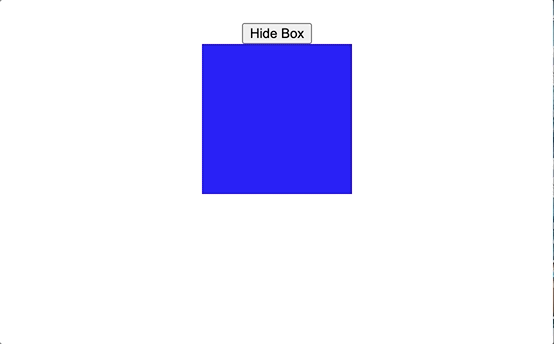
You may want to define custom transitions, and you can do that in Svelte. Under the hood, each transition is a function that gets a node and a parameter.
The gif below shows the custom transition we will create:
👁 Gif of custom transition of a box shrinking and growing at a button press
Let’s see how to create custom transitions in Svelte. Copy the code below into your App.svelte file:
<script>
 import { elasticInOut } from "svelte/easing";
 let isActive = true;
 const customTransition = () => {
 return {
 css: (t) => {
 return `
 transform: scale(${t});
 `;
 },
 easing: elasticInOut,
 duration: 2000,
 };
 };
</script>

<main>
 <button on:click={() => (isActive = !isActive)}>
 {#if isActive} Hide Box {:else} Show Box{/if}
 </button>
 {#if isActive}
 <div class="box" transition:customTransition />
 {/if}
</main>
We defined a function called customTransition. This function returns a css property, easing, and duration. The css property is a function with t as its parameter.
t represents the transition frames available from 0 to 1. We use the value of t to set the scale of the object. Then we pass customTransition to the box.
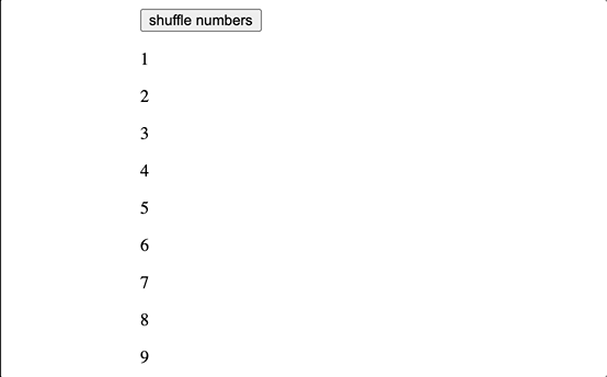
Svelte provides a flip animation function that can be accessed from the svelte/animate module. The animate directive is used when you want to add animations to a list of items that are being reordered. The gif below shows how flip animations work in animating a list of items:
👁 Gif of flip animation in which numbers are rearranged at button press
Let’s see how to make flip animations. Copy the code below into your App.svelte file to follow along:
<script>
 import { flip } from "svelte/animate";

 let numbers = [1, 2, 3, 4, 5, 6, 7, 8, 9];

 const shuffle = () => {
 numbers = numbers.sort(() => 0.5 - Math.random());
 };
</script>
<main>
 <button on:click={shuffle}>shuffle numbers</button>
 <div>
 {#each numbers as number (number)}
 <p animate:flip>{number}</p>
 {/each}
 </div>
</main>
In the snippet above, we are shuffling an array of numbers from 1-9. To animate the shuffling, we start by importing flip from svelte/animate.
We pass flip to the p tag through the animate directive. Svelte tracks and animates the change in position of the numbers whenever the button is clicked.
The svelte/motion module exports two functions, tweened and spring, for creating writable stores whose values change over time after set and update, rather than immediately.
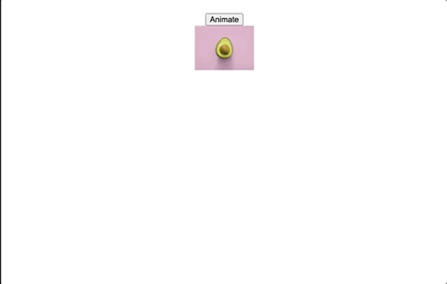
The demo below shows how the tweened animation looks in action:
👁 Gif of tweened animation in which an image grows larger at button press
Let’s set up a demo to see how motions work. To follow along, copy the code below into your App.svelte file:
<script>
 import { tweened } from "svelte/motion";
 import { quartInOut } from "svelte/easing";
 let src = "./pear.jpg";
 const width = tweened(100, {
 duration: 2000,
 easing: quartInOut
 });
 function handleClick() {
 width.set(150);
 }
</script>

<button on:click={handleClick}>Animate</button>
<br />
<img {src} width={$width} alt="" />
We import the tweened motion function from svelte/motion, along with quartInOut easing function from svelte/easing.
Tweened allows us to generate intermediate frames in an animated sequence to give the appearance of smooth movement. Tweened accepts an initial value as its first argument and a configuration object as the second. We define the duration and easing for the tweened motion.
We set the initial width of the image to be 100px. In the handleClick function, we update the width to 150px.
Then, we pass handleClick to the button using Svelte’s on directive.
Now that we know how tweened motions work, what about spring motions?
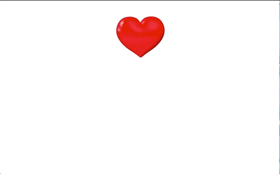
The demo below shows how the spring animation looks when applied to an element:
👁 Gif of spring animation of a beating heart
Copy the code below into your App.svelte file:
<script>
 import { spring } from "svelte/motion";
 let src = "./heart.jpg";
 const width = spring(100, {
 stiffness: 0.01,
 damping: 0.1
 });
 const zoomIn = setInterval(() => {
 width.set(200);
 }, 300);
 const zoomOut = setInterval(() => {
 width.set(100);
 }, 600);
</script>

<img {src} alt="" width={$width} />
Spring works similarly to tweened, although its configuration object accepts stiffness and damping properties. Instead of running this animation when a button is clicked, we use the setInterval function to change the width of the image at different intervals. This gives us the appearance of a beating heart.
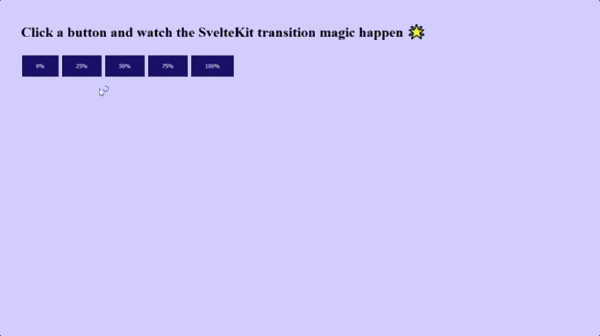
Transitions and animations work the same way in SvelteKit as in Svelte. Let’s set up an animation in SvelteKit.
The demo below shows how tweened transition looks in Sveltekit. Note that there is no difference in implementation or appearance:
Copy the code below into your App.svelte file to follow along:
<script>
 import { tweened } from "svelte/motion";
 import { cubicOut } from "svelte/easing";
 const progress = tweened(0, {
 duration: 4000,
 easing: cubicOut,
 });
</script>

 <h1>Click a button and watch the SvelteKit transition magic happen 🌟</h1>

<progress value={$progress} />
<div class="buttons">
 <button on:click={() => progress.set(0)}> 0% </button>
 <button on:click={() => progress.set(0.25)}> 25% </button>
 <button on:click={() => progress.set(0.5)}> 50% </button>
 <button on:click={() => progress.set(0.75)}> 75% </button>
 <button on:click={() => progress.set(1)}> 100% </button>
</div>
Like we did in Svelte, we import tweened from svelte/motion along with an easing function. We define a progress variable and set the value of the progress bar to that variable.
Whenever any of the buttons are clicked, the value of the progress bar updates, and we see a beautiful transition take place from one value to the other.
Adding subtle animations and transition effects is a great way to keep visitors engaged with your content. When done correctly, animations make your website or app more compelling, and they can help drive user engagement.
Transitions and animations in Svelte are awesome. The Svelte team did a great job in packaging built-in animations, transitions, motions, and easings into the library.
Install LogRocket via npm or script tag. LogRocket.init() must be called client-side, not
server-side
$ npm i --save logrocket

// Code:

import LogRocket from 'logrocket';
LogRocket.init('app/id');
// Add to your HTML:

<script src="https://cdn.lr-ingest.com/LogRocket.min.js"></script>
<script>window.LogRocket && window.LogRocket.init('app/id');</script>
Learn how next-browser gives AI agents runtime context for debugging Next.js apps, including React props, hydration, PPR, forms, and performance.
Build dynamic LLM routing in Next.js with OpenRouter, TanStack AI, task classification, model fallbacks, and cost-aware routing.
TSRX adds first-class control flow, conditional hooks, and scoped styles to React via a TypeScript compiler extension — no new framework required.
Learn how to build a full React Native auth system using Better Auth and Expo — with email/password login, Google OAuth, session persistence, and protected routes.
Hey there, want to help make our blog better?
Join LogRocket’s Content Advisory Board. You’ll help inform the type of content we create and get access to exclusive meetups, social accreditation, and swag.
Sign up now