 |
VOOZH | about |
|
VOOZH | about |
Data visualization is an integral part of modern applications. Most frontend applications are about presenting data, and you can enhance the user experience by using proper data visualization techniques.
👁 Exploring Data Visualization With UnovisUnovis is a data visualization library that is framework-independent, which means you can use it with any popular framework like React, Angular, or Svelte!
Jump ahead:
With only 25 kb in size, Unovis is tiny in size. In comparison, Recharts, one of the most popular visualization libraries is 488kb, making Unovis 20 times lighter!
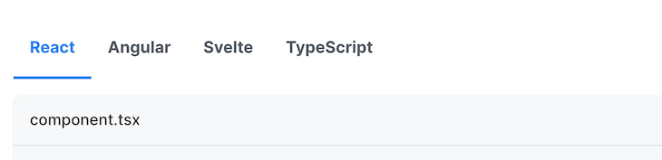
You can use Unovis with many frameworks. You will notice that every example is provided in four languages: React, Angular, Svelte, and plain TypeScript. This is powerful because we can use the same concept in multiple libraries:
Unovis doesn’t have unnecessary charts that you might never need in a real life application. Instead, it has just enough charts that make it easy to understand and customize.
Unovis is better if you need to use a minimal library in your project.
The major benefit of Unovis is its comprehensive and easy-to-use integrations with graph and map charts.
There are very few libraries that have this feature. We will see how we can use these charts and customize them according to our needs.
So it’s clear why you should consider using Unovis. Now let’s dive into some code and see how we can use Unovis in real life.
Today we will build a simple project and demonstrate the different chart types. Here is a look at the final product. If you want to look at the code, here is the GitHub repository.
For this demo, we are going to use a template React.js application.
To initialize the app, we will use vite:
yarn create vite react-univos-demo --template react-ts
Now, you can run the project using the following command:
yarn dev
You can visit http://localhost:5173/ to view your application in action.
To install dependencies, install the Unovis library inside your project:
yarn add @unovis/ts @unovis/react
Now you are ready to start playing with Unovis. But before we get started, let’s familiarize ourselves with an essential concept in Unovis.
The Unovis library takes a different approach to visualizing data. It uses a concept called containers, which are components that hold other components. Containers can be used to create a chart, graph, or dashboard.
There are two types of containers in Unovis: the VisSingleContainer and the VisXYContainer.
VisSingleContainer is a container that can create a single chart. We can create a donut chart, graph chart, map chart, and more.
VisXYContainer can create a chart with multiple components. It can be used to create a bar chart, line chart, area chart, etc.
If your graph needs multiple axes, you should use VisXYContainer. If your chart doesn’t need to depend on the axis, then you should use VisSingleContainer.
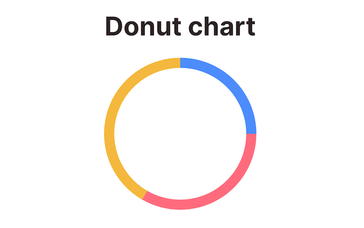
We will first see an example of a donut chart using the VisSingleContainer component:
import React from "react";
import { VisSingleContainer, VisDonut } from "@unovis/react";
export const DonutChartDemo = () => {
 const data: number[] = [30, 40, 50];
 const value = (d: number) => d;
 return (
 <VisSingleContainer data={data}>
 <VisDonut value={value} />
 </VisSingleContainer>
 );
};
Notice that we are passing a data array into the VisSingleContainer component. The data array should contain the data that is needed to create the chart.
Inside VisDonut , we are passing a value function. The value function is used to extract the value from the data array.
It will generate the following chart:
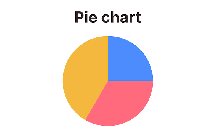
To customize the donut chart, you can use various properties of the VisDonut component. One of them is arcWidth, which determines the amount of space inside the donut.
So, if you want to create a pie chart, you can make arcWidth = 0 and it will become a pie chart.
It will look something like this:
import React from "react";
import { VisSingleContainer, VisDonut, VisTooltip } from "@unovis/react";
import { Donut } from "@unovis/ts";
export const PieChartDemo = () => {
 const data: number[] = [30, 40, 50];
 const value = (d: number) => d;
 return (
 <VisSingleContainer data={data}>
 <VisDonut arcWidth={0} value={value} />
 </VisSingleContainer>
 );
};
Now you have a pie chart like this:
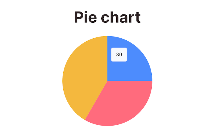
These charts look beautiful, but they are not very useful because you don’t know which part represents which data. We can add more context by adding tooltips to the charts.
If you want to show the tooltips on hover, you can use the VisTooltip component:
const triggers = { [Donut.selectors.segment]: (d: any) => d.data };
return (
 <VisSingleContainer data={data}>
 <VisDonut value={value} />
 <VisTooltip triggers={triggers} />
 </VisSingleContainer>
);
Now the tooltips will be shown on hover:
👁 Pie Chart With Tooltip Hover
You can customize the custom triggers function to show any tooltip you want.
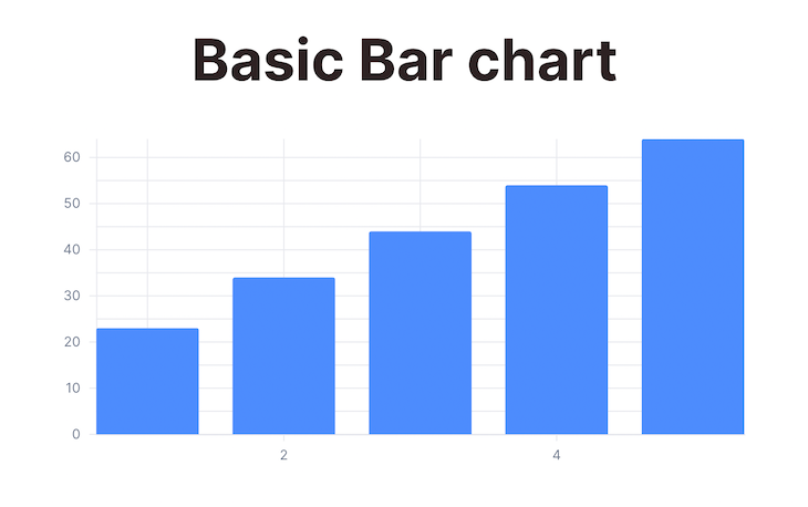
Unlike a donut chart, a bar chart needs multiple axes. So we will use the VisXYContainer component to create a bar chart.
As it has two axes, our data will need to be in a specific format. We need both the x and y axis data:
const data: DataRecord[] = [
 { xAxisValue: 1, yAxisValue: 23 },
 { xAxisValue: 2, yAxisValue: 34 },
 { xAxisValue: 3, yAxisValue: 44 },
 { xAxisValue: 4, yAxisValue: 54 },
 { xAxisValue: 5, yAxisValue: 64 },
];
const x = (d: DataRecord) => d.xAxisValue;
const y = (d: DataRecord) => d.yAxisValue;
Then, we can use the VisXYContainer component to create a bar chart:
return (
 <VisXYContainer data={data}>
 <VisGroupedBar x={x} y={y} />
 </VisXYContainer>
);
Notice that we are using the VisGroupedBar component to create the bar chart. We are also passing the x and y axis functions.
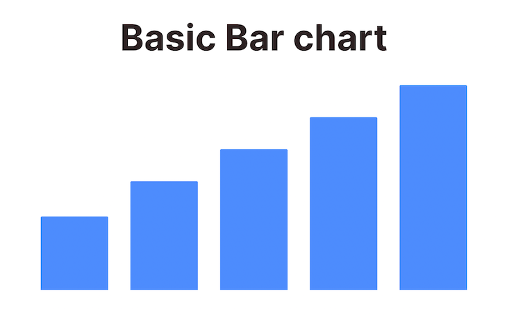
The final output will look something like this:
There are better ways to visualize data than just displaying bars. So we will also add the axis to the chart:
return (
 <VisXYContainer data={data}>
 <VisGroupedBar x={x} y={y} />
 <VisAxis type="x" />
 <VisAxis type="y" />
 </VisXYContainer>
);
Notice that we are using VisAxis component to create the axis. We need to pass the type of axis as a prop. The type can be either x or y.
The final result looks like this:
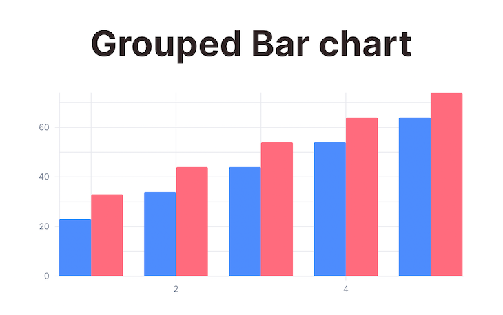
We can represent groups of data using a bar chart. Say we want to show the progression of three parameters over time. We can use the grouped bar chart to show this:
import React from "react";
import { VisXYContainer, VisGroupedBar, VisAxis } from "@unovis/react";
type DataRecord = {
 xAxisValue: number,
 yAxisValue1: number,
 yAxisValue2: number,
};
export const GroupedBarChartDemo = () => {
 const data: DataRecord[] = [
 { xAxisValue: 1, yAxisValue1: 23, yAxisValue2: 33 },
 { xAxisValue: 2, yAxisValue1: 34, yAxisValue2: 44 },
 { xAxisValue: 3, yAxisValue1: 44, yAxisValue2: 54 },
 { xAxisValue: 4, yAxisValue1: 54, yAxisValue2: 64 },
 { xAxisValue: 5, yAxisValue1: 64, yAxisValue2: 74 },
 ];
 const x = (d: DataRecord) => d.xAxisValue;
 const y = [
 (d: DataRecord) => d.yAxisValue1,
 (d: DataRecord) => d.yAxisValue2,
 ];
 return (
 <VisXYContainer data={data}>
 <VisGroupedBar x={x} y={y} />
 <VisAxis type="x" />
 <VisAxis type="y" />
 </VisXYContainer>
 );
};
The result will look like this:
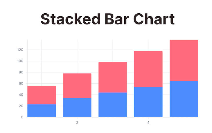
Another way to represent groups of data is to use a stacked chart. It is similar to the grouped bar chart; the only difference is that the stacked chart stacks the bars on top of each other.
The shape of the data is similar to the grouped bar chart. The only difference is that we will use VisStackedBar component instead of VisGroupedBar:
return (
 <VisXYContainer data={data}>
 <VisStackedBar x={x} y={y} />
 <VisAxis type="x" />
 <VisAxis type="y" />
 </VisXYContainer>
);
The result looks like this:
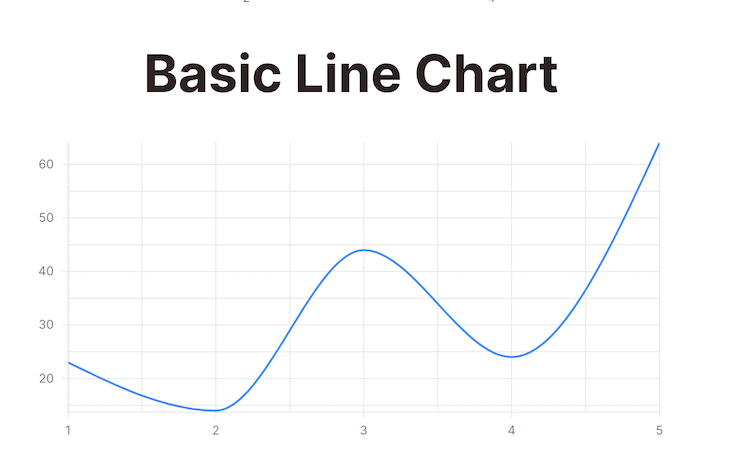
Line charts are useful for showing trends over time. We can use the VisLine component to create a line chart.
The basic structure is almost the same as the other charts:
import React from "react";
import { VisXYContainer, VisLine, VisAxis } from "@unovis/react";
type DataRecord = {
 xAxisValue: number,
 yAxisValue: number,
};
export const BasicLineChartDemo = () => {
 const data: DataRecord[] = [
 { xAxisValue: 1, yAxisValue: 23 },
 { xAxisValue: 2, yAxisValue: 14 },
 { xAxisValue: 3, yAxisValue: 44 },
 { xAxisValue: 4, yAxisValue: 24 },
 { xAxisValue: 5, yAxisValue: 64 },
 ];
 const x = (d: DataRecord) => d.xAxisValue;
 const y = (d: DataRecord) => d.yAxisValue;
 return (
 <VisXYContainer data={data}>
 <VisLine highlightOnHover={true} x={x} y={y} />
 <VisAxis type="x" />
 <VisAxis type="y" />
 </VisXYContainer>
 );
};
Notice that we are using the VisLine component to create the line chart. We are also passing the x and y-axis function because we need both axes to show the progression of data:
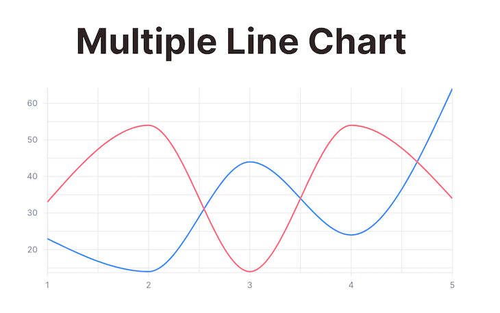
If we want to compare multiple trend lines, then we can update the structure of the data to plot multiple y-axis values for each x-axis value:
import React from "react";
import { VisXYContainer, VisLine, VisAxis } from "@unovis/react";
type DataRecord = {
 xAxisValue: number,
 yAxisValue1: number,
 yAxisValue2: number,
};
export const MultipleLineChartDemo = () => {
 const data: DataRecord[] = [
 { xAxisValue: 1, yAxisValue1: 23, yAxisValue2: 33 },
 { xAxisValue: 2, yAxisValue1: 14, yAxisValue2: 54 },
 { xAxisValue: 3, yAxisValue1: 44, yAxisValue2: 14 },
 { xAxisValue: 4, yAxisValue1: 24, yAxisValue2: 54 },
 { xAxisValue: 5, yAxisValue1: 64, yAxisValue2: 34 },
 ];
 const x = (d: DataRecord) => d.xAxisValue;
 const y = [
 (d: DataRecord) => d.yAxisValue1,
 (d: DataRecord) => d.yAxisValue2,
 ];
 const color = (d: DataRecord, i: number) => \["#6A9DFF", "#1acb9a"\][i];
 return (
 <VisXYContainer data={data}>
 <VisLine highlightOnHover={true} x={x} y={y} />
 <VisAxis type="x" />
 <VisAxis type="y" />
 </VisXYContainer>
 );
};
This will produce the following result with multiple trend lines:
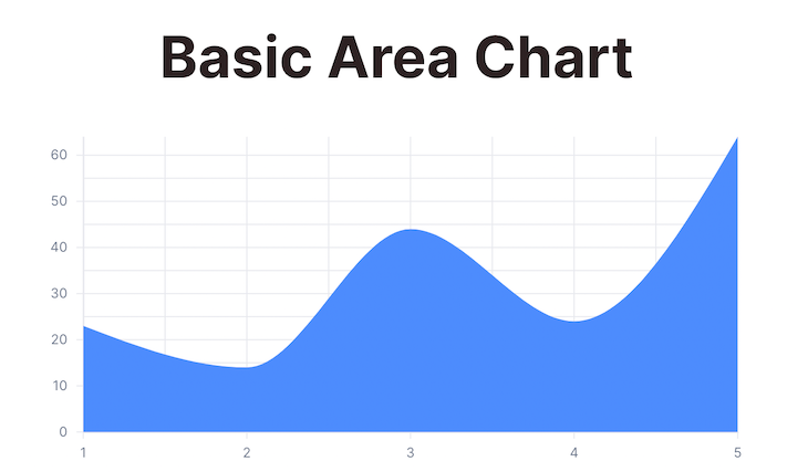
An area chart is similar to a line chart. The only difference is that the area chart fills the area between the line and the x-axis:
import React from "react";
import { VisXYContainer, VisArea, VisAxis } from "@unovis/react";
type DataRecord = {
 xAxisValue: number,
 yAxisValue: number,
};
export const BasicAreaChartDemo = () => {
 const data: DataRecord[] = [
 { xAxisValue: 1, yAxisValue: 23 },
 { xAxisValue: 2, yAxisValue: 14 },
 { xAxisValue: 3, yAxisValue: 44 },
 { xAxisValue: 4, yAxisValue: 24 },
 { xAxisValue: 5, yAxisValue: 64 },
 ];
 const x = (d: DataRecord) => d.xAxisValue;
 const y = (d: DataRecord) => d.yAxisValue;
 return (
 <VisXYContainer data={data}>
 <VisArea x={x} y={y} />
 <VisAxis type="x" />
 <VisAxis type="y" />
 </VisXYContainer>
 );
};
This code will produce the following result:
You can do the same thing with multiple area charts.
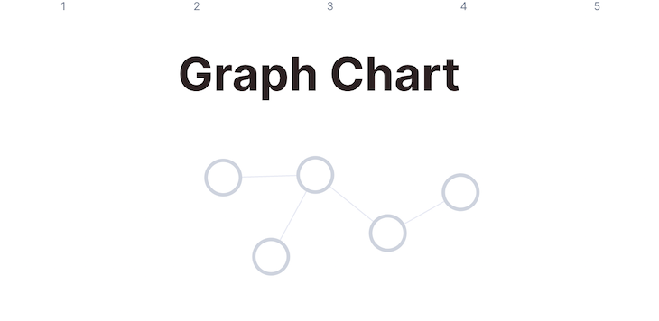
One interesting feature of Unovis is that it can be used to create a graph chart. To do this, we need to use the VisGraph component. It can be used to create a graph chart with multiple nodes and edges.
You need to represent the graph data in a specific format. There will be two parts of the data.
The node data should be an array of objects. Each object should have an id property. The id property should be unique for each node:
const nodes = [{ id: "1" }, { id: "2" }, { id: "3" }, { id: "4" }, { id: "5" }];
You can add any other properties you like but id is the mandatory field.
The link data should be an array of objects. Each object should have a source and target property. The source and target properties should be the id of the nodes connected by the link:
const links = [
 { id: "1", source: "1", target: "2" },
 { id: "2", source: "1", target: "3" },
 { id: "3", source: "2", target: "4" },
 { id: "4", source: "2", target: "5" },
];
The final graph data will be an object with two properties: nodes and links:
const graphData = {
 nodes,
 links,
};
You can then use VisGraph to create a graph chart:
import React from "react";
import { VisXYContainer, VisGraph } from "@unovis/react";
export const GraphChartDemo = () => {
 const graphData = {
 nodes, // created before
 links, // created before
 };
 return (
 <VisXYContainer data={graphData}>
 <VisGraph />
 </VisXYContainer>
 );
};
The final output should look like this:
Now let’s see how we can customize this graph.
Circular nodes are boring, right? Don’t worry — you can customize the nodes by using various node properties.
The nodeSize property can be used to set the size of the nodes in the graph chart:
<VisGraph nodeSize={20} />
The nodeFill property can be used to set the color of the nodes in the graph chart:
<VisGraph nodeFill={(n: NodeDatum) => "red"} />
This way, you can control the color of every node. Just customize the function!
The nodeStroke property can be used to set the border color of the nodes in the graph chart:
<VisGraph nodeStroke={(n: NodeDatum) => "blue"} />
You can add labels to the nodes for better understanding. To do that, you have to use the nodeLabel property:
<VisGraph nodeLabel={(nodeData) => nodeData.id} />
You can also change the shape of each of the nodes. To do that, use the nodeShape property. The available shapes are circle, triangle , hexagon , square, etc:
<VisGraph nodeShape={(n: NodeDatum) => "triangle"} />
Other properties can be used to customize the label of the nodes. Some of them are nodeIcon, nodeIconSize, etc. To learn more, you can refer to the Unovis documentation.
Now let’s see how we can customize the links between the nodes.
You can customize the links as well. You can change the color, width, and style of the links.
The linkStroke property can be used to set the color of the links in the graph chart:
<VisGraph linkStroke={(l: LinkDatum) => "red"} />
The linkWidth property can be used to set the width of the links in the graph chart. Just set any integer:
<VisGraph linkWidth={(l: LinkDatum) => 2} />
The linkStyle property can be used to set the style of the links in the graph chart:
<VisGraph linkStyle={GraphLinkStyle.Dashed} />
The default value of linkStyle is GraphLinkStyle.Solid.
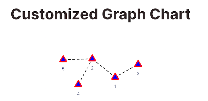
With all of the customizations above, the final code will look something like this:
import React from "react";
import { VisSingleContainer, VisGraph } from "@unovis/react";
import { GraphLinkStyle } from "@unovis/ts";
type GraphData = {
 nodes: NodeDatum[],
 links: LinkDatum[],
};
type NodeDatum = {
 id?: string,
};
type LinkDatum = {
 id?: string,
 source: number | string | NodeDatum,
 target: number | string | NodeDatum,
};
export const CustomizedGraphDemo = () => {
 const nodes = [
 { id: "1" },
 { id: "2" },
 { id: "3" },
 { id: "4" },
 { id: "5" },
 ];
 const links = [
 { id: "1", source: "1", target: "2" },
 { id: "2", source: "1", target: "3" },
 { id: "3", source: "2", target: "4" },
 { id: "4", source: "2", target: "5" },
 ];
 const data: GraphData = {
 nodes,
 links,
 };
 const nodeLabelValues = (n: NodeDatum) => n.id ?? "default";
 const nodeColorValues = (n: NodeDatum) => "red";
 const nodeFillValues = (n: NodeDatum) => "blue";
 const nodeShapeValues = (n: NodeDatum) => "triangle";
 const linkColorValues = (l: LinkDatum) => "black";
 const linkWidthValues = (l: LinkDatum) => 2;
 const linkStyleValues = (l: LinkDatum) => GraphLinkStyle.Dashed;
 return (
 <VisSingleContainer data={data}>
 <VisGraph
 nodeSize={20}
 nodeShape={nodeShapeValues}
 nodeStroke={nodeColorValues}
 nodeLabel={nodeLabelValues}
 nodeFill={nodeFillValues}
 linkStroke={linkColorValues}
 linkWidth={linkWidthValues}
 linkStyle={linkStyleValues}
 />
 </VisSingleContainer>
 );
};
And the result?
Awesome!
But don’t stop here. You can add many customizations and features to your graph charts. You can create tree chart, circular chart, parallel chart, flying particles, and many more!
To learn more about the graph chart, refer to the Unovis documentation.
Another type of chart that you can create with Unovis is a map chart, which you can create by using the VisLeafletMap component.
But before that, you will need an API key to use the map. You can create a free account on MapTier and get an API key.
After opening an account, visit API Keys page and get your API Key to follow along.
To show some points on the map (Usually the most common use case of using a map chart), you can use the VisLeafletMap component with some random latitude and longitude values:
import React from "react";
import { VisLeafletMap } from "@unovis/react";
const key = "YOUR_KEY_GOES_HERE";
export const BasicMapChartDemo = () => {
 const style = `https://api.maptiler.com/maps/basic-v2/style.json?key=${key}`;
 const attribution = [
 `<a href="https://www.maptiler.com/copyright/" target="_blank">MapTiler</a>`,
 `<a href="https://www.openstreetmap.org/copyright" target="_blank">OpenStreetMap contributors</a>`,
 ];
 const locations = [
 { latitude: 76.57744716414618, longitude: 167.02598969888402 },
 { latitude: -69.88903227855825, longitude: -124.39180738161512 },
 { latitude: -65.15557562550397, longitude: 63.12768315018343 },
 { latitude: 9.963608192996048, longitude: 131.90872175784352 },
 { latitude: 18.517816282881938, longitude: -5.674213770692035 },
 { latitude: 7.006024523431535, longitude: -37.97202916896549 },
 { latitude: 16.255591612629146, longitude: -56.43214810193591 },
 { latitude: -89.5085602625064, longitude: -43.379507499950705 },
 { latitude: 10.611461127021741, longitude: -118.58004118222965 },
 { latitude: 84.87864073812892, longitude: 51.35247805286431 },
 ];
 return (
 <VisLeafletMap
 style={style}
 attribution={attribution}
 pointColor="red"
 data={locations}
 />
 );
};
Notice that we are passing a locations array into the data property of the VisLeafletMap component. This array contains the latitude and longitude values of the points we want to show on the map.
You can customize the map in many ways.
You can change the color of the points on the map by passing a function to the pointColor property of the VisLeafletMap component:
<VisLeafletMap pointColor={"red"} />
Now all your nodes will be red. pointColor also supports hex color codes.
You can change the shape of the points on the map by passing a function to the pointShape property of the VisLeafletMap component:
<VisLeafletMap pointShape={"triangle"} />
Now, your icons will be triangles instead of circles.
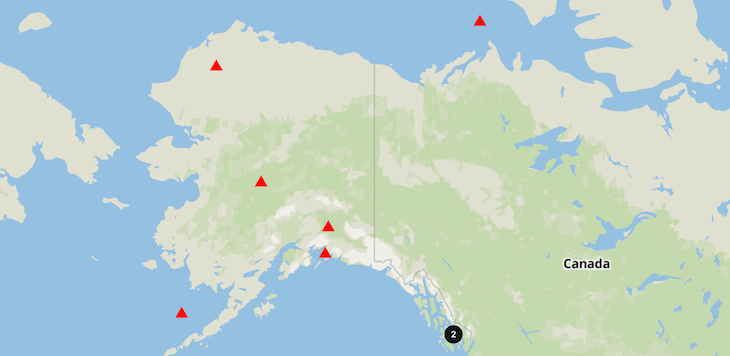
The map intelligently clusters close points as you zoom in or out. You can change the cluster’s color by passing a function to the clusterColor property of the VisLeafletMap component:
<VisLeafletMap clusterColor={"black"} />
You can even make the cluster expand on click by making the clusterExpandOnClick={false} property of the VisLeafletMa``p component:
<VisLeafletMap clusterExpandOnClick={true} />
The final output will look like this:
👁 Map With Customized Clusters
No single library can solve all of your problems. So when it comes to representing your data in charts, take some time to understand the pros and cons of different chart libraries. In my opinion, Unovis is a good starting point for most use cases.
That’s it for today. Have a great day!
There’s no doubt that frontends are getting more complex. As you add new JavaScript libraries and other dependencies to your app, you’ll need more visibility to ensure your users don’t run into unknown issues.
LogRocket is a frontend application monitoring solution that lets you replay JavaScript errors as if they happened in your own browser so you can react to bugs more effectively.
👁 LogRocket Dashboard Free Trial BannerLogRocket works perfectly with any app, regardless of framework, and has plugins to log additional context from Redux, Vuex, and @ngrx/store. Instead of guessing why problems happen, you can aggregate and report on what state your application was in when an issue occurred. LogRocket also monitors your app’s performance, reporting metrics like client CPU load, client memory usage, and more.
Build confidently — start monitoring for free.
We built the same app in TanStack Start RSC and Next.js RSC. TanStack shipped 40% less JS and built 4x faster — but Next.js is still the safer production bet.
From RSC vulnerabilities and the Vercel breach to TypeScript 7.0 Beta and AI agents — the nine frontend storylines that defined H1 2026, ranked.
AI tools generate working React code fast, but miss race conditions, empty states, debouncing, and accessibility. Here’s how to catch bugs before production.
Learn how to use Gemini CLI subagents to delegate frontend, backend, testing, and docs tasks to specialized agents with guardrails and clear ownership.
Would you be interested in joining LogRocket's developer community?
Join LogRocket’s Content Advisory Board. You’ll help inform the type of content we create and get access to exclusive meetups, social accreditation, and swag.
Sign up now