 |
VOOZH | about |
|
VOOZH | about |
The app bar is one of the most-used components in all kinds of applications. It can be used to house a search field, buttons to navigate between pages, or simply the title of the page. Since it’s such a commonly used component, Flutter provides a dedicated widget for this functionality called AppBar.
👁 Flutter AppBar TutorialIn this tutorial, we’ll show you how to customize the AppBar in a Flutter app by walking through some practical examples.
Here’s what we’ll cover:
The Replay is a weekly newsletter for dev and engineering leaders.
Delivered once a week, it's your curated guide to the most important conversations around frontend dev, emerging AI tools, and the state of modern software.
Flutter AppBar is an app component built in accordance with Material Design guidelines. It’s usually placed at the top of the screen and has the ability to contain other widgets within its layout. The AppBar commonly displays branding information such as logos and titles and often contains buttons or other points of user interaction.
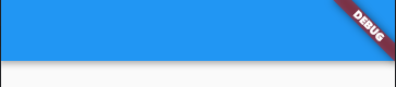
Here’s what the default AppBar looks like in Flutter:
// Mostly, AppBar is used inside a Scaffold widget.
Scaffold(
 appBar: AppBar(),
),
Pretty blank, right? Let’s go ahead and customize it to our liking.
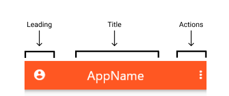
In Flutter, the AppBar’s layout mainly comprises three components: leading, title, and actions. leading is placed at the leftmost position of the AppBar; title and actions appear to its right.
leadingleading takes in a widget and can be assigned anything — text, an icon, or even multiple widgets within a row.
AppBar(
 leading: Icon(Icons.account_circle_rounded),
),
You can control how much width leading can take:
AppBar(
 leading: Icon(Icons.account_circle_rounded),
 leadingWidth: 100, // default is 56
),
👁 Flutter AppBar Leading Width
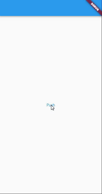
If leading is not provided, AppBar implies it for us automatically. Examples include a navigation arrow to go back to the previous page or a menu icon to open the drawer.
The navigation arrow appears automatically when a previous route is available.
class HomePage extends StatelessWidget {
 @override
 Widget build(BuildContext context) {
 return Scaffold(
 body: Center(
 child: TextButton(
 child: Text('Push'),
 onPressed: () => Navigator.push(context, MaterialPageRoute(
 builder: (context) {
 return SecondPage();
 },
 )),
 ),
 ),
 );
 }
}

class SecondPage extends StatelessWidget {
 @override
 Widget build(BuildContext context) {
 return Scaffold(
 appBar: AppBar(),
 );
 }
}
👁 Flutter AppBar Navigation Arrow
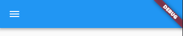
When we add a Drawer to the Scaffold, a menu icon is assigned to leading to open the drawer.
class HomePage extends StatelessWidget {
 @override
 Widget build(BuildContext context) {
 return Scaffold(
 appBar: AppBar(),
 drawer: Drawer(),
 );
 }
}
If desired, this behavior can be prevented by making automaticallyImplyLeading false.
AppBar(
 automaticallyImplyLeading: false, // simple as that!
),
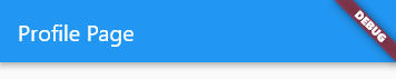
titleAs the name suggests, it’s mostly used for showing titles, such as the app title or a page header.
AppBar(
 title: Text('Profile Page'),
),
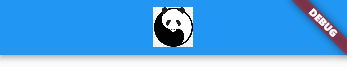
But you’re not limited to that since title takes a widget as well. You can use it to show icons, images, shapes, or any combination of these using layout widgets such as row and column.
Here’s an example:
AppBar(
 title: Container(
 width: 40,
 child: Image.network(url),
 ),
),
By default, title is aligned to the left of AppBar, per Material guidelines. You can change this to align it in the center:
AppBar(
 title: Container(
 width: 40,
 child: Image.network(url),
 ),
 centerTitle: true, // like this!
),
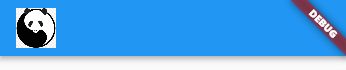
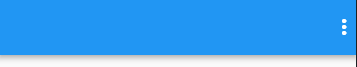
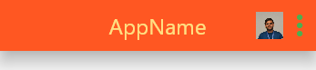
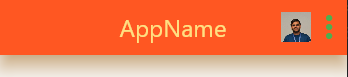
actionsactions is a list of widgets that are aligned to the right of AppBar. We usually see them in apps used as buttons to trigger dropdown menus, profile avatars, etc.
AppBar(
 actions: [
 Icon(Icons.more_vert),
 ],
),
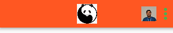
Let’s add one more widget to the list:
AppBar(
 actions: [
 Container(
 width: 30,
 child: Image.asset(
 'assets/images/profile_pic.png',
 ),
 ),
 Icon(Icons.more_vert),
 ],
),
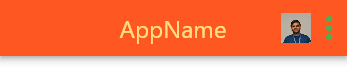
Now that we’re familiar with AppBar’s layout, let’s take the customization to the next level by playing with theming options. AppBar contains all sorts of properties, including colors, sizes, icon themes, text themes, and more.
The following code changes the background color of AppBar to deep orange. 500 is added to access a particular shade of the color, 900 being the darkest and 50 being the lightest.
AppBar(
 backgroundColor: Colors.deepOrange[500],
),
👁 Flutter AppBar Background Color
The code below changes the icon’s color to green and size to 36:
AppBar(
 actionsIconTheme: IconThemeData(color: Colors.green, size: 36),
),
Let’s say you want to change the text color to amber with a lighter shade of 200 and set the font size to 24:
AppBar(
 textTheme: TextTheme(
 headline6: TextStyle( // headline6 is used for setting title's theme
 color: Colors.amber[200],
 fontSize: 24,
 ),
 ),
),
If you want to give the AppBar a little boost, you can use elevation. The following code increases the elevation of AppBar to 15.
AppBar(
 elevation: 15,
),
Notice that AppBar is lifted up and the shadow spans a larger area.
You can even mess around with the color of the drop shadow. The code below changes AppBar’s shadow color to orangeAccent.
AppBar(
 shadowColor: Colors.orangeAccent,
),
Pretty cool, right?
Finally, we have the toolbar properties. The toolbar comprises text, icons, buttons, and anything else that’s in the foreground, except for widgets such as Container and Image.
To change the height and opacity of AppBar’s toolbar items:
AppBar(
 toolbarHeight: 100, // default is 56
 toolbarOpacity: 0.5,
),
👁 Flutter AppBar Toolbar Height and Opacity
If you’ve made it this far, you should now understand:
leading, title, and actions)So here we have it! A complete walkthrough on everything Flutter’s AppBar has to offer. I hope this article helps you create beautiful AppBars in all your future Flutter apps.
Install LogRocket via npm or script tag. LogRocket.init() must be called client-side, not
server-side
$ npm i --save logrocket

// Code:

import LogRocket from 'logrocket';
LogRocket.init('app/id');
// Add to your HTML:

<script src="https://cdn.lr-ingest.com/LogRocket.min.js"></script>
<script>window.LogRocket && window.LogRocket.init('app/id');</script>
Learn how next-browser gives AI agents runtime context for debugging Next.js apps, including React props, hydration, PPR, forms, and performance.
Build dynamic LLM routing in Next.js with OpenRouter, TanStack AI, task classification, model fallbacks, and cost-aware routing.
TSRX adds first-class control flow, conditional hooks, and scoped styles to React via a TypeScript compiler extension — no new framework required.
Learn how to build a full React Native auth system using Better Auth and Expo — with email/password login, Google OAuth, session persistence, and protected routes.
Hey there, want to help make our blog better?
Join LogRocket’s Content Advisory Board. You’ll help inform the type of content we create and get access to exclusive meetups, social accreditation, and swag.
Sign up now