 |
VOOZH | about |
|
VOOZH | about |
Chakra UI is a modular component library for React apps that uses Emotion and Styled System. While building a React app it is beneficial to take advantage of isolated UI components to speed up the building process.
👁 How to create forms with Chakra UI in React appsThe library provides a convenient way of styling components using utility props for styling. For example, a button component from Chakra UI can be written like this:
<Button color="primary" textAlign="center />
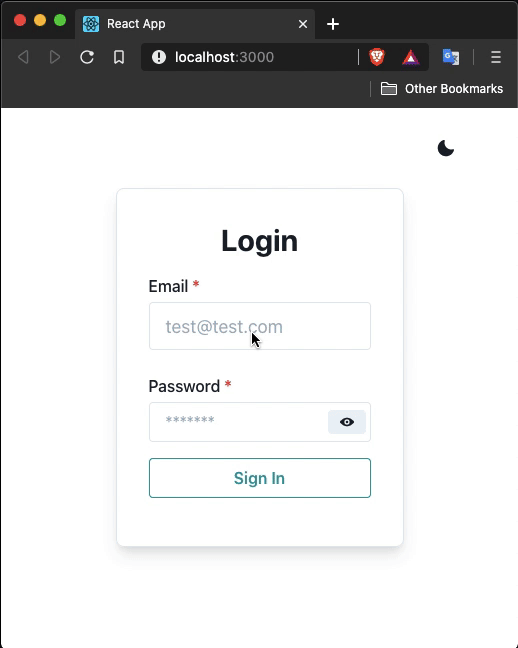
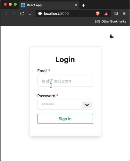
In this post, we’ll build a login form using Chakra UI. I’ve been using this UI library for a recent project and thought exploring it more might be a good idea. Here is what the final result from this demo will look like:
The Replay is a weekly newsletter for dev and engineering leaders.
Delivered once a week, it's your curated guide to the most important conversations around frontend dev, emerging AI tools, and the state of modern software.
To get started with Chakra UI, the initial step is to install the dependency for this component library as well as its peer dependencies. Open up a terminal window, create a new React project, and install these dependencies:
npx create-react-app loginform

cd loginform

yarn add @chakra-ui/[email protected] @emotion/[email protected] @emotion/[email protected] [email protected]
ThemeProviderChakra UI provides a default theme that can be leveraged to toggle between dark and light theme modes. Using the provider ColorModeProvider and useColorMode hook the styles of components switching between these theme modes can be easily handled. The default theme is also extendable.
To start, inside the App.js file import the following statement and return a ThemeProvider from the App component. Make sure to add the CSSReset component to remove all the browser’s default styling. It is recommended to do it this way according to the official documentation:
import React from 'react';
import {
 ThemeProvider,
 theme,
 ColorModeProvider,
 CSSReset
} from '@chakra-ui/core';
export default function App() {
 return (
 <ThemeProvider theme={theme}>
 <ColorModeProvider>
 <CSSReset />
 </ColorModeProvider>
 </ThemeProvider>
 );
}
The ColorModeProvider is going to allow the user to toggle between dark and light theme mode. Most of the components provided in this library are dark mode compatible. The theme object is where the application’s color palette, font stacks, type scale, breakpoints, and so on can be defined with custom values.
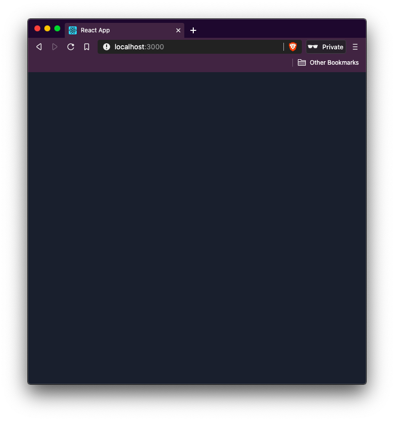
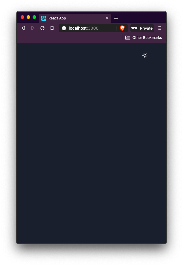
Currently, if you are going to run the development server, you are going to see the default dark mode with no text inside the browser window. To start the development server, execute the command yarn start:
👁 development server in dark mode with no words in it
In this section let us create a new component file called ThemeToggler.js inside the src/components/ directory. If the components/ directory does not exist, create it as well. Then, import the following statements:
import React from 'react';
import { useColorMode, Box, IconButton } from '@chakra-ui/core';
The useColorMode hook in the React app is used to change the color mode.
The Box component renders an equivalent of the div element from HTML. It can be used to create responsive layouts as well as use styles to pass them as props. Inside the ThemeToggler component, the Box component is used to pass on style props.
The style props in the Chakra UI component library provides many shorthand variants which do add a little bit of a learning curve (but which component library doesn’t).
To find the complete reference to style props, please refer to the official documentation here. Some of the common ones you are going to use:
m for marginmt for marginTopmr for marginRightp for paddingpt for paddingToppr for paddingRightpy for padding-left and padding-rightAll these style prop shorthands are related to spacing CSS properties.
Add the following function component inside the ThemeToggler file:
export default function ThemeToggler() {
 const { colorMode, toggleColorMode } = useColorMode();
 return (
 <Box textAlign="right" py={4} mr={12}>
 <IconButton
 icon={colorMode === 'light' ? 'moon' : 'sun'}
 onClick={toggleColorMode}
 variant="ghost"
 />
 </Box>
 );
}
The IconButton component is another convenient way to render only an icon but that has capabilities of a Button component to perform an action when clicked.
There is a default list of icons that Chakra UI comes with but you can add custom icons.
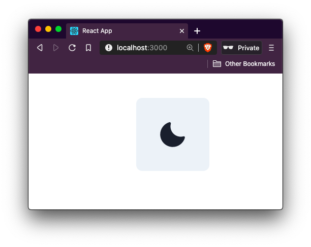
The IconButton here is going to switch between the two icons depending on the state of the current theme mode which is determined by colorMode property from useColorMode hook. The toggleColorMode property from the same hook helps the React app toggle between the two modes. The variant property on the IconButton itself removes any default styles.
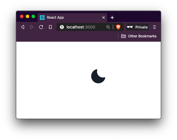
Here is an example of variant property without the value of ghost on IconButton:
The variant property with the value of ghost on IconButton:
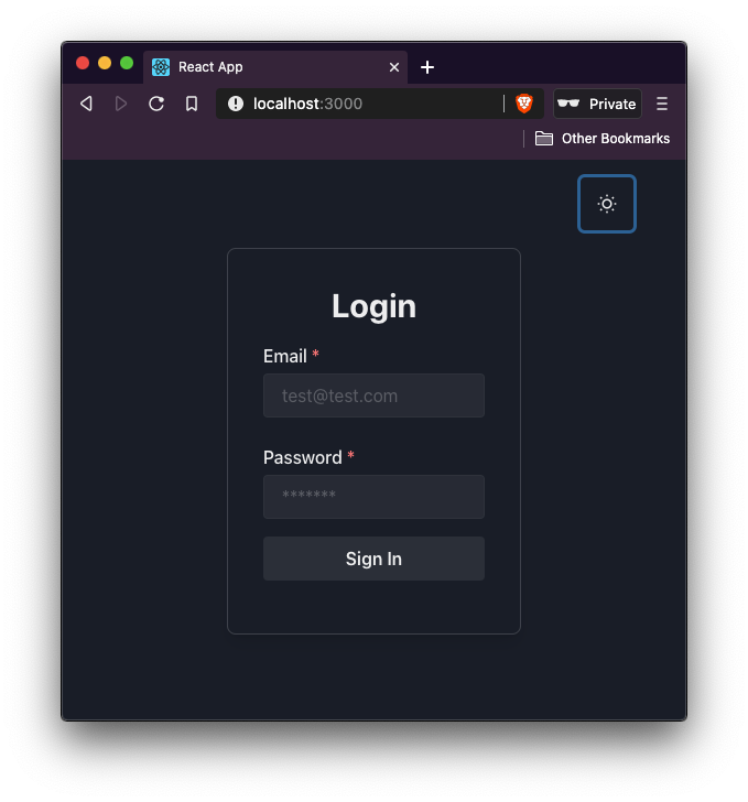
👁 moon icon in browser in light mode
To use this theme toggler, import it in the App component like this:
// rest of the import statements
import ThemeToggler from './components/ThemeToggler';
export default function App() {
 return (
 <ThemeProvider theme={theme}>
 <ColorModeProvider>
 <CSSReset />
 <ThemeToggler />
 </ColorModeProvider>
 </ThemeProvider>
 );
}
👁 imported theme toggler in browser
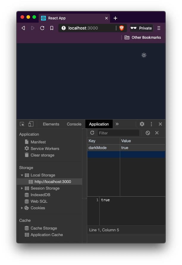
The value of the current theme is stored in the localStorage of the browser by the key to darkMode and is handled by the Chakra UI on its own:
👁 value of current theme is stored in localStorage shown in inspector panel
localStorage changes as well:In this section let’s create a new file called LoginForm.js inside src/pages/ directory. This functional component is going to help display a form for the user to log in. The form is going to contain two input fields as well as a button. Start by importing the following statements:
import React from 'react';
import {
 Flex,
 Box,
 Heading,
 FormControl,
 FormLabel,
 Input,
 Button
} from '@chakra-ui/core';
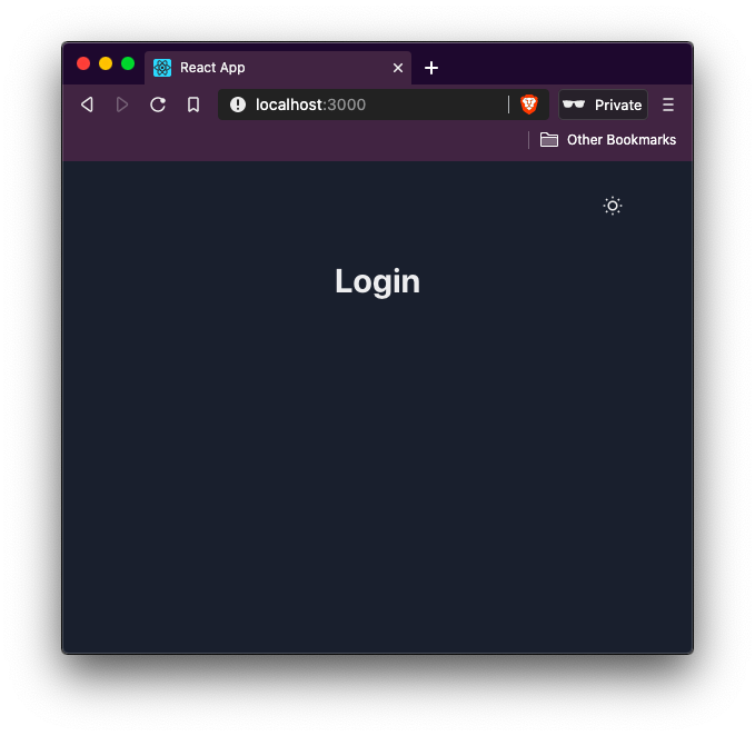
Then, define a Flex component that is going to wrap the whole form. This component is nothing but a Box component with a default styling property of display: flex already applied. This means that you can use all the flex properties such as flexDirection, alignItems, justifyContent, and so on, on the wrapper as props. Inside this wrapper, define a Heading component:
export default function LoginForm() {
 return (
 <Flex width="full" align="center" justifyContent="center">
 <Box p={2}>
 <Box textAlign="center">
 <Heading>Login</Heading>
 </Box>
 </Box>
 </Flex>
 );
}
Now, import this component inside App.js:
// ...
import LoginForm from './pages/LoginForm';
export default function App() {
 return (
 <ThemeProvider theme={theme}>
 <ColorModeProvider>
 <CSSReset />
 <ThemeToggler />
 <LoginForm />
 </ColorModeProvider>
 </ThemeProvider>
 );
}
Using the form components, let us add a login form:
export default function LoginForm() {
 return (
 <Flex width="full" align="center" justifyContent="center">
 <Box p={2}>
 <Box textAlign="center">
 <Heading>Login</Heading>
 </Box>
 <Box my={4} textAlign="left">
 <form>
 <FormControl>
 <FormLabel>Email</FormLabel>
 <Input type="email" placeholder="[email protected]" />
 </FormControl>
 <FormControl mt={6}>
 <FormLabel>Password</FormLabel>
 <Input type="password" placeholder="*******" />
 </FormControl>
 <Button width="full" mt={4} type="submit">
 Sign In
 </Button>
 </form>
 </Box>
 </Box>
 </Flex>
 );
}
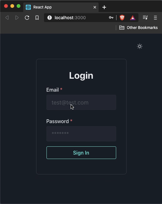
The FormControl component provides context such as isDisabled and isRequired boolean values on individual form fields. This helps when creating user authentication forms or when using form validating libraries like Formik. Let’s add an isRequired field to both input fields to show the red asterisks on FormLabel. This prop also sets the aria-required prop to true on the Input field:
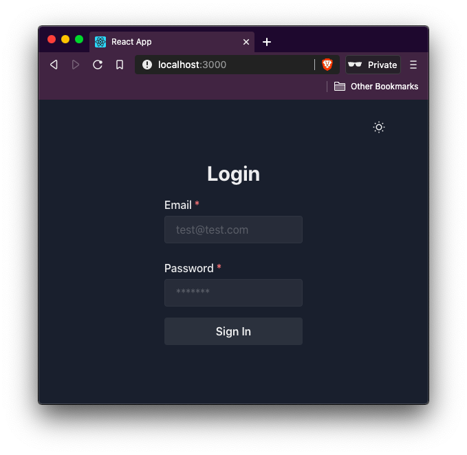
👁 The word Login and email form field and password form field and sign in button
Let’s modify the first Box component that wraps the whole form to add some border width, border radius, and box-shadow to make it appear nice:
<Box p={8} maxWidth="500px" borderWidth={1} borderRadius={8} boxShadow="lg">
👁 border wrapped around form to add some border width
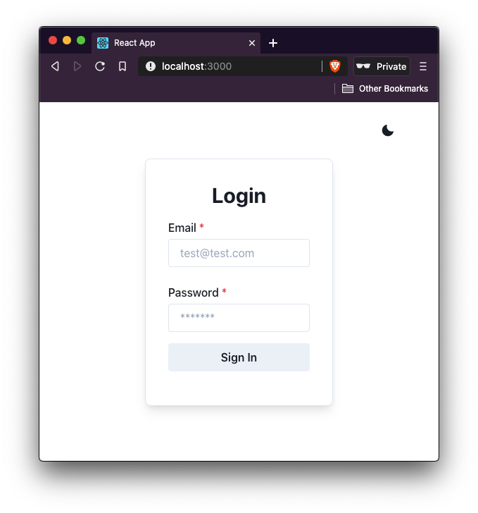
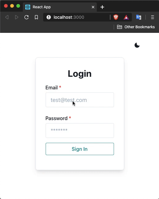
The box-shadow shorthand property makes the form interesting. See it in light mode, here:
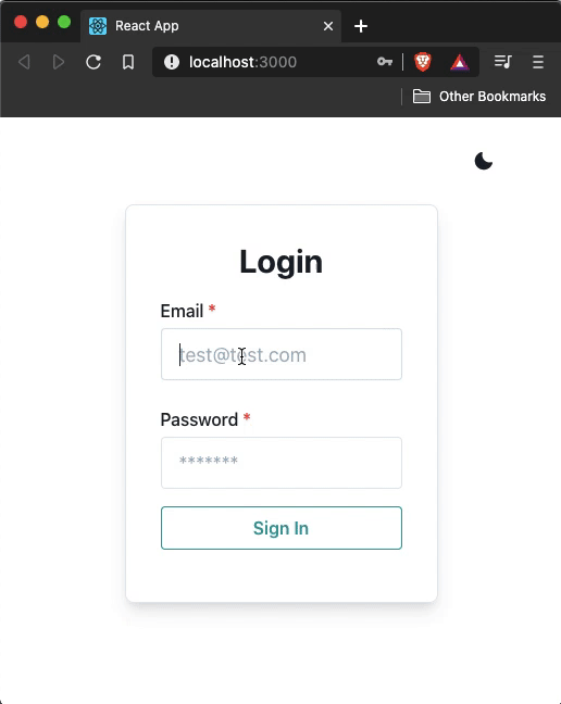
You can change the appearance of the button with variant and variantColor properties:
<Button type="submit" variantColor="teal" variant="outline" width="full" mt={4}>
 Sign In
</Button>
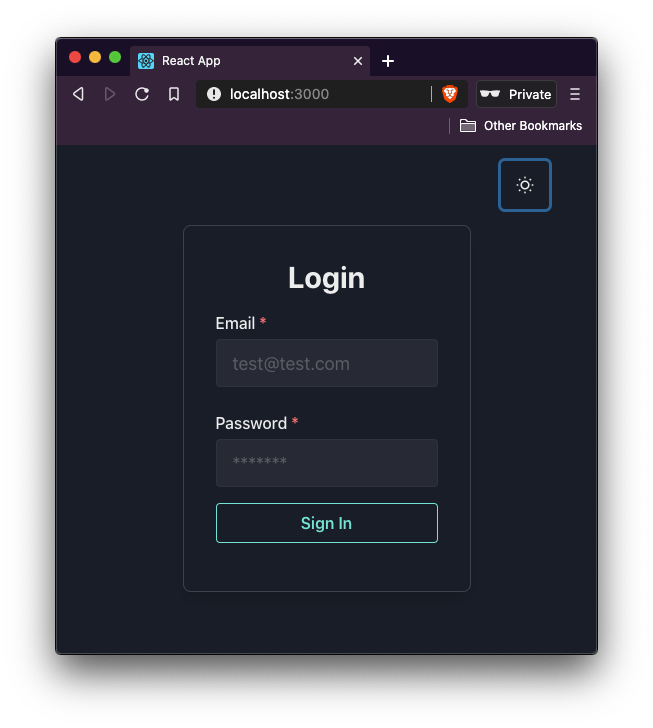
👁 Login form with a teal sign in button
Different theme color values and variant values are provided by the Chakra UI library here:
👁 Login form page in light mode
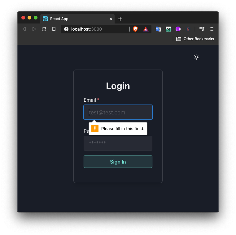
The login form right now contains only two input fields and a sign-in button. You can have a look at the src/components/Login.js file. Because of a prop called isRequired on each FormControl component that wraps each input field, the user won’t be able to log in to the React app right now:
<FormControl isRequired>
A default tooltip is shown when the sign-in button is clicked:
👁 tooltip saying "fill in field" when email field is empty
To keep track of the values for each input field lets add two state variables for email and password input field using useState hook.
The useState hook returns two values in an array. The first value is the current value of the state variable and the second value is the array of the function to update the value fo the first. This is why the second value starts with a conventional prefix fo set. Although you can name it anything but this prefix, a common convention in the world of React. The hook also takes a single argument that represents the initial state:
// make sure to import the useState hook
import React, { useState } from 'react';
// ...
export default function Login() {
 const [email, setEmail] = useState('');
 const [password, setPassword] = useState('');
 const handleSubmit = event => {
 event.preventDefault();
 alert(`Email: ${email} & Password: ${password}`);
 };
 // ...
}
Also, define a handleSubmit method that ideally makes the API call to see if the user’s credentials match the one in the database. For brevity, let’s just show them in an alert box in a browser window for now. Later, there is going to be a mock/fake API call to simulate the user’s login attempt.
Now, modify the form. On for element, add the onSubmit attribute with the value of handleSubmit method. On each Input field, add an onChang prop that captures the user’s input using event.currentTarget.value:
<form onSubmit={handleSubmit}>
 <FormControl isRequired>
 <FormLabel>Email</FormLabel>
 <Input
 type="email"
 placeholder="[email protected]"
 size="lg"
 onChange={event => setEmail(event.currentTarget.value)}
 />
 </FormControl>
 <FormControl isRequired mt={6}>
 <FormLabel>Password</FormLabel>
 <Input
 type="password"
 placeholder="*******"
 size="lg"
 onChange={event => setPassword(event.currentTarget.value)}
 />
 </FormControl>
 <Button
 variantColor="teal"
 variant="outline"
 type="submit"
 width="full"
 mt={4}
 >
 Sign In
 </Button>
</form>
Now go back to the browser window and try to enter values in the form fields, and then click the sign-in button:
In this post, let’s simulate a sign in call when the user enters valid credentials using an asynchronous function. The validity of these credential values is going to be hardcoded. Create a new file called mockApi.js inside src/utils/ directory.
The function userLogin is going to return a promise. If the entered values in the form match the hardcoded values, the promise will resolve, otherwise, it will fail. The setTimeout function is going to simulate the API call for three seconds:
export const userLogin = async ({ email, password }) => {
 return new Promise((resolve, reject) => {
 setTimeout(() => {
 if (email === '[email protected]' && password === 'password') {
 resolve();
 } else {
 reject();
 }
 }, 3000);
 });
};
When the user credentials are not valid (that is, do not match the hardcoded values in the current demo), there is going to be an error shown above the input fields. In this section, let’s create a reusable ErrorMessage component.
Create a new file called ErrorMessage.js inside the src/components/ directory. This component is going to make use of Alert and its peer components from the @chakra-ui/core library. It is also going to have one prop value of message to display the error message. The value of this prop is passed from the Login component:
import React from 'react';
import { Box, Alert, AlertIcon, AlertDescription } from '@chakra-ui/core';
export default function ErrorMessage({ message }) {
 return (
 <Box my={4}>
 <Alert status="error" borderRadius={4}>
 <AlertIcon />
 <AlertDescription>{message}</AlertDescription>
 </Alert>
 </Box>
 );
}
Open pages/Login.js component and start by importing a mock API call utility method and the error message component:
// ...after other import statements
import { userLogin } from '../utils/mockApi';
import ErrorMessage from '../components/ErrorMessage';
Next, add two state variables to keep track of when the form is in the loading state (that is when the API call is being simulated) and the error message itself.
The default value for the loading state variable is going to be false. When this value is true, let’s show a loading indicator inside the form component. Thus, also import the CircularProgress component from the Chakra UI library:
import {
 Flex,
 Box,
 Heading,
 FormControl,
 FormLabel,
 Input,
 Button,
 CircularProgress
} from '@chakra-ui/core';
export default function Login() {
 const [email, setEmail] = useState('');
 const [password, setPassword] = useState('');
 const [error, setError] = useState('');
 const [isLoading, setIsLoading] = useState(false);
 const handleSubmit = async event => {
 event.preventDefault();
 setIsLoading(true);
 try {
 await userLogin({ email, password });
 setIsLoading(false);
 } catch (error) {
 setError('Invalid username or password');
 setIsLoading(false);
 setEmail('');
 setPassword('');
 }
 };
}
The API call simulation part is going to be done inside the handleSubmit method. The loading state is set to true as soon as the form is submitted. Next, using try-catch syntax the mock API call can be handled. When the user enters credential values that match the hardcoded values, then the promise is going to resolve. When the promise resolves, the value of isLoading should update to false.
In the catch block, the value of error is set to a hardcoded message. Also, the form is reset by updating the value of isLoading back to false and email and password to empty strings. In the UI part, first, add a conditional to display the error message just below the form element:
<form onSubmit={handleSubmit}>
 {error && <ErrorMessage message={error} />}
 {/* Previous JSX code */}
</form>
Then, update the contents of the Button component to show the loading indicator when the API call is made:
<Button variantColor="teal" variant="outline" type="submit" width="full" mt={4}>
 {isLoading ? (
 <CircularProgress isIndeterminate size="24px" color="teal" />
 ) : (
 'Sign In'
 )}
</Button>
To see the error message displayed, enter random values for each input field:
👁 random values being entered into the form fields
In this section, let us keep track of the user’s logged-in state. When a user successfully logs in, a success message as well as a logout button will be displayed.
Start by importing the Text component from the Chakra UI library. Then define a state variable called isLoggedIn to keep track of a user’s logged-in state. Update its value to true when the API call finishes simulating inside the handleSubmit method:
import {
 // ...
 Text
} from '@chakra-ui/core';
// ...
export default function Login() {
 //...
 const [isLoggedIn, setIsLoggedIn] = useState(false);
 const handleSubmit = async event => {
 event.preventDefault();
 setIsLoading(true);
 try {
 await userLogin({ email, password });
 setIsLoggedIn(true);
 setIsLoading(false);
 } catch (error) {
 setError('Invalid username or password');
 setIsLoading(false);
 setEmail('');
 setPassword('');
 }
 };
 // ...
}
Update the form’s JSX as well:
export default function Login() {
 //...
 return (
 <Flex width="full" align="center" justifyContent="center">
 <Box
 p={8}
 maxWidth="500px"
 borderWidth={1}
 borderRadius={8}
 boxShadow="lg"
 >
 {isLoggedIn ? (
 <Box textAlign="center">
 <Text>{email} logged in!</Text>
 <Button
 variantColor="orange"
 variant="outline"
 width="full"
 mt={4}
 onClick={() => setIsLoggedIn(false)}
 >
 Sign out
 </Button>
 </Box>
 ) : (
 <>
 <Box textAlign="center">
 <Heading>Login</Heading>
 </Box>
 <Box my={4} textAlign="left">
 <form onSubmit={handleSubmit}>
 {error && <ErrorMessage message={error} />}
 <FormControl isRequired>
 <FormLabel>Email</FormLabel>
 <Input
 type="email"
 placeholder="[email protected]"
 size="lg"
 onChange={event => setEmail(event.currentTarget.value)}
 />
 </FormControl>
 <FormControl isRequired mt={6}>
 <FormLabel>Password</FormLabel>
 <Input
 type="password"
 placeholder="*******"
 size="lg"
 onChange={event => setPassword(event.currentTarget.value)}
 />
 </FormControl>
 <Button
 variantColor="teal"
 variant="outline"
 type="submit"
 width="full"
 mt={4}
 >
 {isLoading ? (
 <CircularProgress
 isIndeterminate
 size="24px"
 color="teal"
 />
 ) : (
 'Sign In'
 )}
 </Button>
 </form>
 </Box>
 </>
 )}
 </Box>
 </Flex>
 );
}
Chakra UI provides an InputGroup component that can be used to group different components related to a single input field. To add show/hide password functionality, let’s use this component to group the input field component for a password. This group is going to have the input field, a right button element that is going to show the icon indicating whether the password is currently shown or hidden.
Import the following components from Chakra UI:
import {
 // ...
 InputGroup,
 InputRightElement,
 Icon
} from '@chakra-ui/core';
To track the boolean state of whether the password is currently hidden or not, let’s add a state variable showPassword and the method to update its value setShowPassword with an initial value of false to the useState hook.
Then, add a method to toggle between the show and hide modes for the password input field:
export default function Login() {
 // ...
 const [showPassword, setShowPassword] = useState(false);
 const handlePasswordVisibility = () => setShowPassword(!showPassword);
 // ...
}
The Icon value is going to be the value of the Button component when toggling between the state of the password field’s visibility. Also, change the type attribute of the Input component based on the value of showPassword.
Replace the form field for password with JSX below:
<FormControl isRequired mt={6}>
 <FormLabel>Password</FormLabel>
 <InputGroup>
 <Input
 type={showPassword ? 'text' : 'password'}
 placeholder="*******"
 size="lg"
 onChange={event => setPassword(event.currentTarget.value)}
 />
 <InputRightElement width="3rem">
 <Button h="1.5rem" size="sm" onClick={handlePasswordVisibility}>
 {showPassword ? <Icon name="view-off" /> : <Icon name="view" />}
 </Button>
 </InputRightElement>
 </InputGroup>
</FormControl>
Also, update the handleSubmit method by manually updating the value of the password field’s visibility to false so that when a user logs out, the form is in its reset state:
const handleSubmit = async event => {
 event.preventDefault();
 setIsLoading(true);
 try {
 await userLogin({ email, password });
 setIsLoggedIn(true);
 setIsLoading(false);
 setShowPassword(false);
 } catch (error) {
 setError('Invalid username or password');
 setIsLoading(false);
 setEmail('');
 setPassword('');
 setShowPassword(false);
 }
};
Here is the output you are going to get in the browser window:
👁 login form in light mode with email input field and password field
Any component library has its advantage when it comes to the development of a React app by leveraging the built-in UI components. But what I like about the Chakra UI library is that it provides a design system that is highly customizable and includes style utilities to create your own design systems, the ability to switch between themes, and Flexbox.
The source code for this project is available at GitHub.
Install LogRocket via npm or script tag. LogRocket.init() must be called client-side, not
server-side
$ npm i --save logrocket

// Code:

import LogRocket from 'logrocket';
LogRocket.init('app/id');
// Add to your HTML:

<script src="https://cdn.lr-ingest.com/LogRocket.min.js"></script>
<script>window.LogRocket && window.LogRocket.init('app/id');</script>
Learn how next-browser gives AI agents runtime context for debugging Next.js apps, including React props, hydration, PPR, forms, and performance.
Build dynamic LLM routing in Next.js with OpenRouter, TanStack AI, task classification, model fallbacks, and cost-aware routing.
TSRX adds first-class control flow, conditional hooks, and scoped styles to React via a TypeScript compiler extension — no new framework required.
Learn how to build a full React Native auth system using Better Auth and Expo — with email/password login, Google OAuth, session persistence, and protected routes.
Would you be interested in joining LogRocket's developer community?
Join LogRocket’s Content Advisory Board. You’ll help inform the type of content we create and get access to exclusive meetups, social accreditation, and swag.
Sign up now