 |
VOOZH | about |
|
VOOZH | about |
In the ever-evolving landscape of web development, drag-and-drop functionality has become a cornerstone for creating intuitive and interactive user interfaces. From file uploads to organizing content in Kanban Board, drag-and-drop functionality enhance the user experience by offering a seamless way to move elements on a webpage.
👁 ImageThis guide provides a comprehensive overview of the Pragmatic drag and drop library, exploring its key features, advantages, and various use cases. Additionally, we will build a Kanban Board application from scratch to understand how different pieces of the library work together without relying on Atlassian UI components. Throughout this blog, you’ll learn how to make elements draggable, define drop targets, handle drag-and-drop events, and create custom drop indicators for a better user experience.
The Replay is a weekly newsletter for dev and engineering leaders.
Delivered once a week, it's your curated guide to the most important conversations around frontend dev, emerging AI tools, and the state of modern software.
Pragmatic drag and drop is a performance-focused library that leverages the native HTML Drag and Drop API to create seamless drag-and-drop experiences across any tech stack. With its robust set of functionalities, it offers developers the flexibility to craft fast and beautiful drag-and-drop experiences for their web applications.
Before diving into implementation details, let’s explore the key features and advantages that make Pragmatic drag and drop a good choice for developers.
Here are some of the key features and advantages of the Pragmatic drag and drop library:
The Pragmatic drag and drop library is versatile and can be used in many applications. Here are some primary use cases:
Here’s a comparison of the key features of different drag-and-drop libraries:
| Feature/Library | Pragmatic drag and drop (core) | React Beautiful DnD | React DnD (+react-dnd-html5-backend) |
DnD kit (+@dnd-kit/modifiers+@dnd-kit/sortable) |
|---|---|---|---|---|
| Size (gzip) | ~4.7kB | ~31 KB | ~24.8 kB | ~26.9 kB |
| Framework compatibility | Any | React only | React only | React only |
| Incremental | ✅ | ❌ | ❌ | ✅ |
| File drop support | ✅ | ❌ | ✅ | ❌ |
| Handles URL, text, image dragging | ✅ | ❌ | ✅ | ❌ |
| Lazy loading | ✅ | ❌ | ❌ | ❌ |
| Cross-browser window dragging | ✅ | ❌ | ❌ | ❌ |
| Accessible | ❌ (accessible with provided toolchain) | ✅ | ❌ | ✅ |
You can find the full list of feature comparisons here.
In this section, we’ll explore the core concepts of the library and understand how its components work together by building a Kanban board. Let’s get started!
To get started quickly, I have created a starter code repository that contains all the necessary code. To clone the starter code, open up a terminal and run the following command:
git clone [email protected]:rishipurwar1/pragmatic-drag-and-drop-demo.git
Once you have cloned the starter code repository, you will find all the components inside the src/components folder and dummy data for this project in the src/constant.js.
Now, let’s install the dependencies by running the following commands:
cd pragmatic-drag-and-drop-demo
npm install
To use the Pragmatic drag and drop library in your project, install the pragmatic-drag-and-drop package along with the tiny-invariant and @atlaskit/pragmatic-drag-and-drop-hitbox library by running the following:
npm i @atlaskit/pragmatic-drag-and-drop @atlaskit/pragmatic-drag-and-drop-hitbox tiny-invariant
This installs the below:
@atlaskit/pragmatic-drag-and-drop: The core Pragmatic drag and drop library@atlaskit/pragmatic-drag-and-drop-hitbox: An optional package that allows attaching interaction information to a drop targettiny-invariant: A lightweight library that helps identify potential errors in your code during developmentWith these steps, you have successfully set up your project and installed the necessary packages.
Now, start the application by running:
npm start
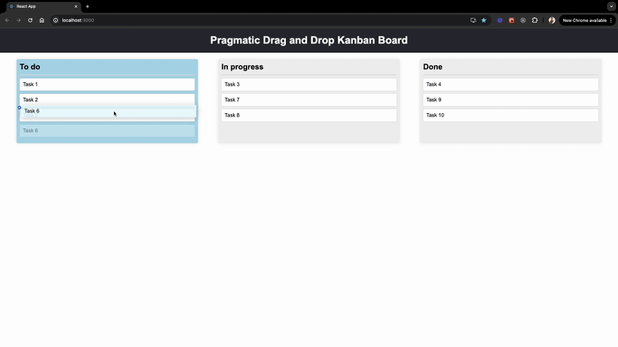
You can access the application by navigating to http://localhost:3000 in your web browser:
At this point, you’ll observe that none of the cards are draggable. In the next section, we’ll learn how to make them draggable.
To make an element draggable, we can use the [draggable](https://atlassian.design/components/pragmatic-drag-and-drop/core-package/adapters/element/about#draggable) function provided by the library. First, import the draggable function from the @atlaskit/pragmatic-drag-and-drop/element/adapter package and other necessary React hooks in your Card.js file:
// Card.js
import { useEffect, useRef } from "react";
import invariant from "tiny-invariant";
import { draggable } from "@atlaskit/pragmatic-drag-and-drop/element/adapter";
Now, in our Card component, create a reference for the card element using useRef. Then, within a useEffect hook, implement the invariant function to ensure the card element exists before making it draggable. Finally, call the draggable function and provide an object argument with the following key-value pairs:
element — Reference to the card elementgetInitialData — Function to attach card data to the draggable item when dragging startsThis will make the card element draggable:
// Card.js
const Card = ({ children, ...card }) => {
 const cardRef = useRef(null); // Create a ref for the card

 useEffect(() => {
 const cardEl = cardRef.current;
 invariant(cardEl); // Ensure the card element exists

 return draggable({
 element: cardEl, // Attach the card element to draggable
 getInitialData: () => ({ type: "card", cardId: card.id }), // Attach card data to a draggable item when dragging starts
 });
 }, []);
 return (
 // attach a cardRef to the card div
 <div className="card" ref={cardRef}>
 {children}
 </div>
 );
};
The draggable function returns a cleanup function to remove its behavior when the component unmounts. This is why we return it from the useEffect hook. With these changes, our Card component is now draggable:
In the next section, we’ll take this a step further by adding a fading effect to the draggable cards.
To add a fading effect while dragging, we need to change the opacity of the Card element when the drag starts and reapply the original style when the drag ends. We’ll use the draggable function’s event handlers for this purpose.
Let’s start by creating an isDragging state variable to track the dragging state. Then, update the draggable call within the useEffect hook to add onDragStart and onDrop event handlers. Finally, apply the dragging class to the card div based on the value of isDragging, like this:
import { useEffect, useRef, useState } from "react"; // import useState
// rest of the imports

const Card = ({ children, ...card }) => {
 const cardRef = useRef(null);
 const [isDragging, setIsDragging] = useState(false); // create a state for dragging

 useEffect(() => {
 const cardEl = cardRef.current;
 invariant(cardEl);

 return draggable({
 element: cardEl,
 getInitialData: () => ({ type: "card", cardId: card.id }),
 onDragStart: () => setIsDragging(true), // set isDragging to true when dragging starts
 onDrop: () => setIsDragging(false), // set isDragging to false when dragging ends
 });
 }, []);
 return (
 // Add dragging class when isDragging is true
 <div className={`card ${isDragging ? "dragging" : ""}`} ref={cardRef}>
 {children}
 </div>
 );
};
When you start dragging a card, the onDragStart event triggers. This event sets a state variable called isDragging to true. This change in state does two things:
dragging class to the cardOnce you drop the card, the onDrop event fires. This event reverts the isDragging state back to false. The result is as follows:
dragging class is removed from the cardThe styles for the dragging class are defined in the App.css file.
To create drop targets for the cards, we first need to set up drop targets where the cards can be dropped. For that purpose, pragmatic-drag-and-drop library provides the dropTargetForElements function to make an element a drop target.
In our case, we need to make both the cards and columns droppable elements because we want to support reordering within the same column and moving cards between different columns.
Making the cards drop targets
Let’s start by making the card a drop target. First, import the dropTargetForElements function in the Card component, and attach it to the card element to set it up as a drop target:
// rest of the imports
import {
 draggable,
 dropTargetForElements, // NEW
} from "@atlaskit/pragmatic-drag-and-drop/element/adapter";
import { combine } from "@atlaskit/pragmatic-drag-and-drop/combine"; // NEW
import { attachClosestEdge } from "@atlaskit/pragmatic-drag-and-drop-hitbox/closest-edge"; // NEW

const Card = ({ children, ...card }) => {
 const cardRef = useRef(null);
 const [isDragging, setIsDragging] = useState(false);

 useEffect(() => {
 const cardEl = cardRef.current;
 invariant(cardEl);

 // Combine draggable and dropTargetForElements cleanup functions
 // to return a single cleanup function
 return combine(
 draggable({
 element: cardEl,
 getInitialData: () => ({ type: "card", cardId: card.id }),
 onDragStart: () => setIsDragging(true),
 onDrop: () => setIsDragging(false),
 }),
 // Add dropTargetForElements to make the card a drop target
 dropTargetForElements({
 element: cardEl,
 getData: ({ input, element }) => {
 // To attach card data to a drop target
 const data = { type: "card", cardId: card.id };

 // Attaches the closest edge (top or bottom) to the data object
 // This data will be used to determine where to drop card relative
 // to the target card.
 return attachClosestEdge(data, {
 input,
 element,
 allowedEdges: ["top", "bottom"],
 });
 },
 getIsSticky: () => true, // To make a drop target "sticky"
 onDragEnter: (args) => {
 if (args.source.data.cardId !== card.id) {
 console.log("onDragEnter", args);
 }
 },
 })
 );
 // Update the dependency array
 }, [card.id]);
 return (
 <div className={`card ${isDragging ? "dragging" : ""}`} ref={cardRef}>
 {children}
 </div>
 );
};
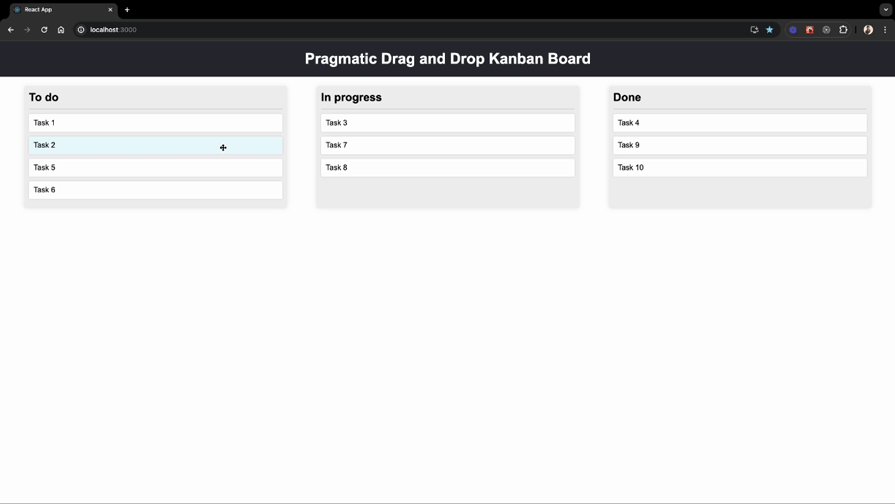
We’ve made some changes to our code to turn the card into a drop target. Let me walk you through each step.
First, we used the dropTargetForElements function to make the card a drop target by attaching the card element’s ref. We also included the getData function to attach the card and closest edge data to the drop target, which we’ll use to determine which card a draggable item is dropped onto.
Next, we added getIsSticky to make the drop target sticky, which is helpful for keeping a selection active while moving between drop targets.
Additionally, we attached the onDragEnter event to detect when a draggable item enters the drop target area.
To manage cleanup efficiently, we combined the cleanup functions of draggable and dropTargetForElements using the combine function provided by the library.
To test these changes, simply drag one card over another. You’ll see detailed logs in your console, including information about the dragged item’s data and the drop target. Here’s how it looks:
// This log has draggable and drop target data
// that we attached using the getData and getInitialData
// function along with additional information.
{
 source: {...},
 location: {...},
 self: {...}
}
Making the columns drop targets
Now, let’s make all the columns drop targets using the same approach we used for the cards.
In the Column component, create a ref for the column using useRef. Then, within a useEffect hook, use the invariant function to ensure the column element exists before making it a drop target. Finally, call the dropTargetForElements function like this:
import { useEffect, useRef, useState } from "react"; // NEW
import invariant from "tiny-invariant"; // NEW
import { dropTargetForElements } from "@atlaskit/pragmatic-drag-and-drop/element/adapter"; // NEW

import Card from "./Card";

const Column = ({ columnId, title, cards }) => {
 const columnRef = useRef(null); // Create a ref for the column
 const [isDraggedOver, setIsDraggedOver] = useState(false);

 useEffect(() => {
 const columnEl = columnRef.current;
 invariant(columnEl); // Ensure the column element exists

 // Set up the drop target for the column element
 return dropTargetForElements({
 element: columnEl,
 onDragStart: () => setIsDraggedOver(true),
 onDragEnter: () => setIsDraggedOver(true),
 onDragLeave: () => setIsDraggedOver(false),
 onDrop: () => setIsDraggedOver(false),
 getData: () => ({ columnId }),
 getIsSticky: () => true,
 });
 }, [columnId]);
 return (
 <div
 className={`column ${isDraggedOver ? "dragged-over" : ""}`}
 ref={columnRef} // attach a columnRef to the column div
 >
 <h2>{title}</h2>
 {cards.map((card) => (
 <Card key={card.id} {...card}>
 {card.content}
 </Card>
 ))}
 </div>
 );
};
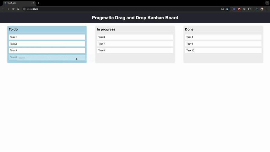
We’ve modified our code to make the columns a drop target. Let me guide you through each step.
First, we created a columnRef using the useRef hook to keep a reference to the column DOM element.
Next, we used the dropTargetForElements function to make the column a drop target by attaching the column element’s ref. We also added the getData function to attach column data to the drop target, which we’ll use to determine which column a draggable item is dropped into.
Additionally, we attached the onDragEnter, onDragStart, onDragLeave, and onDrop events to detect when a draggable item enters, leaves, or is dropped onto the drop target area. These events also update the isDraggedOver state accordingly.
Finally, we added the dragged-over class when isDraggedOver is true, allowing us to style the column accordingly.
To test these changes, try moving a card to a different column, and observe the background color change of the column:
To move cards within and across columns, we can use the monitorForElements function provided by the library. This function monitors drag-and-drop events like onDrop and allows us to define custom drag-and-drop logic for moving cards.
Before we get into the details of drag-and-drop implementation, let’s break down the key scenarios we’ll handle. This will give us a clearer understanding of how the functionality will work.
The drag-and-drop feature allows us to move cards in two primary ways:
Now, let’s further break it down based on a number of drop targets.
In summary, we need to handle four scenarios:
Now that we have a clear understanding of all the scenarios, let’s dive into the implementation!
Now, open the Board.js file and call the monitorForElements function inside the useEffect hook to listen for a drop event:
import { useEffect, useState, useCallback } from "react";
import { monitorForElements } from "@atlaskit/pragmatic-drag-and-drop/element/adapter";

const Board = () => {
 const [columnsData, setColumnsData] = useState(BOARD_COLUMNS);

 // Function to handle drop events
 const handleDrop = useCallback(({ source, location }) => {
 // Logic to handle the drop event will be added here
 console.log("handleDrop", source, location, columnsData);
 }, [columnsData]);

 // setup the monitor
 useEffect(() => {
 return monitorForElements({
 onDrop: handleDrop,
 });
 }, [handleDrop]);
 return (
 <div className="board">
 {Object.keys(columnsData).map((columnId) => (
 <Column key={columnId} {...columnsData[columnId]} />
 ))}
 </div>
 );
};
Now, when you move a card, you’ll see a console log with all the details about the dragged element and the drop target. The value of location.current.dropTargets.length in the log indicates the number of available drop targets.
Now that we have set up the monitorForElements function to listen for drop events, let’s implement the logic to handle the onDrop event.
First, update the handleDrop function to handle the drop target cases that we discussed in the previous section:
const handleDrop = useCallback(({ source, location }) => {
 // Early return if there are no drop targets in the current location
 const destination = location.current.dropTargets.length;
 if (!destination) {
 return;
 }
 // Check if the source of the drag is a card to handle card-specific logic
 if (source.data.type === "card") {
 // Retrieve the ID of the card being dragged
 const draggedCardId = source.data.cardId;

 // Get the source column from the initial drop targets
 const [, sourceColumnRecord] = location.initial.dropTargets;

 // Retrieve the ID of the source column
 const sourceColumnId = sourceColumnRecord.data.columnId;

 // Get the data of the source column
 const sourceColumnData = columnsData[sourceColumnId];

 // Get the index of the card being dragged in the source column
 const draggedCardIndex = sourceColumnData.cards.findIndex(
 (card) => card.id === draggedCardId
 );

 if (location.current.dropTargets.length === 1) {
 console.log(
 "dropTargets1",
 location.current.dropTargets,
 location.current.dropTargets.length
 );
 }

 if (location.current.dropTargets.length === 2) {
 console.log(
 "dropTargets2",
 location.current.dropTargets,
 location.current.dropTargets.length
 );
 }
 }
},[columnsData]);
Now, let’s handle all the cases one by one.
Case 1: Reordering within a column by dropping in an empty space — drop target: 1
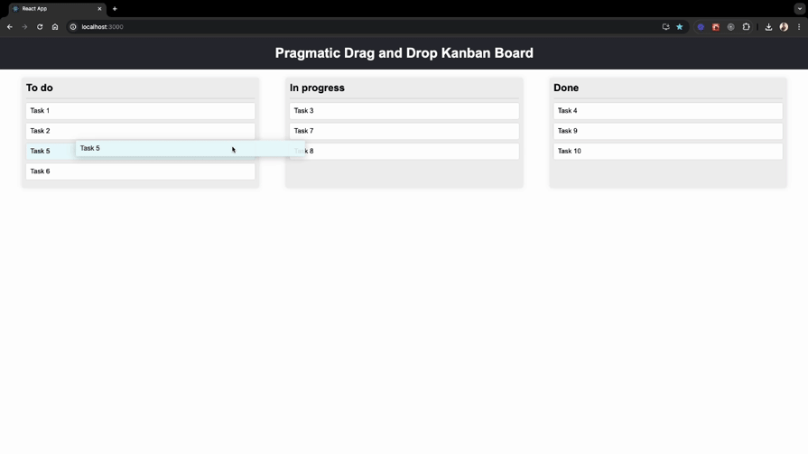
To handle this case, we need to determine the new position of the card within the same column, and for that, we can use the getReorderDestinationIndex function provided by the library to get the new index of the dragged card. Then we can use the reorder function to reorder the cards.
Here’s how you can implement this:
// rest of the imports
import { getReorderDestinationIndex } from "@atlaskit/pragmatic-drag-and-drop-hitbox/util/get-reorder-destination-index"; //NEW

// rest of the code
if (location.current.dropTargets.length === 1) {
 // Get the destination column from the current drop targets
 const [destinationColumnRecord] = location.current.dropTargets;

 // Retrieve the ID of the destination column
 const destinationColumnId = destinationColumnRecord.data.columnId;

 // check if the source and destination columns are the same
 if (sourceColumnId === destinationColumnId) {
 // Calculate the destination index for the dragged card within the same column
 const destinationIndex = getReorderDestinationIndex({
 startIndex: draggedCardIndex,
 indexOfTarget: sourceColumnData.cards.length - 1,
 closestEdgeOfTarget: null,
 axis: "vertical",
 });

 // will implement this function
 reorderCard({
 columnId: sourceColumnData.columnId,
 startIndex: draggedCardIndex,
 finishIndex: destinationIndex,
 });
 return;
 }
}
Then define the reorderCard function just above the handleDrop function like this:
// rest of the import
import { reorder } from "@atlaskit/pragmatic-drag-and-drop/reorder"; // NEW

const Board = () => {
 const [columnsData, setColumnsData] = useState(BOARD_COLUMNS);

 const reorderCard = useCallback(
 ({ columnId, startIndex, finishIndex }) => {
 // Get the source column data
 const sourceColumnData = columnsData[columnId];

 // Call the reorder function to get a new array
 // of cards with the moved card's new position
 const updatedItems = reorder({
 list: sourceColumnData.cards,
 startIndex,
 finishIndex,
 });

 // Create a new object for the source column
 // with the updated list of cards
 const updatedSourceColumn = {
 ...sourceColumnData,
 cards: updatedItems,
 };

 // Update columns state
 setColumnsData({
 ...columnsData,
 [columnId]: updatedSourceColumn,
 });
 },
 [columnsData]
 );

 const handleDrop = useCallback(
 ({ source, location }) => {
 // rest of the code
 },
 // update the dependency array to include reorderCard
 [columnsData, reorderCard]
 );

 /*...rest of the code...*/
};
Now, we can reorder the cards within the same column by dropping them into an empty space:
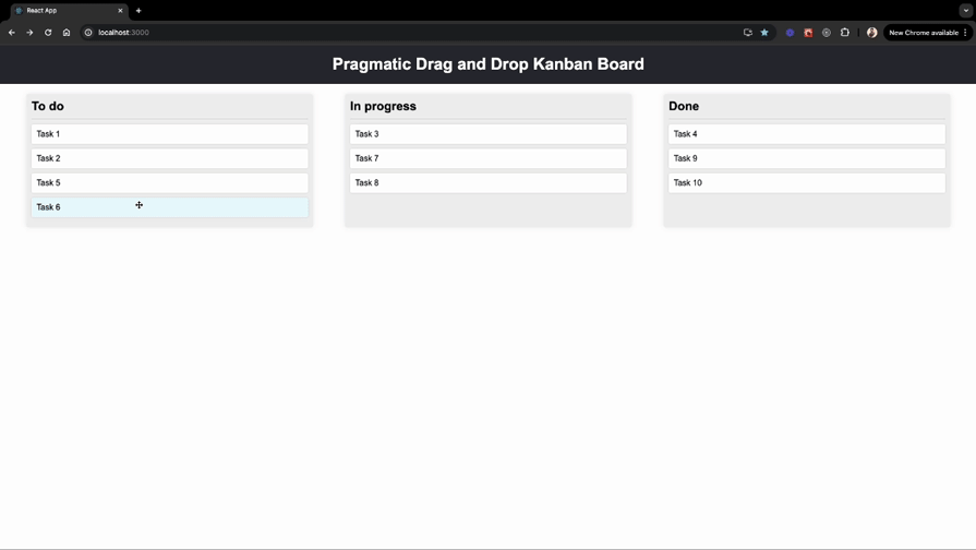
Case 2: Moving between columns by dropping into an empty column or space — drop target: 1
To handle this case, we first need to remove the dragged card from the source column and then insert it into the destination column. First, let’s define the moveCard function inside our Board component like this:
const moveCard = useCallback(
 ({
 movedCardIndexInSourceColumn,
 sourceColumnId,
 destinationColumnId,
 movedCardIndexInDestinationColumn,
 }) => {
 // Get data of the source column
 const sourceColumnData = columnsData[sourceColumnId];

 // Get data of the destination column
 const destinationColumnData = columnsData[destinationColumnId];

 // Identify the card to move
 const cardToMove = sourceColumnData.cards[movedCardIndexInSourceColumn];

 // Remove the moved card from the source column
 const newSourceColumnData = {
 ...sourceColumnData,
 cards: sourceColumnData.cards.filter(
 (card) => card.id !== cardToMove.id
 ),
 };

 // Create a copy of the destination column's cards array
 const newDestinationCards = Array.from(destinationColumnData.cards);

 // Determine the new index in the destination column
 const newIndexInDestination = movedCardIndexInDestinationColumn ?? 0;

 // Insert the moved card into the new index in the destination column
 newDestinationCards.splice(newIndexInDestination, 0, cardToMove);

 // Create new destination column data with the moved card
 const newFinishColumnData = {
 ...destinationColumnData,
 cards: newDestinationCards,
 };

 // Update the state with the new columns data
 setColumnsData({
 ...columnsData,
 [sourceColumnId]: newSourceColumnData,
 [destinationColumnId]: newFinishColumnData,
 });
 },
 [columnsData]
);
Then call it when the source and destination columns are different:
const handleDrop = useCallback(
 ({ source, location }) => {
 // rest of the code
 if (location.current.dropTargets.length === 1) {
 // check if the source and destination columns are the same
 if (sourceColumnId === destinationColumnId) {
 // rest of the code
 }

 // When columns are different, move the card to the new column
 moveCard({
 movedCardIndexInSourceColumn: draggedCardIndex,
 sourceColumnId,
 destinationColumnId,
 });
 return;
 }
 // rest of the code
 }
 // update the dependency array to include moveCard
 [columnsData, moveCard, reorderCard]
 );
Now, you’ll be able to move cards into empty columns:
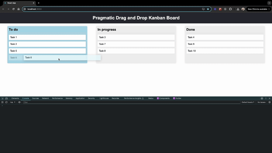
Case 3: Reordering within a column by dropping onto another card — drop target: 2
To handle this case, we need to determine the new position of the card within the same column relative to the target card, and for that, we can again use the getReorderDestinationIndex function. However, this time we’ll pass the closestEdgeOfTarget data that we attached in the “Making the cards drop targets” section to know what the closest edge is when dragging over a drop target. Then, we can use the reorderCard function to reorder the cards.
Here’s how you can implement this:
import { extractClosestEdge } from "@atlaskit/pragmatic-drag-and-drop-hitbox/closest-edge"; // NEW

const handleDrop = useCallback(
 ({ source, location }) => {
 // rest of the code

 if (source.data.type === "card") {
 // rest of the code

 // Check if the current location has exactly two drop targets
 if (location.current.dropTargets.length === 2) {
 // Destructure and extract the destination card and column data from the drop targets
 const [destinationCardRecord, destinationColumnRecord] =
 location.current.dropTargets;

 // Extract the destination column ID from the destination column data
 const destinationColumnId = destinationColumnRecord.data.columnId;

 // Retrieve the destination column data using the destination column ID
 const destinationColumn = columnsData[destinationColumnId];

 // Find the index of the target card within the destination column's cards
 const indexOfTarget = destinationColumn.cards.findIndex(
 (card) => card.id === destinationCardRecord.data.cardId
 );

 // Determine the closest edge of the target card: top or bottom
 const closestEdgeOfTarget = extractClosestEdge(
 destinationCardRecord.data
 );

 // Check if the source and destination columns are the same
 if (sourceColumnId === destinationColumnId) {
 // Calculate the destination index for the card to be reordered within the same column
 const destinationIndex = getReorderDestinationIndex({
 startIndex: draggedCardIndex,
 indexOfTarget,
 closestEdgeOfTarget,
 axis: "vertical",
 });

 // Perform the card reordering within the same column
 reorderCard({
 columnId: sourceColumnId,
 startIndex: draggedCardIndex,
 finishIndex: destinationIndex,
 });

 return;
 }
 }
 }
 },
 [columnsData, moveCard, reorderCard]
Now, you should be able to reorder cards within a column by dropping onto another card:
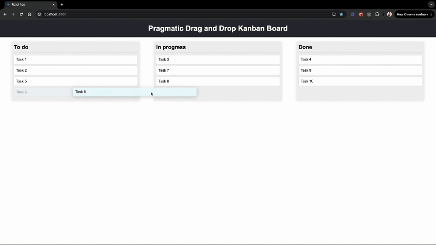
Case 4: Moving between columns by dropping onto another card — drop target: 2
To handle this case, we first need to remove the moved card from the source column and then insert it relative to the target card in a different column. We can use the moveCard function again to move the cards, but this time, we’ll pass the value of movedCardIndexInDestinationColumn to the moveCard function:
if (location.current.dropTargets.length === 2) {
 // rest of the code

 // Check if the source and destination columns are the same
 if (sourceColumnId === destinationColumnId) {
 // rest of the code
 }
 // Determine the new index for the moved card in the destination column.
 const destinationIndex =
 closestEdgeOfTarget === "bottom"
 ? indexOfTarget + 1
 : indexOfTarget;

 moveCard({
 movedCardIndexInSourceColumn: draggedCardIndex,
 sourceColumnId,
 destinationColumnId,
 movedCardIndexInDestinationColumn: destinationIndex,
 });
}
Now, you should be able to move cards between columns by dropping onto another card.
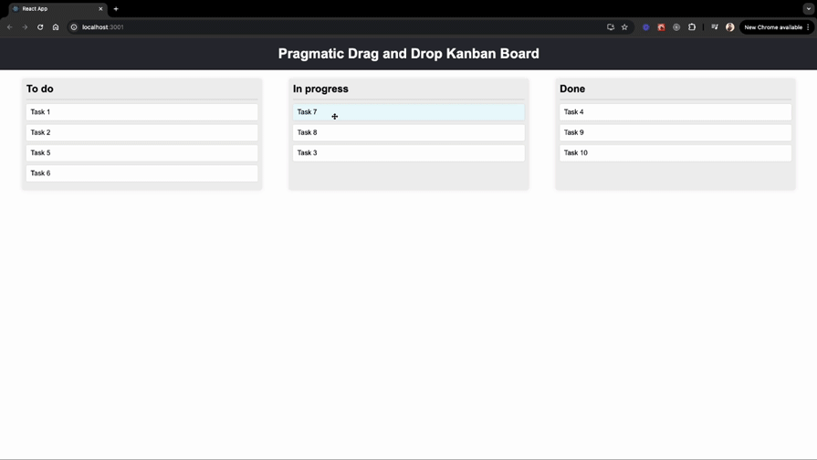
To improve the user experience, adding a drop indicator can be very helpful. A drop indicator visually shows where the dragged item will be placed when dropped.
To implement a drop indicator, first, create a new component called DropIndicator.js in the components folder. This component will render a visual indicator where the item will be dropped:
const DropIndicator = ({ edge, gap }) => {
 const edgeClassMap = {
 top: "edge-top",
 bottom: "edge-bottom",
 };

 const edgeClass = edgeClassMap[edge];

 const style = {
 "--gap": gap,
 };

 return <div className={`drop-indicator ${edgeClass}`} style={style}></div>;
};

export default DropIndicator;
You can find the styling for the DropIndicator component in the App.css file.
Now, import the DropIndicator component in the Card component, and add logic to show the indicator when a card is being dragged over:
// rest of the imports
import {
 attachClosestEdge,
 extractClosestEdge, // NEW
} from "@atlaskit/pragmatic-drag-and-drop-hitbox/closest-edge";
import DropIndicator from "./DropIndicator"; // NEW

const Card = ({ children, ...card }) => {
 // rest of the state variables

 // State to track the closest edge during drag over
 const [closestEdge, setClosestEdge] = useState(null); // NEW

 useEffect(() => {
 // rest of the code
 return combine(
 draggable({
 /*...*/
 }),
 dropTargetForElements({
 element: cardEl,
 getData: ({ input, element }) => {
 // rest of the code
 },
 getIsSticky: () => true,
 // NEW
 onDragEnter: (args) => {
 // Update the closest edge when a draggable item enters the drop zone
 if (args.source.data.cardId !== card.id) {
 setClosestEdge(extractClosestEdge(args.self.data));
 }
 },
 onDrag: (args) => {
 // Continuously update the closest edge while dragging over the drop zone
 if (args.source.data.cardId !== card.id) {
 setClosestEdge(extractClosestEdge(args.self.data));
 }
 },
 onDragLeave: () => {
 // Reset the closest edge when the draggable item leaves the drop zone
 setClosestEdge(null);
 },
 onDrop: () => {
 // Reset the closest edge when the draggable item is dropped
 setClosestEdge(null);
 },
 })
 );
 }, [card.id]);
 return (
 <div className={`card ${isDragging ? "dragging" : ""}`} ref={cardRef}>
 {children}
 {/* render the DropIndicator if there's a closest edge */}
 {closestEdge && <DropIndicator edge={closestEdge} gap="8px" />}
 </div>
 );
};
Now, when you drag a card over another card, you should see a drop indicator showing where the card will be placed:
In conclusion, the Pragmatic drag and drop library offers a powerful and flexible solution for implementing drag-and-drop functionality in web applications. Its small size, compatibility with any front-end framework, and comprehensive feature set make it an excellent choice for developers to create great drag-and-drop experiences.
I hope you found this tutorial on using the Pragmatic drag and drop library in a React project helpful. But why stop there? I encourage you to make columns draggable and share your implementations with us in the comments below! If you have any questions or feedback, feel free to leave a comment. Happy coding!
Debugging code is always a tedious task. But the more you understand your errors, the easier it is to fix them.
LogRocket allows you to understand these errors in new and unique ways. Our frontend monitoring solution tracks user engagement with your JavaScript frontends to give you the ability to see exactly what the user did that led to an error.
👁 LogRocket Dashboard Free Trial BannerLogRocket records console logs, page load times, stack traces, slow network requests/responses with headers + bodies, browser metadata, and custom logs. Understanding the impact of your JavaScript code will never be easier!
Install LogRocket via npm or script tag. LogRocket.init() must be called client-side, not
server-side
$ npm i --save logrocket

// Code:

import LogRocket from 'logrocket';
LogRocket.init('app/id');
// Add to your HTML:

<script src="https://cdn.lr-ingest.com/LogRocket.min.js"></script>
<script>window.LogRocket && window.LogRocket.init('app/id');</script>
Learn how next-browser gives AI agents runtime context for debugging Next.js apps, including React props, hydration, PPR, forms, and performance.
Build dynamic LLM routing in Next.js with OpenRouter, TanStack AI, task classification, model fallbacks, and cost-aware routing.
TSRX adds first-class control flow, conditional hooks, and scoped styles to React via a TypeScript compiler extension — no new framework required.
Learn how to build a full React Native auth system using Better Auth and Expo — with email/password login, Google OAuth, session persistence, and protected routes.
Would you be interested in joining LogRocket's developer community?
Join LogRocket’s Content Advisory Board. You’ll help inform the type of content we create and get access to exclusive meetups, social accreditation, and swag.
Sign up now