 |
VOOZH | about |
|
VOOZH | about |
Editor’s note: This article was last updated 06 June 2022 to include newer features to Storybook, like accessibility testing.
👁 React Storybook Component Unit TestingEvery developer’s goal is to build software that works. We can make sure our software’s code works flawlessly by isolating it and showing its behavior in tests. However, we can’t say the same for our components, which are tested within the context of our app.
Storybook allows us to view and interact with our components in an isolated manner. It’s just like unit testing but for UI components.
According to Storybook’s documentation, Storybook is a user interface development environment and playground for UI components. Storybook enables developers to create components independently and showcase components interactively in an isolated development environment.
In this article, we’ll explore how Storybook can help us create UI components and improve our component testing.
If you want to play around with or follow along with the code, you can always check out the source code on GitHub. Let’s get started!
The Replay is a weekly newsletter for dev and engineering leaders.
Delivered once a week, it's your curated guide to the most important conversations around frontend dev, emerging AI tools, and the state of modern software.
First, we’ll bootstrap a new React project. In it, we’ll install Storybook via the CLI:
#create a react app
npx create-react-app my-storybook-app

#navigate to the newly created app
cd my-storybook-app

#install storybook
npx sb init

#run via npm
npm run storybook

#running via yarn
yarn storybook
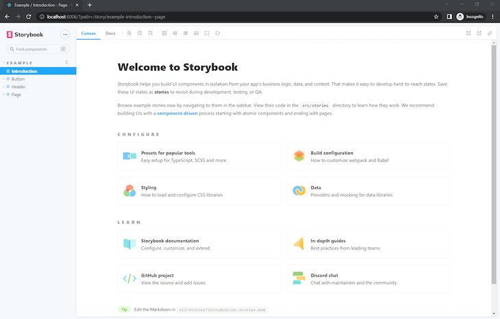
Storybook’s testing page should start on the local address http://localhost:6006/ in our browser:
We’ll create a component for testing, a button called Button.jsx, which will display the number of cups of coffee to be served. This fundamental component is controlled by Storybook’s default export metadata, which controls how stories are listed:
// /src/components/Button.jsx

import React from "react";
import PropTypes from "prop-types";
import "./button.css";
export const Button = ({ backgroundColor, size, label, ...props }) => {
 return (
 <div>
 <button
 type="button"
 className={["storybook-button", `storybook-button--${size}`].join(" ")}
 id="button"
 style={backgroundColor && { backgroundColor }}
 {...props}
 >
 {label}
 </button>
 </div>
 );
};
Button.propTypes = {
 backgroundColor: PropTypes.string,
 size: PropTypes.oneOf(["small", "medium", "large"]),
 label: PropTypes.string.isRequired,
 onClick: PropTypes.func,
};
Button.defaultProps = {
 backgroundColor: null,
 size: "medium",
 onClick: undefined,
};
Storybook works using stories; a story is a function that contains the single state of one component and renders that component to the screen for testing purposes. Let’s write a story for our Button.jsx component. In src/stories, create a file called Button.stories.jsx:
import React from "react";
import { Button } from "../components/Button";

export default {
 title: "Components/Button",
 component: Button,
 argTypes: {
 backgroundColor: { control: "color" },
 onClick: { action: "clicked" },
 },
};
const Template = (args) => <Button {...args} />;
export const Primary = Template.bind({});
Primary.args = {
 label: "Button",
};
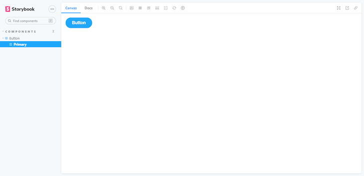
In Storybook, our component looks like the following:
Storybook offers several different techniques for testing UI components. Components need to undergo tests for a variety of reasons, some of which include detecting bugs, preventing code from breaking during new commits, and serving as guidelines for other developers who will work on the project.
Let’s examine some of the ways Storybook can make component testing seamless.
Accessibility testing audits the rendered DOM against a set of heuristics based on WCAG rules and other industry-accepted best practices. These act as the first line of quality assurance to catch blatant accessibility violations.
Storybook’s accessibility runs Axe on the active story, visualizing the test results in a panel and outlining all the DOM nodes that have a violation. The Axe library is popular among teams because it integrates with most existing test environments. On average, Axe automatically detects 57 percent of WCAG violations.
To install the add-on, run the code below:
npm i -D @storybook/addon-a11y
Then, add @storybook/addon-a11y to the addons array in .storybook/main.js:
module.exports = {
 stories: ['../src/**/*.stories.mdx', '../src/**/*.stories.@(js|jsx|ts|tsx)'],
 addons: [
 '@storybook/addon-links',
 '@storybook/addon-essentials',
 '@storybook/preset-create-react-app',
+ '@storybook/addon-a11y',
 ],
};
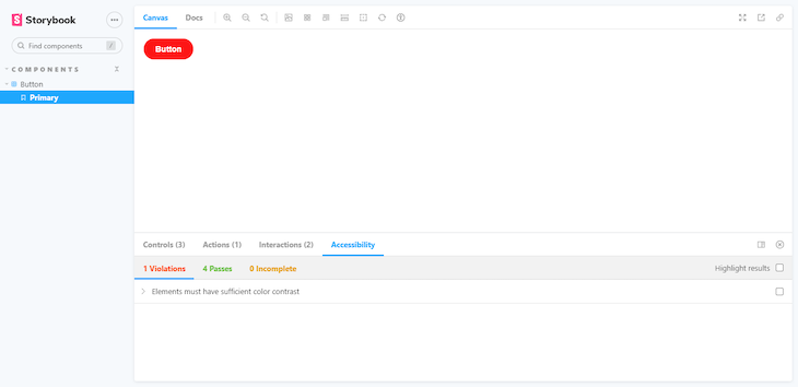
Let’s have a look at our component:
At first glance, the component appears to be ready to ship. But, when we open the accessibility tab, the tests reveal something different.
👁 Image
The accessibility add-on has a Highlight results checkbox, which aids in identifying the components that are failing. This comes in handy, especially when working with larger components, preventing us from executing tests individually in each component.
Notice how the add-on found a violation that says Ensures the contrast between foreground and background colors meets WCAG 2 AA contrast thresholds. Essentially, there isn’t enough contrast between the text and the background. We can fix that by changing the text color to a slightly darker gray, from gray.400 to gray.600.
Automated visual testing automatically verifies that our UI’s visuals appear as intended. In cross-browser testing, automated visual testing can detect lapses that escaped the developer’s observations.
There are many tools for visual testing, but I recommend Chromatic, created by Storybook maintainers, to run visual tests in a lightning-fast cloud browser environment.
Chromatic is a cloud service built for Storybook that allows you to run visual tests with zero configuration. To get started, sign up with GitHub, GitLab, Bitbucket, or your email address and generate a unique <project-token> for the Storybook project.
Next, install the Chromatic CLI package from npm:
# With npm
npm install chromatic --save-dev

# With yarn
yarn add --dev chromatic
After the package finishes installing, run the following command:
npx chromatic --project-token <your-project-token>
Don’t forget to replace your-project-token with the one provided by Chromatic.
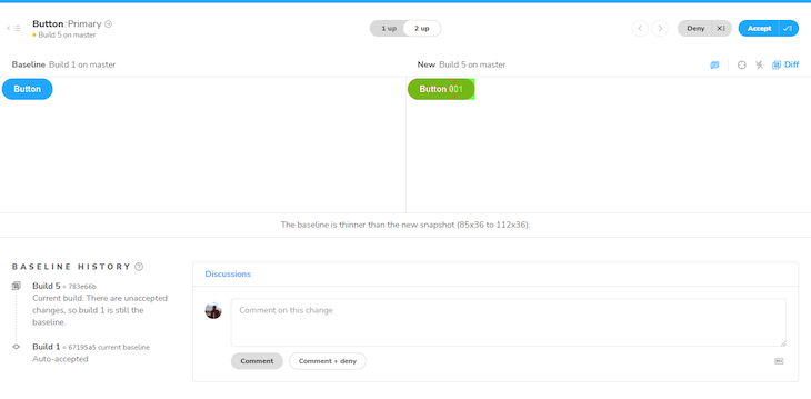
When Chromatic is done, it should have successfully deployed the Storybook project and established baselines, the beginning points for all of our component’s stories. In addition, Chromatic provides us with a link to the published Storybook, which we can share with our team to gather feedback:
👁 Chromatic Link Published Storybook
Each time we run Chromatic, it generates new snapshots and compares them against the existing baselines, which is ideal for detecting UI changes and preventing potential UI regressions:
👁 Run chromatic Detect UI Changes
If the changes are intentional, accept them as baselines. Otherwise, deny them to prevent UI regressions.
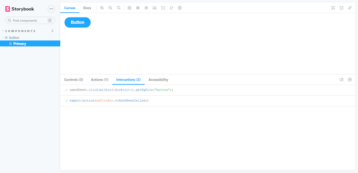
Storybook allows us to verify the functional aspects of UIs with interaction testing. As we build more complex UIs, like pages, components become responsible for more than just rendering the UI. They also fetch data and manage the state.
We can set up interaction testing in Storybook using the play function and @storybook/addon-interactions.
The play function is a small code snippet that runs after a story finishes rendering. We can use the play function to test user workflows.
The @storybook/addon-interactions add-on is installed and configured automatically by Storybook. It includes helper utilities and a playback interface that simulates user behavior in the browser.
Update the Button.stories.jsx file to set up interaction testing in Storybook with the play function:
import React from "react";
import { Button } from "../components/Button";

export default {
 title: "Components/Button",
 component: Button,
 argTypes: {
 backgroundColor: { control: "color" },
 onClick: { action: "clicked" },
 },
};
const Template = (args) => <Button {...args} />;
export const Primary = Template.bind({});

+ Primary.play = async ({ args, canvasElement }) => {
+ const canvas = within(canvasElement);
+ await userEvent.click(canvas.getByRole("button"));
+ await expect(args.onClick).toHaveBeenCalled();
+ };

Primary.args = {
 label: "Button",
};
Once the story loads in the UI, it simulates the component’s behavior.
👁 Story Stimulate Component Behavior
Storybook provides a great way to test our UI components. It may seem like we are doing away with unit testing, but that’s not the case. Unit testing aims at finding out what went wrong with the code; in this case, we’re testing React components. If something went wrong with our UI, we would still investigate what markup we have to fix, implying that integration and snapshot tests are as good as unit tests in this context.
Install LogRocket via npm or script tag. LogRocket.init() must be called client-side, not
server-side
$ npm i --save logrocket

// Code:

import LogRocket from 'logrocket';
LogRocket.init('app/id');
// Add to your HTML:

<script src="https://cdn.lr-ingest.com/LogRocket.min.js"></script>
<script>window.LogRocket && window.LogRocket.init('app/id');</script>
Learn how next-browser gives AI agents runtime context for debugging Next.js apps, including React props, hydration, PPR, forms, and performance.
Build dynamic LLM routing in Next.js with OpenRouter, TanStack AI, task classification, model fallbacks, and cost-aware routing.
TSRX adds first-class control flow, conditional hooks, and scoped styles to React via a TypeScript compiler extension — no new framework required.
Learn how to build a full React Native auth system using Better Auth and Expo — with email/password login, Google OAuth, session persistence, and protected routes.
Would you be interested in joining LogRocket's developer community?
Join LogRocket’s Content Advisory Board. You’ll help inform the type of content we create and get access to exclusive meetups, social accreditation, and swag.
Sign up now