 |
VOOZH | about |
|
VOOZH | about |
As web development capabilities and tools evolve, web development framework styling has mirrored that evolution. Moving away from inline styles to CSS-in-JS solutions has made the development experience more consistent.
👁 Theming Vue.js With Styled-ComponentsWith the styled-components library, developers can utilize CSS within JavaScript or JavaScript frameworks instead of creating traditional separate CSS files when styling. It has seen huge success in React, and now it is available for Vue projects.
In this post, we’ll see why utilizing styled-components is advantageous when styling in Vue.
The Replay is a weekly newsletter for dev and engineering leaders.
Delivered once a week, it's your curated guide to the most important conversations around frontend dev, emerging AI tools, and the state of modern software.
Styled-components gives you the freedom to make your own custom styled components in Vue. You can style the HTML tags and give them the name of your choice to make your code more readable.
With styled-components, everything is done with the help of props. You can dynamically change the style of your components without using classes. It gives you the power to use the ternary operators inside the string literals of the styled components.
Styled-components makes the styling and design of your components concurrent and similar throughout the entire application without much effort. The theming capabilities provide a central place to define the basic design elements such as color, size, and spacing, and can be easily integrated into all of the components in the app.
Seeing tremendous growth, the styled-components community provides help for any issue and has a popular library for developers.
Now that we’ve seen the benefits of the styled-components, it’s time to install the library in our Vue project and look at how we can use its different features.
Before installing the library, have a Vue project up and running on your local machine. With a project set up, install the library with the following command:
npm i vue-styled-components
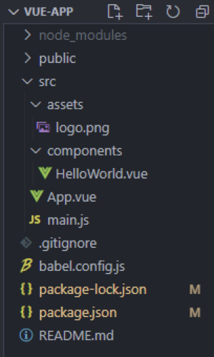
If you used Vue CLI to set up the project, the folder structure will look something like this:
With all the styles removed from our Vue app, HelloWorld.vue looks like the following:
// HelloWorld.vue

<template>
 <div class="hello">
 <h1>{{ msg }}</h1>
 </div>
</template>

<script>
export default {
 name: 'HelloWorld',
 props: {
 msg: String
 }
}
</script>
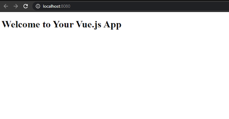
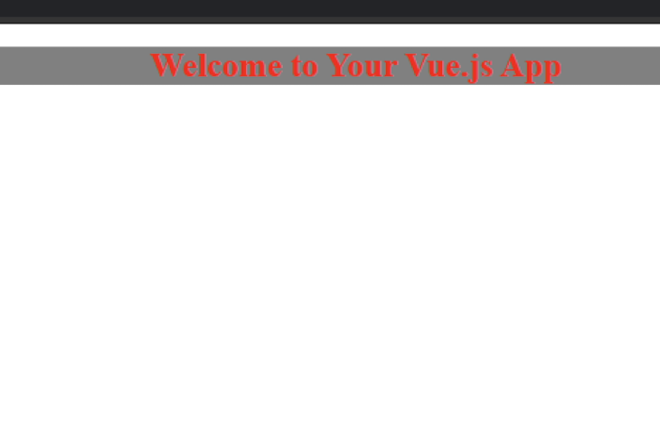
Let’s run the project to see the following output in the browser:
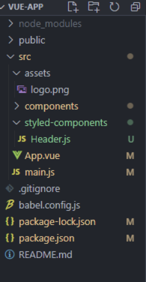
As we can see, there is a simple h1 header tag with no styles applied. We will style this h1 with styled-components, and we must create a new folder in the src directory to store them. In that folder, create a Header.js file. The project structure will look as follows:
Then, add the following lines of code in Header.js:
import styled from "vue-styled-components";

export const StyledHeader = styled.h1`
 font-size: 1.5em;
 text-align: center;
 color: red;
 background-color: grey;
`;
Finally, we can register StyledHeader in HelloWorld.vue and use it instead of h1:
<template>
 <div class="hello">
 <StyledHeader>{{ msg }}</StyledHeader>
 </div>
</template>

<script>
import {StyledHeader} from "../styled-components/Header"
export default {
 name: 'HelloWorld',
 components:{
 StyledHeader
 },
 props: {
 msg: String
 }
}
</script>
Now, let’s start the server and see how the plain and boring header tag changes:
As we can see, the required styles have been applied without using any CSS!
Styled components, like any other components, have the ability to accept props. For example, we can create an input field and pass a prop to it. Here, we’ll create a new component named Input.js in the components folder and add the following code to it:
import styled from "vue-styled-components";

export const StyledInput = styled.input`
 font-size: 1.25em;
 padding: 0.5em;
 margin: 0.5em;
 color: blueviolet;
 border: none;
 background-color: lavender;
 border-radius: 3px;

 &:hover {
 box-shadow: inset 1px 1px 2px rgba(0, 0, 0, 0.1);
 }
`;
The next step is to use it in HelloWorld.vue:
<template>
 <div class="hello">
 <StyledHeader>{{ msg }}</StyledHeader>
 <StyledInput/>
 </div>
</template>

<script>
import {StyledInput} from "../styled-components/Input"
import {StyledHeader} from "../styled-components/Header"

export default {
 name: 'HelloWorld',
 components:{
 StyledInput,StyledHeader
 },
 props: {
 msg: String
 }

}
</script>
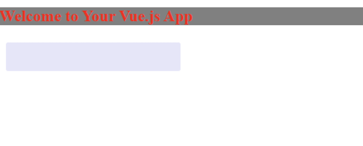
Saving the changes will reflect them in the browser, confirming our input is rendered:
👁 Render The Input Field In The Browser
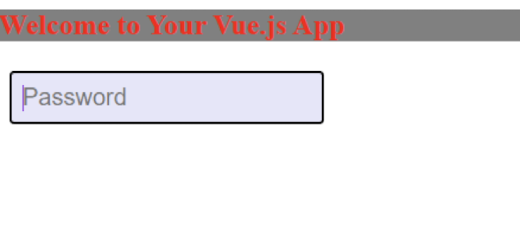
But this looks weird without a proper input. Let’s pass it as a prop to StyledInput along with the type:
<template>
 <div class="hello">
 <StyledHeader>{{ msg }}</StyledHeader>
 <StyledInput placeholder="Password" type="text"/>
 </div>
</template>

...
Running this gives us the following output:
👁 Styled Input Appears In Browser
This is one of the strongest features of styled-components. It allows developers to set dynamic styles without using tons of classes.
Because styled-components can take props and apply style based on props, let’s give custom props to StyledHeader.
Let’s modify our Header.js file as follows:
import styled from "vue-styled-components";
const hdrProps = { primary: Boolean };

export const StyledHeader = styled("h1", hdrProps)`
 font-size: 1.5em;
 text-align: start;
 color: ${(props) => (props.primary ? "white" : "red")};
 background-color: ${(props) => (props.primary ? "green" : "yellow")};
`;
Here, we have defined the props for our StyledHeader. The styled function takes the HTML element with the props as an argument, after which we can specify the behavior of our CSS based on the value of that prop.
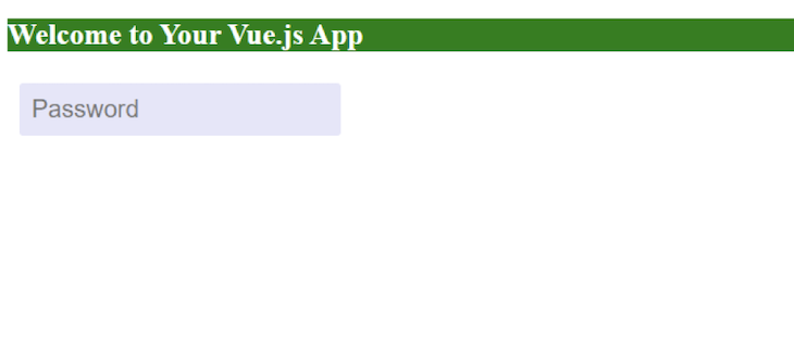
Let’s run the project without giving any prop to our previously created header, and see the following output in the browser:
This is working exactly as we have specified. Now, let’s provide a primary prop to our StyledHeader, and check whether the styles are applied correctly:
<template>
 <div class="hello">
 <StyledHeader primary>{{ msg }}</StyledHeader>
 <StyledInput placeholder="Password" type="text"/>
 </div>
</template>

<script>
import {StyledInput} from "../styled-components/Input"
import {StyledHeader} from "../styled-components/Header"

export default {
 name: 'HelloWorld',
 components:{
 StyledInput,StyledHeader
 },
 props: {
 msg: String
 }

}
</script>
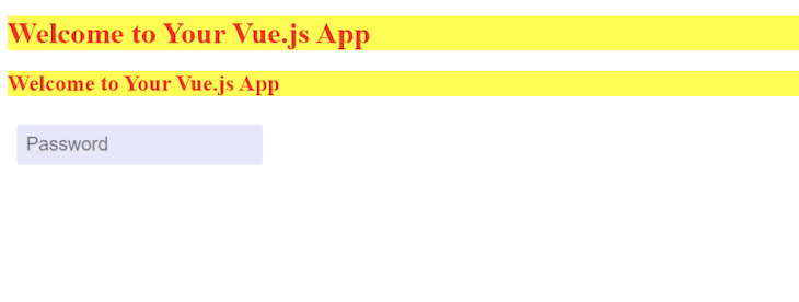
As we can see, the StyledHeader is accepting primary as a prop. After saving the changes, our project renders the following output:
👁 StyledHeader Accepting The Primary Output In The Browser
With this, we have successfully changed the style based on our props, giving us the basic concept behind the approach. Styles with props can be changed with button events, form submissions, and more. We can now leverage the full power of dynamic styling with styled-components.
Styled-components also provides the ability to make components follow the same style. This creates a consistent style for applications and removes a lot of repetitious code.
By simply adding the following line of code in Header.js, we can apply the following to use the same styles for h2:
export const StyledHeader2
= StyledHeader.withComponent("h2");
After using this component in the HelloWorld.vue file, we will get the following output:
👁 Applying The Same Styles To H2
Sometimes, components must change based on a specific scenario but retain the same styles. For this instance, styled-components can use a prop to change the component being rendered.
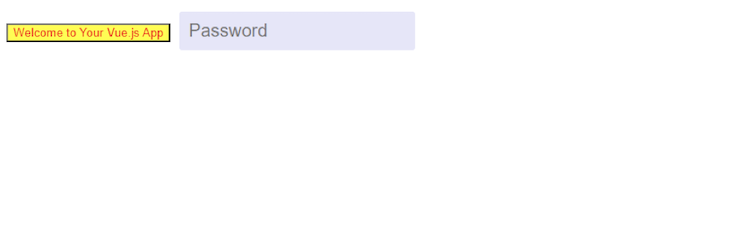
If we apply the as prop to change the StyledHeader, we can change it to a button:
<template>
 <div class="hello">
 <StyledHeader as=button>{{ msg }}</StyledHeader>
 <StyledInput placeholder="Password" type="text"/>
 </div>
</template>
The browser then gives us the following output:
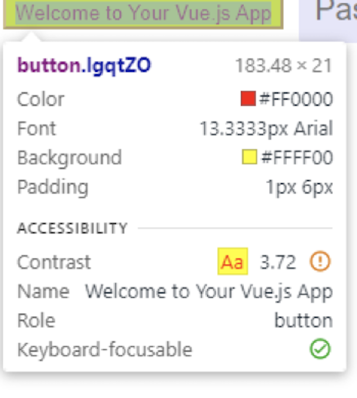
👁 Change The StyledHeader Button
Inspecting the role, we can clearly see that it is a button:
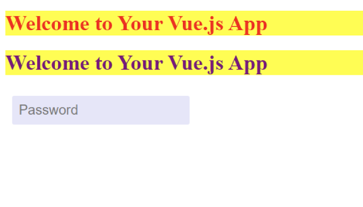
If changes must be made to the component styling without rewriting it, we can override or add new styles to it.
By creating a new component named NewHeader.js, we can override the color attribute from the previously created Header.js.
Then, let’s add the following code in the NewHeader.js:
import { StyledHeader } from "./Header";
export const NewHeader = StyledHeader.extend`
 color: purple;
 border-color: purple;
`;
Let us now render and use it in our HelloWorld.vue file:
<template>
 <div class="hello">
 <StyledHeader >{{ msg }}</StyledHeader>
 <NewHeader >{{ msg }}</NewHeader>
 <StyledInput placeholder="Password" type="text"/>
 </div>
</template>

<script>
import {StyledInput} from "../styled-components/Input"
import {NewHeader} from "../styled-components/NewHeader"

import {StyledHeader} from "../styled-components/Header"

export default {
 name: 'HelloWorld',
 components:{
 StyledInput,StyledHeader,NewHeader
 },
 props: {
 msg: String
 }

}
</script>
After saving the changes, we get the following output:
👁 Override The Color Attribute
As we can see, we have overridden the color of Header.js and used its styling in our newly created NewHeader.js.
Styled-components is a powerful library that solves most of the pain points we would find using plain CSS. While the learning curve can be steep initially, the benefits are worth it.
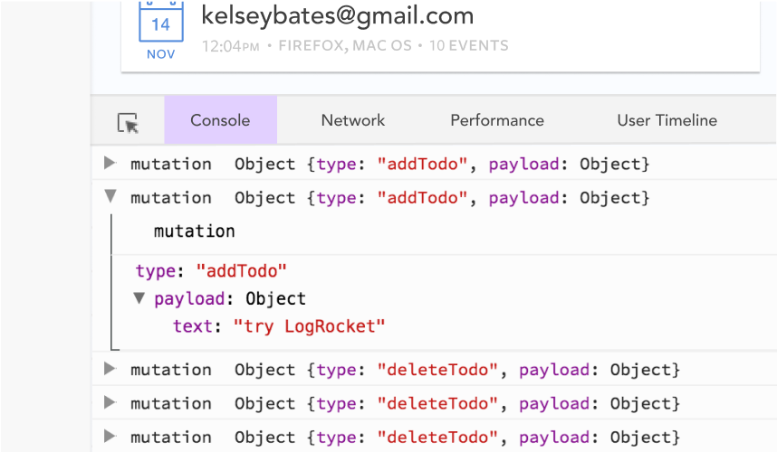
Debugging Vue.js applications can be difficult, especially when users experience issues that are difficult to reproduce. If you’re interested in monitoring and tracking Vue mutations and actions for all of your users in production, try LogRocket.
👁 LogRocket Dashboard Free Trial BannerLogRocket lets you replay user sessions, eliminating guesswork by showing exactly what users experienced. It captures console logs, errors, network requests, and pixel-perfect DOM recordings — compatible with all frameworks.
With Galileo AI, you can instantly identify and explain user struggles with automated monitoring of your entire product experience.
Modernize how you debug your Vue apps — start monitoring for free.
Learn how next-browser gives AI agents runtime context for debugging Next.js apps, including React props, hydration, PPR, forms, and performance.
Build dynamic LLM routing in Next.js with OpenRouter, TanStack AI, task classification, model fallbacks, and cost-aware routing.
TSRX adds first-class control flow, conditional hooks, and scoped styles to React via a TypeScript compiler extension — no new framework required.
Learn how to build a full React Native auth system using Better Auth and Expo — with email/password login, Google OAuth, session persistence, and protected routes.
Hey there, want to help make our blog better?
Join LogRocket’s Content Advisory Board. You’ll help inform the type of content we create and get access to exclusive meetups, social accreditation, and swag.
Sign up now