 |
VOOZH | about |
|
VOOZH | about |
Ant Design is an open source library that allows you to create appealing, responsive websites. It’s an excellent choice for your next project if you want to use a framework that’s both well-tested and easy to learn.
👁 Vue and Ant Design LogosVue.js, on the other hand, is a progressive framework for creating user interfaces. It’s intended to be simple to learn while being flexible and customizable. Using these two together allows you to create responsive websites faster than ever before.
Ant Design and the inclusion of the Composition API in Vue 3 make it simple to create beautiful, responsive, and scalable applications while writing limited code.
In this short guide, we’ll look at how to use the ant-design-vue package in a Vue 3 application as well as how to use the Ant icon system.
The Replay is a weekly newsletter for dev and engineering leaders.
Delivered once a week, it's your curated guide to the most important conversations around frontend dev, emerging AI tools, and the state of modern software.
It’s also worth mentioning that all of the methods described here would work with Vue 3 projects generated with both the Vue CLI and Vite.
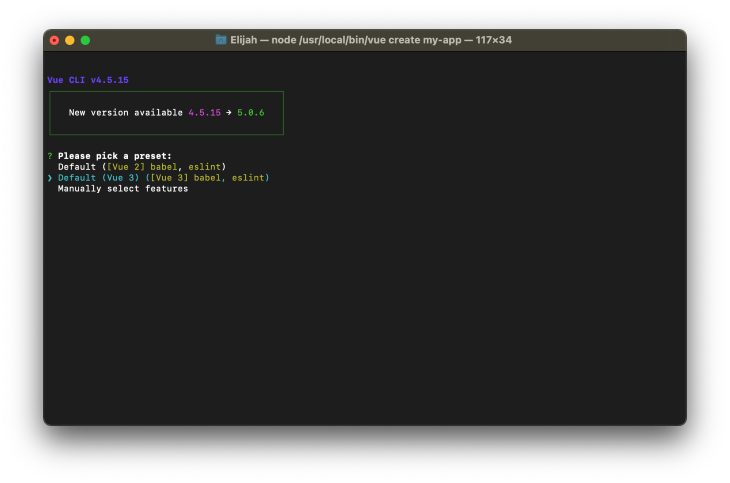
Let’s get started by running the following command to create a new Vue 3 application:
vue create my-app
# OR Vite
npm init vue@3
If you’re using the Vue CLI, be sure to choose Vue 3 as your preferred preset, as shown in the screenshot below:
You could easily add the ant-design-vue package to your Vue 3 project with the command below:
npm install ant-design-vue
# OR
yarn add ant-design-vue
And once the installation is completed, we can get started with registering it in our project.
One approach is to globally register the package in our project, so that we may refer to its components from anywhere. This is possible by updating the entry src/main.js file with the code below:
import { createApp } from "vue";
import App from "./App.vue";

import Antd from "ant-design-vue";
import "ant-design-vue/dist/antd.css";

const app = createApp(App);
app.use(Antd).mount("#app");
This way, we can begin using its components in our application without having to do any extra importing:
<!-- components/Sample.vue -->
<template>
 <a-button type="primary">Primary Button</a-button>
 <a-button>Default Button</a-button>
 <a-button type="dashed">Dashed Button</a-button>
</template>
You could also import individual components on demand:
<!-- components/Sample.vue -->
<template>
 <div>
 <Button type="primary">Primary Button</Button>
 <Button>Default Button</Button>
 <Button type="dashed">Dashed Button</Button>
 </div>
</template>

<script setup>
import { Button } from "ant-design-vue";
import "ant-design-vue/dist/antd.css";
</script>
As you might have noticed, we also imported the Ant Design CSS file into this single file component, and it wouldn’t make sense to do the same for all our component files moving forward. To address this, simply import the Ant Design CSS file into the src/main.js file instead, such that the file content looks like this:
import { createApp } from "vue";
import App from "./App.vue";

import "ant-design-vue/dist/antd.css";

createApp(App).mount("#app");
To avoid having to do the extra imports, we’ll assume that ant-design-vue has been registered globally in the preceding code samples in this article.
The Ant Design component kit includes several elements like buttons, lists, cards, and many more, which are all available in different colors and sizes. Icons can also be utilized on the main interface as well as within other components. However, let’s get started by exploring the basics while attaching custom Vue methods and reactive data to them:
<template>
 <div>
 <a-row>
 <a-col span="12">
 <div v-for="(alert, i) in alerts" :key="i">
 <a-alert
 :message="alert + ' message'"
 description="Lorem ipsum dolor sit amet."
 :type="alert"
 />
 </div>
 </a-col>
 <a-col span="12">
 <a-button type="primary" @click="message = 'Hello!'">
 {{ message }}
 </a-button>
 <a-skeleton avatar :paragraph="{ rows: 4 }" />
 </a-col>
 </a-row>
 </div>
</template>

<script setup>
import { ref } from "vue";

const alerts = ref(["success", "info", "warning", "error"]);
const message = ref("Click Me!");
</script>
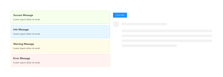
The code example above demonstrates how to use Vue 3 setup sugar syntax to do a simple iteration as well as attach custom events to ant-design-vue components. We had developed a two-column grid system where the first column displayed a button and a skeleton loader component, while the second column basically iterated through our array of alerts and used their data to render custom alert components.
We’ll get the following result if we run our application:
Handling form data is an essential operation in any application. Here’s an example of how to use ant-design-vue to create a basic form component and process its data:
<template>
 <div>
 <a-form
 :model="formData"
 name="basic"
 autocomplete="off"
 @finish="onSubmit"
 @finishFailed="onError"
 >
 <a-form-item
 label="Username"
 name="username"
 :rules="[{ required: true, message: 'Please input your username!' }]"
 >
 <a-input v-model:value="formData.username" />
 </a-form-item>

 <a-form-item
 label="Password"
 name="password"
 :rules="[{ required: true, message: 'Please input your password!' }]"
 >
 <a-input-password v-model:value="formData.password" />
 </a-form-item>

 <a-form-item name="remember" :wrapper-col="{ offset: 8, span: 16 }">
 <a-checkbox v-model:checked="formData.remember">
 Remember me
 </a-checkbox>
 </a-form-item>

 <a-form-item :wrapper-col="{ offset: 8, span: 16 }">
 <a-button type="primary" html-type="submit">Continue</a-button>
 </a-form-item>
 </a-form>
 </div>
</template>

<script setup>
import { ref } from "vue";

const formData = ref({
 username: "",
 password: "",
 remember: true,
});

const onSubmit = async (_formData) => {
 console.log("Form Submitted!:", _formData);
 const response = await fetch("https://some.api/process-form", {
 method: "POST",
 body: _formData,
 });
};

const onError = (errorInfo) => {
 console.log("Failed:", errorInfo);
};
</script>
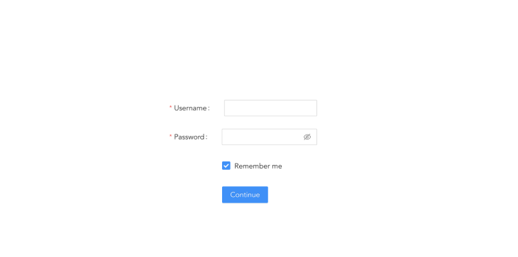
In the code above, we defined a reactive object, formData, with some default empty strings, and we also used the v-model form binding to tie this data to our ant-design-vue form input components. We also created a custom function onSubmit and attached it to our ant-design-vue form component to submit our formData to some imaginary API for processing, as well as an onError function to handle any errors that occurred while validating our form.
Additionally, this code sample shows how the custom properties included in the ant-design-vue components simplify the process of validating forms as well as making them accessible.
And here’s what our form’s output would look like when we run the app:
👁 Form Output Username Password Fields
If you want to create complex forms in Vue 3, you should also read this article on v-model.
Icons play an important part in making application design more rich and attractive. And Ant Design system is aware.
The Ant design team also developed an external package that allows you to rapidly add rich icons to your application, including outlined, solid, and even two-tone icons.
You can easily install the icon package in your Vue project with:
npm install @ant-design/icons-vue
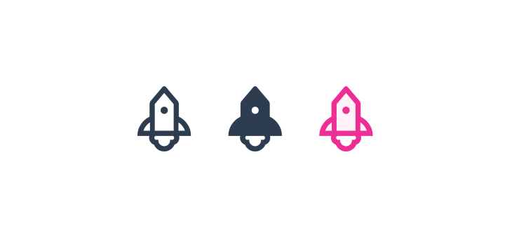
Here’s an example of how we imported the three different rocket icon stylings:
<template>
 <div>
 <rocket-outlined />
 <rocket-filled />
 <rocket-two-tone two-tone-color="#eb2f96" />
 </div>
</template>

<script setup>
import {
 RocketOutlined,
 RocketFilled,
 RocketTwoTone,
} from "@ant-design/icons-vue";
</script>
And running this code produces the following results:
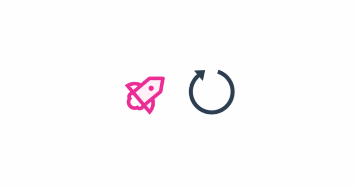
To add extra interaction, we can also apply a custom spin and rotation property to any icon.
<template>
 <div class="center">
 <rocket-two-tone two-tone-color="#eb2f96" :rotate="50" />
 <reload-outlined spin />
 </div>
</template>

<script setup>
import { RocketTwoTone, ReloadOutlined } from "@ant-design/icons-vue";
</script>
Which results in the following output:
👁 Spinning Circle Next to Rocket
Ant Design is an excellent tool for creating a website with minimal effort. It is a very adaptable framework that allows you to create simple websites with a lot of flexibility. And throughout this article, we looked at how to use the ant-design-vue package with Vue 3. We also went over how to use ant-icon as well as how to handle basic form submissions.
The documentation page for the ant-design-vue package is a wonderful starting point for learning about all the components that are offered.
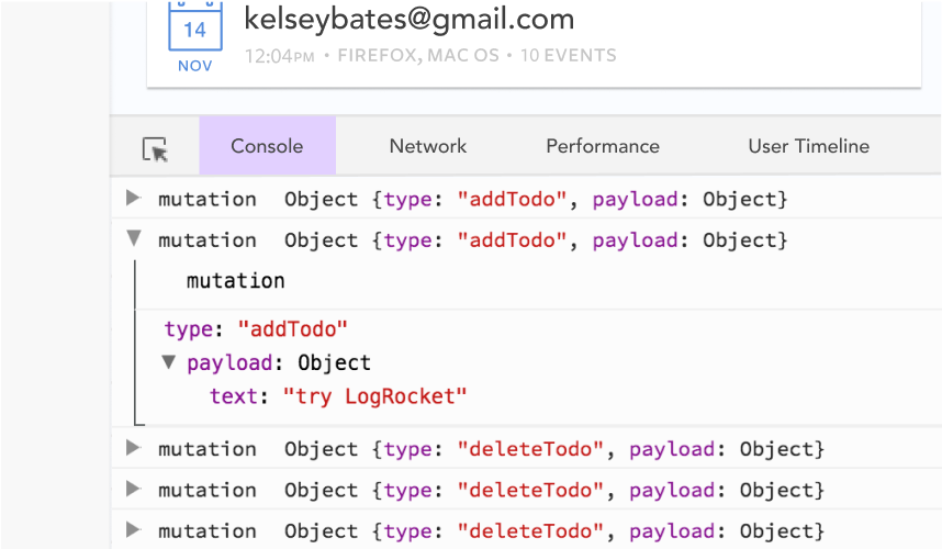
Debugging Vue.js applications can be difficult, especially when users experience issues that are difficult to reproduce. If you’re interested in monitoring and tracking Vue mutations and actions for all of your users in production, try LogRocket.
👁 LogRocket Dashboard Free Trial BannerLogRocket lets you replay user sessions, eliminating guesswork by showing exactly what users experienced. It captures console logs, errors, network requests, and pixel-perfect DOM recordings — compatible with all frameworks.
With Galileo AI, you can instantly identify and explain user struggles with automated monitoring of your entire product experience.
Modernize how you debug your Vue apps — start monitoring for free.
Learn how next-browser gives AI agents runtime context for debugging Next.js apps, including React props, hydration, PPR, forms, and performance.
Build dynamic LLM routing in Next.js with OpenRouter, TanStack AI, task classification, model fallbacks, and cost-aware routing.
TSRX adds first-class control flow, conditional hooks, and scoped styles to React via a TypeScript compiler extension — no new framework required.
Learn how to build a full React Native auth system using Better Auth and Expo — with email/password login, Google OAuth, session persistence, and protected routes.
Would you be interested in joining LogRocket's developer community?
Join LogRocket’s Content Advisory Board. You’ll help inform the type of content we create and get access to exclusive meetups, social accreditation, and swag.
Sign up now