 |
VOOZH | about |
|
VOOZH | about |
Today, dark mode is a frequently-requested feature in web, desktop, and mobile apps.
👁 The Vue, React, and Angular logos against a night sky.Improving developers’ experience in UI libraries by adding a customizable interface is very important and can drive a lot of developers to use a specific UI library.
Below are some known UI libraries that support dark mode.
The Replay is a weekly newsletter for dev and engineering leaders.
Delivered once a week, it's your curated guide to the most important conversations around frontend dev, emerging AI tools, and the state of modern software.
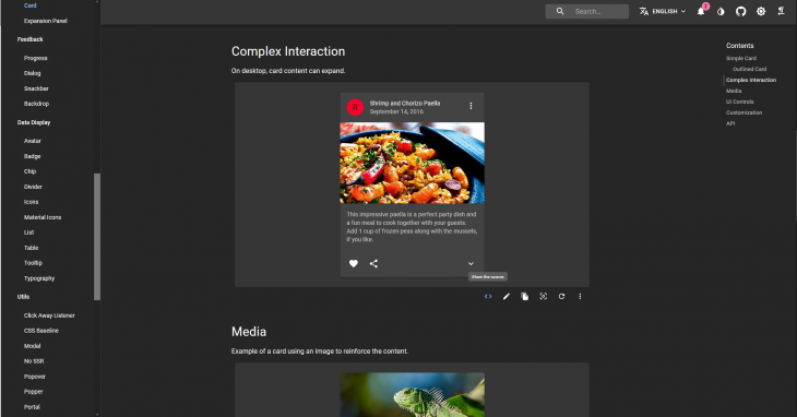
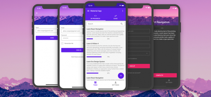
👁 A screenshot of the Material UI.
With 57k+ stars on GitHub, React JS’ material design UI framework has a simple, developer-oriented, and extensible theming facility. It’s based on the famous CSS-in-JS and enables developers to choose between three different styling APIs pertaining to the same underlying concept.
Any developer familiar with Material UI can attest that its theming and color palette management capabilities are some of the best in the ecosystem.
Following the theming docs, we can easily add a dark theme on a basic material UI app.
Moreover, when we visit the docs, we have the ability to toggle light/dark mode and switch palettes to help visualize all the provided material components with the different themes.
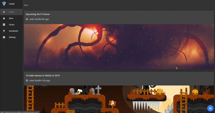
👁 The Vuetify UI in dark mode.
With 25k+ stars on GitHub, Vuetify is an extremely popular UI framework in Vue.
It’s well known because it fully utilizes the Vue API. On Vuetify, the theme system is very well built. Giving your web app a dark theme is very easy.
Vuetify supports both light and dark variants of the Material Design spec.
This designation starts at the root application component, v-app, and is supported by the majority of components. By default, your application will use the light theme, but this can be easily overwritten by adding the dark option in the theme service.
When you designate a component as light or dark, all of its children will inherit and apply the same component unless otherwise specified. You can manually turn dark on and off by changing this.$vuetify.theme.dark to true or false.
Customizations are also very easy to do and available.
👁 The Nebular UI in dark mode.
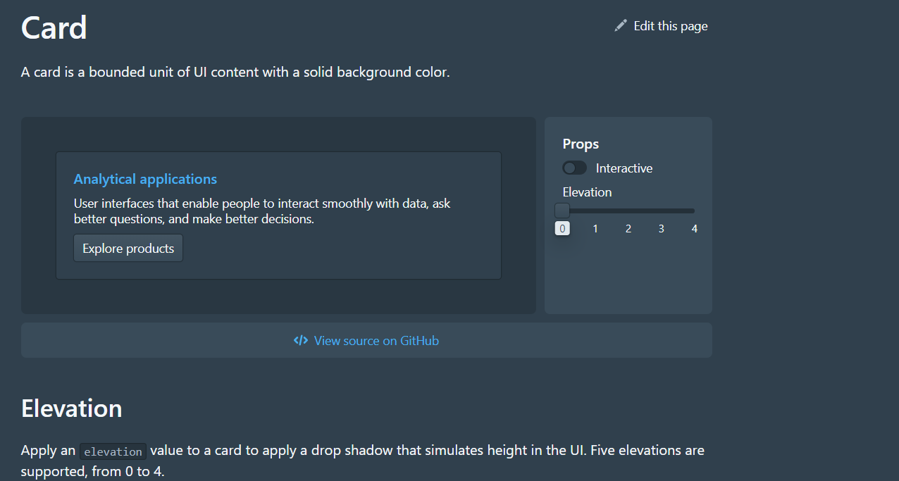
Nebular, based on Eva Design System, is one of the most beautiful UI libraries in Angular.
Nebular pays great attention to the beauty and UX of their components. Nebular ships with a fully customizable default theme, cosmic theme, corporate theme, and dark theme.
UI Kitten is a React Native UI library based on Eva Design system (the mobile version of Nebular). It has 25+ general-purpose components and has a great theming system similar to Nebular. They have a starter app which showcases their components with 40 screens in light and dark themes.
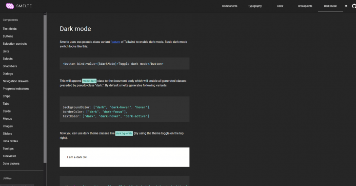
Smelte is a SvelteJS UI framework built on top of TailwindCSS following the Material design guidelines. Do you know how easy it is to add a dark mode to Smelte? It is as easy as just adding darkMode:true in your Smelte options object.
Moreover, you are able to toggle this setting any way you want and also customize the look and feel while dark mode is turned on.
With over 15k stars on GitHub and a weekly download of over 100k on npm, it’s clear that Blueprint UI makes an impact on UI libraries in 2020.
However, the reason it stands out is because of its ability to switch so easily to dark mode. This is even showcased in their docs, where you can toggle light and dark theme by pressing shift + D.
Blueprint v3 ships with two UI color themes. To apply the dark theme, we simply apply the class bp3-dark to a container element to theme all the nested children elements. All the components can be viewable in both themes using the toggle we previously mentioned.
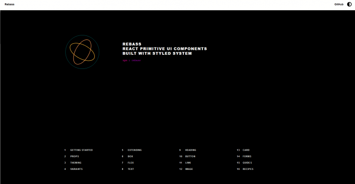
Rebass is so focused on making themeable components that their catch phrase is “our components were all built with themeability in mind.” This is very much true. They provide a straightforward theming API. Rebass is loved for being stylistically un-opinionated.
You can customize your application’s theme to your liking following the theme guide in the docs.
You can play with Rebass’ themes in the demo section of their docs
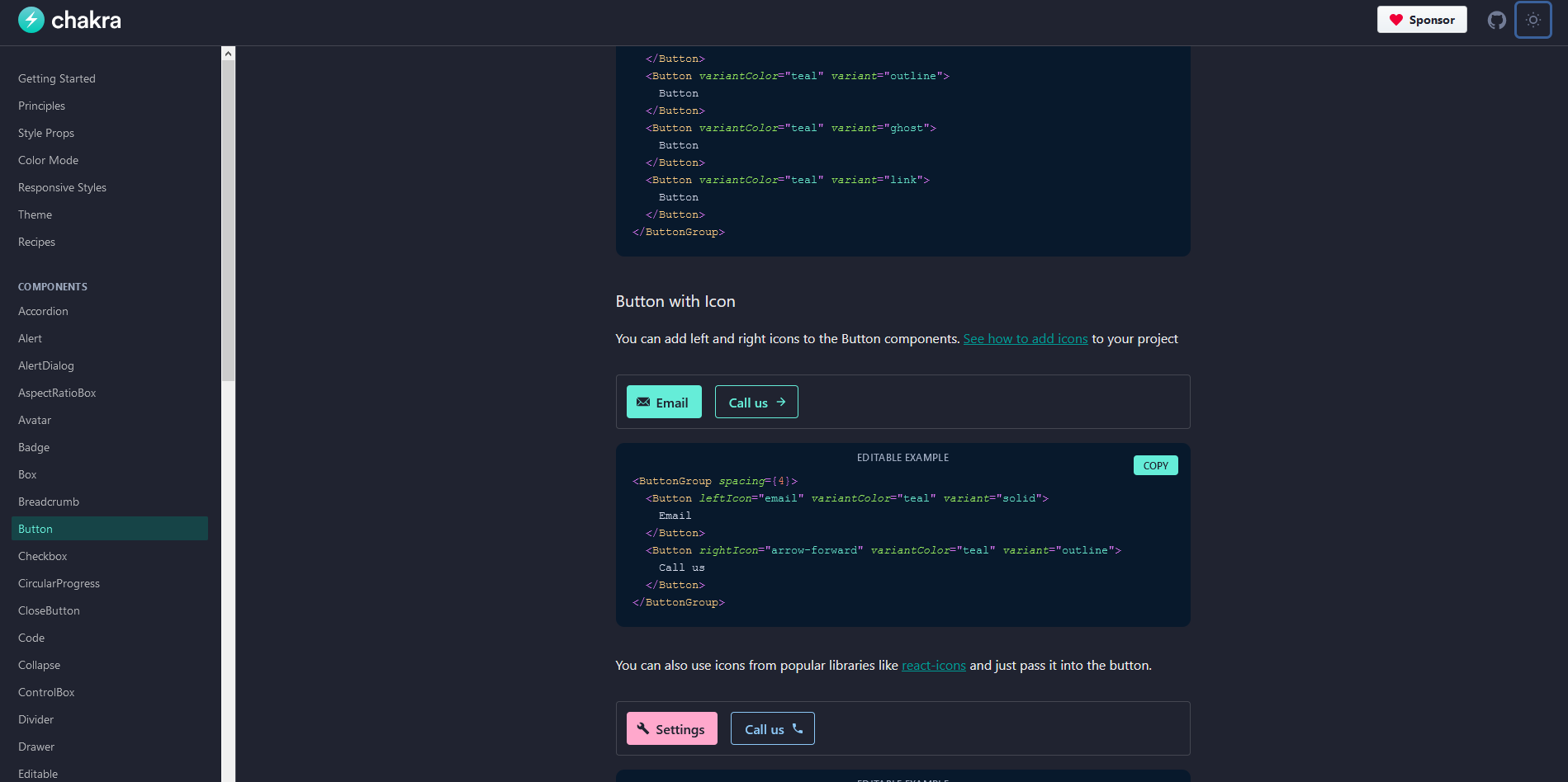
Chakra UI is a simple, modular, and accessible component library that gives you all the building blocks you need to build your React applications.
Chakra’s themeable interface helps developers quickly reference values from your customized theme throughout the entire application.
It provides a sensible default theme inspired by Tailwind CSS, which can be customized to fit your design.
Most of its components are dark mode compatible and it uses a custom React Hook: useColorMode whose value is stored in the localStorage and used whenever the page is loaded.
Tailwind CSS is a popular CSS framework. It is highly customizable and provides you with all the necessary building blocks you need to build your designs.
Unfortunately, Tailwind doesn’t come with dark mode out the box. However, its awesome community came up with a dark mode plugin which can be coupled with the library to help developers bring in dark mode support.
This plugin has variants which work the same as Tailwind’s and enables the styles to be completely customized.
Quasar framework is a Vue.js-based framework, which allows developers to quickly create websites, mobile, and desktop apps in many flavors.
Quasar frameworks ships with a lot of Components, directives, plugins, and extensions which will help you build awesome apps.
Luckily for us, Quasar has a dark mode plugin which is automatically installed and relatively easy to handle.
This plugin works well with basic Vue apps and with SSR builds.
There are also UI libraries that support dark mode on cross-platform mobile frameworks. This is a frequently-requested feature from developers using various frameworks.
👁 A screenshot of the Ionic UI.
Ionic has been around for a long time, so its developers understand what cross-platform mobile needs in terms of aesthetics.
Ionic now makes it extremely easy to change the themes of your app, including supporting dark color schemes.
With growing support for dark mode in native apps, Ionic developers are now looking to add it to their apps to support user preferences. Moreover, Ionic is not only a mobile UI library, but it also works great on web apps
In Ionic, adding a color scheme preference is as easy as writing media queries for CSS:
@media (prefers-color-scheme: dark) {
 :root {
 /* dark mode variables go here */
 }
}
Paper is a collection of customizable and production-ready components for React Native, following Google’s Material Design guidelines. It has a collection of very well-designed components which can be easily integrated in React Native.
Since Paper v3 dark mode is supported, it is a very solid point that drives great attention to this library.
Dark mode is a great improvement to an app’s user experience. Therefore, creating tools that support it out of the box will make developer’s lives easier.
Build dynamic LLM routing in Next.js with OpenRouter, TanStack AI, task classification, model fallbacks, and cost-aware routing.
TSRX adds first-class control flow, conditional hooks, and scoped styles to React via a TypeScript compiler extension — no new framework required.
Learn how to build a full React Native auth system using Better Auth and Expo — with email/password login, Google OAuth, session persistence, and protected routes.
Compare the top AI development tools and models of June 2026. View updated rankings, feature breakdowns, and find the best fit for you.
Would you be interested in joining LogRocket's developer community?
Join LogRocket’s Content Advisory Board. You’ll help inform the type of content we create and get access to exclusive meetups, social accreditation, and swag.
Sign up now