
Read how to get started, or view quick start projects for plain HTML and JavaScript, React, and TypeScript.
Elix elements
These elements are ready for production use as is. You can also customize them.
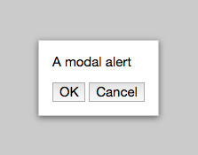
AlertDialog
Asks a single question the user can answer with choice buttons
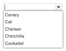
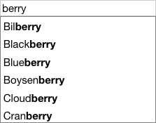
AutoCompleteComboBox
A combo box that auto-completes the user's input against the list items
AutoCompleteInput
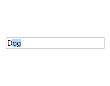
A text input box that completes text as the user types
AutoSizeTextarea
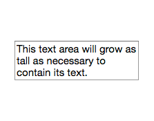
Text area that grows to accommodate its content
Backdrop
Background element shown behind an overlay's primary content
Button
Base class for custom buttons
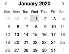
CalendarDay
Calendar representation of a single day
CalendarDayNamesHeader
Header showing the localized days of the week
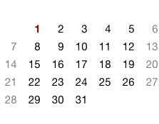
CalendarDays
A 7-column grid of days for use in a month calendar or multi-week calendar
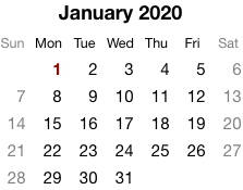
CalendarMonth
A single calendar month, optimized for a given locale
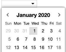
CalendarMonthNavigator
Interactive month calendar that lets the user select a date
CalendarMonthYearHeader
Header showing a localized month name and the year
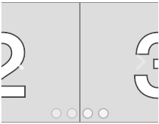
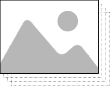
Carousel
Carousel with a sliding effect and navigation controls
CarouselSlideshow
Slideshow with carousel controls
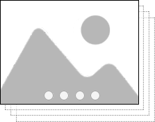
CarouselWithThumbnails
Carousel showing a thumbnail for each image
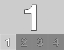
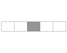
CenteredStrip
Horizontal strip of items with the selected item centered
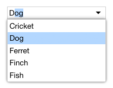
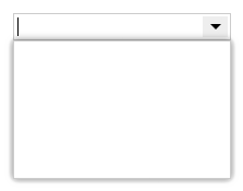
ComboBox
A text input paired with a popup that can be used as an alternative to typing
CrossfadeStage
Shows a crossfade effect when transitioning between a single selected item
DateComboBox
Combo box that lets the user type a date or pick one from a popup calendar
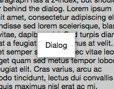
Dialog
Basic modal overlay that the user typically dismisses with an explicit action
Drawer
A panel that slides in from the side of the page
DrawerWithGrip
A drawer that includes an always-visible grip element
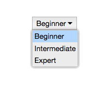
DropdownList
Shows a single choice made from a pop-up list of choices
ExpandablePanel
Region that expands/collapses in place with an animated transition
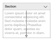
ExpandableSection
A document section with a header that can be expanded or collapsed
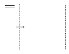
Explorer
Combines a list with an area focusing on a single selected item
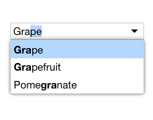
FilterComboBox
A combo box which applies its text input as a filter on its list items
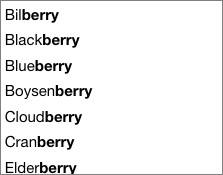
FilterListBox
List that only shows items containing a given text string
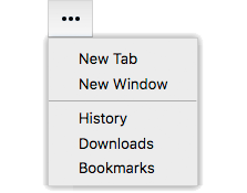
HamburgerMenuButton
Button that invokes a command menu, usually in a mobile context
Input
Base class for custom input elements
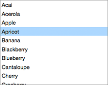
ListBox
Single-selection list box
ListComboBox
A combo box whose popup presents a list of choices
ListExplorer
Master/detail user interface pattern navigated with a list box
ListWithSearch
A list accompanied by a search box
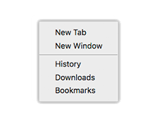
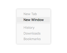
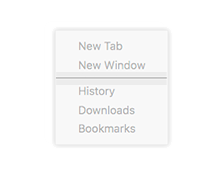
Menu
A menu of choices or commands
MenuButton
A button that invokes a menu
MenuItem
A choice in a menu
MenuSeparator
Inactive item that helps group related menu items
ModalBackdrop
Semi-transparent backdrop for a modal overlay
Modes
Shows a single panel at a time
MultiSelectListBox
Multiple-selection list box
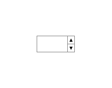
NumberSpinBox
Input with buttons to increase or decrease a numeric value
Overlay
An element that appears over other page elements
Popup
Lightweight form of modeless overlay that can be easily dismissed
PopupButton
A button that invokes an attached popup
PopupSource
Positions a popup with respect to a source element
ProgressSpinner
Spinning progress indicator
PullToRefresh
Lets the user refresh content with a swipe down gesture
ReactiveElement
General-purpose base for writing components in functional-reactive style
SeamlessButton
Slideshow
Slideshow with a simple crossfade transition
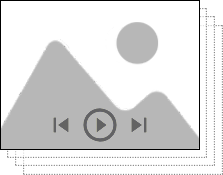
SlideshowWithPlayControls
Slideshow with buttons for controlling playback
SlidingPages
Simple carousel with no visible UI controls
SlidingStage
Slides between selected items on a horizontal axis
SpinBox
Input with buttons to increase or decrease a value
TabButton
Generic tab button with a text label
TabStrip
Strip of tab buttons
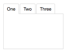
Tabs
Basic tabs structure for navigation and configuration
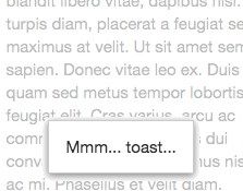
Toast
Lightweight popup intended to display a short, non-critical message
TooltipButton
Button with a non-interactive tooltip that appears on hover
WrappedStandardElement
Wraps a standard HTML element so it can be extended
- AlertDialog
- AutoCompleteComboBox
- AutoCompleteInput
- AutoSizeTextarea
- Backdrop
- Button
- CalendarDay
- CalendarDayButton
- CalendarDayNamesHeader
- CalendarDays
- CalendarMonth
- CalendarMonthNavigator
- CalendarMonthYearHeader
- Carousel
- CarouselSlideshow
- CarouselWithThumbnails
- CenteredStrip
- CheckListItem
- ComboBox
- CrossfadeStage
- DateComboBox
- DateInput
- Dialog
- Drawer
- DrawerWithGrip
- DropdownList
- ExpandablePanel
- ExpandableSection
- Explorer
- FilterComboBox
- FilterListBox
- HamburgerMenuButton
- Hidden
- Input
- ListBox
- ListComboBox
- ListExplorer
- ListWithSearch
- Menu
- MenuButton
- MenuItem
- MenuSeparator
- ModalBackdrop
- Modes
- MultiSelectListBox
- NumberSpinBox
- OpenCloseToggle
- Option
- OptionList
- Overlay
- OverlayFrame
- PlainAlertDialog
- PlainArrowDirectionButton
- PlainAutoCompleteComboBox
- PlainAutoCompleteInput
- PlainAutoSizeTextarea
- PlainBackdrop
- PlainBorderButton
- PlainButton
- PlainCalendarDay
- PlainCalendarDayButton
- PlainCalendarDayNamesHeader
- PlainCalendarDays
- PlainCalendarMonth
- PlainCalendarMonthNavigator
- PlainCalendarMonthYearHeader
- PlainCarousel
- PlainCarouselSlideshow
- PlainCarouselWithThumbnails
- PlainCenteredStrip
- PlainCenteredStripHighlight
- PlainCenteredStripOpacity
- PlainCheckListItem
- PlainChoice
- PlainComboBox
- PlainCrossfadeStage
- PlainDateComboBox
- PlainDateInput
- PlainDialog
- PlainDrawer
- PlainDrawerWithGrip
- PlainDropdownList
- PlainExpandablePanel
- PlainExpandableSection
- PlainExpandCollapseToggle
- PlainExplorer
- PlainFilterComboBox
- PlainFilterListBox
- PlainHamburgerMenuButton
- PlainHidden
- PlainInput
- PlainListBox
- PlainListComboBox
- PlainListExplorer
- PlainListWithSearch
- PlainMenu
- PlainMenuButton
- PlainMenuItem
- PlainMenuSeparator
- PlainModalBackdrop
- PlainModes
- PlainMultiSelectListBox
- PlainNumberSpinBox
- PlainOpenCloseToggle
- PlainOptionList
- PlainOverlay
- PlainOverlayFrame
- PlainPageDot
- PlainPopup
- PlainPopupButton
- PlainPopupSource
- PlainProgressSpinner
- PlainPullToRefresh
- PlainRepeatButton
- PlainSelectableButton
- PlainSlideshow
- PlainSlideshowWithPlayControls
- PlainSlidingPages
- PlainSlidingStage
- PlainSpinBox
- PlainTabButton
- PlainTabs
- PlainTabStrip
- PlainToast
- Popup
- PopupButton
- PopupSource
- ProgressSpinner
- PullToRefresh
- ReactiveElement
- RepeatButton
- SeamlessButton
- SelectableButton
- Slideshow
- SlideshowWithPlayControls
- SlidingPages
- SlidingStage
- SpinBox
- TabButton
- Tabs
- TabStrip
- Toast
- TooltipButton
- UpDownToggle
- WrappedStandardElement
Elix mixins
The Elix elements above are built up from composable mixins so they can share aspects of their behavior and APIs. You can use these mixins to create your own components.
- AriaListMixin
- AriaMenuMixin
- AriaRoleMixin
- ArrowDirectionMixin
- AttributeMarshallingMixin
- CalendarElementMixin
- ComposedFocusMixin
- ContentItemsMixin
- CurrentMixin
- CursorAPIMixin
- CursorInViewMixin
- CursorSelectMixin
- DarkModeMixin
- DelegateCursorMixin
- DelegateFocusMixin
- DelegateInputLabelMixin
- DelegateInputSelectionMixin
- DelegateItemsMixin
- DialogModalityMixin
- DirectionCursorMixin
- DisabledMixin
- EffectMixin
- FocusCaptureMixin
- FocusVisibleMixin
- FormElementMixin
- HoverMixin
- ItemsAPIMixin
- ItemsCursorMixin
- ItemsMultiSelectMixin
- ItemsTextMixin
- KeyboardDirectionMixin
- KeyboardMixin
- KeyboardPagedCursorMixin
- KeyboardPrefixCursorMixin
- LanguageDirectionMixin
- MultiSelectAPIMixin
- MultiSelectToggleMixin
- MultiSelectValueAPIMixin
- OpenCloseMixin
- OverlayMixin
- PageNumbersMixin
- PlainArrowDirectionMixin
- PlainButtonMixin
- PlainCarouselMixin
- PlainComboBoxMixin
- PlainDrawerMixin
- PlainInputMixin
- PlainListBoxMixin
- PlainModalOverlayMixin
- PlainPlayControlsMixin
- PlainSpinBoxMixin
- PlayControlsMixin
- PopupDragSelectMixin
- PopupListMixin
- PopupModalityMixin
- PopupToggleMixin
- ReactiveMixin
- RepeatMousedownMixin
- ResizeMixin
- SelectableMixin
- SelectedTextAPIMixin
- SelectedValueAPIMixin
- ShadowTemplateMixin
- SingleSelectAPIMixin
- SlotContentMixin
- SlotItemsMixin
- SwipeCommandsMixin
- SwipeDirectionMixin
- TapCursorMixin
- TimerCursorMixin
- TouchSwipeMixin
- TrackpadSwipeMixin
- TrackTextSelectionMixin
- TransitionEffectMixin