 |
VOOZH | about |
|
VOOZH | about |
Observability and telemetry work together to correlate the health of individual systems with the overall health of the business, highlighting what’s going on within the complex systems, processes, and microservices of an entire tech stack and/or application — purely from the existing data streams collected. In this Refcard, explore the fundamentals of full-stack observability and key components of the OpenTelemetry standard.
Written By
As applications become more and more complex, there is an increased need to change how organizations monitor the state of their entire system. Increased migration to the cloud brings different, more elaborate architecture paradigms — microservices and all components they enable.
Although microservices enable faster, more aggressive scaling, flexibility, and cost control, it becomes harder for a single person to assess the system's overall status. Observability (affectionately abbreviated as "o11y") brings clarity; it empowers teams to ask questions about their system and business and get clear answers driven by the signals collected.
The challenge is getting started:
How to instrument? Auto-instrumentation? Manual? Both?
At what point in the product lifecycle to start?
What framework or vendor to select?
These questions can quickly become overwhelming. OpenTelemetry provides the freedom to instrument a system once and maintains the flexibility of choosing any back-end observability or analytics solution without getting locked into a single vendor.
Observability was introduced in control theory by the engineer Rudolf Kámál. He defined it as "the ability to understand the current state of a system using only its external outputs." When a system is a black box, we cannot understand it; therefore, it becomes harder to maintain and predict. That's where high-quality telemetry and observability enter.
Observability and telemetry signals — logs, metrics, traces, events, and metadata — work together to correlate individual systems' health with the business' overall health. It highlights what's going on within the systems, processes, and microservices of an entire tech stack purely from the existing data streams collected. Ultimately, observability gives developers and operations teams a greater understanding of their systems.
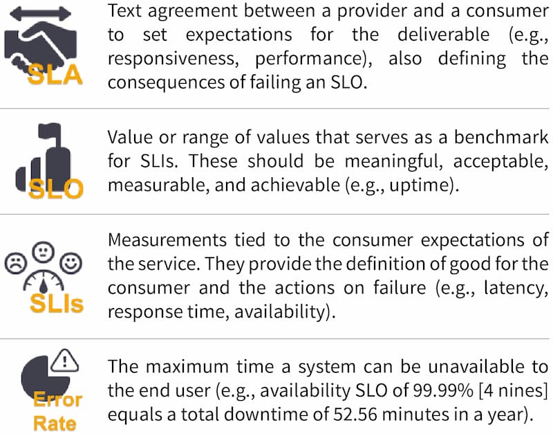
To understand and manage services, we need to measure, observe, and quantify their behaviors. We define KPIs that make sense for our domain to determine what's expected of our service. Defining these KPIs is paramount to understanding what actions need to be taken if the appropriate level of service is not delivered — ideally before the service consumer notices degradation. The four concepts described in Figure 1 help build a relationship of trust that can be maintained and quantified:
Figure 1
Let's start by saying that observability doesn't replace monitoring; quite the contrary — observability is meant to amplify its potential.
You can monitor a system, but if the telemetry signals are ineffective, insufficient, or inaccurate, there is no way to infer its status, and then observability cannot be achieved.
Full-stack observability is the ability to understand what is happening in a system at any time. Collecting, correlating, and aggregating telemetry from the system's components provides insight into its behavior, performance, and health. Through full-stack observability, teams can fully understand the dependencies across domains and system topology.
Contrary to traditional monitoring systems, full-stack observability enables engineers to proactively react, predict, and prevent problems by asking questions of their system that they didn’t know they needed to ask. We refer to this as the “unknown unknowns.” Presenting the data in unified analytics or intuitive dashboards can give the observer a complete picture of the system's health.
By instrumenting every line of code, endpoint, hardware, or software piece, we are generating outputs and signals that document its activity. When these signals are analyzed together, they can provide insight into the relationships and dependencies of the system. The table below notes some of the more common signals:
Table 1
|
Signal |
Description |
|
Metrics |
A numerical representation of a value calculated or aggregated over a period (e.g., percent of memory used, queue size of a message broker, number of errors per second) |
|
Events |
|
|
Logs |
|
|
Probes |
|
|
Traces |
|
|
User experience |
The end user's perspective when interacting with the software (e.g., Application Performance Index [Apdex]) |
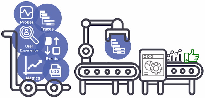
If you ever Google-searched "observability," you might have come across the Three Pillars of Observability: logs, traces, and metrics. Often, this automatically creates a visualization in our minds, similar to the orbs illustrated below:
Figure 2: Common telemetry signals collected and processed
With that mental image, it is easy to jump to conclusions, such as assuming that a metric line starting to increase means something is wrong, which is only one part of the picture in many cases. With telemetry, it's not just about quantity or spending all storage quota on it but about quality and relevance — the questions it answers.
The single responsibility principle was first coined by Robert C. Martin and became the base of the microservices philosophy:
"Gather together the things that change for the same reasons. Separate those things that change for different reasons."
A microservice architecture follows this approach by arranging an application into smaller, loosely coupled services that can be developed, deployed, and maintained independently. Communication happens through application programming interfaces (APIs) that serve as building blocks of the overall system while isolating other components from issues that can negatively impact the system. Development teams can select the best stack for the problem at hand — being able to alter, enhance, and scale without crossing other services' borders.
This architecture also brings challenges as companies can easily reach hundreds or thousands of microservices, making security, observability, and network policies more complex. As the number of deployed services increases, handling communication, observability, and errors becomes a monstrous task. One of the patterns used to deal with these challenges is service meshes, which are useful for companies with services starting in the hundreds that need to manage, observe, and secure communication between them by moving the logic from the services into an infrastructure layer.
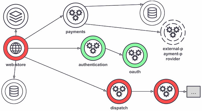
Although not all service mesh implementations are what's shown in Figure 3, most requests are routed between microservices through proxies that live in their infrastructure, decoupling business logic from network function. The individual proxies sit beside the service — sometimes called a "sidecar" for that reason. All these decoupled proxies form a service mesh network.
Figure 3: Service mesh example
The connectivity between services made by their individual proxies
Service meshes can help bring visibility into the application layer without code changes, making it easier to configure metrics collection. All traffic goes through the mesh proxies, enabling greater visibility into all service interactions. Each proxy reports its portion of the interaction, providing information on inbound and outbound traffic and service-level metrics. Access logs with service calls and distributed traces, generated by the mesh on every service within it, make it easier to follow requests across multiple services and proxies.
Storing all telemetry from a system in one place is compelling; however, IT teams must be able to interrogate the data to answer meaningful questions. They can rely on query languages for analysis, which can then be used to create visualizations, troubleshoot, perform business analysis, etc. Let's see some querying languages in action using OpenTelemetry DevStats to check how many companies have contributed over the last 10 years:
Table 2
|
Language |
Query |
Result |
|
PostgreSQL |
select count(name) from shcom where series = 'hcomcontributions' and period = 'y10' |
> 597 |
|
PromQL |
sum_over_time(shcom{series="hcomcontributions"}[10y]) by(name) |
|
|
Atlas |
series,hcomcontributions,:eq, now-10y,now,:time-span, :count |
|
|
Flux |
from(db: "shcom") |> range(start: -10y) |> filter(fn: (r) => r.series == "hcomcontributions") |> count() |
Combining OpenTelemetry with the flexibility of a powerful query language allows users to gain more value from the telemetry stored. Using the query languages mentioned here, we can jump into the next section to see how we can present the results in simple ways.
Gathering and correlating all system data is challenging, especially without the tools or techniques to visualize and process the telemetry in a meaningful manner, which is vital. Understanding dependencies throughout the stack and across services, processes, and hosts give observers and SRE teams the ability to predict and understand the topology of their service.
It's essential to understand the intended user when setting up dashboards, reports, or single visualizations. Give each different persona the level of detail and context they need, reducing the effort of reading and interpreting the information provided. Visualizations are a great way to deliver context and information — following are several visualization types that each provide value in unique ways.
In multi-cloud environments, applications can reach millions of components, making it incredibly challenging to understand the context between them. One way to visualize their relationships is through topology maps (Figure 4). Analyzing distributed traces is often one of the more effective ways to perform a root cause analysis, which becomes easier to profile with the help of visual aids.
Figure 4
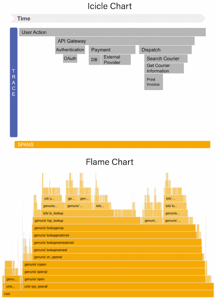
Flame charts and icicle charts (Figure 5) help developers see the relationship between service calls and the impact on a single trace, such as unusually high latency or errors, and how they impact other calls and services. They represent each call on a distributed trace as a time-stamped horizontal or vertical line that contains details for each span.
Figure 5
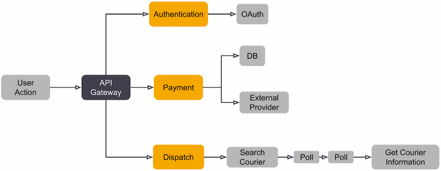
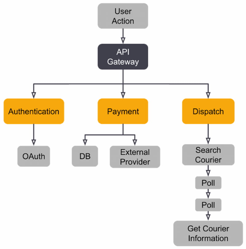
A trace map (Figure 6) shows the connection between spans and lets one quickly understand the relationship between services. Like trace maps, trace trees (Figure 7) are represented vertically with the parent span as the root node.
Figure 6
Figure 7
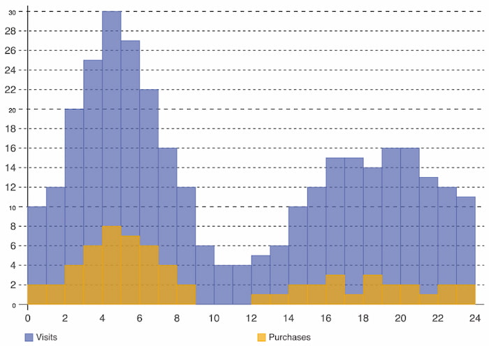
Histograms illustrate data distribution over a continuous interval or period and demonstrate the frequency of occurrences to quickly identify gaps or atypical values. In Figure 9, we can easily identify website traffic in relation to purchases:
Figure 8
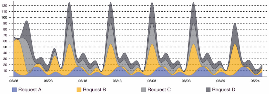
Similar to a line chart, an area chart has a color filling underneath that represents the total value at each point. When using more than one series for comparison, they are stacked to show how individual values affect the whole. Figure 10 shows changes over time and how each request impacts the total volume:
Figure 9
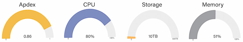
A gauge chart is one of the most effective visualizations for making quick decisions, as it shows one metric, its scale, and where a value is along that scale (e.g., a car speedometer). In Figure 11 are examples where this visualization can be used:
Figure 10
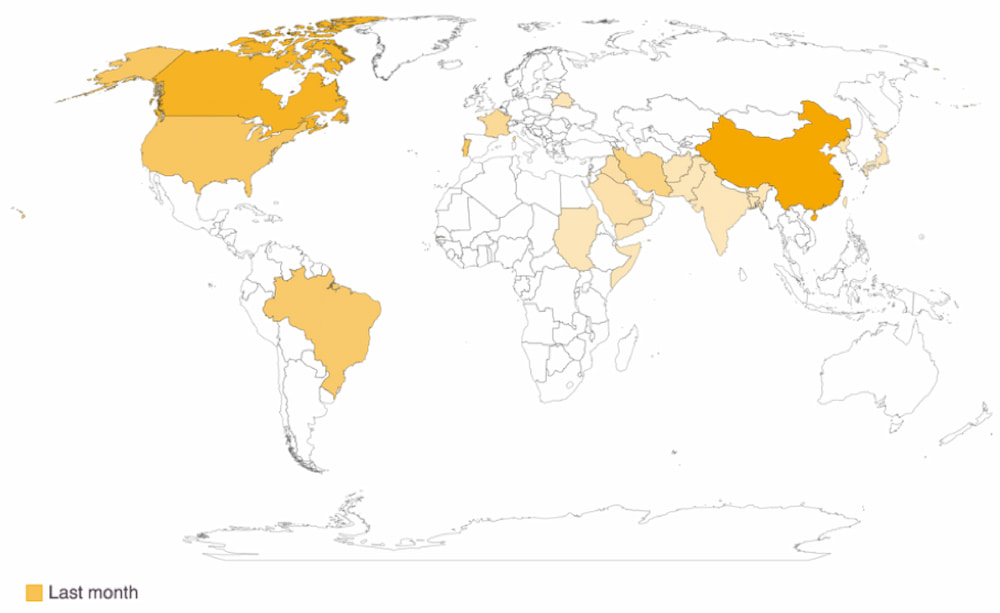
Unlike other charts, geographical charts are most valuable when they have added interactivity to see the exact values. Their use of color gradients to represent numerical variations across geographical regions helps to quickly identify data such as that shown in Figure 12, conversion rates by country:
Figure 11
Today, organizations think about security, performance, and quality earlier in a product's lifecycle. There is a strong argument in favor of the shift-left principle happening across the industry — and observability practices are no exception. As we've extensively covered in this Refcard, observability is meant to answer questions, one of the most important when developing a new change being, "Should this go to production?"
The shift-left principle involves moving testing, assessment, quality, and performance to the earlier stages of the DevOps lifecycle. This way, teams can have feedback sooner, and the cost and complexity of solving issues decreases while the frequency and speed of delivery increases. Shift right, while similar, is done in production environments. It's a practice gaining traction as demand for more performant, resilient, reliable software increases. Using real-world environments for testing under the same conditions that users experience enables the detection of bugs that would be harder to identify in lower environments. It also helps ensure that added noise doesn't affect the experience.
Integrating observability principles into the entire SDLC helps apply and maintain the same standards and SLOs used in production. Using the telemetry to create pipeline gates to detect anomalies and validations for acceptance tests prevents issues from bubbling up. If caught early, problems are easier to handle, cost less to fix, and require less context switching from teams, as the concepts are still present.
Another (significant) advantage of shifting observability left is increasing stakeholders' visibility of the complexities and challenges that teams face. Seeing the status of applications from left to right can also reduce the finger-pointing culture and help developers feel more connected to production environments.
Make the right telemetry and proper visualizations available to meet people's needs. Irrelevant or too much information is the first factor to contribute to ignoring dashboards. Remember that observability is as relevant for engineers as it is for businesses. Organizations can achieve a blameless culture when there is an understanding of why an incident occurred, how to handle it, and how we can prevent it in the future.
Inspired by OpenTracing and OpenCensus, OpenTelemetry has one goal: to give developers a vendor-agnostic way to generate and send telemetry information to back-end systems to analyze that information. The OpenTracing and OpenCensus combined under the new banner of OpenTelemetry in 2019 and has grown to become the #2 project supported by the Cloud Native Computing Foundation (CNCF).
OpenTracing became a CNCF project in 2016, and Google made the OpenCensus project open source in 2018. The two competing tracing frameworks shared the same goal but weren't mutually compatible. Although competition usually means better software, this is not necessarily true in the world of open source. It can often lead to poor adoption, contribution, and support. To stop "the tracing wars," it was announced at KubeCon 2019 in Barcelona that the projects would converge into OpenTelemetry and join the CNCF. Hence, OpenTelemetry, or OTel for short, was born.
With the ultimate goal of providing a unified set of vendor-neutral standards, libraries, integrations, APIs, and software development kits (SDKs), OpenTelemetry has become the de facto standard for adding flexible full-stack observability to cloud-native applications. This open standard enables companies with any technology stack to gather observability data from all their systems.
As OpenTelemetry is open source, the maturity level of each component will depend on the language and the interest taken by that particular community. The following table shows the current maturity status of its elements for some of the languages it supports:
Table 3: OpenTelemetry code instrumentation state
|
Language |
Tracing |
Metrics |
Logging |
|
Java |
Stable |
Stable |
Experimental |
|
.NET |
Stable |
Stable |
ILogger: Stable OTLP log exporter: Experimental |
|
Go |
Stable |
Experimental |
Not yet implemented |
|
JS* |
Stable |
Development |
Roadmap |
|
Python |
Stable |
Experimental |
Experimental |
*JavaScript can be used in both browser-based applications as well as on the server. The maturity of usage in the browser is slightly different to the usage in server-side applications.
There are three main ways to instrument apps using OpenTelemetry:
If you had to manually instrument every function in every microservice, it would likely mean spending almost as much time building and maintaining telemetry as building and maintaining the software itself. That's where auto-instrumentation and instrumentation libraries step in: They make it possible to collect application-level telemetry without manually changing the code of your application. They allow tracing a transaction's path as it navigates different components, including application frameworks, communication protocols, and data stores.
Four type of libraries are provided by OpenTelemetry:
Tracing all operations involved in a transaction provides an end-to-end view of how the service functions. We can then visualize, aggregate, and inspect the data to understand the experience of individual users, identify bottlenecks, and map out dependencies between services.
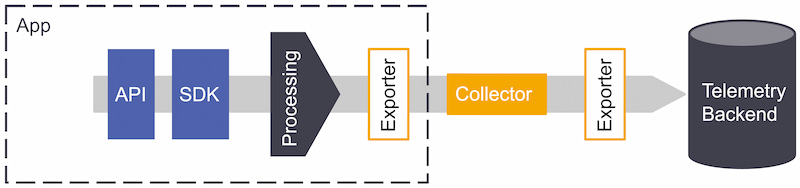
When integrating OpenTelemetry into your application stack, the telemetry delivery pipeline will look like Figure 13. The topology will depend on how your application architecture is structured and how deeply you want to instrument.
Figure 12: OpenTelemetry pipeline
When opting to use OpenTelemetry, these are the pipeline components to consider:
The collector consists of three components:
Table 4
|
Receiver |
Processor |
Exporter |
|
Can push or pull data that will get into the collector (e.g., Jaeger, Prometheus). |
Sit between receivers and exporters and run on the data; filter, format, and enrich data before it's sent through the exporter to a back end. Although not required, some might be recommended based on the data source. |
Can push or pull data into one or multiple configured back ends or destinations (e.g., Kafka, OTLP). It separates instrumentation from the back-end configuration, so users can switch back ends without re-instrumenting the code. |
OpenTelemetry is a library framework for receiving, processing, and exporting telemetry, which requires a back end to receive and store the data — the purpose of the collector.
Correlating and analyzing data can be cumbersome for organizations trying to obtain insight into their applications, especially nowadays with highly ephemeral infrastructure and countless services to manage. OpenTelemetry aims to simplify data collection to focus on data analysis and processing while creating a standard that eliminates the previous proprietary and in-house solutions.
With 93 pull requests per week in all repositories and more than 450 companies backing up and maintaining the project in the last year alone, OpenTelemetry provides access to an extensive set of telemetry collection frameworks. The community's involvement also means it will respond and offer support with new technologies, without users having to wait for a vendor's support.
To reach full-stack observability of modern distributed application stacks, data must be collected, processed, and correlated visually from the entire system. Achieving this can be challenging for development teams when they have to support all stacks, frameworks, and providers within their organization.
By standardizing how frameworks and applications collect and send observability data, OpenTelemetry aims to solve some of the challenges created by the heterogeneity of stacks, giving teams a vendor-neutral, portable, and pluggable solution that's easily configured with open-source and commercial solutions alike.
Additional Resources:
ADVERTISE
CONTRIBUTE ON DZONE
LEGAL
CONTACT US
Let's be friends: