 |
VOOZH | about |
|
VOOZH | about |
This page is
By Vincent Hardy, Sylvain Galineau
This guide looks into the relationship between CSS pixels and other units, as well as between CSS and device pixels.
A growing number of CSS length units have provided new flexibility to web authors (see the CSS Values and Units specification). For example, the ‘rem’ (root ‘em’) unit permits the font size of the root element to be used for sizing throughout the document.
They help developers lay out content independently of display size and resolution.
Modern content needs to be ready for a variety of viewing environments: smart phones, tablets, large monitors or even TV screens cover a huge range of sizes, aspect ratios, pixel densities and viewing distances. A number of tools are available to help developers optimize their layout for the best experience e.g. to avoid or minimize awkward scrolling.
Most developers are now familiar with the use of media queries. They enable the application of CSS rules depending on display media factors such as size or aspect ratio. They can be used to specify separate stylesheets for each target environments, or they can refine and adapt a primary stylesheet.
Understanding and setting up the display viewport is especially important for mobile clients as it allows your content to fit to the display of the user’s device.
Available since CSS1, percentages allow the sizing of elements relative to their containing block. For example, we can set up the body of a document like so:
body {
 width: 80%;
 max-width: 900px;
 margin-left: auto;
 margin-right: auto;
}
…to ensure the body is at most 900px and take 80% of the width of the viewport otherwise. (Note that CSS pixels are not device pixels; this will be discussed at length later)
Several other CSS unit types support layout adaptation. The following table enumerates a number of them:
| Unit | Description | Example use case |
|---|---|---|
| em | 1 em is the computed value of the font-size on the element on which it is used. | For example, the font size <h1> heading elements may be set to 3em and the body kept at 1em, making sure that under all display conditions heading text will be 3 times as large as the body’s. It must be noted that when used as a font-size property value, the em unit refers to the font size of the parent element. Thus, in our example, a <span> element inside an <h1> with font-size: 2 em would end up with text 6 times larger than in the body. |
| ex | 1 ex is the current font’s x-height. The x-height is usually (but not always, e.g., if there is no ‘x’ in the font) equal to the height of a lowercase ‘x’ | Rarely used in practice. May be used to size inline images to fit the x-height of the current font for visual harmony. |
| ch | 1 ch is the advance of the ‘0’ (zero) glyph in the current font. ‘ch’ stands for character. | Can be used to style monospace text or braille. |
| rem | 1 rem is the computed value of the font-size property for the document’s root element.
This unit is often easier to use than the ‘em’ unit because it is not affected by inheritance as ‘em’ units are. |
For example, given a root element font-size of 20px, setting a 0.5em font-size on <li> elements would resolve to 10px for first-level <li> but second-level <li> would have a 5px font-size. Setting the font-size to 0.5rem would result in 10px <li> elements no matter their nesting level. |
| vw | 1vw is 1% of the width of the viewport. ‘vw’ stands for ‘viewport width’. | Useful to size boxes that adapt to different viewport widths. |
| vh | 1vh is 1% of the height of the viewport. ‘vh’ stands for ‘viewport height’. | Useful to size boxes that adapt to different viewport heights. For example, may be used to set a maximum height on an image so that it does not exceed the viewport dimensions. |
| vmin | Equal to the smaller of ‘vw’ or ‘vh’ | See vh/vw |
| vmax | Equal to the larger of ‘vw’ or ‘vh’ | See vh/vw |
We have thus far focused on the styling of document elements using CSS. Some use-cases, however, require full application control over each drawn pixel e.g. in a video game.
Both the Canvas 2D context and Scalable Vector Graphics can be used to address such requirements, as well as WebGL. It is also possible to use absolutely positioned content to get faster performance under very specific circumstance (like gaming).
While developers should not casually implement their own layout, there are use-cases where this is still a better option than moving to native application development.
But let’s go back to the basics: what is resolution independence and why does it matter?
When content is drawn to to an output medium such as a printer or a screen, software converts the description of what needs to be drawn into actual pixels. For example, a line of text is first converted to a set of geometric outlines defined by font data; these outlines are then ‘rasterized’, or turned into pixels. The same process occurs for simpler shapes such as a rectangle drawn at a particular location (x/y coordinate) and with a particular size (width and height).
As a rendering approach, resolution independence requires objects to be described in a way that is independent of the output medium’s exact characteristics. The goal is to be able to specify what needs to be drawn and let the underlying software figure how do so for a particular output device at runtime.
This is especially important when the size and pixel density of output devices varies as widely as it does across modern browsing devices. For example, on a 96dppi screen (dppi = device pixel per inch) resolution, a millimeter would be about 4 device pixels long so a rectangle positioned at (x=10mm, y=20mm) would get positioned at x=40 device pixel and y=80 device pixels. While on a 300dppi display, a millimeter would be about 12 device pixel long, and the rectangle should be positioned at x=120 device pixels and y=240 device pixels. However, and this is the important part, the rectangle would show at the same physical position on the display modulo rounding i.e. at approximately 10mm on the x-axis and 20mm on the y-axis.
To be resolution independent, a system must able to scale content based on rendering conditions. Postscript and PDF are examples of technologies based on the concept of units that can then be scaled as needed to accommodate the available display resolution. Both use the ‘point’ unit and define it as being 1/72nd of an inch.
Scalable Vector Graphics (SVG) does the same and has a concept of user unit that all other units ultimately derive from; CSS defines CSS pixels, the unit all others resolve to (an SVG user unit is the same as a CSS ‘px’).
In all these cases, objects’ positions and dimensions eventually resolve to a single unit which can then be mapped to a number of device pixels and scaled as desired e.g. when the user zooms the content.
Before we dive deeper into CSS ‘px’ unit, we will note that scalable formats such as SVG are very effective way to achieve resolution independence, or responsiveness, for your image assets.
Note : Icon fonts are another recent popular practice as of 2013 e.g. see http://css-tricks.com/html-for-icon-font-usage/, or http://nimbupani.com/markup-free-icon-fonts-with-unicode-range.html. And then there are very clever OpenType hacks like Chartwell or Symbolset. These are part of the scalable arsenal today.
Though the CSS Values and Units specification defines all the CSS units in one single document, it can take some work to wrap one’s head around the way CSS relates its units to real-world measures, or physical units. All the specification says can be stated as:
96px = 1in
Simple math guides the two possible behaviors allowed by the specification:
border: 1px solid blue;
…its border should be 3.125 device pixel wide. Depending on the rasterizer - the part of the software that converts basic shapes to pixels - you could get blue covering 3 pixels fully and then partial coverage of the 4th pixel using anti-aliasing to blend with the background.
Until a few years ago, a CSS pixel was generally mapped to a single screen pixel. As a consequence, a CSS inch did not always map to an actual physical inch; if a laptop’s true resolution was 120dppi, a 96px-long inch would end up being 96/120 = 0.8 physical inch!
With the advent of higher density screens, we are seeing devices with 2 device pixels per CSS pixel (the Apple Retina, for instance) as well as displays with fractional pixel ratios (see this MDN article). Note that fractional pixel ratios may introduce additional anti-aliasing in the rendering, as with high-resolution rendering.
<!DOCTYPE html>
<html>
 <head>
 <meta charset="utf-8">
 <meta http-equiv="X-UA-Compatible" content="IE=edge,chrome=1">
 <title>CSS Units px/in test</title>
 <meta name="description" content="">
 <meta name="viewport"
 content="width=device-width, initial-scale=1, maximum-scale=1">
 </head>

 <style>
 body {
 background: #404040;
 }

 .css-box > span {
 display: inline-block;
 height: 1em;
 border-right: 1px solid black;
 }

 .css-box.px > span {
 width: 96px;
 background: #fefefe;
 }

 .css-box.in > span {
 width: 1in;
 background: #4166B5;
 }
 </style>
 <body>
 <div class="css-box px"></span><span></span><span></div>
 <div class="css-box in"></span><span></span><span></div>
 </body>
</html>
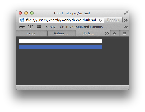
Figure 1: Rendering in OSX Safari
When we try render this document across different devices we see that:
Well, that is almost like that but it is not as bad as it seems. Here is why:
So what should keep in mind as web developers to have our content render nicely on various display sizes, form factors and pixel densities? Here are a few take-aways: