 |
VOOZH | about |
|
VOOZH | about |
The use of this article is best illustrated by a case study. So let’s dive straight in.
Recently, we entered 2015 and before starting new projects and initiatives, every company would want to review their performance in last year. Let’s think about a sales oriented company ABC. They have branches across India and these branches fall under four regions. Now, the company wants to analyse profitability at branch level and compare region level performance. They are looking for answers like which regions are following good practices and can they be replicated in other regions.
So, you want to compare performance of a group of branches to come out with insights on relative performance like Region N branches are more profitable as compared to region S or 75% of Region W branches are more profitable than Region E.
Now at individual level, we can easily evaluate profitability and visualize it with the help of Pivot Tables or Bar Chart to show top and bottom branches. But the question is, how would we visualize comparison of branch profitability at regional level? In other words, we can say how to compare distribution of branch profitability at regional level?
Let’s look at the available options to visualize this information. We can represent it through a pie chart, stacked column chart and also through table but all of these visualizations have some limitation.
👁 BoxPlot, Qlikview, Pie Chart
So, whenever we come across with such situations, we should look at Box Plot chart. It is the best way to visualize distribution of a group and compare across different levels. This chart is also known as Five Number Summary in statistics.
A box plot is a graphical method of displaying variation in a set of data. In most cases, a histogram provides a sufficient display; however, a box plot can provide additional detail while allowing multiple sets of data to be displayed in the same graph. As I have mentioned before, it is also known as Five Number Summary, reason being it uses five statistic metrics to represent it.
👁 Box Plot, Qlikview
There are some other types of Box plot also known as Modified Box Plot, those used to highlight outliers. In this article we will look at Box Plot only.
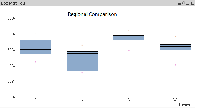
Let’s visualize the above discussed scenario using Box Plot and understand the insights gained from it.
While looking at the above visualization, the following inferences can be generated:-
In similar way, we can generate various inferences compare to different levels of dimensions.
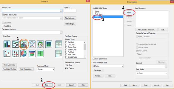
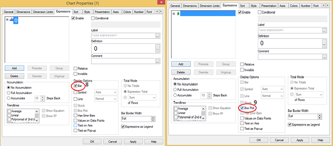
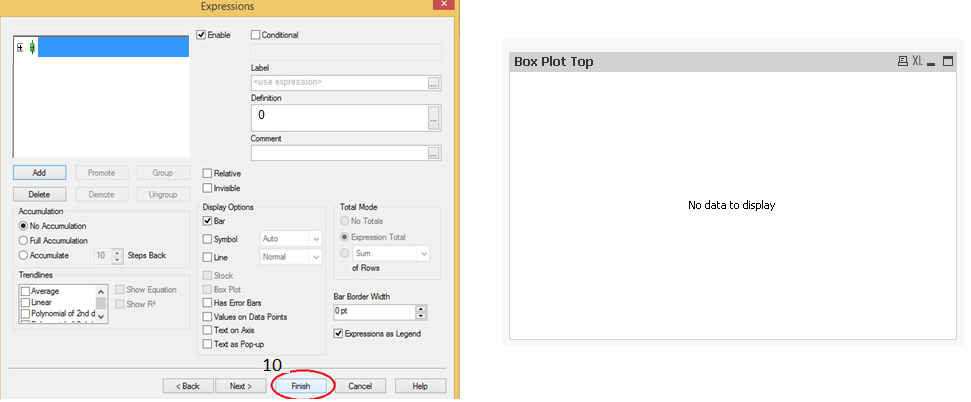
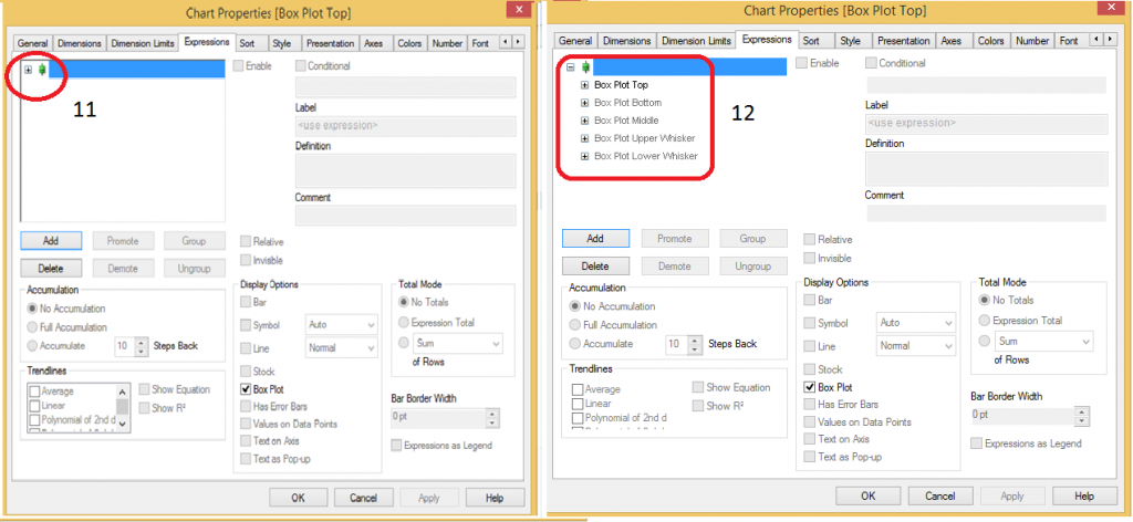
Now that the use of Box plot is clear, it is dis-appointing that creating box plot is not a simple click away on QlikView. You need to use a combo chart with a few hacks to create a Box Plot. Let us look at them step by step:
In this article, precisely, we have looked at the methods to create Box Plot in Qlikview and how to generate insight while looking at box plot. Additionally, We have also looked at five statistical measures Minimum, Maximum, Median, First and third quartile and how these are useful to visualize the information effectively. Do you use Box Plots in your roles and visualizations? If yes, how do you create them? Do you think this tip is useful?
Do let me know your thoughts on using this chart in Qlikview.
Sunil Ray is Chief Content Officer at Analytics Vidhya, India's largest Analytics community. I am deeply passionate about understanding and explaining concepts from first principles. In my current role, I am responsible for creating top notch content for Analytics Vidhya including its courses, conferences, blogs and Competitions.
I thrive in fast paced environment and love building and scaling products which unleash huge value for customers using data and technology. Over the last 6 years, I have built the content team and created multiple data products at Analytics Vidhya.
Prior to Analytics Vidhya, I have 7+ years of experience working with several insurance companies like Max Life, Max Bupa, Birla Sun Life & Aviva Life Insurance in different data roles.
Industry exposure: Insurance, and EdTech
Major capabilities: Content Development, Product Management, Analytics, Growth Strategy.
GPT-4 vs. Llama 3.1 – Which Model is Better?
Llama-3.1-Storm-8B: The 8B LLM Powerhouse Surpa...
A Comprehensive Guide to Building Agentic RAG S...
Top 10 Machine Learning Algorithms in 2026
45 Questions to Test a Data Scientist on Basics...
90+ Python Interview Questions and Answers (202...
8 Easy Ways to Access ChatGPT for Free
Prompt Engineering: Definition, Examples, Tips ...
What is LangChain?
What is Retrieval-Augmented Generation (RAG)?
Hello, I have read couple of Your articles which were very helpfull. Last one "A Comprehensive guide to Data Exploration" was really excellent!! I am quite new to data science and I am working with QlikView and have a little problem. I suppose that it is not so difficult as it seems to me but it stops me and I can't find any idea for solution. Could You maybe help me? Here is my question on Qlik website: https://community.qlik.com/thread/199364?sr=inbox I will be gratefull for any reply.
Edit
Resend OTP
Resend OTP in 45s