 |
VOOZH | about |
|
VOOZH | about |
The beauty of art lies in the message it conveys. At times, reality is not what we see or perceive. The endless efforts from the likes of Vinci and Picasso have tried to bring people closer to the reality using their exceptional artworks on a certain topic/matter.
Data scientists are no less than artists. They make paintings in form of digital visualization (of data) with a motive of manifesting the hidden patterns / insights in it. It is even more interesting to know that, the tendency of human perception, cognition and communication increases when he / she gets exposed to visualized form of any content/data.
There are multiple tools for performing visualization in data science. In this article, I have demonstrated various visualization charts using Python.
Not much ! Python has already made it easy for you – with two exclusive libraries for visualization, commonly known as matplotlib and seaborn. Heard of them?
Matplotlib: Python based plotting library offers matplotlib with a complete 2D support along with limited 3D graphic support. It is useful in producing publication quality figures in interactive environment across platforms. It can also be used for animations as well. To know more about this library, check this link.
Seaborn: Seaborn is a library for creating informative and attractive statistical graphics in python. This library is based on matplotlib. Seaborn offers various features such as built in themes, color palettes, functions and tools to visualize univariate, bivariate, linear regression, matrices of data, statistical time series etc which lets us to build complex visualizations. To know more about this library, check this link.
Last week, A comprehensive guide on Data Visualization was published to introduce you to the most commonly used visualizations techniques. We recommend you to refer that before proceeding further, in case you haven’t.
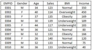
Below are the python codes with their output. I have used following data set to create these visualization:
import matplotlib.pyplot as plt
import pandas as pd
df=pd.read_excel("E:/First.xlsx", "Sheet1")
fig=plt.figure() #Plots in matplotlib reside within a figure object, use plt.figure to create new figure
#Create one or more subplots using add_subplot, because you can't create blank figure
ax = fig.add_subplot(1,1,1)
#Variable
ax.hist(df['Age'],bins = 7) # Here you can play with number of bins
Labels and Tit
plt.title('Age distribution')
plt.xlabel('Age')
plt.ylabel('#Employee')
plt.show()
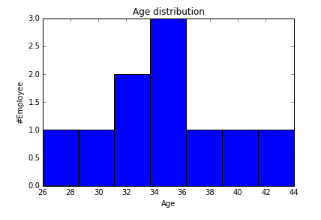
import matplotlib.pyplot as plt
import pandas as pd
fig=plt.figure()
ax = fig.add_subplot(1,1,1)
#Variable
ax.boxplot(df['Age'])
plt.show()
👁 Box plot in Python, matplotlib, seaborn
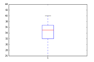
import seaborn as sns
sns.violinplot(df['Age'], df['Gender']) #Variable Plot
sns.despine()

👁 Violin Plot in Python
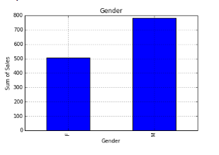
var = df.groupby('Gender').Sales.sum() #grouped sum of sales at Gender level
fig = plt.figure()
ax1 = fig.add_subplot(1,1,1)
ax1.set_xlabel('Gender')
ax1.set_ylabel('Sum of Sales')
ax1.set_title("Gender wise Sum of Sales")
var.plot(kind='bar')
👁 Bar chart in Python, Matplotlib
You can read more about pandas groupby here and for dataframe. For plot refer this link.
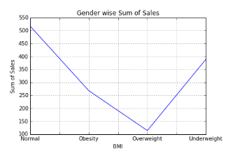
var = df.groupby('BMI').Sales.sum()
fig = plt.figure()
ax1 = fig.add_subplot(1,1,1)
ax1.set_xlabel('BMI')
ax1.set_ylabel('Sum of Sales')
ax1.set_title("BMI wise Sum of Sales")
var.plot(kind='line')
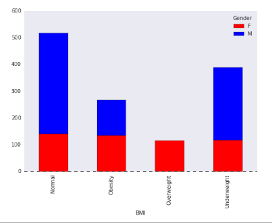
var = df.groupby(['BMI','Gender']).Sales.sum()
var.unstack().plot(kind='bar',stacked=True,  color=['red','blue'], grid=False)
👁 Stacked Column Chart in Python, Matplotlib, Seaborn
Dataframe.unstack() returns a Data Frame having a new level of column labels whose inner-most level consists of the pivoted index labels. Read more about dataframe.unstack here.
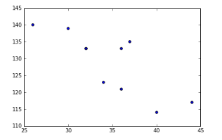
fig = plt.figure()
ax = fig.add_subplot(1,1,1)
ax.scatter(df['Age'],df['Sales']) #You can also add more variables here to represent color and size.
plt.show()
👁 Scatter Plot in Python, Data Visualization
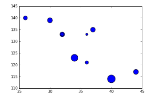
fig = plt.figure()
ax = fig.add_subplot(1,1,1)
ax.scatter(df['Age'],df['Sales'], s=df['Income']) # Added third variable income as size of the bubble
plt.show()
👁 Bubble chart, Python, Data Visualization
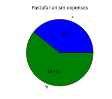
var=df.groupby(['Gender']).sum().stack()
temp=var.unstack()
type(temp)
x_list = temp['Sales']
label_list = temp.index
pyplot.axis("equal") #The pie chart is oval by default. To make it a circle use pyplot.axis("equal")
#To show the percentage of each pie slice, pass an output format to the autopctparameter plt.pie(x_list,labels=label_list,autopct="%1.1f%%") plt.title("Pastafarianism expenses") plt.show()
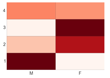
import numpy as np
#Generate a random number, you can refer your data values also
data = np.random.rand(4,2)
rows = list('1234') #rows categories
columns = list('MF') #column categories
fig,ax=plt.subplots()
#Advance color controls
ax.pcolor(data,cmap=plt.cm.Reds,edgecolors='k')
ax.set_xticks(np.arange(0,2)+0.5)
ax.set_yticks(np.arange(0,4)+0.5)
# Here we position the tick labels for x and y axis
ax.xaxis.tick_bottom()
ax.yaxis.tick_left()
#Values against each labels
ax.set_xticklabels(columns,minor=False,fontsize=20)
ax.set_yticklabels(rows,minor=False,fontsize=20)
plt.show()
👁 Heat Map in Python, Data Visualization, Analytics Vidhya
You can attempt to plot a heat based on two variables like Gender on x-axis, BMI on Y-axis and Sales values as data points. Please share your code and output in comment section.
By now, you must have realized, how beautifully data can be presented using visualization. I find performing visualization in Python much easier as compared to R. In this article, we discussed about deriving various visualizations in Python. In this process, we made use of matplotlib and seaborn in python. In the subsequent articles we will explore map visualization and word cloud in python.
Do you have any questions on visualization methods / techniques / selection? Feel free to discuss it with us.
Sunil Ray is Chief Content Officer at Analytics Vidhya, India's largest Analytics community. I am deeply passionate about understanding and explaining concepts from first principles. In my current role, I am responsible for creating top notch content for Analytics Vidhya including its courses, conferences, blogs and Competitions.
I thrive in fast paced environment and love building and scaling products which unleash huge value for customers using data and technology. Over the last 6 years, I have built the content team and created multiple data products at Analytics Vidhya.
Prior to Analytics Vidhya, I have 7+ years of experience working with several insurance companies like Max Life, Max Bupa, Birla Sun Life & Aviva Life Insurance in different data roles.
Industry exposure: Insurance, and EdTech
Major capabilities: Content Development, Product Management, Analytics, Growth Strategy.
GPT-4 vs. Llama 3.1 – Which Model is Better?
Llama-3.1-Storm-8B: The 8B LLM Powerhouse Surpa...
A Comprehensive Guide to Building Agentic RAG S...
Top 10 Machine Learning Algorithms in 2026
45 Questions to Test a Data Scientist on Basics...
90+ Python Interview Questions and Answers (202...
8 Easy Ways to Access ChatGPT for Free
Prompt Engineering: Definition, Examples, Tips ...
What is LangChain?
What is Retrieval-Augmented Generation (RAG)?
It looks like the link you provided for "A comprehensive guide on Data Visualization" has nothing to do with Data Visualization. Can you please put the correct link. Thanks...
Hi Karsibali, Thanks for pointing it out. Will rectify it. Regards, Kunal
It would be awesome if you have provided a link to download the excel file as well. I have to create it myself!?
Edit
Resend OTP
Resend OTP in 45s