 |
VOOZH | about |
|
VOOZH | about |
In today’s world, every second the data keeps on getting bigger and bigger. In order to understand the data quickly and to draw insights, data visualization becomes necessary.
For e.g. consider a case where you are asked to illustrate crucial sales aspects (like sales performance, target, revenue, acquisition cost, etc.) from huge amounts of sales data, which one would you prefer:
Obviously, you would prefer graphs and charts. So data visualization plays a key role in data exploration and data analysis.
Data Visualization is the technique to represent the data/information in a pictorial or graphical format. It enables the stakeholders and decision-makers to analyze and explore the data visually and uncover deep insights.
“Visualization gives you answers to questions you didn’t know you had.” – Ben Schneiderman
There are several libraries available in Python like Matplotlib, Seaborn, etc. for data visualization. But they render only the static images of the charts/plots and due to this, many crucial things get lost in the visualization. Wouldn’t it be amazing if we could interact better with the charts by hovering in (or) zooming in? Plotly allows us to do the same.
In this post, we will cover the most commonly used graph types using Plotly. So let’s get started using the Cars93datasetavailable on Kaggle.
The dataset contains 27 car parameters (like manufacturer, make, price, horsepower, engine size, weight, cylinders, airbags, passengers, etc.) of 93 different cars.
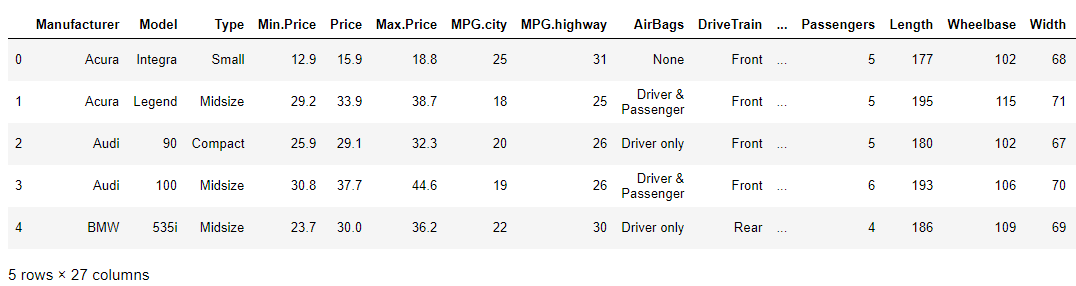
The dataset looks like this:
Additional NOTE: In order to access the entire python code follow the kaggle kernel here(https://www.kaggle.com/vikashrajluhaniwal/interactive-visualizations-using-plotly).
In order to install Plotly, use the following command in the terminal.
pip install plotly
Plotly comes with few modules to create visualizations, i.e. giving us a choice of how to utilize it.
Having known and installed Plotly, now let’s plot different graphs/charts using it.
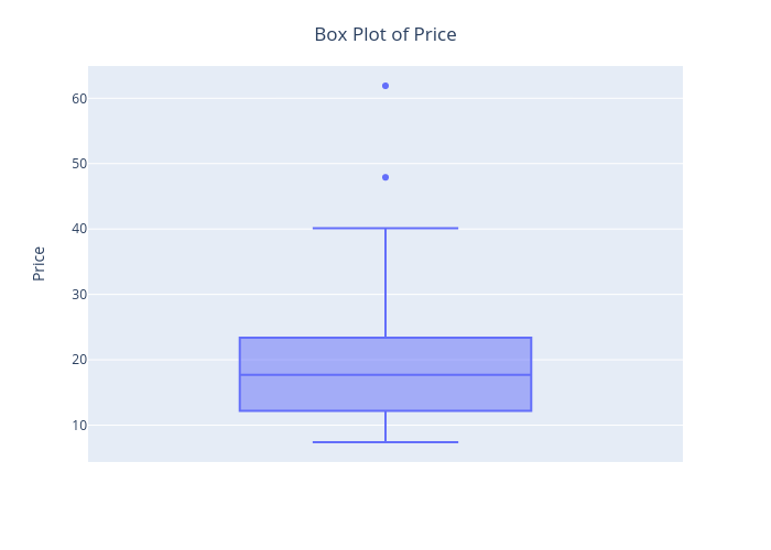
Now let’s craft a box plot for cars’ Price feature.
👁 Plotly box-plot
The best thing about this visualization is that we can start interacting with it by hovering in to see the quantiles values.
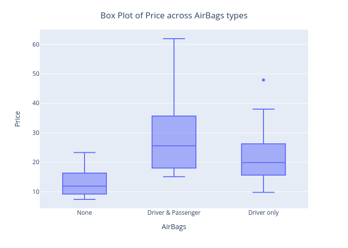
Similarly, we can customize it as per the requirement. For e.g. drawing a boxplot of Price for each AirBags type.
2. Histogram
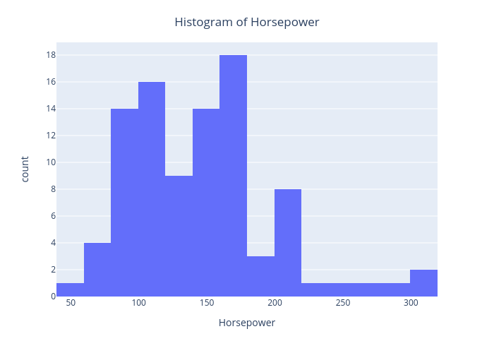
Let’s draw a histogram for cars’ Horsepower feature.
Here, X-axis is about bin ranges of Horsepower whereas Y-axis talks about frequency/count in each bin.
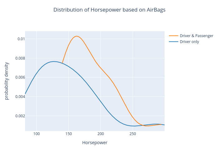
The density plot of Horsepower based on AirBags type is as shown below.
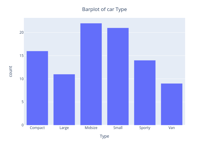
The bar chart of the Type feature is as shown below.
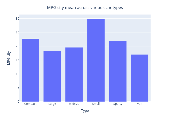
Similarly, we can customize it to display MPG.city mean on the Y-axis, instead of displaying count.👁 Plotly - mpg
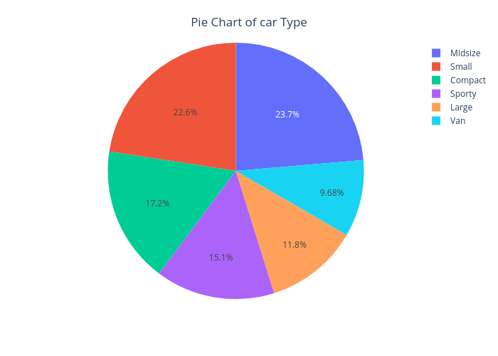
The pie chart of the Type feature is as shown below.

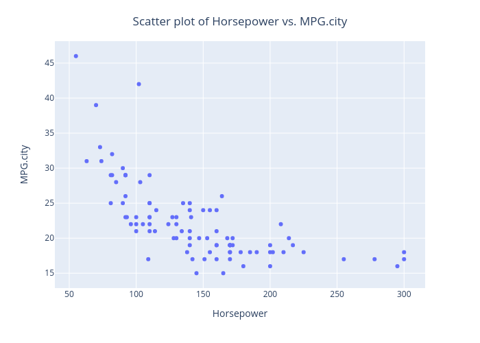
Let’s draw a scatter plot, in order to assess the relationship between Horsepower and MPG.city.
From this plot, we can observe that as the Horsepower increases, MPG in the city decreases.
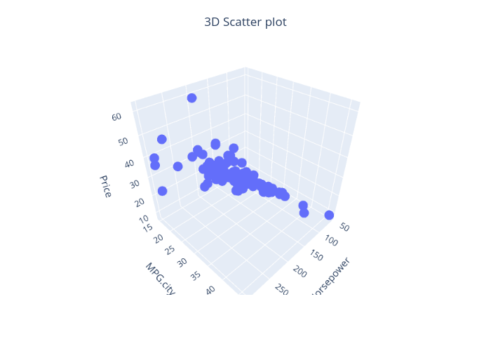
Plotly also provides a way to draw 3D scatter plots. Let’s draw the same using Horsepower, MPG.city, and Price features.
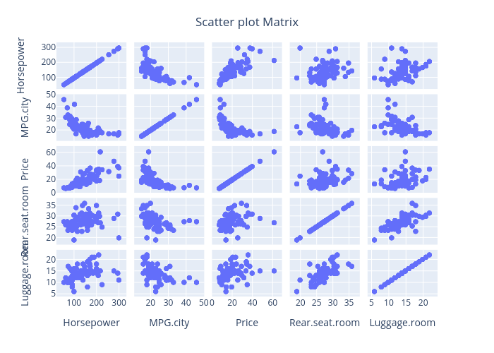
Similarly, we can draw a scatter plot matrix (a grid/matrix of scatter plots) to assess pairwise relationships for each combination of variables.
Let’s draw a scatter plot, in order to assess the relationship between Horsepower and MPG.city.
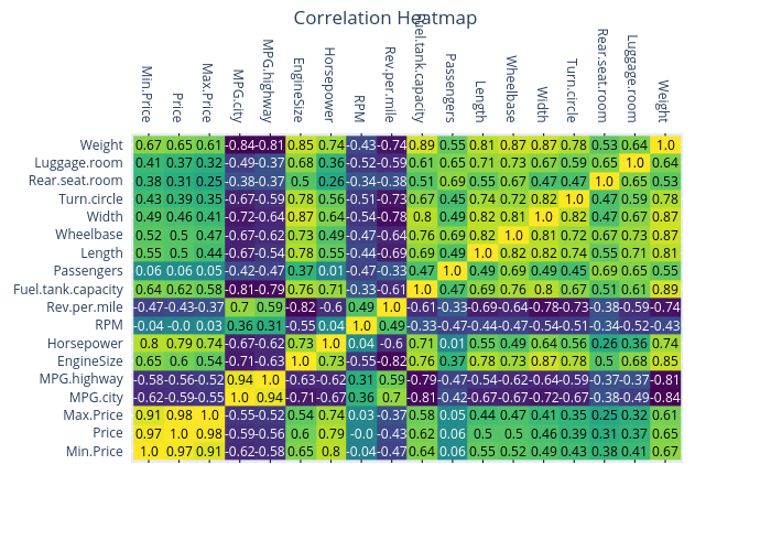
Let’s draw a heatmap to represent the correlation matrix of cars93 data.
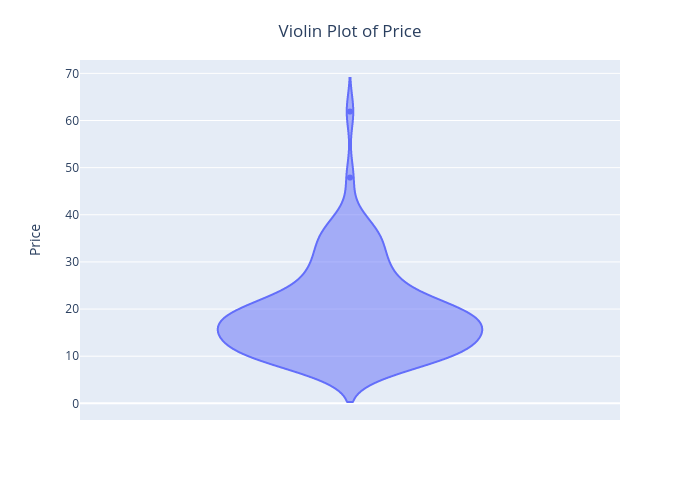
The Violin plot of the Price feature is shown below.
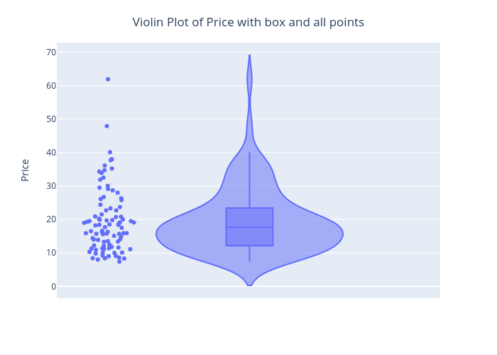
Similarly, we can customize it using Plotly to display the box and all the data points.
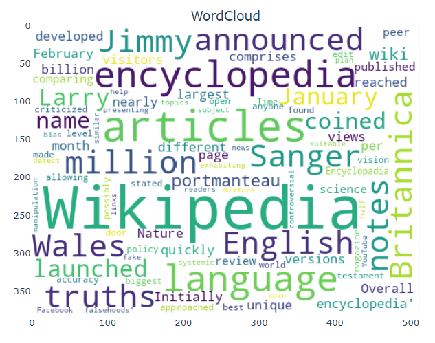
Word cloud of a chosen text document is as shown below.
In this article, we discussed different types of plots/charts using Plotly in Python. Plotly is highly recommended for creating interactive visualizations.
The media shown in this article are not owned by Analytics Vidhya and is used at the Author’s discretion.
A Data Science professional with 7.5 years of experience in data science, machine learning, and programming. Hands-on experience in different domains like data analytics, deep learning, big data, and natural language processing.
GPT-4 vs. Llama 3.1 – Which Model is Better?
Llama-3.1-Storm-8B: The 8B LLM Powerhouse Surpa...
A Comprehensive Guide to Building Agentic RAG S...
Top 10 Machine Learning Algorithms in 2026
45 Questions to Test a Data Scientist on Basics...
90+ Python Interview Questions and Answers (202...
8 Easy Ways to Access ChatGPT for Free
Prompt Engineering: Definition, Examples, Tips ...
What is LangChain?
What is Retrieval-Augmented Generation (RAG)?
Edit
Resend OTP
Resend OTP in 45s