 |
VOOZH | about |
|
VOOZH | about |
This article was published as a part of the Data Science Blogathon.
Microsoft‘s business analytics product, Power BI, delivers interactive data visualization BI capabilities that allow users to see and share data and insights throughout their organisation. Power BI provides insight data by using data interactively and exploring it by visualizations. Create visualizations and reports using the data models.
Report files can be shared so that others can use, improve, and share them. pbix files are just another file but uploading them to the service is the most attractive option. Power BI Desktop combines Microsoft’s query engine, data modelling, and visualization technologies. By combining the Power BI Desktop, and service you may get a better understanding of your data.The following are the main aspects of developer extensibility: Power BI may be embedded in apps, websites, and portals. Using the open-source SDK, create unique visualizations.
Run automatic data refresh, augmentation, and transformation processes, autoscale resources, automate application lifecycle management (ALM), and more using the Power BI REST API.
Power BI has consisted of desktop and service. Power BI Desktop is available free, consists of one of the features query editors. It is available from the Microsoft store. Power BI Desktop is a desktop version of Power BI that you can install and use. Select Get from the Microsoft Store page, and then follow instructions to install Power BI Desktop. Power BI Desktop can be launched from the Windows Start menu or the taskbar icon.
Getting started with Power BI. You’re ready to connect to the ever-expanding world of data now that you’ve installed Power BI Desktop. Select Get Data > More in the Power BI Desktop Home tab to different types of data and then go through the list of All data sources in the Get Data window. Paste the URL https://www.bankrate.com/retirement/best-and-worst-states-for-retirement/ into the in the From Web dialogue box, then select OK. Select Connect to use anonymous access on the Access Web Content page. Power BI Desktop’s query functionality kicks in and accesses the resource.
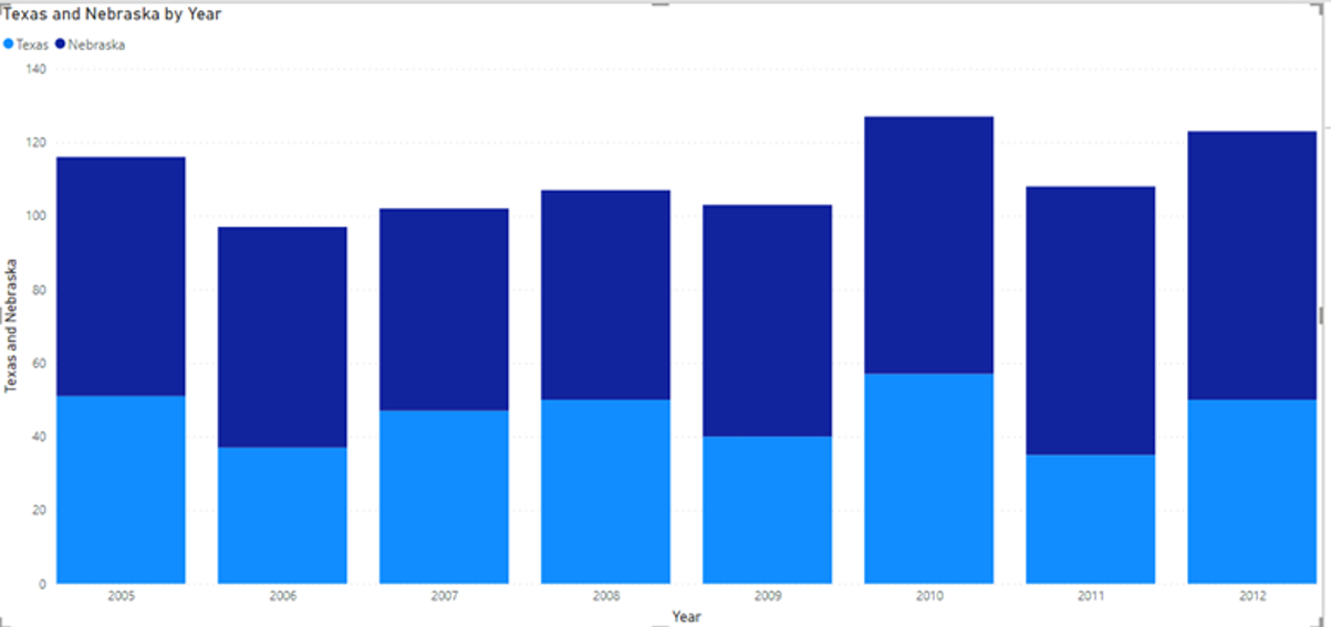
To get started with Desktop Power BI for excel, CSV files will be imported. First, we will click get data, and from that menu, we will select the CSV file and then load the data. In these Fig. we have uploaded data from Sales of Beef in Nebraska and Texas.
Fig 1 Country Nebraska, and Texas showing the sales from the Year 2005-2012.
We can create chart of different types on visualizations. Under the File menu, you can save the file and reopen it .
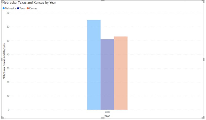
Model can be created by selecting excel sheets and making a relation with other data.
Fig 2 Relation between sales of data in the 2005 year in Nebraska, Texas, and Kansas.
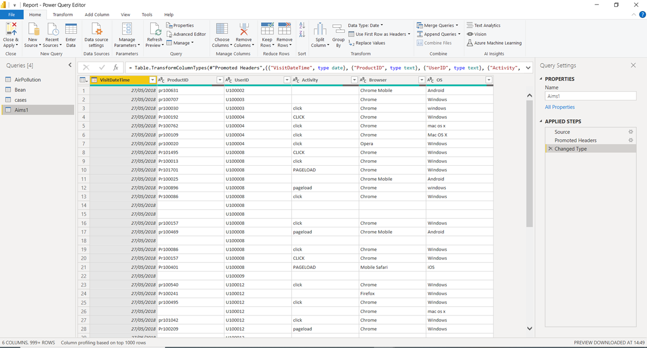
Data needs to be formatted according to the need of columns. There are many processing errors which leads to blank rows.
We will use the Power Query Editor which is a tool that allows you to edit the data before loading it. You can use it to format the data and decide what needs to be load. Power Query is that you need to close and apply the changes to be made to the data in the report. We need to clean the data before loading it. We can here remove or delete the columns on our own choice. You give Power Query Editor step-by-step directions for modifying data while loading and presenting it. The original data source is unaffected by shaping; only this view of the data is affected. Transforming data, or renaming columns, tables, eliminating rows or columns, or altering data types, is an example of shaping.
Build Reports
The top of the screen displays common report and visualization functions.
The middle part is where visualizations are produced and placed.
The bottom of the page tab section allows you to pick or add report pages.
You can filter data visualizations in the Filters window.
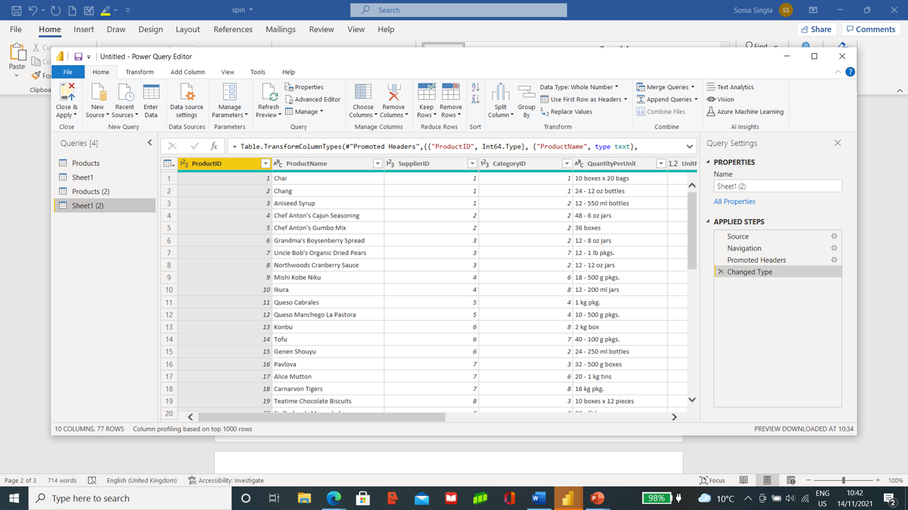
Let’s take an example in which we must analyze sales data from an excel sheet. From the Get tab, select the excel workbook and load the products excel as in the Figure.
Before loading the data, we will clean the data.
After confirming the option to Transform, we will get the power query editor opened, where we will clean the data.
Select Product Name, Product ID, Quantity per Units and Units in Stock by pressing Ctrl and then with the help of right-clicking pressing remove other columns, which will remove the rest of columns present.
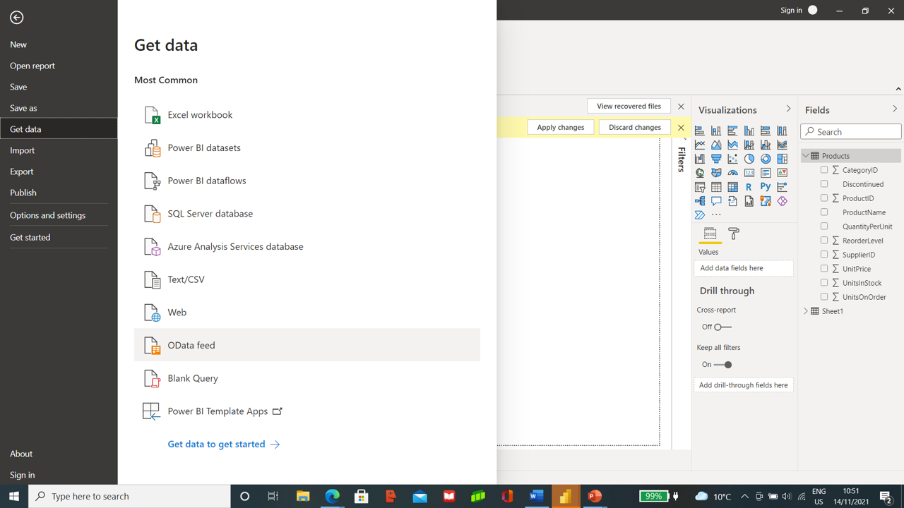
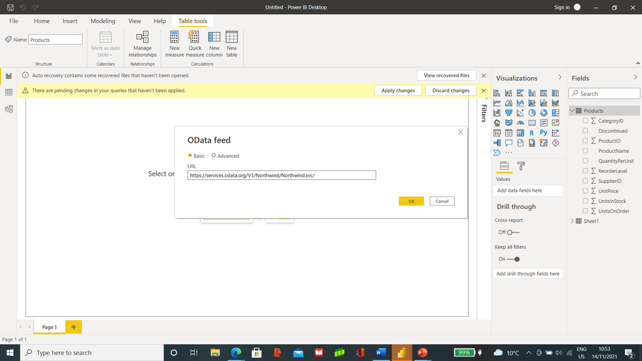
In the next step, we will import Order Data from the OData Feeds.
In the Url, Section pastes the URL https://services.odata.org. Pick up Orders from it and load the data.
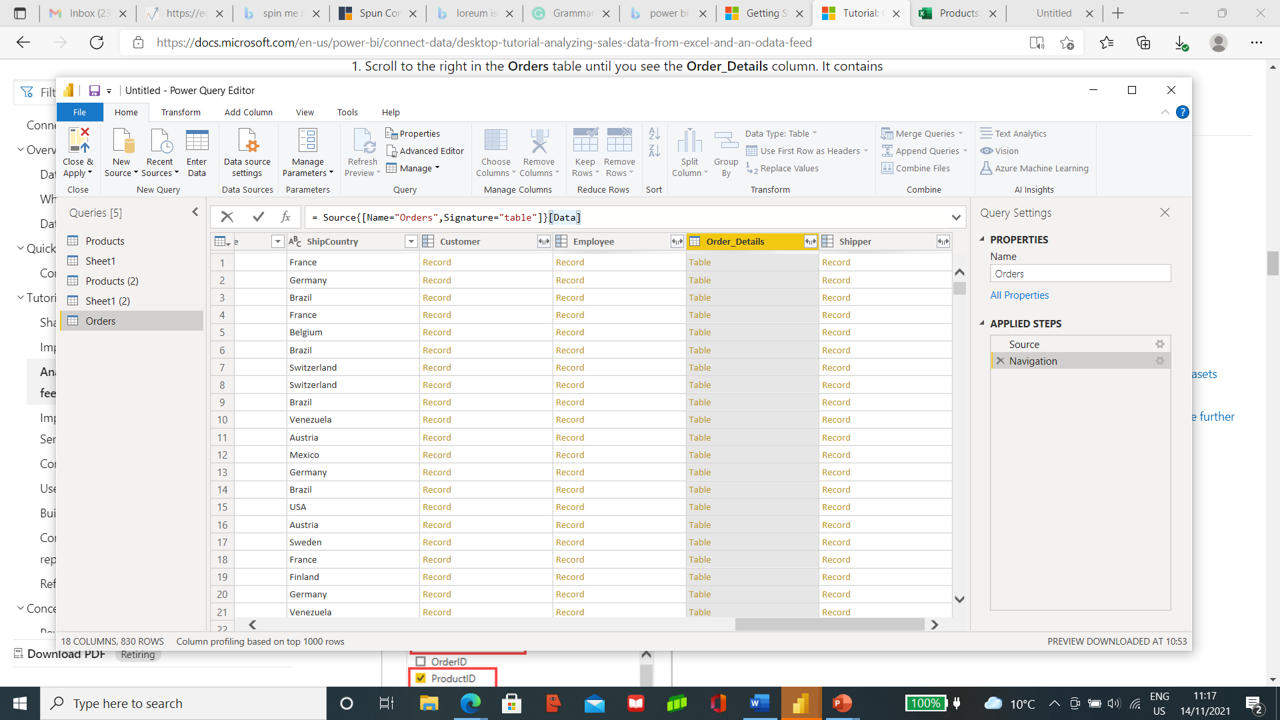
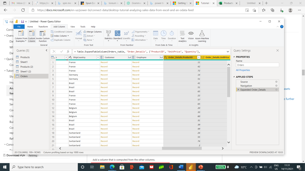
Order Table contains Order Details Table, which needs to expand by pressing the expand icon on the header of Order Details. Select all columns and then select ProductID, Unit Price, and Quantity.
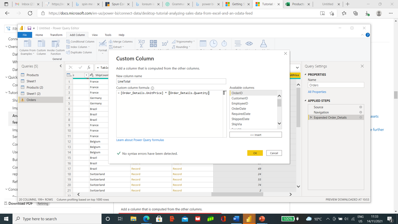
We will now create Custom columns to calculate the total price by multiplying Unit Price and Quantity. From the top, choose Add Column and then the Custom column and type LineTotal in the new column and Custom Column Formula type [Order_Details.UnitPrice] * [Order_Details.Quantity].
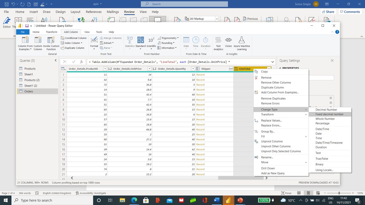
LineTotal column gets added in last in Order Table. LineTotal column needs to fix data type by changing it to a Fixed decimal Number. To do this, we will select the LineTotal column and right-click on its header, and select change type to Fixed Decimal Number.
We will need now following columns in Orders Table.
· Order_Details.Quantity
· LineTotal
. OrderDate
· ShipCity
· ShipCountry
· Order_Details.ProductID
· Order_Details.UnitPrice
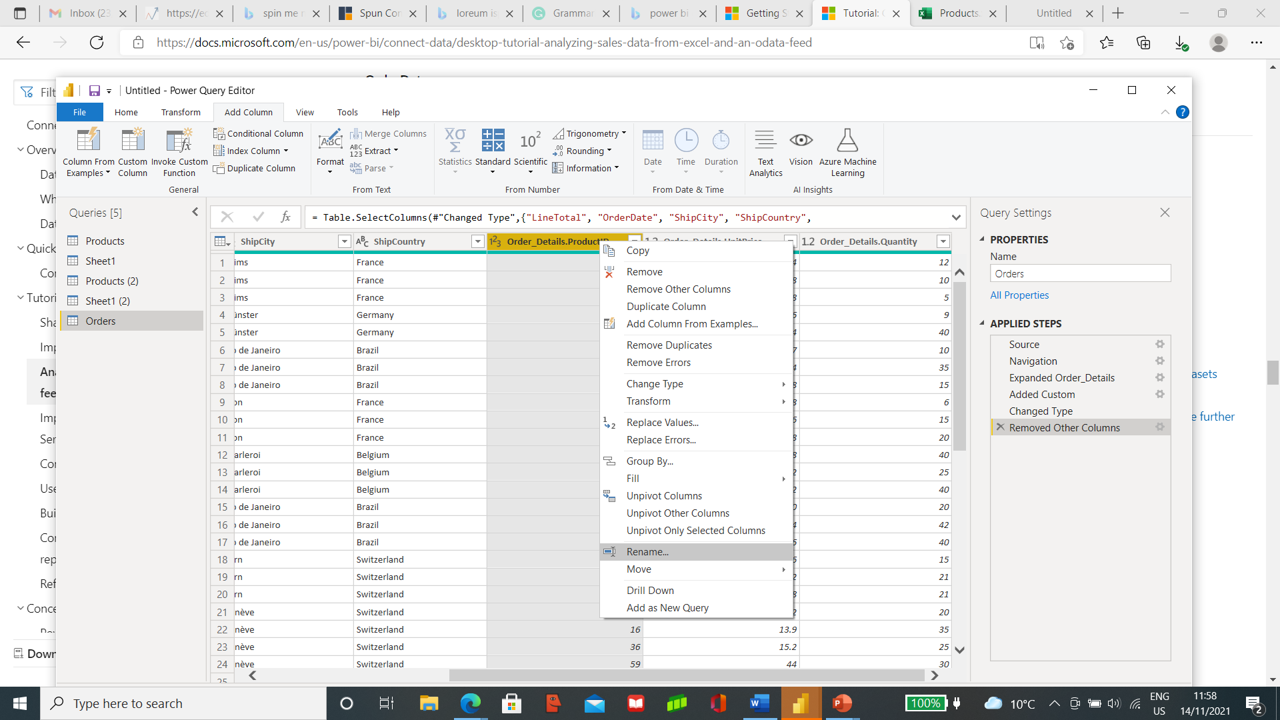
Select all these columns by using Ctrl and then right-click on the header to select remove other columns.
To make it easier to access, we will rename the columns by removing Order Details from the columns of Order_Details.ProductID, Order_Details.UnitPrice, Order_Details.Quantity.
We will select the columns and right-click the header, and select rename and remove the prefix Order Details.
We will shift LineTotal by dragging it to the right of ShipCountry. Once the data gets, cleaned you are ready to close and apply the changes to the query editor. Data shows up in the field of Power BI Desktop.
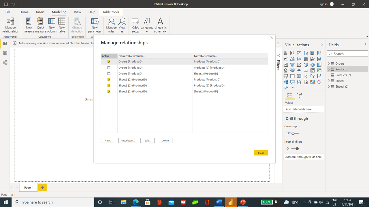
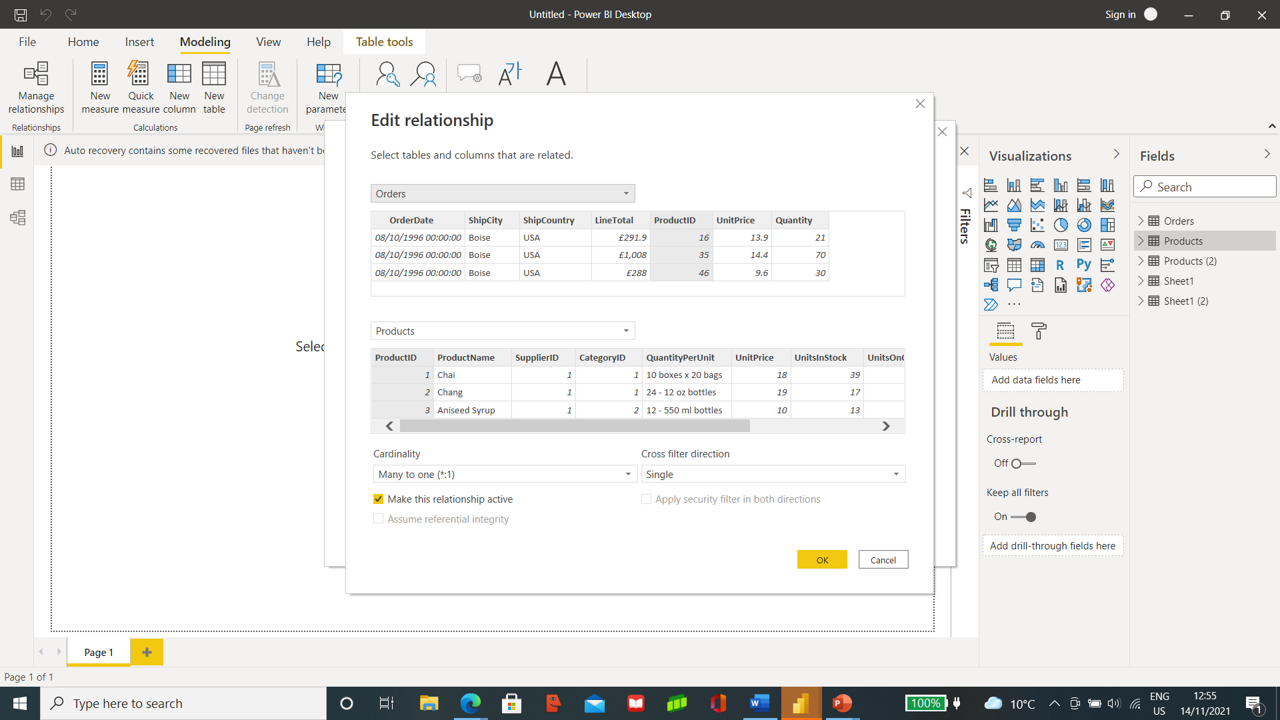
To create a relationship between both datasets, we will select Modelling and then choose Manage Relationships. To view in detail, we will go with the option edit.
Power BI has self-created relation between Orders and Products, so we will cancel and close it.
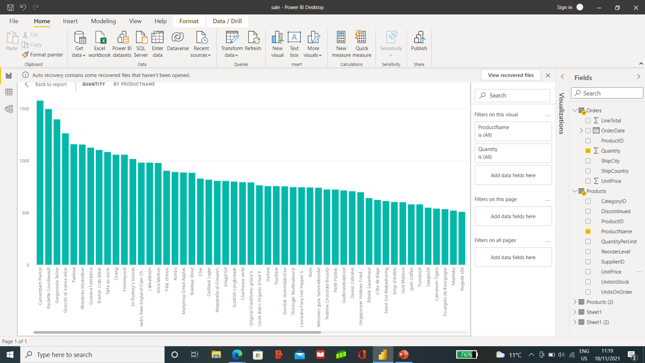
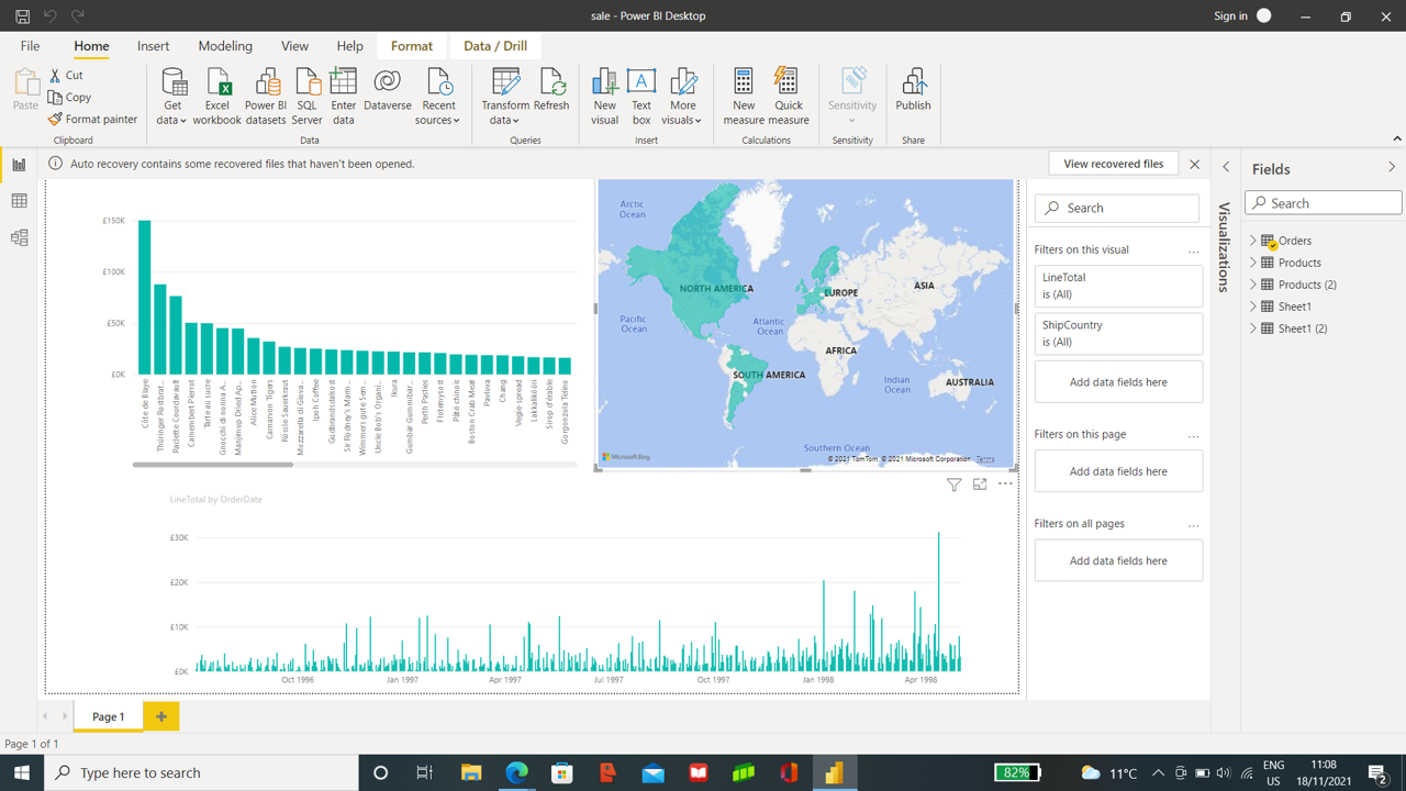
Stacked Column Chart
To view the Quantity of each product, we will select a Quantity from the table Order and ProductName from Product Table.
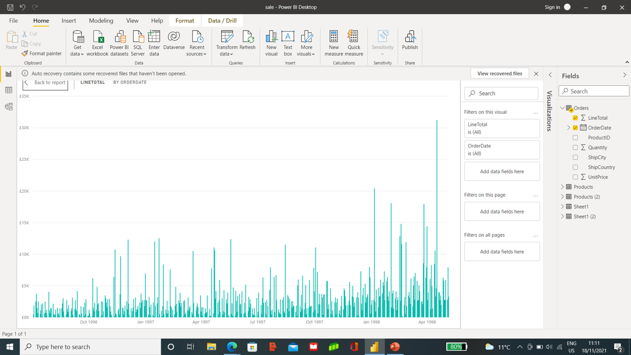
To have the chart showing Order amount (LineTotal) and Order Date, select LineTotal and Order Date from Order Table.
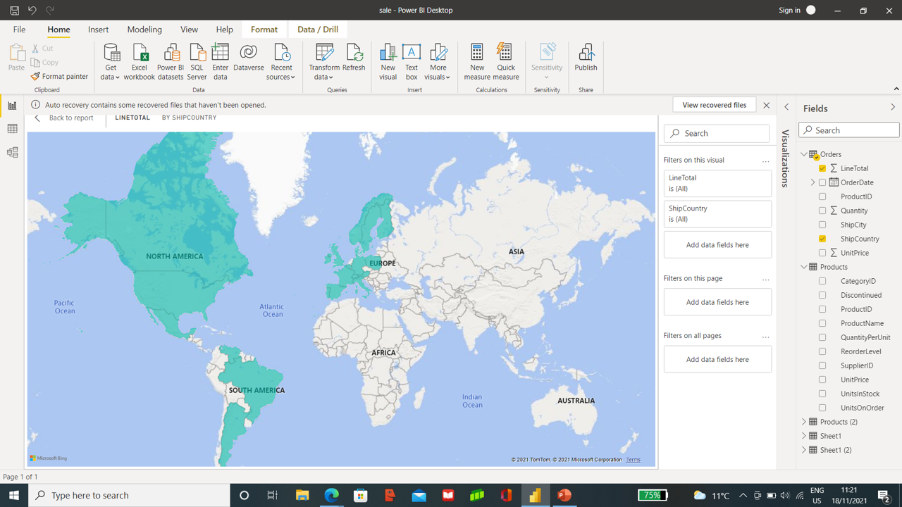
Map Visualizations from each Country.
To view the order amounts from each Country, select shipCountry and LineTotal a map is created.
Combined reports from both sheets help you analyze different Country order information,
time frames, and products.
You can save the report, and share it on Power BI Service with other users.
Working on a Project report and creating many versions makes it difficult for the team to manage and as the whole team works, losing an updated version is a more common error. To overcome this problem, Power BI provides a dashboard where all the team workers can work simultaneously. The team can update the contents of the report and can share, comment, and take a print.
Sharing the contents of the design
Several ways used by designers like
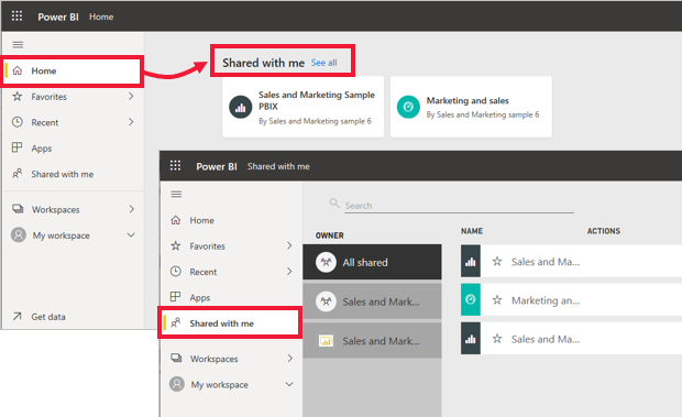
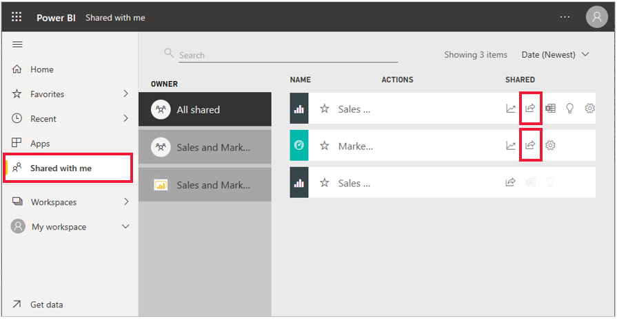
Link send-up by email will be seen as shared content when is selected, to view, go through nav pane > shared with me as shown in Figure.
Source- Power BI on Microsoft Learn | Microsoft Docs
Source- Power BI on Microsoft Learn | Microsoft Docs
In the Figure, you will notice the issue of external and internal team workers. Re-sharing the contents with an internal team member is possible. It cant be done with an external one even if a share icon exists.
Source- Power BI on Microsoft Learn | Microsoft Docs
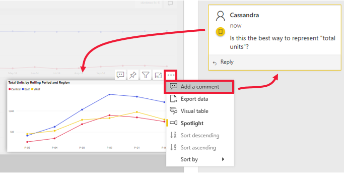
After sharing the dashboard, you can send the comments along with it instead of sending them separately by email. Comments can be general or attached to the chart, which can be seen ongoing through the Visual icon.
Source- Power BI on Microsoft Learn | Microsoft Docs
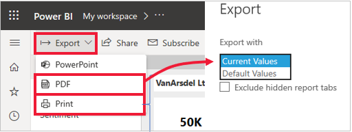
Another way of sharing reports or dashboards is through the printing method.
Another way is by sharing it to PowerPoint by selecting export and then PowerPoint.
Source- Power BI on Microsoft Learn | Microsoft Docs
In this article we tried to understand data analysis by using Power BI . Microsoft’s lifecycle management (ALM) Power BI is a set of software services, apps, and connectors that work together to transform disparate data sources into logical, visually immersive, and interactive insights. Power BI makes it simple to connect to your data sources, visualize what matters, and share it with anyone you want.
I have done my Master Of Science in Biotechnology and Master of Science in Bioinformatics from reputed Universities. I have written a few research papers, reviewed them, and am currently an Advisory Editorial Board Member at IJPBS.
I Look forward to the opportunities in IT to utilize my skills gained during work and Internship.
https://aster28.github.io/SoniaSinglaBio/site/
GPT-4 vs. Llama 3.1 – Which Model is Better?
Llama-3.1-Storm-8B: The 8B LLM Powerhouse Surpa...
A Comprehensive Guide to Building Agentic RAG S...
Top 10 Machine Learning Algorithms in 2026
45 Questions to Test a Data Scientist on Basics...
90+ Python Interview Questions and Answers (202...
8 Easy Ways to Access ChatGPT for Free
Prompt Engineering: Definition, Examples, Tips ...
What is LangChain?
What is Retrieval-Augmented Generation (RAG)?
Edit
Resend OTP
Resend OTP in 45s
.png)